Custom Cartography for Dutch Media Company VPRO
Designing maps using the national color of Holland

Working closely with Dutch broadcasting heavies VPRO, we designed an interactive map of the Netherlands to accompany the forthcoming broadcast of a series of shows about this fascinating tiny country. As our friend Ben Cerveny is known to say: “New York started gentrifying in the 1970s, but Amsterdam started gentrifying in the 1790s,” and the opportunity to design custom maps for a country that’s essentially all infrastructure was one that we leapt at gladly.
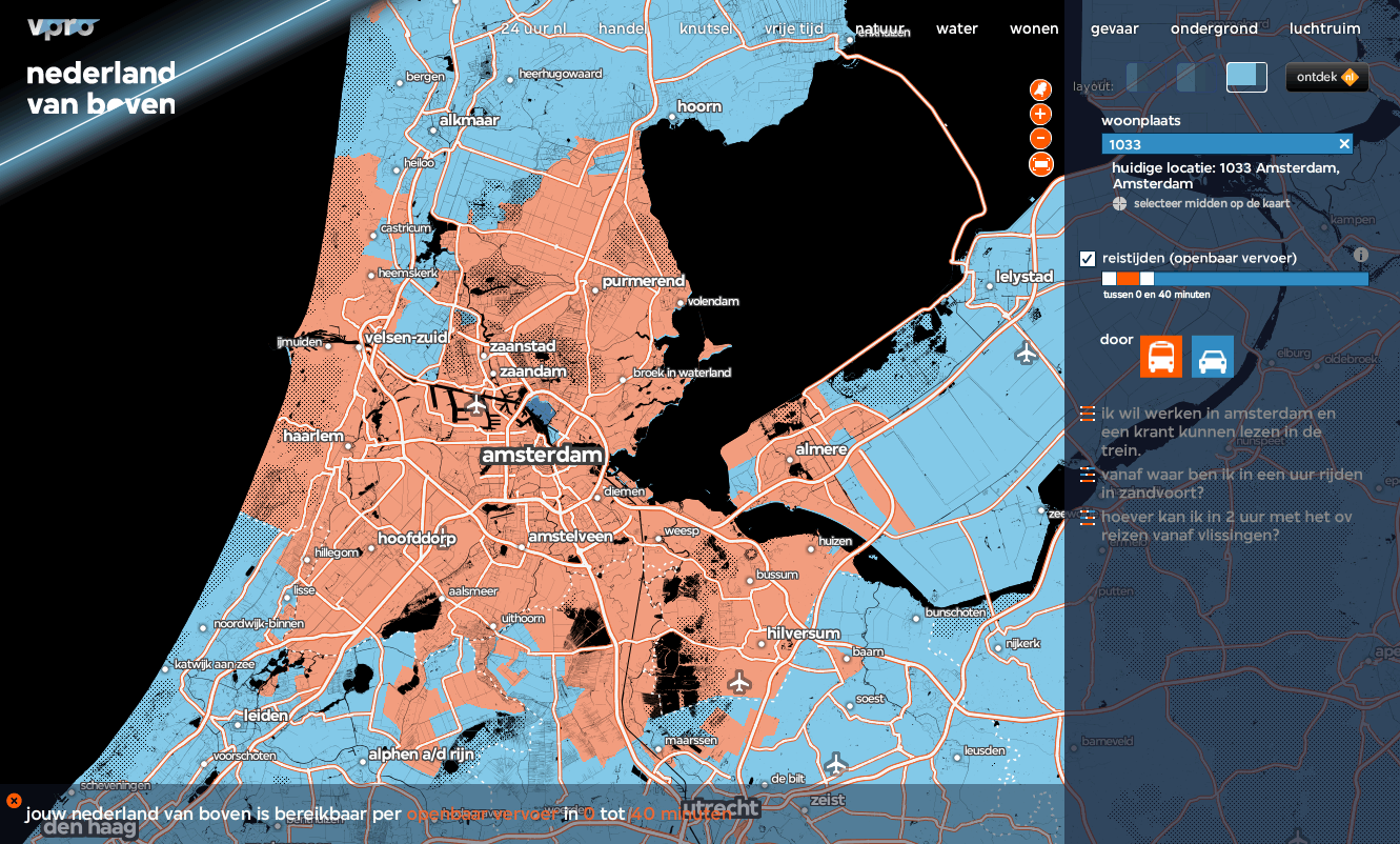
The show ran in a series of episodes, each addressing a different aspect of life in Holland. It started with mobility, answering questions like “where can I live, if I work in Amsterdam and want to be able to finish the newspaper by the time I get to work on the train?” or “How far can I travel in two hours by public transport from Vlissingen?”
Following episodes dealt with other ways of looking at the environment around you: examining the natural environment by comparing distances from buildings, open space, and the density of wild animals, the landscape of danger by examining rates of lightning strikes, flammable locations and the arrival times of ambulances, and the contours of the air around the country, looking at the density of birds, flght paths of planes and the highest places in the Netherlands.
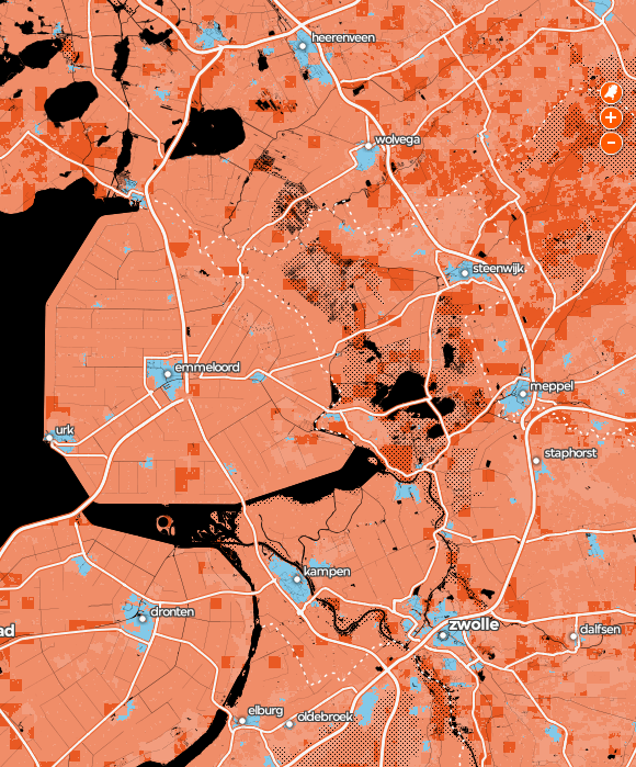
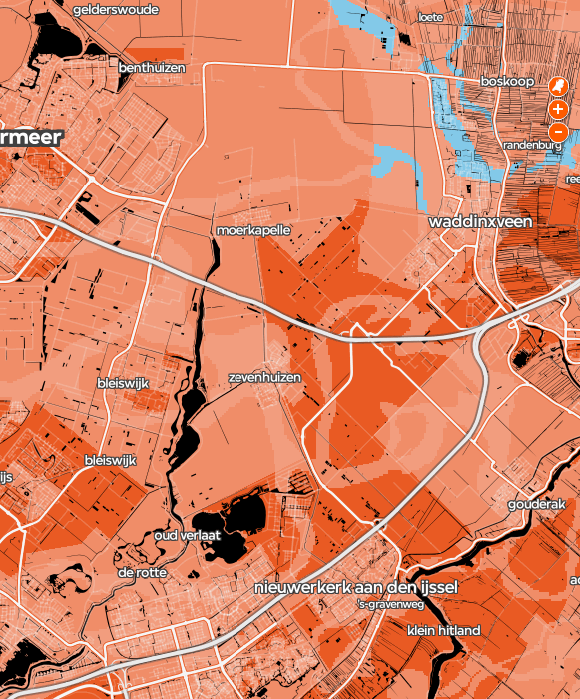
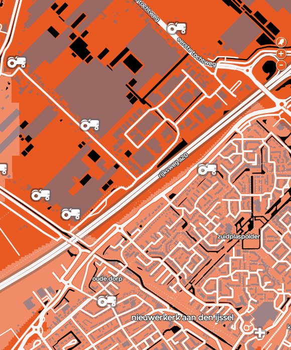
The cartography for the project is custom-made for VPRO, designed to complement the channel’s rich visual branding. Cities fill in based on a custom compilation we derived using a combination of NaturalEarthData and GeoNames sources, and and at lower zoom levels roads become visible and are drawn using data sourced from OpenStreetMap. On the most detailed zoom all roads are drawn and the arterial streets receive names. With roads come more place labels, now from OpenStreetMap and sized by population. Water bodies (black) are drawn using data from VPRO, as are park lands (black stipple pattern), airports, farm locations, pancake restaurants, neighborhood names, and zipcode shapes (the locations of pancake restaurants being as important to the Dutch as the locations of airports and farms, apparently).
The highlight layers are orange, because that’s the national color of the Netherlands. Also, did you know that carrots are orange because that’s the national color of the Netherlands; “in the 17th century, Dutch growers are thought to have cultivated orange carrots as a tribute to William of Orange — who led the the struggle for Dutch independence.” So: orange maps over custom OpenStreetMap cartography, a client who wanted to tell a story and was willing to stretch what it means to design a map, and a country made of canals and land claimed from the sea. Hoera!