
In July 2015, after my first two years at Stamen, I wrote a blog post called “Year Two at Stamen”, and followed it up in December 2018 with another post “Year Five at Stamen”. Now that I’ve hit eight years at my dream job, it’s time to look back at what else has happened since I last wrote one of these updates. I’ll be talking about the Stamen projects I worked on over the last few years, all the blog posts and recorded presentations I’ve published, and some of the weird and fun map glitches that happened along the way. This is a long post, so feel free to skip around or just look at the pretty pictures!
Projects
In the last few years we’ve launched a lot of great client projects that I’ve been involved with to various degrees:
In 2019 we built Culture Compass for the Community Arts Stabilization Trust (CAST). Culture Compass is a map of non-profit organizations in San Francisco, combined with various demographic, infrastructural, and land use layers that helps support CAST’s mission to raise money and purchase buildings to serve as permanent homes for arts and cultural organizations.
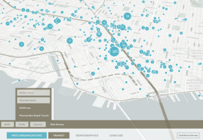
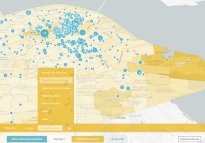
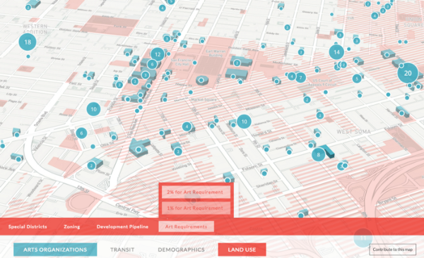
You can read more about Culture Compass at Stamen’s blog post about the project, or in this introductory video from CAST:
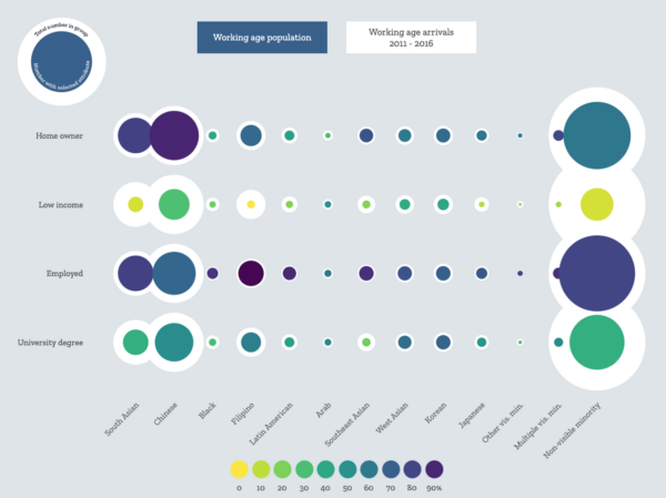
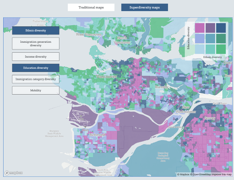
We also visualized complex interactions of demographic diversity (the concept known as superdiversity, or “the diversification of diversity”) with the Max Planck Institute, and researchers at my alma mater UBC. The final project at superdiv.mmg.mpg.de is packed with different kinds of data visualizations and fascinating multivariate choropleth maps:
Also in 2019 we built another batch of demos for HERE using their XYZ tool.
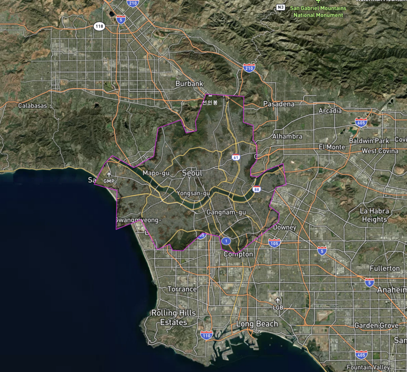
One of these demos was a chance for me to revisit my la.stamen.com project that I originally built using CARTO and bring it to a new platform. We had fun exploring parcel data for New York City and Los Angeles County, comparing the different urban textures of the two cities, block by block and neighborhood by neighborhood.
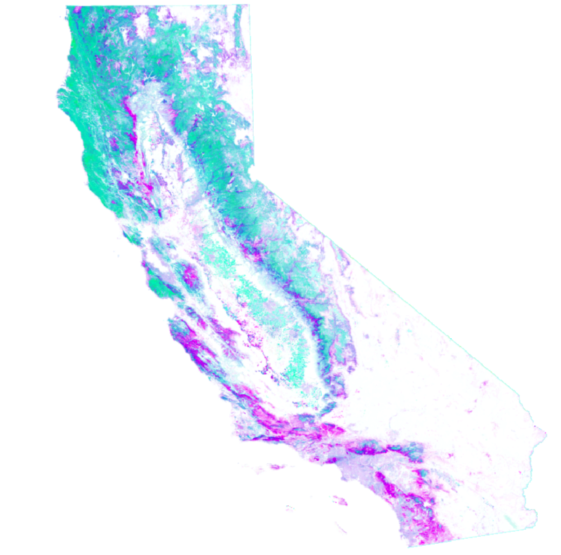
I also used HERE XYZ to re-create a map of California crops originally made by my then-colleague Logan Williams using Mapbox. This map uses a public dataset from the California Natural Resources Agency to let you explore the myriad different types of food grown across the state of California. As you pan around the map, the linked data visualization updates automatically, giving you aggregated statistics of the number of acres occupied by each crop within your field of view:
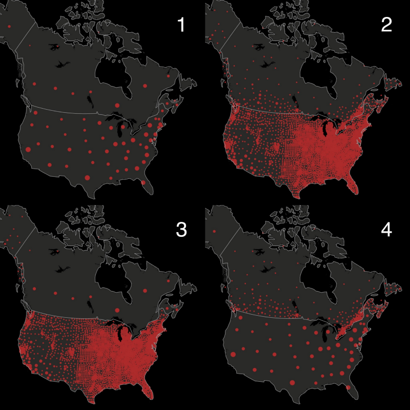
We closed out 2019 with another epic update to our long-running series of climate change maps for the Audubon Society. Our first project for Audubon back in 2014 remains one of my favorite projects (I talk about it in my Year Two at Stamen post) and we were lucky to get to revisit the concept with ever-improving data in subsequent years. This new iteration “Survival By Degrees” expanded the map data beyond the US and Canada down into Mexico, and shows the impacts of climate change on North American bird species at a much more detailed resolution than ever before.
You can read more in our blog post on the project “Survival by Degrees: How We Built It”, or in the article in The Atlantic: “A Field Guide for the Entire 21st Century”.
In 2020 we made maps of the coronavirus pandemic, working with infectious disease researchers and the Facebook Data for Good team to visualize aggregated mobility data to see which counties, states, and countries were most affected by COVID lockdowns:
You can read more about the COVID maps in Eric’s blog post: How we approached building Movement Trends with Facebook Data for Good and the Covid-19 Mobility Data Network, or in my recorded presentation on YouTube (which I’ll talk about more down below).
Throughout 2020 and into 2021, we were also working on another unrelated project for Facebook: helping to design and build their own worldwide basemap using OpenStreetMap data! This was (and is) by far the longest-running and most ambitious project I’ve ever worked on at Stamen, and it was a huge, collaborative team effort. While all Stamen projects are intensely collaborative (which is one of the things I love about working here) our teams are usually fairly small, maybe only three or four people actively working on a project at a time, and rarely more than one of us specializing in cartography. For the Facebook map project, however, it’s been a real pleasure to significantly grow our team of mapping specialists to help shoulder this massive undertaking, and to get to work together with some of my favorite cartographers including Stephanie May, Jonah Adkins, Gretchen Peterson, Mamata Akella, Katie Kowalsky, Dana Bauer, and Ross Thorn.
To read more about the Facebook map project, you can read Jonah’s excellent post: “Launching the Facebook Map”, and Stephanie’s presentation on YouTube: “We Made A Facebook Map”.
As always, every year there is a bunch of interesting client work that I can’t share because it isn’t public, and there are also some fantastic public projects coming out of the studio that I had nothing to do with!
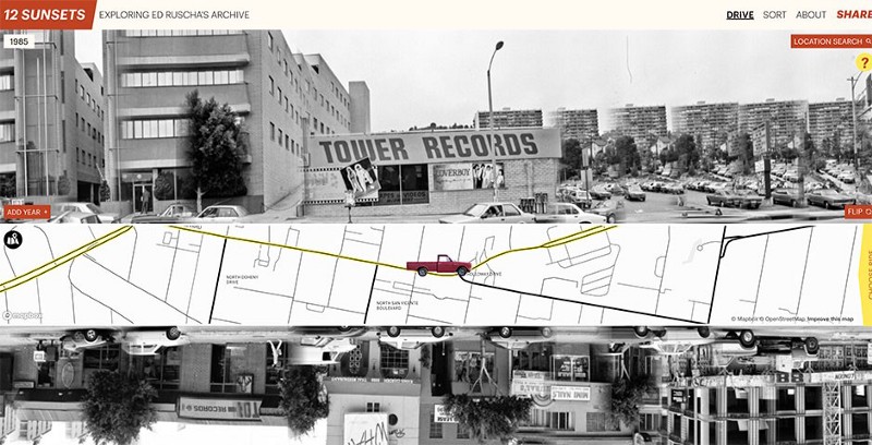
In particular, I’d like to call out the beautiful work my colleagues created in collaboration with The Getty Museum visualizing the photographs of artist Ed Ruscha. This project called “12 Sunsets” lets you virtually drive up and down the length of Sunset Boulevard by stitching together Ruscha’s encyclopedic collection of photography of every building along the Sunset Strip, a work he re-photographed every few years over the course of several decades. This project went on to win the Webby Award this year. Congrats team!
The many Stamen employees from before my time also won some more well-deserved recognition when Stamen’s Watercolor map tiles (which were made before I started at Stamen) became the first website acquired by the Smithsonian’s permanent collection!
Presentations and Workshops
I did fewer conference presentations than I reported in my previous updates, which is understandable because the past year and a half of the COVID pandemic has radically changed our habits and expectations of how conference travel and presenting should work.
One presentation from shortly before the pandemic is available for viewing online, where I discuss an ongoing side project to get native reservations to show up on OpenStreetMap:
If you’d rather not watch the video, I have a full transcript here: Getting Native Reservations on OpenStreetMap.
At the only virtual conference I attended so far (the 2020 North American Cartographic Information Society meeting) I talked about some of the behind-the-scenes mapping techniques we used for our COVID-19 mobility map that I discussed earlier:
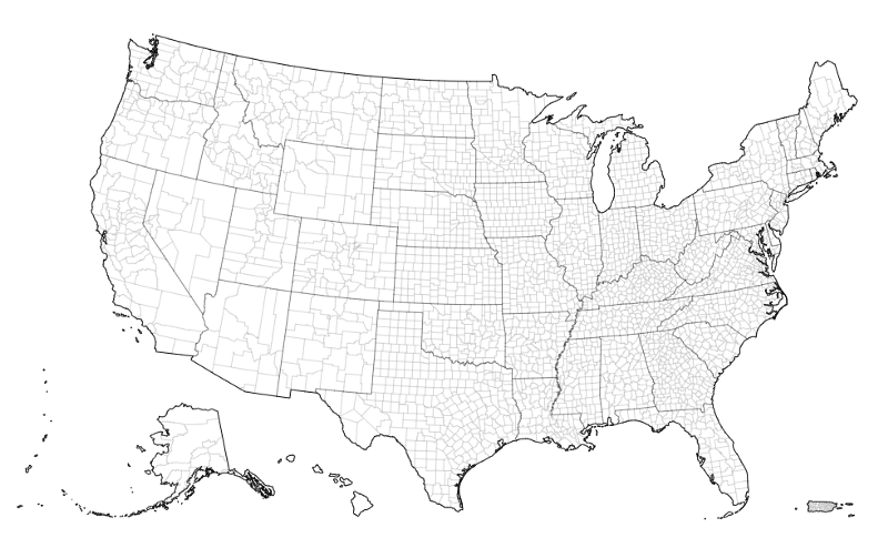
In that presentation I talk a lot about the nitty-gritty of working with map projections. One outcome from the COVID project was a brand new map projection we created that shows all of the United States, including its overseas territories like Guam, American Samoa, and the Northern Mariana Islands. Well, okay, it’s really just a hybridization of existing map projections, but as far as I could tell there wasn’t any out-of-the-box solution for this particular mapping need. Now this “US Albers + Territories” projection is available as an NPM module that anyone can easily use in their D3.js maps:
We also continued our Stamen dataviz and mapping workshops, some onsite for clients, and some for the general public in our San Francisco studio. These classes were increasingly a collaboration with the talented Curran Kelleher who has extensive experience developing online teaching materials for D3.js and for data visualization in general. We did our last in-person workshop in San Francisco in November 2019, and tried out our first virtual class in April 2020. We think our first foray into online teaching went well, but are still doing some serious thinking about how we really want to continue our training initiatives, whether in person, online or both. For now our workshops are on hiatus, but please keep in touch if you want to be notified of when classes start up again!
Also in 2019 I attended the d3.unconf in Chicago, where we all got custom name badges using a data visualization we created, printed using 3D lenticular lenses so the visualization would change when you look at it from different angles. I made an “interactive” map using data from my old Pop vs Soda website. Here’s a video of the name badge in action:
Today Pop vs Soda is at the #D3 Data Visualization Unconference #visfestunconf @d3unconf pic.twitter.com/R9TVbOQXny
— Pop vs Soda (@pop_vs_soda) August 26, 2019
Writing
Starting in late 2020, I was able to spend more time to write some more long-form blog posts for Stamen. These were a fun experience to put together, and a new way of thinking about writing for me: these posts were less about my personal views on any topics, and more of an attempt to synthesize all the fascinating but not-ready-for-prime-time conversations, thoughts, and passing observations that happen around the virtual water cooler at Stamen (basically, on Slack and in the margins of our Zoom meetings).
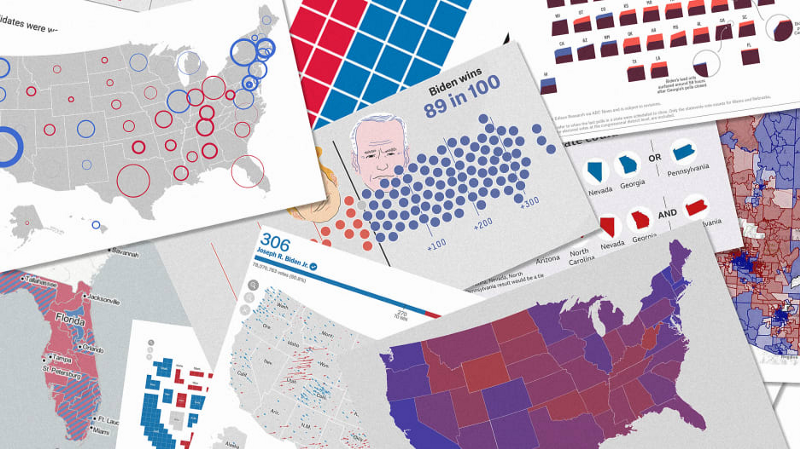
First I wrote a long piece about election maps that was republished by Fast Company: “We design maps for a living. Here’s who got the 2020 election right.”
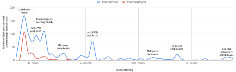
I wrote a pair of posts surveying the best maps and data visualizations from the pandemic: “Visualizing the pulse of a pandemic: A year of COVID line charts” and “Corona-cartography: what we learned from a year of COVID-19 maps,” which included a bit of autobiographical-visualization of activity in our own Slack channels:
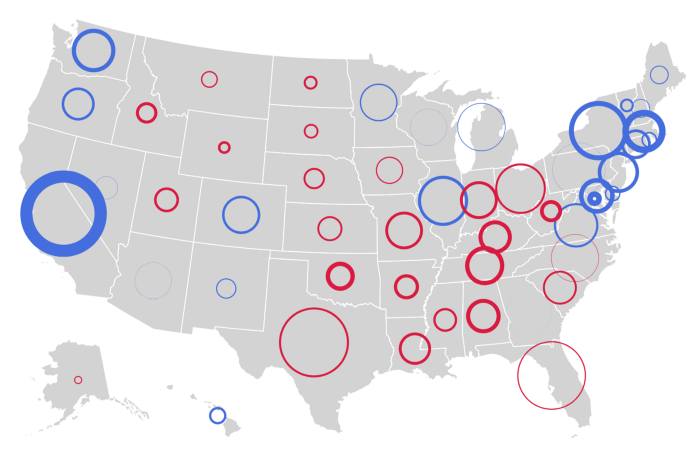
I should also admit that some large parts of those blog posts were sourced from Twitter rants I’d already made about the topic. Here’s an experiment: these maps use simulated COVID data. In which scenarios do you think the covid rates are higher in Canada? In which scenarios are the rates higher in the US? In which maps are they the same?
Spoiler, they’re all the same data! In short: the way you classify and cluster your data can have a huge effect on how readers interpret it. Thank you for coming to my TED talk.
I also started a series of posts about Stamen’s history with OpenStreetMap, which so far has two parts and will have one or two more before the series ends: “Our Brilliant Friend: Stamen and OpenStreetMap through the years, part 1” and “part 2.”
Thinking of the relationship between Stamen and OpenStreetMap as an evolving friendship is perhaps a bit pretentious, but it did give me an excuse to pepper the blog posts with a lot of fun GIFs of famous friendships:

Glitches, side projects, and work-in-progress
In the course of our work at Stamen, we often stumble on some some cool or bizarre output that happens along the way. Sharing this “exhaust” (as we call it, or sometimes #stamenpreview) often prompts some interesting conversations or stimulates new ways of thinking about the problem. A few I enjoyed:
An ominous glitch animation while trying to vectorize a hillshade:
These animations of QGIS crashing by @mappingmashups feel weirdly appropriate today, not in a good way pic.twitter.com/LZLGqdRVKW
— Stamen Design (@stamen) March 11, 2020
Some “Solo jazz cup” cartography while mapping California wildfire hazards:
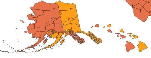
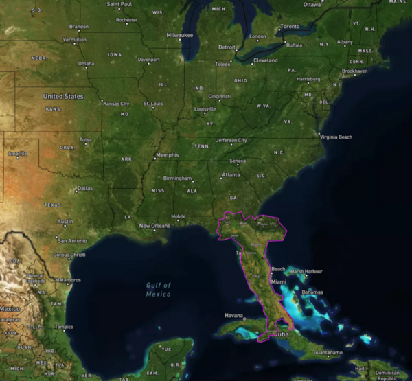
When hacking on map projections you accidentally get Double Alaska:
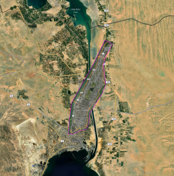
We are trying create more time in our schedules for these kinds of explorations and to do more intentional side projects at Stamen too: I enjoyed prompting Eric Brelsford to create Scale-a-Tron (a tool that lets you compare sizes of different areas on an interactive map), a project that started as an off-hand comment on twitter and turned into a goldmine of playful and thought-provoking maps made by a bunch of people on the internet (which you can see with the hashtag #scaleatron).
Another quick side project was the creation of a new kind of map for viewing election results, as a spin off from my election night blog post. If anyone has good ideas for a name for this kind of visualization, please let me know! You can read more about it on VizHub:
And in what turned out to be an extremely not-lucrative side hustle, I made some Stamen map masks on Zazzle. If for some reason you still need another cloth mask, you know where to go:
One last thing…
Eric Rodenbeck and I were interviewed on The Geomob Podcast, which was great fun and gave us a chance to look back at some of the history of our work at Stamen and think a bit about what the future holds for the next few years. Give it a listen wherever get your podcasts, or online here.
What’s next?
As always we have some great projects in the pipeline that are just about to launch, which you’ll hear about if you stay tuned to our blog at hi.stamen.com. I also have some more blog posts in progress, including the conclusion of the History of Stamen & OpenStreetMap series, and an exploration of what the heck is going on with all these people making dramatic hillshade maps using Blender.
Meanwhile back at home in Bellingham, Washington, the coworking space I run called Localgroup Studio is rebounding from closures due to COVID and is once again becoming a thriving place for connection in our small but lively community. Please stop by if you’re ever in town! I’m also continuing to explore ways to bring more affordable housing to our city as part of the new Bellingham Housing Cooperative Resource Center; if you have experience with limited- or shared-equity housing coops, especially in smaller cities like Bellingham, I’d love to hear from you. And finally as part of yet another group of ambitious, pie-in-the-sky dreamers, I’ve been helping out with the nascent organization Cascadia Rail however I can, and have a bunch of half-finished maps of potential High Speed Rail alignments in the Pacific Northwest… if I ever find the time to finish them, you can be sure I’ll post them here on Medium. For further non-Stamen news from my side of things, make sure to follow me at @mappingmashups on twitter and mappingmashups.medium.com!
Thanks for reading! If you’ve got projects that you think Stamen could help you with, please get in touch: stamen.com/contact