Stamen worked with the National Audubon Society to visualize the future of bird species across North America in the face of climate change. Eric Rodenbeck, CEO and creative director of Stamen, sat down to talk with the team to talk about this new work, Survival by Degrees: 389 Bird Species on the Brink.
ER: Let’s start with your roles on this project.
LW: I’m Logan Williams, design technologist.
AM: I’m Alan McConchie, lead cartographer.
AR: Adam Richardson, user research.
NH: I’m Nicolette Hayes, the lead designer on this project.
EA: And I’m Ersin Akinci, the lead engineer on the project.
KM: I’m Kelly Morrison. Stamen tinkerer and bird enthusiast.
ER: So, what did we build? We built more maps of the changing bird ranges of North American birds under scenarios of climate change, and we built a lot, and it was complicated. So I’d like to talk about that. The project is much more detailed than the original maps that we made for Audubon. What’s new about this one?
AM: The original project was from 2014, and we had maps for about 300 species. Now Audubon has over 600 species mapped. But the really dramatic change is the improved spatial resolution of the maps. The level of detail in the old project was nothing compared to what we have now. This one blows it away in terms of how precise they were, in terms of modeling — which parts of the landscape are hospitable or will potentially be hospitable to these different types of birds under different climate scenarios.
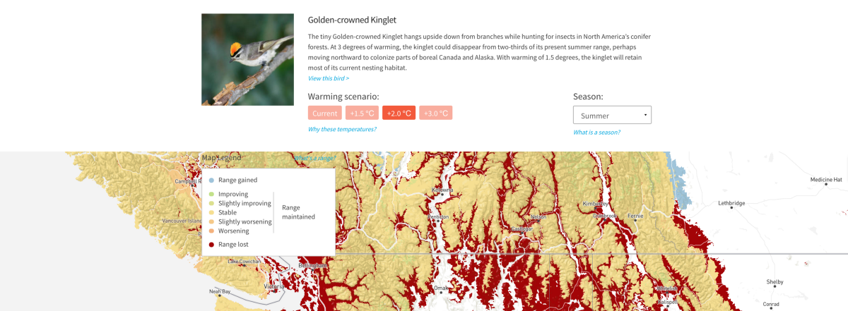
One of the other things Audubon added this time around was a more nuanced and detailed modeling of the different threats that these birds will be facing. The first iteration of this project didn’t focus on the climate-related threats birds would face. It was just in general how birds would move based on their ability to survive in a given climate. But now the user can look at a particular part of the country or continent and see additional threats like increased amounts of wildfires, or spring coming earlier. That’s something completely new.

NH: From the perspective of having worked on the National Parks project, the thing that really stood out to me in terms of how the data was changing was that the National Parks project was capturing a similar kind of story about where different birds can live, but the climate projections were completely agnostic of the actual habitat that the birds are in. Without habitat as a factor, you could have a scenario where from a climate standpoint the ruddy duck seems more likely to live at the very tippy-top of the Sierra Nevada, where there’s not always standing water. Factoring in habitat allows us to take into account the fact that the ruddy duck needs freshwater marshes to survive. With habitat factored in, it makes it less likely that someone would misinterpret the model and cry foul. We had the opportunity to paint a fuller picture.
This new data not only covers more birds at a higher resolution, but it also uses much more complex models to indicate where species should live based on more than just climate. And then it layers the threats on top of that. Threats weren’t included in the actual climate projection data, but we show it alongside to provide more color. Audubon even had experts review the data to make sure the sites projected as suitable would be more ecologically realistic for each species based on the habitats in that area.
LW: Can we appreciate the pun of “crying fowl” for a moment?
LW: I think something that’s pretty cool about how Audubon got that data is that they started with crowdsourced observations from eBird to find where birds had been seen, and mapped their current climatic range; you could then use that to make some assumptions about the way that habitat might be suitable to them in the future. Audubon then brought in two ornithologists to review the projected impacts of the 604 species studies to ensure that each model was ecologically realistic.
ER: I mean, birds really are a kind of canary in a coal mine. Right? Just to put another bird pun in there. So you’re saying if they’ve been seen in new places but not very often, that could be an indication that it’s a place that they might go to more in the future. Right?
AR: Yeah. And one other significant change in this version compared to the prior one is that the prior one was based around time — when the climate was going to be changing a certain number of years into the future. Whereas with this one we made a choice to focus on several temperature scenarios within a single time frame. One of the things that I was interested to find out as we were talking with users was whether basic things around temperature would be too abstract, or whether it would sort of still feel concrete enough, especially since we were doing it in Centigrade as opposed to Fahrenheit.
NH: That was actually one of the first design decisions that we made.When we show it by time it gives this impression that it’s a little bit more concrete than it actually is. It’s very fatalistic, versus sending the message that we can change this.
EA: One thing that was interesting about these Audubon projects was that this particular data was linked to a peer-reviewed paper intended for the science community. So they were trying to literally translate something was originally packaged for a highly scientific audience, and they were trying to — with as much fidelity as possible — translate that to a broader audience. I thought the engagement from the science team was amazing in terms of how they thought through how the data would appear to different groups and different audiences. They were always trying to be as true as possible to the model that was printed in their paper and being very careful about their wording, but at the same time trying to not dumb things down but translate them in a way that would be comprehensible to a broader audience.
AM: It’s interesting that even a decision on whether to show temperature scenarios or dates is something that climate scientists always struggle with when whatever we’re working with them — I’m thinking of other projects like when we worked with Climate Central on their sea level rise maps. They’re in a similar situation where they have a ton of confidence in their models, but how do you present them to the public in such a way that the public takes them seriously but also doesn’t feel like there’s no hope?
Digging into the range maps
ER: I’m looking at the scarlet tanager in the middle of the country — Milwaukee — and I’m seeing that the current range is all yellow. It’s fine. In a 1.5 degree scenario, you get a little bit of range loss around the edges and along the river. At 2 degrees, it’s pretty seriously impacted. And then at 3 degrees, the bird is gone. I mean, it’s just extirpated from the whole region. There’s not a lot of talk in public about how this stuff accelerates incredibly quickly. Wasn’t one of the things that they wanted to do with this was to answer the question, “If 2 degrees is inevitable, what’s the point in stopping 3 degrees? Is it that much different?” to show that, actually, yeah. It is really different.
LW: Yeah. The metaphor I heard the other day was that if you think that 1 or 2 degrees of average temperature change is not a big deal, then think about what your body temperature being at 100 degrees Fahrenheit does to your physiology. It’s actually incredibly serious.
AR: That was one of the things that really came through in the user feedback. It was very eye-opening for people to see how much of an impact it was just with a very small temperature increase. And using birds as a proxy for the bigger climate change picture was really effective. Canaries in the coal mine.
Capturing trends across species
NH: In 2014, each bird had a Venn diagram for their winter range and another one for their summer range. And the point was to quickly illustrate how much of their current range would still be maintained in the future. So the very simple thing we had in the 2014 version was circles that were scaled according to the amount of land they have in present-day versus what they can inhabit in the future. The circles overlap based on how much of that is actually maintained.
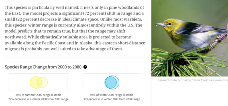
I like how simple they are, and they also were probably the safest statistically to make because, at the time, these were much more coarse spatial models, so we didn’t really want to get too precise into what land and where. But now that the modeling is a bit better, we’ve evolved those Venn diagrams into visualizations that we ended up calling the Pills.
ER: So what are we looking at here, Nicolette?
NH: We’re looking by habitat type at the number of species within the 94110 zip code. Each one of the pills is representative of a single species. There are so many levels of information here. The first is that for this exact zip code, 13 species are classified as aridland birds, versus only 4 that are eastern forest birds. At the next level we begin to see trends across those bird types. Initially we had the birds grouped by risk, but since that information is ultimately provided anyway, we thought we could tell more of the story by showing the impact distributed across habitats.
Digging even deeper, we start to see the proportion of the birds impacted by different warming scenarios. What we’re looking at here is at the most extreme climate scenario — you can see how many birds fall above and below the line in terms of being less vulnerable or more vulnerable. If you take note of, let’s say, generalists, by definition they are the most hearty and able to survive in various conditions. And we see that even at this most extreme temperature scenario, there are quite a few generalist species that remain stable.
ER: And this is something we see in lots of different places, right? I just picked two zip codes that I know — where Stamen is and where I grew up. This is in some ways the story of climate change and resilience, right? That the generalist species might do fine, and those with specialized habitat representations and needs might not.
NH: Yeah.
Inside the process
ER: So I would love to understand a little bit about the process of designing this — where you guys started with Audubon and how you worked with the scientists at Audubon to make this happen.
NH: One of the things that stood out even from the earliest calls is that the Audubon team had a really clear vision of what this needed to be. I definitely came out of that first meeting seeing everything that we have here already fairly worked out. In my mind, the place for us to really contribute was in the manifestation of how the actual data was visualized — for example, those pills that we were already talking about, or the way we use range maps to tell the story.
But everything else was very clearly laid out by them. They already had wireframes. They already had all kinds of mind maps about all the different connections that needed to be made back and forth, interaction-wise. So for me, it was a little bit more about translating their vision from an interactive standpoint into the story they wanted to tell.
In terms of process, it was a very open back-and-forth collaboration. Joanna Wu, who is based here in San Francisco, was very available as we were iterating through very specific mechanics of how things should behave. One of the great pleasures of working with a client like this is when you come across something unexpected in the data there are experts on hand to validate whether it’s a feature or a bug. We leaned on their team to make these calls as much as possible.
The Audubon team was also very open to trying out different visuals as long as they successfully communicated the story to people who weren’t as steeped in the data as they were. And they understood their story really, really well. They tend to be really amazing partners because we can ask them nuanced questions like, “What does it really mean? If we represent it this way, will we be obfuscating something important?” And even though they walked in with a scatter plot, we walked out with little tie-dyed pills so it’s one of the best possible client service gigs that you can have, because they know everything, and they have a really cool visual aesthetic that they’re willing to let us play with.
Exploring threats to bird habitats
ER: I remember in the 2014 version the idea of being on the border was an issue. And I’m wondering if that was an issue this time.
AM: The last time, we had no data at all for Mexico. In this iteration, the range models go to Canada and Mexico. The threats data is only complete for the lower 48 in the US. Just to be able to extend these ranges down into Mexico is really gorgeous. Of course, a lot of these birds migrate past Mexico. But it felt like a weird arbitrary cutoff in the data before.
KM: Can we talk a little bit more about threats and how that was developed? That’s another interesting and new element of this project.
NH: What I didn’t realize right off the bat and finally figured out about halfway through was that we had two different levels of visualizing threat data. One was spatial. And that was something that they wanted to show at the local level, as part of the state or zip code page. The other is what we’re looking at here [see below], which is a different way of summarizing the threats data set that you can actually ascribe to a single species. So that’s represented differently.
This is the next step in the storytelling. I really liked that there were so many ways that everything weaved back and reinforced itself. So if you’re learning about threats, and then you’re learning about a place, and then you see that this one bird is there, and you link to that bird, you will then see threats again. It doesn’t just take you down a path and away from the thing that you were already learning about. It just keeps bringing up the same content over and over again. But the meat of the threats data is on the local page.
AM: Yeah, we show on the map the colors from yellowish to orange and red showing the number of threats that are overlapping in any particular spot on the land. And you can toggle that map between two climate scenarios, the 1.5 and the 3.0 Celsius. So you can see looking at a place like Waco, Texas, it looks like it had two threats under 1.5 and maybe like three or four under the 3.0 scenario. Each of the layers is sourced from either public domain data sets or different types of spatial analyses. Some of it is from satellites. Some of it is from land-cover analysis. There’s a bit of a chunkiness to the resolution because some of the threat data is much more precise than others. Weather is hard to spatially model at a very fine grain. But with something like urbanization, you can model pretty precisely down to the kilometer based on the proximity to other existing cities and infrastructure like roads.
ER: That’s super interesting — this idea of data and multiple resolutions in the same interactive piece. Alan, can you talk about the decision to just show the number of threats rather than trying to separate out the specific ones?
AM: They did separate the threats for the print artifacts. Throughout the course of this project, while building this interactive online version, we were also making a few charts and maps to support a spread in their print magazine. We ended up combining them into maybe three maps, where each one was only showing two or three threats together, because that’s how many colors we could blend and still make the maps readable.
LW: You did try putting them all on one, right?
AM: Yeah. To try to find a map where you could look at the color on the map and tell what combination of eight potential layers it was — if given arbitrary input data — that would be impossible. I think the threat map is not meant to be super central. It’s really The threat map is a foundation of the analysis, and you’re meant to be able to see it and explore it to some extent. But I don’t think we were really wanting to draw our users to spend too much time turning toggles on and off on the threat map.
NH: I did think it was really cool that I could go to, say, Santa Rosa, and I could see at a zoomed-in level what was specifically going to be threatening a place that I know and care about. Because even though it’s chunky, it’s granular enough that I can see a difference between Santa Rosa and Sonoma, which are the two places where I spend the majority of my time. There was definitely a moment in the design process where we weren’t sure that this was going to be zoomable to this extent. And I’m excited that it ended up being this explorable because this is information I wouldn’t have access to otherwise.
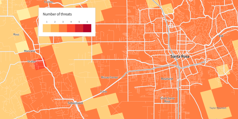
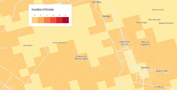
Going back to the 2014 project, the data wasn’t really precise enough to support that level of exploration. The national parks project was a step in the direction of becoming more spatially confident and precise, as long as it was within a controlled geography. And then finally, with this map, now we can let you zoom in to your neighborhood anywhere in the U.S.
ER: This is pretty amazing. And I’m thinking about what Logan was saying earlier, that this a great way of showing that the difference between 1.5 and 3 degrees is huge. It’s bringing a whole new set of issues into the conversation that maybe people aren’t thinking about directly as impacting bird habitats.
AM: Yeah. And with the source data, we can say, “The probability of wildfires is 43% in one scenario and 87% in another scenario.” So we can be much more precise about how likely all these threats are. But in order to make these analyses work and to be able to assign yes or no, this threat has to cross some threshold of significance for this bird or for this particular piece of land, Audubon has to do those analyses. It’s Audubon’s research that determines the point at which heat becomes significant enough to add another color to a spot on the map.
Contemplating map types and zoomability
AM: In order to support a map that lets you zoom to a neighborhood level and see streets on it, we had to combine this threat data — the Audubon raster data and the bird data — with some existing map layers that were produced for us, because we needed some existing maps that had OpenStreetMap streets for all of North America. And any of the maps where you can zoom had to use the Mercator projection, because that’s the only widely used map projection where pre-existing roads data was available, in this case from Mapbox. But some of the other maps where zooming in is not available but where you can zoom out to the whole continent, we use an Albers projection, which is an equal-area projection showing much less distortion, especially in northern Canada. I think Albers is what we would have preferred to use for the whole map, but it’s difficult to make an online map in Albers that you can zoom in to that level.
So here’s an Albers projection.
Everything on this map — we have base map data, the outlines of land, state and province boundaries, some rivers, some major cities — if you zoom in, that’s all you get. You can’t start to see streets. And at some point, we stop you before you zoom in to the point that you lose all context.
Learning from user testing
ER: Adam, you did a bunch of user testing. What’d you learn?
AR: The hypothesis going in was that focusing on the local would be the key way that people would relate to this, rather than starting at the macro, we’re-all-going-to-hell-in-a-handbasket kind of narrative that is typical for a lot of climate change stuff. They really wanted to start at the local and then let people expand out from there. And that was really validated in the user testing as an effective way to do things. Having a basic idea of the birds around them and seeing how they’re impacted gave people that entry point and made it not just a collection of data. It actually had an emotional impact as well, which I think was very powerful. And a few people made the leap from birds to thinking about how this affects other animals and humans and realizing without any prompting that the birds are the harbingers — the canaries in the coalmine, like you said — for what’s going on with the climate that’s going to affect everything on earth, not just the birds.
KM: Was there a particular aspect or feature that helped them make that leap?
AR: The large areas of red. [laughter] So on the first map that you see when you come in, it’s curated, to a certain extent, to show you birds in different parts of the country that are going to have major impacts and have a lot of habitat loss. And that definitely got people’s attention. They intuitively understood what that red meant. They didn’t necessarily understand without reading a little bit further that it was habitat loss or range loss, but they understood. So I think that was effective.
I think, going back to the vulnerability plots, those were definitely things that it took people a little longer to understand, but in some ways, it gave people the sense of the scale of the problem in contrast to just looking at individual species. So those two things were the two sides of the coin that let people understand the local and the personal and also the macro scale at the same time.
— —
See Audubon’s Survival by Degrees: Species on the Brink
— —
We like talking about how to make online maps & data visualizations. You can read more about the process behind these projects: Watercolor Process, Facebook: Evolution of the Flowers, Environmental Data Visualization: Many Dimensions of Lake Tahoe. If you’re interested in signing up for our data visualization classes to learn how to do this work yourself, you can do so here.
