
Combining scientific research with spiritual illumination is hard work. But when you’re presented with an idea for a map of emotions by some of the world’s top emotion researchers and the Dalai Lama himself, you rise to the challenge. In our inaugural episode, Stamen founder Eric Rodenbeck discusses the difficulties and breakthroughs of bringing such a task to fruition and his personal and professional journey leading up to the creation of the Atlas of Emotions.
Before founding Stamen, Eric was a grubby teenager living in New York City applying to wait staff jobs after getting kicked out of architecture school. A chance encounter doing a photoshoot with a world-renowned photographer struck him with the desire to capture any and every opportunity that presented itself. This manifested into a stint with WIRED magazine in San Francisco and again when Stamen was approached by Dr. Paul Ekman and his daughter Dr. Eve Ekman with the idea of creating a map of human emotion for the Dalai Lama.
The idea was to bridge scientific and spiritual understanding in a map that would help people navigate their own emotional experiences. And with over 60 years of emotion research and data, there was a lot to work with. Except the data had little quantitative metrics that could be easily plotted… and no spatial component at all…
So then how do you do it? How do you create a map of something that is not spatial?
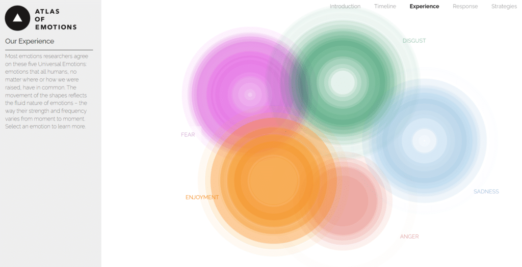
Eric explains that it starts with lots of sketches and iteration, working closely with Paul, Eve, and the Stamen team. Together they created a visualization that pushes the boundaries of traditional dataviz and cartography. Instead of a singular map, it became an atlas: a beautiful display of emotional “continents,” each one accompanied by graph-like representations repurposing well-established design principles like color hue, brightness, and orientation coupled with evocative animations to communicate feeling.
The purpose of the atlas is to teach emotional awareness. As the user reads through the atlas and learns about how we experience certain emotions, the background brightens to solidify the motif of illumination. The app is also meant to be reused, Eric says, describing it as “a tool to come back to over and over as you experience different kinds of emotions.” He hopes recurrent use of visualizations like this can become commonplace in visual fields saying, “If we can open up the kind of space inside data visualization like a great novel opens up…or a song that you might want to hear many times and develop a set of relationships with, that could be really good.”
Explore the atlas yourself at http://atlasofemotions.org and check out the several other blog posts that go deep on the design choices to create it!
Transcript — +
You’re listening to Pollinate, a podcast on data, design, and the people that bring them to life. Brought to you by Stamen Design. Emotional data viz, modeling with placenta in your hair, and the Dalai Lama and Mickey Mouse ears. These are just a few things that come up in today’s episode. I’m Ross Thorn, a cartographer at Stamen and today’s host. I chatted with one of Stamen’s own about his personal journey and how their team created a visual atlas of emotions for His Holiness, the Dalai Lama. Please welcome my guest.
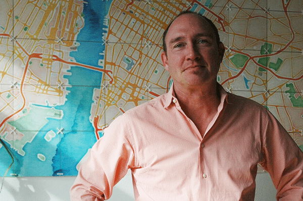
Eric Rodenbeck: I’m Eric Rodenbeck. I’m the founder and creative director at Stamen Design. I started the firm 20 years ago. Kind of blown away to still be here.
Ross Thorn: Yeah. That’s kind of insane. My work experience has been so nascent. And to think about how– and to only just observe these changes too of how quickly tech changes and then how you have to change as well to be able to survive that long. But also, you haven’t only been the creative director. You’ve held a number of different titles.
ER: Well, I started the company because I wanted the CEO and the creative director to be the same person. Because I had a bunch of companies before. Some of them worked and some didn’t. And I saw how the CEO got to make all the decisions. And they were, inevitably, not in the service of quality design or of experimentation or any of those things. So I started a company where I could do both of those things. And I did it pretty well for a long number of years. And then we’ve been through all these different iterations of younger people and older people and projects for a kind of really wild range of clients from the Dalai Lama to the Smithsonian to little New York artists. At a certain point, I realized that the business was going to be better run by somebody with a business head. So that’s when I brought in Jim Stanley, who’s our general manager. And it’s been really great to sort of hand that pressure to him because it’s a lot to carry.
There were times in the early days when I just didn’t know how I was going to pay people. Just that kind of very baseline like, “Are we going to be able to keep doing this?” kind of feeling. And that’s great to let that go.
RT: So even before Stamen, tell me a little bit more about you and your upbringing and anything that you’re comfortable sharing and how, kind of, Stamen even got to be a thought in your head.
ER: I grew up in Queens, New York, and came to San Francisco in the mid-1990s when Wired magazine was first getting started and there was a time of kind of crazy optimism about the web. When we really all thought that this was the next new communication paradigm and it was going to break down all the authority walls and we were all going to be able to communicate with each other in a giant global village. I was trained as a draftsman and had always been interested in mechanical reproduction and printing and that kind of stuff, so it was pretty natural that I would get into desktop publishing, which was just getting started at the time. And the web was just getting started. I’m going to sound like an old guy but I mean, my first server was registered to the domain of .to, and it was on a box in my friend Kenji’s office underneath his desk. So yeah. No cloud software. None of that stuff. Everything under FTP and Linux. So it was a wild, fun time to think that we could actually change the world, to think that we could create a bright digital future. It was like fucking TRON or something. And so I did that in San Francisco for a little while. And then my lucky break was that I was the only person who knew Photoshop in San Francisco who wasn’t at Burning Man this one Labor Day weekend. So I got a gig at WIRED magazine working alongside Douglas Coupland, doing some image manipulation of a plague scenario, actually. The premise of the article was that a global plague sweeps the world and everybody has to go into little isolation bubbles and the internet helps us solve the virus crisis because we can collaborate across labs.
RT: So we’ve come full circle, is what you’re saying?
ER: Yeah. So I got to work on something a little more positive now for the coming years.
RT: So you said that you all thought that the internet would be like this global village. In what ways have you seen it fulfill that? And then in what ways has that totally just been some sort of weird tech pipe dream?
ER: Well, I mean, the amount of knowledge that we have at our fingertips is just astonishing. I mean, just this idea that you’re never lost, this idea that you never lose the recipe, never lose that photograph. That’s real. And it’s changed everything. And it definitely succeeded in allowing people to connect with the other people who are like them. It gave all the weirdos a chance to connect with one another. But I guess what I hadn’t fully considered was that it would let not just the good weirdos, but the bad weirdos get together, too.
RT: How long ago was that that you were a weirdo?
ER: Well, before I knew that there were lots of others, I would read all the Re/Search books that I could find. They were by this guy, V. Vale, out here in San Francisco, and he would write about Brian Gyson and William Burroughs and body manipulators and these sort of weird digital freaks. And it was all very subversive and underground and smash the state, but in a sort of anti-patriarchy way. Not in a, “Let’s all storm the Capitol” kind of way. So I just kind of wasn’t anticipating that. I mean, literally, that people could just create their own fictional universes of post-fact, naked ideology and ram it all the way through to the top.
RT: Yeah. It’s kind of strange. And I guess, if you think about it, take a step back and think about how every tool can be used for good, but it can definitely also be used for malevolence. Just think about any sort of weapon that could be considered a tool. You think about maps as tools too and how like early-day redlining, maps seem to have been so romanticized as exploratory and some amazing visualizations and would sort of evoke that thought inside of you. But then also, have been used as tools to oppress people. And so I guess it kind of makes sense that the internet, as a tool, has sort of seen both of those sides of the sword.
ER: Well, maps are always an expression of power of some kind. And that’s always true. The person who’s making the marks is deciding where they go and is deciding what to put on it and what not to put on it. And I think this idea that maps are neutral in some way is an idea that I had to try to push against. It’s always about power. And it’s always about an agenda, whatever that agenda is. And so this idea that we have to teach people the correct way to read maps seems like a charming artifact of the past.
RT: Interesting. So you came to San Francisco, started working for Wired. I heard through Jim Stanley, who you had also mentioned as the principal manager of Stamen, that some of the inception of Stamen even started before that with something about a modeling career.
ER: Jim Stanley is telling you about my modeling career?
RT: He might have briefly mentioned that. And it’s not totally like, “Oh, here. We got you. Here’s this funny story.” But he also mentioned that it is tangentially related to your inception of how you want to live your career, I guess. Is that true? Or was it just Jim Stanley saying, “Here’s an embarrassing story about Eric”?
ER: No, it’s not embarrassing. It’s just funny. I didn’t realize that it had made it out there. Yeah. It’s a funny story. I got kicked out of architecture school and I was living in New York City and I was trying to get jobs at restaurants. And I had no idea what I was doing. And I was just a grubby 19-year-old. And eventually, somebody gave me this advice. They said, “Listen, it’s obvious that you’re lying because you have no experience in the restaurant business. Because if you did, you’d know that the way to go to an interview is you comb your hair out, you’d shower, you wear a white shirt, and you clean under your fingernails.” That was the thing that they were like, “If you don’t do that, there’s no way.”
So I was 19 years old and just a grubby sewer rat at the point. So what I did, I went and washed my hair, got a nice, white shirt, combed my hair, and cleaned under my fingernails and went for a walk from Times Square, where I was living down Broadway, to St. Mark’s Place, where the restaurant I was applying for a job as a busboy. And I got stopped on the street by somebody who said, “Hey, do you want to do a shot for Levi’s magazine?” And I said, “Sure, yeah. I’d love to.” They took my picture, took my phone number, and then I went down and applied for this busboy job, which was 7 bucks an hour, 9 bucks an hour slinging dishes.
And then the next day, I got a call that said, “We’d love to hire you for this modeling shoot for Levi’s. Do you want to come up to the Upper East Side Tuesday afternoon?” So I basically got paid 1500 bucks for 15 minutes of posing in jeans as a 19-year-old by Richard Avedon, one of the world’s great living photographers, who I’d never heard of. And so it kind of ruined my work ethic after that, you know? Because I’d just learned that there is no relationship between the quality of the work you do and the amount of money you get paid. And yeah. I have a picture of me at 19 years old basically posing shirtless with placenta in my hair.
RT: What?
ER: But that gave me a healthy sense of skepticism and of optimism, you know? Just you never know. You could just be walking down the street and suddenly, you get pegged. And 20 minutes later, you’re being photographed by one of the world’s great living photographers.
RT: Making $100 a minute.
ER: So you just kind of have to get out there and not ask too many questions. That’s been my philosophy. It got us to a certain place to have that philosophy. We just go for it, right? I mean, when Paul Ekman calls you and says, “Hey, I want you to make a map of human emotion for the Dalai Lama for me” that’s not the time to question things. Sometimes you’ve got to leap forward before you know where you’re going to go.
RT: Speaking of that, I was watching one of your TED talks, and you sort of describe Stamen itself as a collection of cartographers and explorers that do a lot of work with data that’s obscure and difficult to access.
ER: Yup.
RT: Speaking of that project of working on the Atlas of Human Emotions, if I were to pick a topic or something to map, that seems like one of the most abstract and difficult sort of things that I could come up with. Like, “Oh, yeah. Let’s map human emotions in this sort of digital space.”
ER: Paul Ekman told us, “The data is all in my book.” And it kind of was. But it was also kind of spread across many books. So with that one, it wasn’t a traditional dataviz project where you get an API key and access to their GitHub repo. This was more about sitting across the kitchen table with one of the 20th century’s great psychologists and making drawings for him and asking him if this is what’s in his mind. And that was an incredibly valuable experience. Rather than firing up the latest QGIS plugin or open D3, sitting and drawing and making marks on paper was the only way to get the information out of him. So that was a moment where I realized that we don’t just do data visualization, we help people communicate with their data, whatever that data is. And even if we have to go get it, we can go do that also. I’ve tried to open up a space for data visualization that’s about more than computers and JavaScript libraries. That there’s a whole..I don’t want to say a trick, but there’s a whole process to communicating with data and learning about data and figuring out how to put yourself into the position of somebody who doesn’t necessarily understand it, or maybe they’re even hostile to it. I mean, there’s a whole kind of communications angle to this that’s not just about programming.
RT: There’s a lot of ongoing conversation, especially now in this new age of AI and things of like, “What is art? What defines art?” And I’ve never really thought about a parallel conversation of like, “What is data and what is visualizing that data?” It seems like this project falls in that sort of space of like, “Is that data?” What defines that? You know?
ER: Yeah. And I think if you could express that in a single sentence that you could either be right or wrong about, it wouldn’t be a very interesting field. Right?
RT: I think that’s true.
ER: An example I use is instead of saying data or data visualization, you say photography or movies, you know? This idea that you can decide, that one person could decide what’s a movie and what’s not, seems crazy to me? Right? There’s all different kinds of movies. There’s 20-second YouTube clips, there’s Hollywood feature films, there’s Andy Warhol’s 24-hour long video of the Empire State Building. They’re all movies! This is not to say that you can’t critique them and not to say that there shouldn’t be societies for them and that the Emmys and the Oscars, that they’re all bullshit. It’s a wide-ranging medium. There’s all kinds of things that you can do with it. And I think that’s true of data and data visualization, right? I mean, what does it mean to say that seismography data is the same thing as financial data? Is it? I’m not clear that it is. And I think it’s interesting, too, to think about biases in data because, clearly, they’re always there. But that’s not just to say that just because data is not neutral, that it’s all not neutral in the same way. Like data from a Gallup poll is of a different quality than the data that’s coming in off of all the seismographs that are buried all along where the earthquakes are. I mean, yes, they’re both biased and there are power relations inscribed in both of them, but that doesn’t mean they’re just the same.
RT: Interesting. I want to wrap back around because also, the definition of what defines data and what defines a map, I also want to get back to that too. But tell me a little bit more about the inception of this project. So the Atlas of Emotion, of what we’re talking about, it’s thought of by the Dalai Lama. And his people communicated with you. And tell me a little bit about that and how this all came about, as well as the intended purpose or at least, what you were told was the intended purpose and sort of how you rose to meet that with Stamen.
ER: So Paul Ekman is one of the great psychologists of the 20th century, and he did some really groundbreaking work on the relationship of human emotions to facial expression. And he proved that a number of them were universal, right? And if you don’t– if you’re a human being and you are feeling disgust, your face behaves this way. And he did all this research on people in Papua New Guinea who had never been exposed to Westerners and things like that.
RT: Right. Is it cultural or is it sort of innate?
ER: Right. And that was an open question until Paul Ekman came along.
RT: Pretty cool.
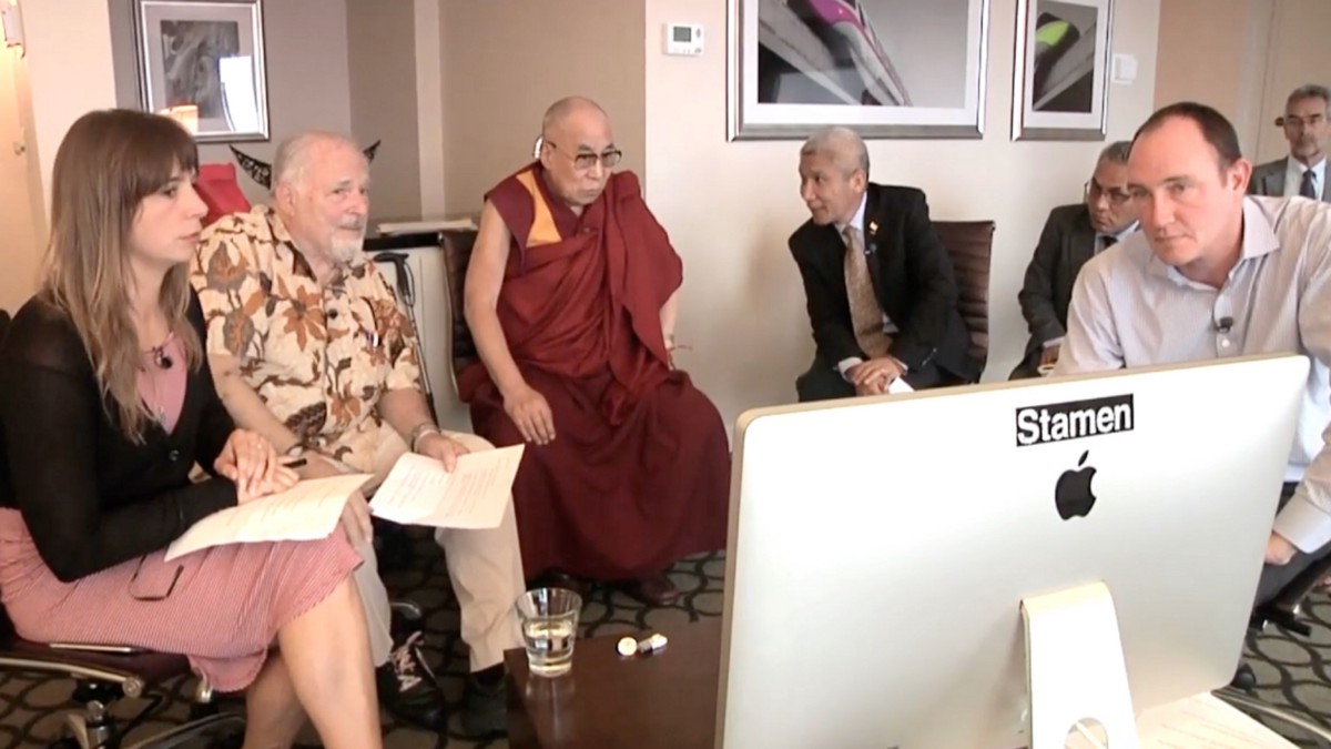
ER: The research says that the universal five emotions are fear, disgust, anger, sadness, and enjoyment. Those are the ones that are universal according to his research. And Paul, through his daughter, who was involved in Free Tibet things at UC Berkeley, managed to connect with the Dalai Lama. And the two of them just really hit it off and they developed a long friendship. And so they’ve written a number of books together where they just get together and hang out and talk about emotions. Paul brings the Western mindset and the Dalai Lama brings the Tibetan mindset and the Buddhist mindset. And they get together and chat about what emotions are and how they’re dealt with in those two traditions. And so they learn about each other’s worldviews. At a certain point, the Dalai Lama said to Paul, “Look, this is all great. But we need this to be expressed not just verbally, but we need a map. I want to be able to communicate to Western scientists and people who wouldn’t necessarily listen to the Dalai Lama. So I need a visual artifact for that.” And Paul, who is still old school enough to be reading The New York Times paper every day, had seen a picture of me in an article about Stamen in The New York Times. And so he thought, “Oh, that’s my guy. That’s the guy who can make the map of the emotions for the Dalai Lama for me.”
RT: That’s also a recognition of the power that maps sort have, especially in Western society, that to communicate things like that, you need some sort of powerful visual and seemingly-authoritative data source to say “This is how things can work.” It seems like a very interesting concept for a map too.-When we think about maps and we think about space, there’s a lot of argument that’s like”Oh, is the Monopoly game board considered a map?” And things like that. And so when I was using this, that was one of the first things I had thought of too, of seeing the continents that you had placed thoughtfully in this sort of digital space of my screen and wondering what does that imply? I’m looking for these concrete patterns as well, especially as a trained cartographer. Hearing the term map, I think about that authoritative statement: “This is here. New York is here. It’s 100% right there. Anger is right there. And enjoyment is right here.” So I found that interesting, how you might have made those calls or how you sort of had to navigate in terms of both a linguistic space and apply this pseudo-spatial data to these.
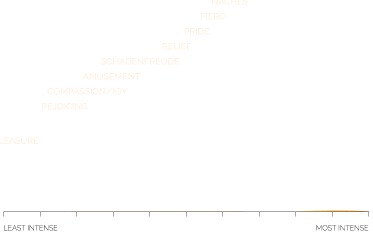
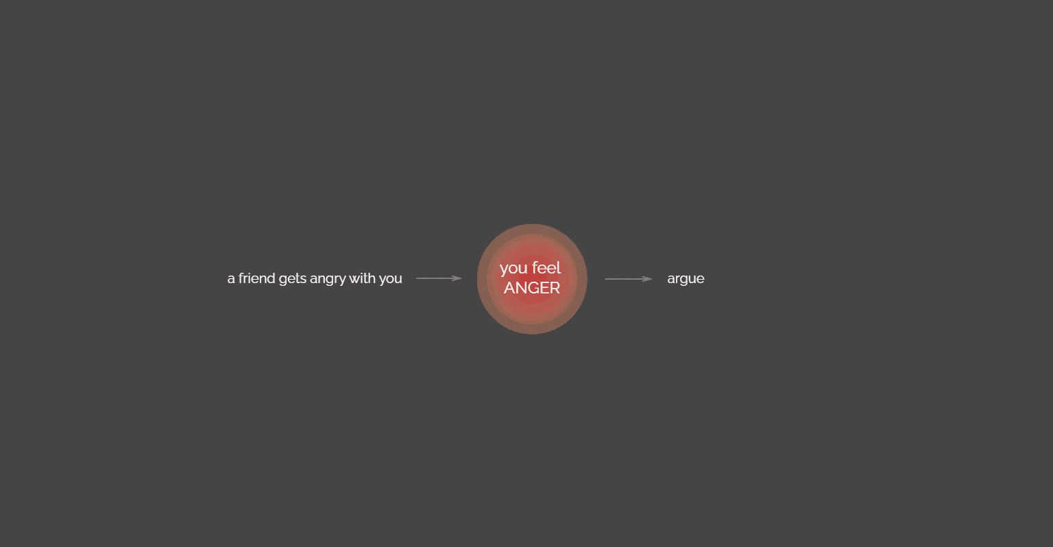
ER: Well, that was the challenge with Paul because he’s both very literal and very beauty-oriented. And so we’d get comments from him that say, “Well, we can’t show those two emotions overlapping one another because emotions don’t blend. You’re either feeling angry or you’re not. The scientific definition of emotion is something that happens very quickly. There’s a concept of a mood, which is a very different thing. If you’re in an angry mood, you’re going to be more likely to react with anger. And if you’re in an enjoyable mood, you’ll be able to react happily. But Paul would just say things like, “Yeah, we can’t show emotions overlapping one another because they don’t overlap in science.” And we’d say, “Well, fuck. What are we supposed to do now?” You know? So we had to go back to the drawing board literally many, many times throughout the course of that work. What was fun about it too is that Paul had never looked at his work this way before. We made charts of all the emotions. The central concept of the Atlas is that you have emotions and that those emotions have phases or types. Which is to say if you’re a little bit angry, maybe you’re annoyed. But if you’re super angry, you’re furious. And can those emotions travel across those different ranges? So we built profiles of the different kinds of shapes that different kinds of emotions have across their intensity levels. And Paul had just never looked at it that way before.
RT: I loved going through those graphs. First, starting with that introduction of: “Here’s how emotions sort of work with human beings.” Or maybe even beyond human beings. But there’s this context, there’s this trigger, and then there’s this reaction that you have. And it lays everything out like a mathematical equation and then takes you to these continents that are these big moving and pulsating circles. When you click on one, it takes you to those graphs that you’re talking about, and there’s least intense and most intense. This was really interesting to me. A little context here is that in grad school, I did this quantitative content analysis of over 100 paleoecology papers. And looking at all their visualizations, how they use the visual variables to communicate the data. Did they use it correctly, but now, this conversation is making me think, “What is correct when it comes to visual variables?” Because you’ve used them in such an interesting way. And they’re often thought of– back to that authoritative thing of there’s orientation that can help you see trends in a graph. But you use them to not communicate data, necessarily, but to communicate feeling.
ER: Yeah. That was the trick.
RT: Tell me about how you came to this decision, especially in the context of knowing that these graphs and things like maps have that authoritativeness. But these use that in terms of, sort of, playfulness.
ER: One of the things about spiritual leaders that I’ve found, the really enlightened ones, is they seem to laugh a lot. And it’s almost like they’re in on a joke that the rest of us only dimly perceive. And the Dalai Lama is definitely like that. I mean, he showed up to the meeting with Mickey Mouse ears on and was handing out Mickey Mouse ears as part of the– we were howling on the floor, laughing before anything else happened, so. And you know that was deliberate, you know?
RT: That’s quite an ice breaker.
ER: If there’s an ice breaker, Mickey Mouse is one. If I experienced any emotion consistently throughout the work, it was the feeling of panic. Of just raw, naked fear that we were going to put out this data visualization of emotions for the Dalai Lama, and we were going to get just panned in the press and people were going to be like, “What is this garbage? These kids have really swallowed the Kool-Aid. And this is not data visualization. This is garbage.” Because I’d never seen anything like that before and nobody else had done it. I got very comfortable with the feeling of fear and panic and trepidation, which is a very specific stage of fear of something that’s in the Atlas. In retrospect, I should have known better. If the Dalai Lama makes a map of human emotions, people are going to pay attention. So maybe that fear was unfounded. But it was largely a question of talking. Of talking through and iterating and making drawing after drawing, after drawing, after drawing and saying, “Is it like this? Is it like this? Is it like this?” And it’s just often the case with scientists, that they’re not visual thinkers. Some of them are, but many of them are not. And so it’s very refreshing for them to see their work visually. But it also is work for them to get it out, understand it, look at it, respond to it. So there are a lot of cycles. Basically a lot of cycles on paper with Paul and his daughter Eve. And then showing it to the Dalai Lama midway through and asking for more money, which was another sort of milestone in my life of asking the Dalai Lama for money and having him say yes.
RT: When you picked these colors and these angular peaks for anger, these almost like shark fins, very jagged-looking ones for fear, and one of my favorites, as you described, is the green mountains of poop for disgust. When I look at those– and I shouldn’t bring these up without mentioning the animations that come with them. I feel like the suite of tools that you use that are often so rigid in data viz and in academic research where you use this for quantitative data, this for qualitative. And I just have to say that when I look at these, they definitely evoke this emotion. And so well that it’s just a bravo moment. You talk about the iterative process, but how else– what sort of things did you use to inform your initial design decisions to even sort of ask that question of Paul and the Dalai Lama?
ER: Well, they had this idea that it would be a map. And the whole notion of the project is to enable people to be calmer. The idea is, if you know more about triggers and emotions and moods, then you can kind of introduce a bit of space into your emotional life. And so that if you know that when you’re angry in this way, you have these four, five options, you can choose which action to take. You don’t necessarily have to be a slave to your emotions. You’ll still feel them. Nothing will stop you from feeling them. But the idea was to try and give people a sense of what their emotional landscapes were, so that they could better understand them and be less caught up in them.
So then there started to be this idea of calm. Paul would ask me, “Where is calm on the map?” And I could never find the answer. Eventually, we broke it out so the product wasn’t a map, but it was an atlas. If you’ve got a map, and it’s the one map, then all the decisions, all the pressure is on that one map. Whereas if you’ve got an atlas, you can show different aspects of things in the different pages. And it sort of conceptually freed us up to not have a map with calm on it, but a map that you would use in order to better understand your emotions. And that that would indirectly lead you to calm. So that took some doing. That took some figuring to get away from this idea that there is a place where you see calm on a map, and more that calm is knowing your way around your neighborhood. If you look at the maps enough, then you don’t need the maps anymore. So it turned into that kind of concept.
RT: That makes a lot of sense too, tht the purpose was to help people to navigate their emotions. The concept was amazing to me.
ER: Thanks, Ross.
RT: I’m going to use the atlas here. Some sensory pleasure.
ER: Oh, there’s some good ones in there.
RT: Your favorite emotion, I think, you mentioned in another talk, was schadenfreude.
ER: It’s finding enjoyment in other people’s pain.
RT: One of my favorite visual metaphors in the project is the use of color value and brightness behind. As you go into this introduction and you begin, the back of the screen is dark. And as you learn a little bit more about the awareness and the experience, and as you’re going through these tutorials, that background is going further and further, becoming brighter and more illuminated. And to me, that was an amazing meta visualization of what’s happening to the user this whole time as you’re learning about this. And then the rest of the experience is within that light. I loved that.
ER: I think the field of data visualization is waking up to the idea that it’s not just about clarity. Right? It’s about experience also. And it’s about emotion. And it’s about finding ways for people to receive your message in a way that they can hear, or make their own message. This idea that there’s a correct way of doing this has not been true, in my experience. It’s about journeys and it’s about conversations and it’s about argument more than it is about the sort of even handed depiction of neutral facts to an unbiased audience.
RT: Definitely. And it goes into even just what the atlas itself says, which is that everyone who’s going to be consuming this atlas has different environmental contexts like emotional things and different moods that are influencing how they even take this in. A lot of this was just so enlightening to read. And I found a lot of meaning in that actions sections. Like the kind of bringing it all together in sort of like, “Why did I act in this way?” So many times that I’ve found myself responding to certain situations in a way and I think, “Why did I do that?” And knowing this broken down mathematical equation of the things that’s happened to you. There are things that happen that set you up for another trigger and influence your outcome.
What did you take away from not only the design and data viz experience, but also just the content of what you’re putting in there?
ER: One thing I learned was that there are different kinds of anger. There’s annoyance, which is a kind of, “Oh, man. I can’t find my toothbrush.” But then there’s exasperation, which is like, “I can’t find my toothbrush again.” That exasperation can be quite mellow or it can be quite intense. Whereas fury, another one of the stages of anger, is always very intense. You’re never just a little furious, right? So there are different categories within anger, which is an emotion that I’m sadly a little too familiar with. And I learned that there are choices that you can make. You can check in with yourself and see what kind of anger you’re experiencing or what kind of sadness. That link between trigger emotion and action as a cycle that can be intervened in very specifically was earth-shattering for me. You can’t control what you feel, but you can control what you do. And that separation of those two things was really kind of mind-bending.
RT: And if you can take that brief moment to sort of evaluate the rest of the equation, that definitely allows you to change. Instead of like, “This plus this equals this” and you almost get to change that operator of equals to could equal all of these things.
ER: That’s right. That’s exactly right.
RT: And which ones do I choose?
ER: That’s exactly it. So that was very much the point, just to be able to increase literacy around that. I think a lot of times in data visualization, we place a really high priority on somebody being able to instantly understand the thing that we want them to understand. And that’s fine. But I think, also, we can open up the kind of space inside data visualization that, like a great novel, opens up. Or like a concert or a song, that you might want to hear many times and develop a sort of set of relationships with. If we could think about dataviz in this way, that could be really good.
RT: What do you mean by that?
ER: If you think about the Atlas of Emotion, you’re supposed to understand it when you look at it. But it’s also a tool to kind of come back to over and over as you experience different kinds of emotions. I think this idea that maps are supposed to give you every answer right away does the creative potential of the medium a disservice. I grew up in New York City and I know the subway there very well from both reading the maps, but then also by going on those journeys. And I think there’s a concept of kind of literacy that comes from repeat viewing and action in the world that is not often taught in data viz 101.
RT: How do you think that the atlas itself lived up to your expectations of what you thought it might be?
ER: Well, it went through three different iterations. Nicolette Hayes deserves a huge amount of credit for taking the last one and making it real and working with them. And in some sense, this was Paul Ekman’s life work. It’s like it was a summation of 60 years of research into emotions. So I think he did that quite well. What I’m very proud of is that we synthesized a really wacky set of scientific concepts and turned them into something that could get into The New York Times. The idea of approaching a very abstract problem space and emerging with something that has some life to it is what I’ve spent my whole career pursuing. I’ve found there’s a thing that happens in scientific data visualization, where if anybody could potentially misconstrue a certain kind of visualization, it gets thrown out in the name of scientific accuracy. I think what you sort of lose there is any sense of narrative or any sense of engagement or any sense of delight. And opening up scientific data visualization to aspirational or wisdom-oriented activities is something that I think the project did a pretty good job of. It’s not just about latitude and longitude data, but it can be about aspirational, higher-order concepts and finding ways to express those using the languages of mapping and cartography.
RT: I think everyone who worked on this did an awesome job and made me rethink as a quote-unquote, “classically trained” cartographer, of, “What does it mean to create a map? And what does it mean to use a map and the different purposes of maps?” I was left with so many questions, good questions, in terms of how I move forward in pieces that I make as well as a human being with my own emotions too. My brother and I, we often share some very good conversations about this stuff. So I’m definitely going to send this to him and say, “Hey, page through this. Tell me what you think. How does this make you feel? And what do you think about it?” This is some amazing stuff.
ER: Thanks, Ross. Appreciate being the chance of being able to talk about it.
RT: And thank you so much for talking with me and sharing more insight into it. [music] Thank you for listening to Pollinate. And thanks to Eric for our conversation today. Music for Pollinate was created by Julian Russell. You can read more about the Atlas of Emotions on Stamen’s website at stamen.com and explore the atlas itself at atlasofemotions.org. For a summary and full transcript of today’s conversation, check out the blog post at stamen.com/blog.