
Earlier this year, Amazon Location Service launched their Open Data Maps collection, and with it four new map styles that Stamen designed. This wasn’t just any project for us. As Kate Leroux, Stephanie May, and Seth Fitzsimmons explained at State of the Map in Richmond in June, it was a chance to showcase not only that you can create web maps exclusively from open data, but also that you can create many different web maps from open data, each expressing a different purpose as part of its design.
When starting on this project, we knew that these map styles had to work for anyone coming to Amazon Web Services (AWS) and fit gracefully into a multitude of websites and apps – whether it’s creating an app showing great vacation rentals, a dashboard for a logistics company, or analyzing where to locate a new business. These styles were designed from the ground up to be easy to use and visually compelling, without distracting from the purpose they are meant to serve, and all from open source tools, standards, and data, like OpenStreetMap.
Why choose a map style?
When AWS came to Stamen, they were already offering professionally designed basemaps created by some of the biggest names in the industry, such as Esri and HERE. They wanted to partner with us to style the map they were building from the ground up, exclusively from open data and open standards. Since Stamen has a storied history of doing just that, of course we said, sign us up! We are always delighted to help evangelize about the power of open source, we believe in it and know how to make it work.
But a nagging question remained as we set about creating yet more map styles to choose from within the Amazon Location Services platform: why would anyone coming to this through AWS choose any one of these maps, including the ones we were about to create, specifically for their application?
Not very long ago, apart from within select audiences of map enthusiasts, everyone assumed that for online maps, there is just one option: Google Maps. This has changed, and we’re glad to see it – more choice is good! Right?
Well, maybe. If you know what you are choosing between and why. Thinking about the user first allows us to focus on what matters visually and provide a style that emphasizes what’s important.
For the existing offerings, the answer would have to come down to aesthetics, preferences, or confidence in those brands. These are all great brands, and beautiful, high quality maps – no wrong choices there, and we were excited by the challenge of creating something on par that highlighted the opportunity of open source.
But we saw another opportunity in what we were about to do – and we put it to our new partners at AWS – since we’re building this exclusively for Amazon, how can we customize it to AWS-specific customer needs? This is a product development question as well as a cartographic one. The right answer will lead to smart product decisions that highlight the information users need and expect for their precise applications, without the clutter of everything else.
How to create a map custom style?
The opportunity we saw with the Open Maps Data Collection was to focus on what we could create that speaks to AWS-specific customer needs. This was a unique challenge: AWS customers are all over the world, and come from every industry and government sector you can imagine, and we do not have direct access to or knowledge of any of them. Luckily, we have enough knowledge of AWS as customers ourselves, combined with 20 years of experience making maps with open data, to imagine quite a lot about what these needs might be.
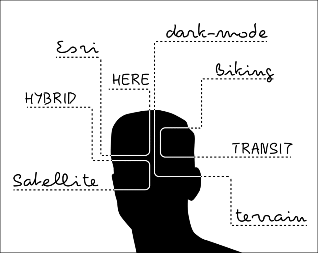
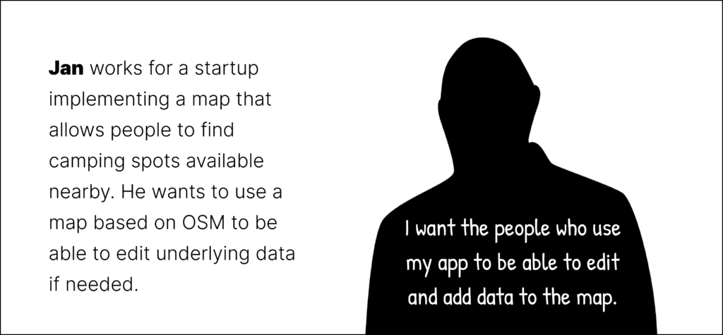
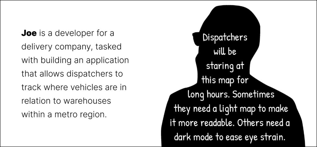
Here are some AWS customers from our imagination that need to put something on a map:


We mapped out the user journeys of customers needing map styles from the Amazon Location Services Open Data Collection and proposed this 2×2 matrix to serve them all:
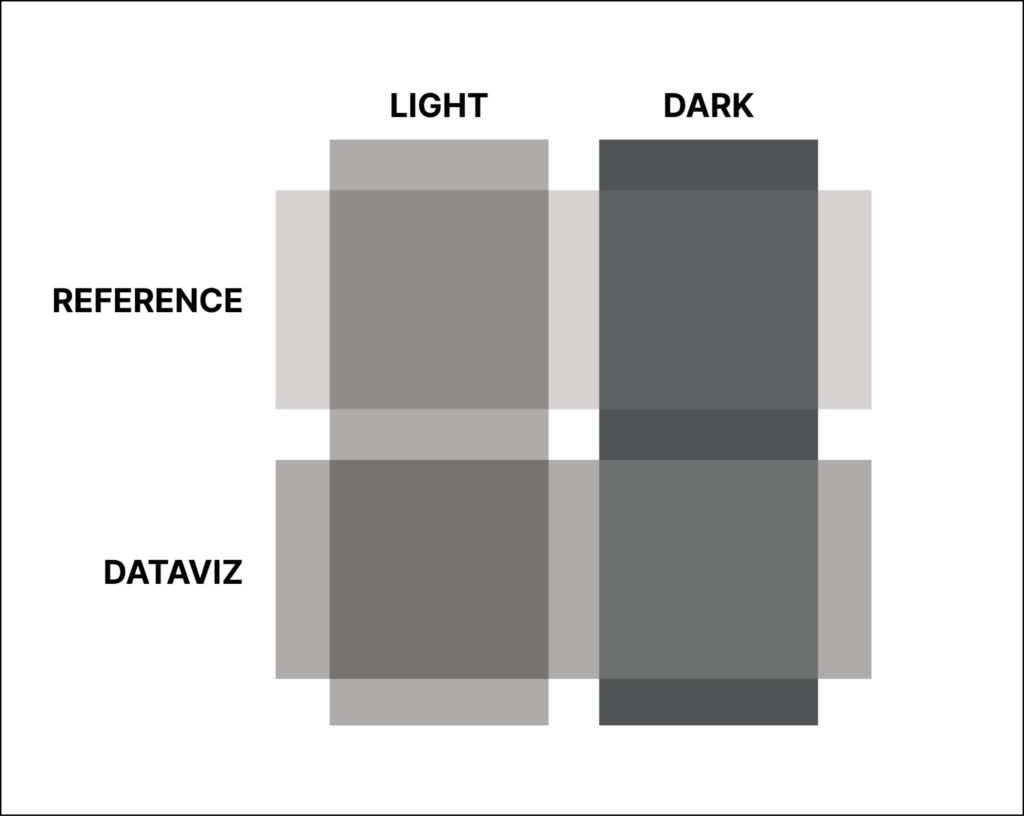
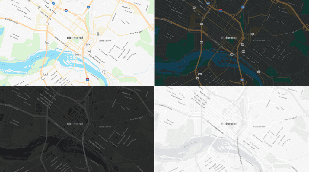
We created the Dataviz map styles for Sarah and Erin and Reference map styles for Jan and Joe. AWS customers need maps to show store locations, track assets in the field, and look up addresses. They also need maps to show complex data spatially – traffic, pollution, risk, opportunity, availability, frequency. This gets at the most fundamental distinction in cartography: reference maps and thematic maps:
- Reference maps show place names and streets and natural features and political boundaries; they are used whenever you need to place yourself (or a point) in context. (think of Google/Apple Maps here)
- Thematic maps are data visualizations. While they may contain reference layers, like country names, their primary purpose is to show the distribution or pattern of something that varies spatially – thus we made a map style specifically optimized for overlaying data on top.
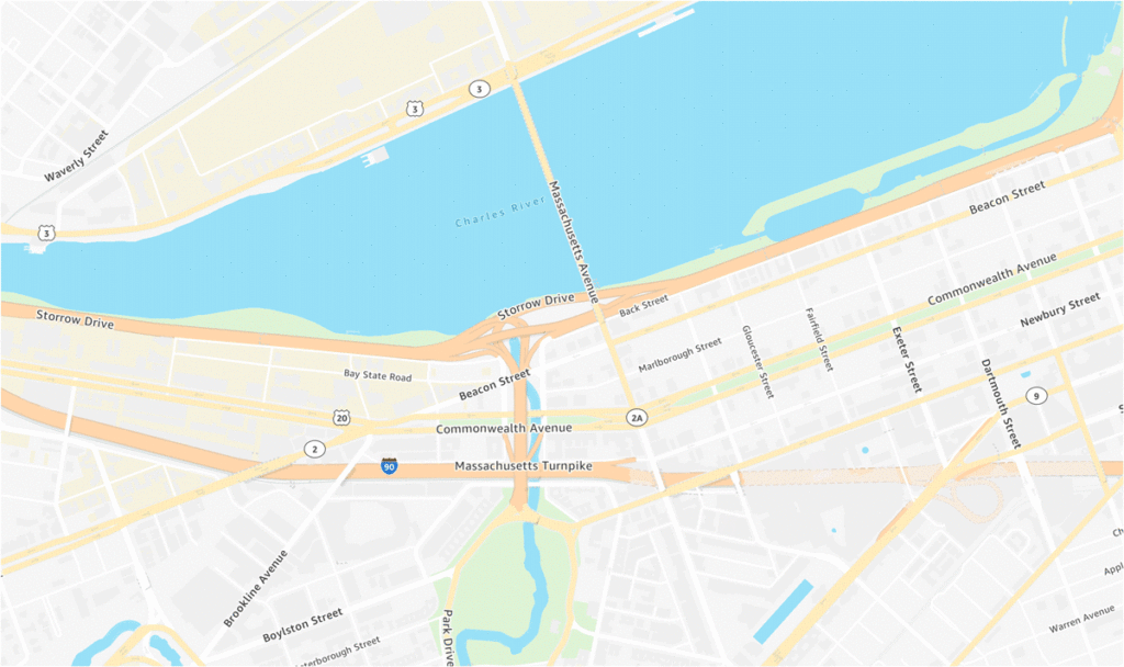
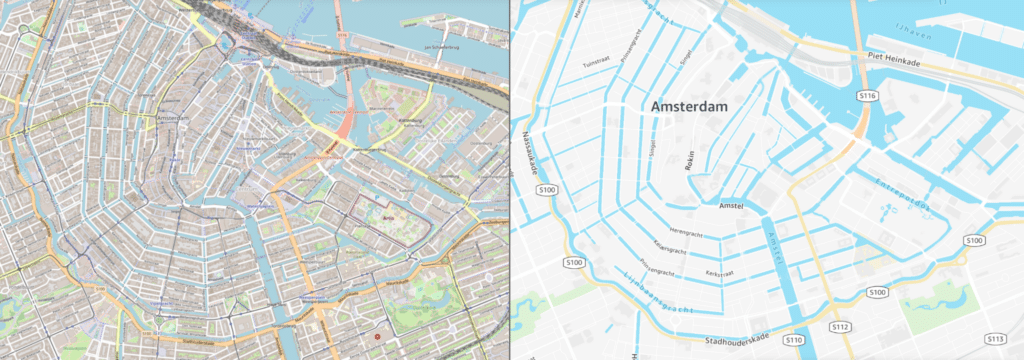
When we say ‘reference maps’, we’re referring to the styles similar to road atlases of yore, where colors are vivid to distinguish between important land uses, roads are highly visible, and labels are used to provide crucial context. These maps are often used for identifying the location of a store or alongside a routing API. With ‘data visualization’ styles, we try to balance between crucial contextual information and a color palette that is cohesive and understated to allow for data to easily be rendered over the map. Data visualization styles can easily be used to show data layers on top, whether they’re integrated into a dashboard or on their own.
Label Madness
Ask any cartographer – what’s the most maddening, least appreciated challenge in map design? Without hesitation we will tell you: IT’S LABELS. With print maps, the challenge of label placement is that there is limited space to make everything legible and make sure everything fits. This can be an enormous, almost impossible task that requires hours and hours of painstaking manual work. With web maps, it’s different – label placement is automated, so the cartographer’s job is to give the algorithm some rules. In order to work for everything everywhere all at once, these rules are a constant balancing act.
Our big, complex, heterogeneous world is a big reason for this. When does it make sense to show surrounding towns around a big city? How many street labels should appear when looking at different cities, whether it’s as dense as NYC or more spread out like Dallas? How many labels make sense for a reference style? What about a data visualization style? Should highway shields appear on both? Once you figure it out, now zoom in on Tokyo or Dar Es Salaam.
With online maps, collision rules determine which features get labeled on the fly based on whether they can be placed without overlapping. Thus, the cartographer’s job is not just to style the labels such that the map labels that matter most stand out, but also to curate the collisions such that the critical labels will always be placed. Now consider that with a basemap, the scale changes as you zoom in, and with it, the relative importance of features and labels.
People expect labels on the map, particularly a reference map, in order to orient themselves. And labels are not just text – icons for landmarks and route shields on major highways are among the placemakers that help us recognize the place we are looking at on the map. However, depending on what data and how much data AWS customers put on the map, these labels and other map symbols will be obscured and would be better drawn over the data than carefully curated within the basemap.
We resolved this by focusing on simplicity, legibility, and hierarchy in our label styles. Everything important is labeled, but the labels are designed to never overwhelm the map.
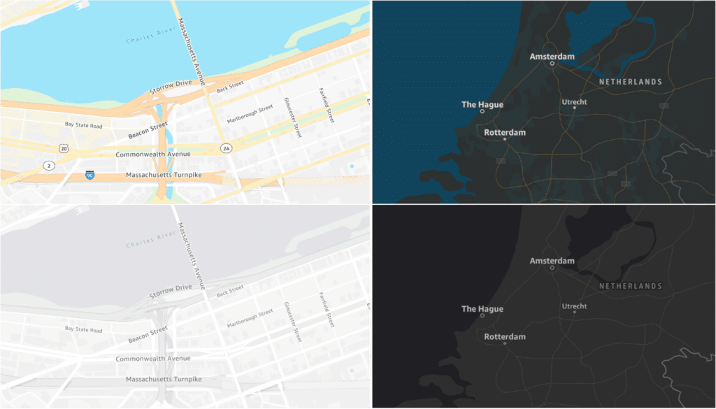
Dark Maps
But what about Erin, who needs to create a high-contrast data display that is visible from across the room? Or Joe, whose users complain of eye strain from bright screens? For these customers, we created a dark variant for each map style. Support for dark mode has become an industry standard in web design in recent years. Dark maps, like dark mode generally, have an accessibility aspect, as some people find the lower luminosity reduces eye strain. From a cartographic standpoint, the higher contrast of a dark map with brighter data overlaid is easier to read. For some applications, it’s more about giving customers a choice, so we made sure to design dark and light modes that fade seamlessly into one another.
Designing for the Open Data Collection
Amazon has been a big supporter and contributor to OpenStreetMap and its global community for many years. However, for AWS to incorporate OpenStreetMap data into a customer-facing product is an exciting big deal. They created the Open Data Maps collection for everyone, but especially for developers like Jan, who they hope will also contribute back to OSM, helping to further improve the quality of the data and strengthen the community.
At Stamen, we have been building maps with OpenStreetMap data for longer than almost anyone else. We believe in the mission and goals of OpenStreetMap as a global community and open source data project and want to support it every way we can. However, when it comes to the standard practice of using a generic data schema and symbolizing absolutely everything you possibly can on the map, cartographically speaking, we don’t think this approach helps the cause.
It might sound counterintuitive, but in order to figure out what belongs on the map, we have to consider the opposite. There are boat loads of great data included in vector tile schemes, from OSM, but less is more when map styles are designed to be used as a component and not the star of the show. An added bonus is that using less data makes for a more performant product, which is what matters most in the end.
It is with this spirit that AWS Open Data Maps are made to showcase the best of OSM.
Hire us!
When it comes to cooking up a new map style, we think about all of this and more with our clients. Map styles should be memorable, but useful to a user for whatever they’re trying to accomplish. Maps play a critical role in understanding the built environment, but now more than ever, map styles are a part of UIs that now interplay with other visual components, whether it’s a dashboard, data layers or routing directions on top, and so on.
Contact us to learn more about why your project needs Full Stack Cartography.