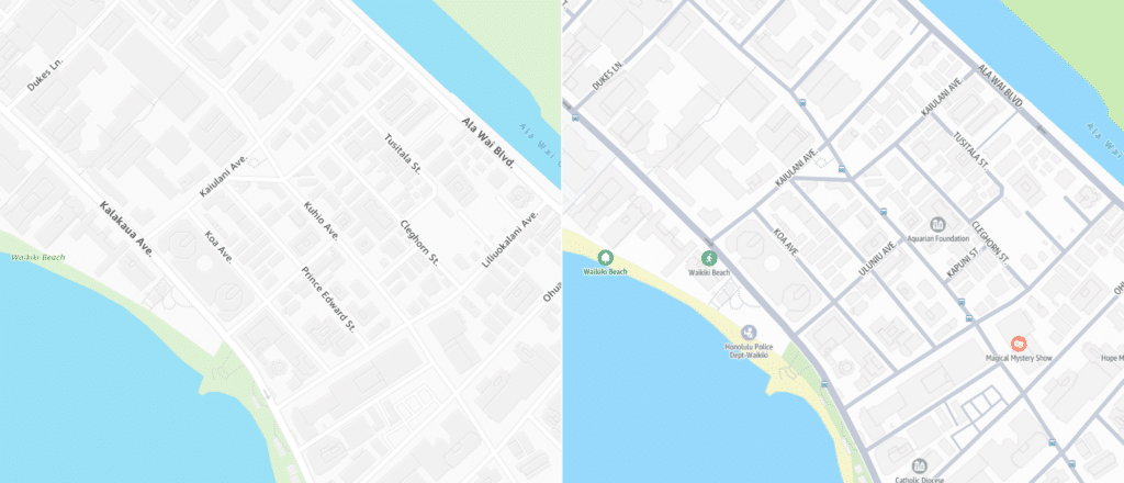
In March 2023, we shared the initial release of a set of global basemaps we designed for Amazon Location Service. In 2024, we undertook a design refresh to improve upon the original release, adding more detail and contrast to the suite of maps Amazon provides. To celebrate the release, we are excited to walk you through updates to the new styles, which are available now in Standard, Monochrome, and Hybrid.
Updates to all styles
We have introduced global landcover data to the styles, available beginning at zoom level 1. Now, it’s much easier to see patterns across the landscape, with forests, deserts, and more clearly visible. This data gets more detailed as you zoom in, with landuse data appearing as well at the regional level.
Standard and Hybrid now include points of interest, which are designated with custom icons grouped by type. The Monochrome styles include a reduced version of this icon set to keep the map as minimalist as possible. Including POIs on the map really enriches the user experience at city and neighborhood scales.
We designed dozens of new icons for points of interest, including transit features such as rail stations, bus stops, bikeshare docks, and station entrances. This added detail opens up a whole new world of practicality for users navigating their local area or planning a trip.
For Standard Dark, we’ve kept the same category colors as Standard Light, but opted for dark icons to keep the user in the dark mode experience.
Added context with neighborhood and park labels helps a user more easily identify their chosen location right away. Finding the right balance for cities across the globe was a challenge due to differences in data classification, but we feel that we’ve struck the right balance.

As the visual design of commercial basemaps becomes more similar across the landscape, the easiest way to identify a map for us as cartographers is to study its fonts. We wanted to brand Amazon’s maps in a way that makes them easily distinguishable from other providers, which we accomplished with widespread use of Amazon’s brand typeface Ember in its condensed form. An added benefit of this change is that many more labels appear on the map since each takes up less space when condensed.
A modernized Standard
The Standard styles underwent the most dramatic changes, which revolved around a focus on gray roads and highways. Most commercial basemaps have moved in this direction in recent years, so it was important to us to stay current with the trend and keep up with user expectations. For Standard Light, the road network is much easier to see in the new color palette with its improved contrast. With the addition of transit data to the map, the gray color palette is designed to hint towards the connectivity of transportation infrastructure in our modern world.
We introduced more colors to the palette for landuse, with specific shades for several types of greenspace, hospitals, universities, airports, beaches, and so on. These colors breathe more life into the map and show off the rich data available in both the Open Data and HERE tiles.
Monochrome for data visualization
As a canvas for data, the Monochrome styles needed to provide minimal context with no distractions. Lines should be easily distinguishable from one another and labels should remain readable in the background. In the new version, roads are always white and boundaries always gray to avoid any confusion between the two. By reducing visual noise in the basemap, your custom data on top will shine.
Similarly, we took Monochrome Dark darker and simplified the color palette so thematic data on top will really pop. Now, the Monochrome styles are more consistent and similar to one another in terms of color relationships and data hierarchy.
Legibility improvements to Hybrid
Borders, roads, and labels were our focus for the Hybrid style, which combines imagery as its base and vector data on top for added context. By increasing color contrast and leaning into bold fonts everywhere, we find the new version to be much easier to read and understand.
To avoid data mismatches between vector roads and raster imagery, we decided to have most vector roads fade out as you zoom in. This change really lets the imagery shine and creates a clearer connection between labels and the places they’re labelling.
Hire us!
We put a lot of thought and care into cartographic design for our clients. Are you looking to brand or refresh your maps? Contact us to learn more about how Stamen can bring your map offering to life with Full Stack Cartography.
