
Stamen has been working with a team out of UCSF (University of San Francisco) Population Health and Health Equity to create and maintain their Health Atlas since 2019. You can read a bit about the initial launch in our blog post from 2020. In 2024 we had the opportunity to rebuild the Health Atlas and expand its scope from strictly California data to cover all of the United States, including the continental US, Alaska, Hawaii, and Puerto Rico. If you’re interested you can see a recording of us talking about the Health Atlas at NACIS.
Data
The Health Atlas includes over 120 variables related to public health, including health outcomes (such as asthma or diabetes) and factors that can impact health (such as demographics, socioeconomics, and pollution). These variables are collected from a variety of sources such as the Census (ACS), CDC (PLACES), and the EPA (EJScreen). Users can select two variables at a time and visualize the relationship between the two on a map, then they can download the data for further analysis in their own tools.
Health Atlas’s aggregation of this data and straightforward interface have been an asset for researchers since it started. But now, given the current president’s antics related to various federal government agencies including removing various web pages and datasets, Health Atlas is one of the only places where you can see and download data such as EPA’s EJScreen data (the official site currently returns a 404, but you can see some of what it used to host with the Wayback Machine). While we hope that this outage turns out to be temporary, we are prepared to continue hosting and giving access to the variables that are part of Health Atlas.
Features
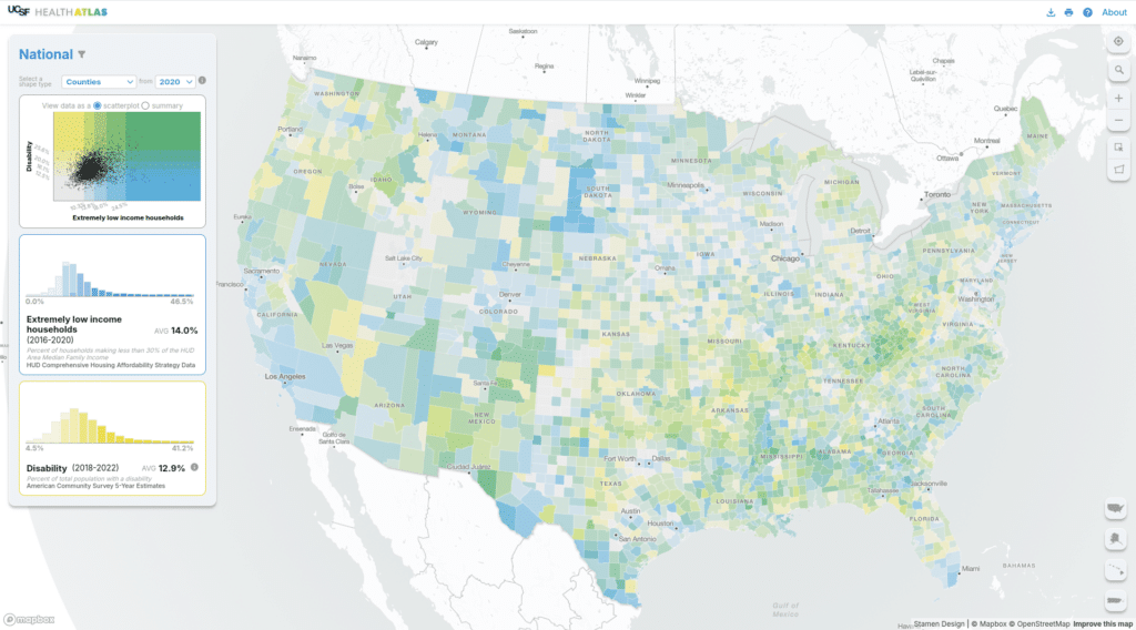
The national Health Atlas does a lot–let’s walk through some of the features.
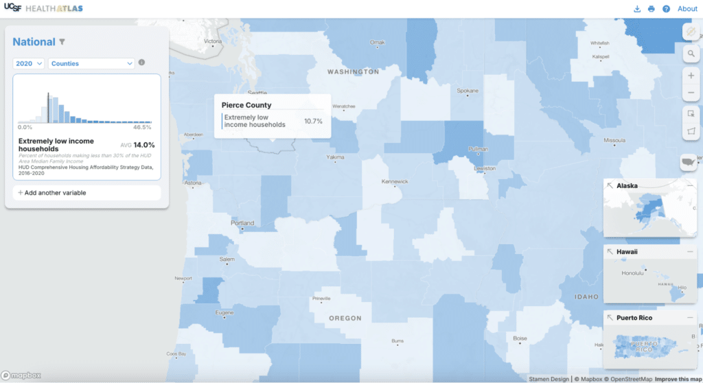
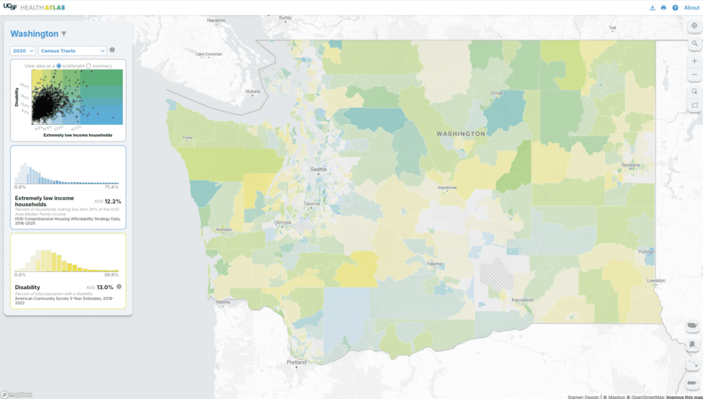
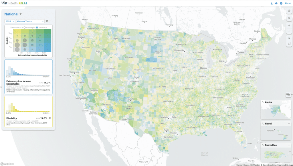
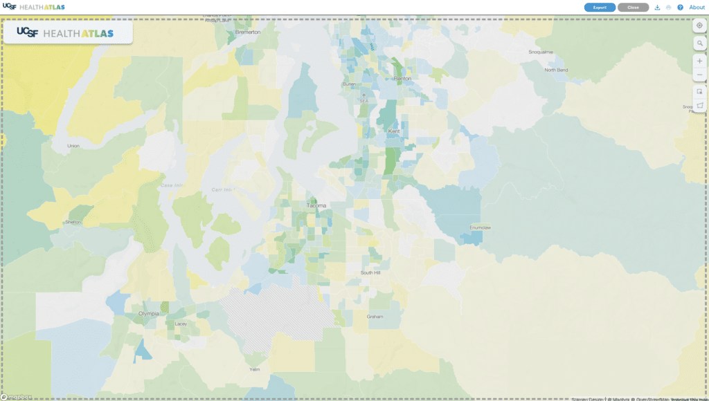
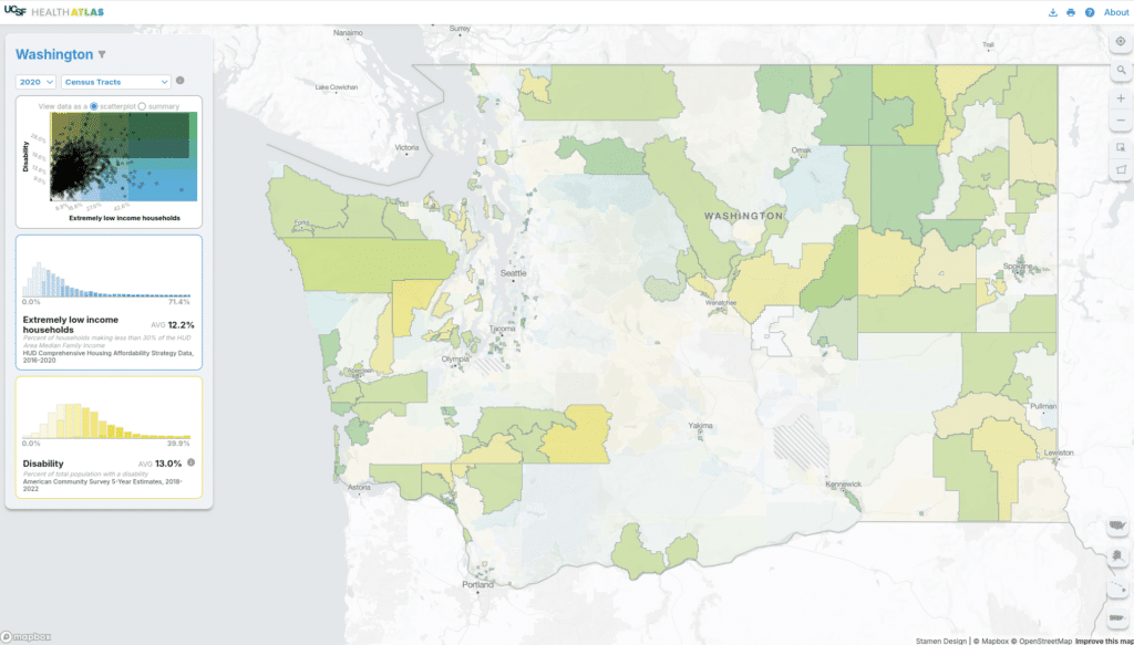
The simplest function of this map is to view a single variable aggregated to one of many available Census geographies. We include Census shapes for 2010 and 2020, as some of the data is available for only one vintage or the other. We use a custom monochrome basemap built with Mapbox Studio to give added context to the choropleth data. Each variable has five buckets ranging from light to dark blue, which you can see in the histogram on the left. In the CA-only version we used a continuous color palette for both univariate and bivariate maps. We felt that shifting to a discrete color palette with five colors would make the map more legible.
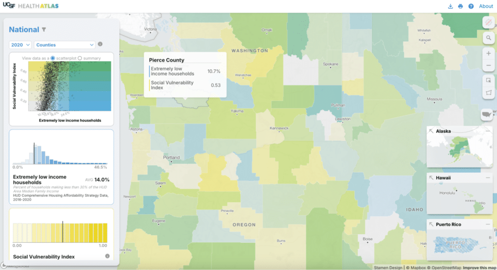
Where this map really shines is when you compare two variables to create a bivariate choropleth map. Via both the map and the visualizations in the sidebar, you can explore and understand the relationship between the selected variables. Here, geographies where both variables have high values are in green and lower values are in light gray. We use a 5×5 grid based on the distribution of each dataset to show meaningful correlations on the map. As we did for the univariate view, the bivariate map uses only 25 colors (in that 5×5 grid) in lieu of an continuous color spectrum. In this view, you can see the scatterplot along with histograms for each variable.
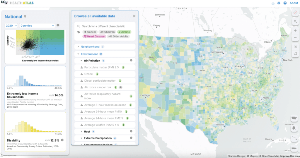
A major use for this tool is data exploration, so we wanted to make it easy for users to find other variables of interest. You can search for a term, browse through the list of over 120 variables, or select a tag to see relevant variables for each topic (or some combination of all three!). The data source and vintage are available for each variable as well.
If you are only interested in a single state or a region, you can filter to one or more states to see data for that state only. The histogram and scatterplot redraw to adjust for the new selection. Health Atlas has users that work for state or regional health agencies so this type of feature can be helpful for them.
With inset maps to accompany the main map, we can see the contiguous US, Alaska, Hawaii, and Puerto Rico all at once. Being able to see the entire continental US and Puerto Rico at once felt like an important (and often missing) feature to include in a national-level tool. To take that a step further, we can easily navigate to non-contiguous areas (and back) via the insets.
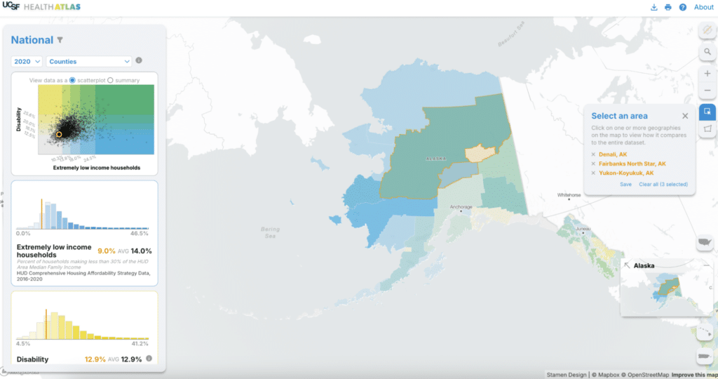
If we’re interested in seeing how a subset of the current map compares to the overall dataset, we can select a few counties or draw a shape to select all features within that area. The histograms and scatterplot recalculate averages for the selected area with respect to the entire dataset (in orange on the left). In this example, the selected counties have a lower than average level of extremely low income households.
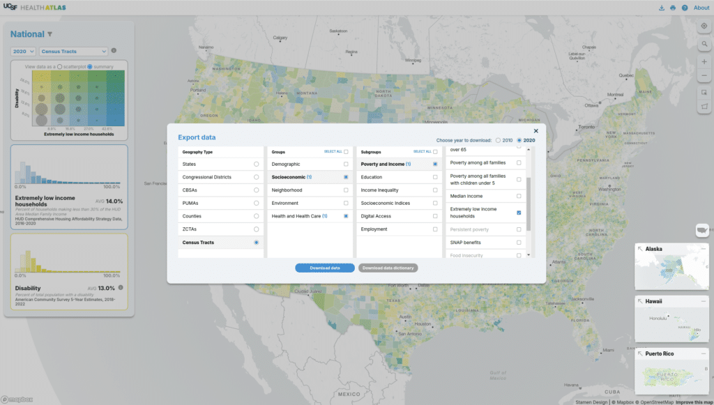
Of course, beyond exploring and understanding the data, users often want to export data for use in a desktop GIS or other software. You can export any selected data or the entire dataset for the geography and year you have selected as a CSV.
Our users often include images of the map in presentations, so we’ve also included a way to easily export an image. You can export the map with almost no UI at all if you want to add context yourself. Or you can include the data visualizations, insets, and source info as needed to give your audience the full picture. Our user testing indicated that both versions are helpful for different use cases, so having this flexibility is important.
Technical Details
Choropleths
The previous version of the Health Atlas used a linear scale to style both univariate and bivariate choropleths. That is, a gradient was created from the minimum value to the maximum value for a variable, and each area was styled based on where its value fell in that gradient. While this can be intuitive (more blue means higher values), there are situations such as outliers in datasets that can artificially skew the gradient. At the same time, since the areas on the map generally all have different values for a variable the result is that you have potentially one distinct color per area. That’s a lot to take in visually, and it can make it difficult to see patterns.
For the national Health Atlas we decided to arrange the data in bins to make the distinctions between colors more clear and better avoid issues with outliers. We generate choropleth bins using ckmeans from the simple-statistics JS library by Tom MacWright, and we use five bins per variable. For bivariate choropleths a grid of five by five bins is generated for the two variables in use. Some variables are ordinal (such as binary or indexed data) in which case the number of bins is dependent on the number of values covered by each variable. For example, if you look at two binary variables together you will see a two by two grid.
Judging from user testing and feedback, this was successful–it was easier for users to distinguish areas of different values.
Histograms
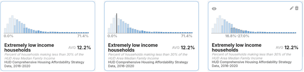
In addition to the map, which is the main focus of the tool, we include a few supplementary visualizations to help users understand the texture of the data. For each enabled variable we include a histogram that gives you a sense of where most of the data is weighted.
Above you can see three states of interactivity:
- Left: the histogram at rest
- Center: user is hovering over a feature on the map
- Right: the user is hovering over part of the histogram
As you can see, the histogram does a lot–it acts as a map legend, shows you where a hovered feature lands with respect to the rest of the features, and gives you a way to highlight an entire bin at once to find clustered features.
We iterated on the histogram form quite a bit while developing the national atlas. Our goal was to ensure that users would get a clear sense of the contours of the data by using a traditional, equal interval, histogram, but we also wanted to use the histogram as a map legend so we needed to show the boundaries of the bins. The bin boundaries and histogram boundaries would almost never line up since they are determined using different methods. We ended up sticking with bars that are equal interval along the x axis but are stacked, proportionally, to indicate where a bar covers multiple bins.
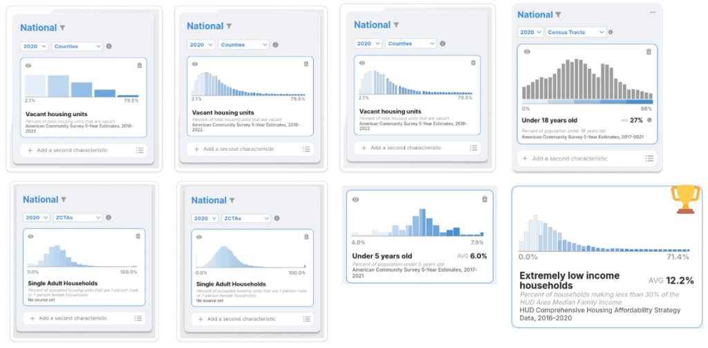
Above you can see a subset of the options we iterated through while trying to find a solution that balances traditional histogram bars (the shapes visualized) with the map bins (the colors). In the bottom right you can see the version we decided to stick with. This is a unique form of histogram that we could envision using in other mapping contexts where the bars and colors will not always align.
Scatterplots
When you’re looking at two variables on the map, in addition to the histograms for each variable we include a few visualizations that summarize both variables at once. The first is a traditional scatterplot where one variable is shown on the x axis, the other variable is on the y axis, and a point is shown for each map feature. Points in the bottom left have low values for both variables and points in the top right have high values for both variables.
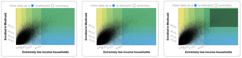
Above you can see the scatterplots in various states of interaction:
- Left: no interaction
- Center: user hovering over a map feature
- Right: user brushed the scatterplot (by dragging to create a rectangle)
As with histograms, the scatterplots serve as map legend, a way to see the texture of the data, and a way to see where a feature you’re interested in is situated with respect to the other features on the map.
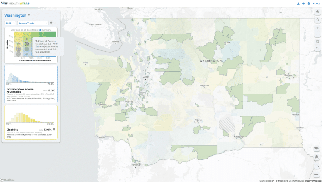
Bivariate Summary Heatmaps
In addition to scatterplots for two variables we include a summary heatmap. The background here is an even grid where each rectangle represents one distinct color included in the bivariate choropleth. On top of the grid is a circle for each bin, where the radius is proportional to the number of features in that bin.

As with other visualizations we see three interaction states:
- Left: no interaction
- Center: hovering over a map feature (seeing with grid cell that feature is in)
- Right: hovering over the circle
Scatterplots are a great way to understand how two variables may be correlated, but it can be tricky when you have thousands of points to parse through. The summary view is really helpful for geographies like Census tracts which would place thousands of points on the scatterplot. Hovering over one of the circles on the summary visualization tells you what percentages of the geographies on the map fall into that bucket.
This is a unique visualization that we imagine could be useful for other maps that use bivariate choropleths, which can be tricky to read.
Partitioning Data
With the smaller datasets involved in the California Health Atlas, we used one large CSV per geographic level. We are avoiding adding server-side processing when we can avoid it for simplicity of hosting the site and resiliency.
For the national Health Atlas, we’re opting for a client-side-friendly static data format with hive partitioning. This splits large tables into multiple smaller CSVs based on values in key columns. We can read in the entire dataset with columns for year, geographic_level, variable, and split them up like this–Polars and DuckDB make this relatively straightforward:
df = pl.read_csv(‘all-the-data.csv’)
duckdb.sql(
  f"COPY df TO '{output}' (FORMAT CSV, PARTITION_BY (year, geographic_level, variable))"
)
This leaves you with files in a directory structure like this:
/year=2020/geographic_level=tract/variable=diabetes_crudeprev/data.csv
/year=2020/geographic_level=ZCTA/variable=pct_under5/data.csv
Having the data partitioned this way ensures that we’re usually only getting the data that a users wants to view and means that download sizes and performance are not impacted by the vast amount of data that is behind the Health Atlas.
If we were only using the data in a map it might have made more sense to tie this variable data directly into the vector tiles used on the map, but in our case we do have a need for getting all the values when generating the supplemental visualizations such as histograms and scatterplots.
Try it out
You can view the Health Atlas now and see these features for yourself! And get in touch if you have data that you would like us to explore with you.