
As designers, our imaginations are the most powerful tools in our toolkit. They help us bring static mocks to life by thinking about how a user might interact with our ideas. Imagination can also hold us back sometimes, as it can be very challenging to communicate these interactions to others. It can also only get you so far when working with data because data visualizations can surprise us. It’s generally in everyone’s best interest to bring our imaginations to the page as early as possible.
Our general approach
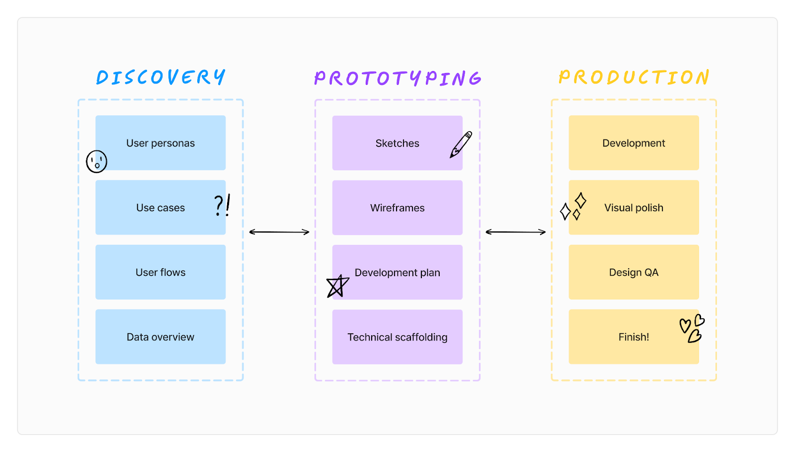
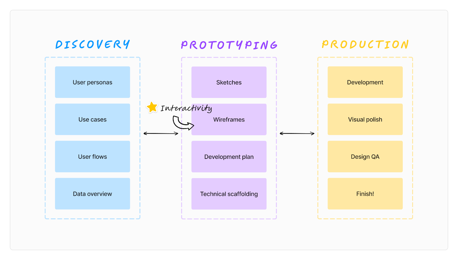
Here at Stamen we believe there is no “one size fits all” process to finding the right solution to a data problem. We do, however, have certain phases we use when approaching most of our work. These approaches tend to fit into three relatively linear categories:
- Discovery: Diving into the high-level goals and questions behind the problem by defining our users, use cases, general flows, understanding the data, etc.
- Prototyping: Iterating through various data-driven design directions as depicted by static mocks, triangulating on one with increasing fidelity while we set the groundwork for the technology behind the scenes
- Production: Bringing our mocks to life typically in a web-app while we continue to refine and make updates along the way
General Stamen approach to creating a data-driven visualization
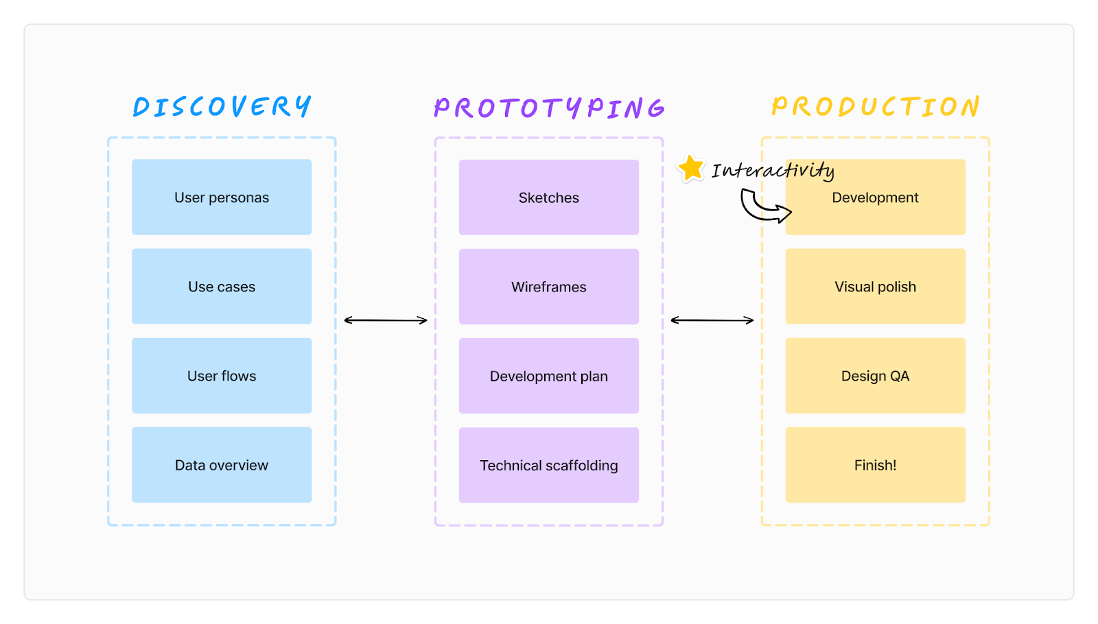
As designers working with data, we often have to chart the unknown space between designing mocks and bringing them to life with data and user interaction. This is most obvious when we jump from static mocks to animation and interaction. This part of the process usually happens as we move from prototyping to production where we hope that the interactions we’ve been imagining will create a positive user experience and encourage users to engage with the data.
It can be challenging to articulate data-driven user interactions through static mocks to our internal team as well as to the clients we work with. If the user interactions are not as we imagined, when we bring the data to life in production we can lose a lot of time needing to go back to the prototyping or even discovery phase. This begs the question of how can we incorporate interactivity and animation earlier in the design process so as to get a better understanding of the user experience?
Using design prototyping to introduce interactivity
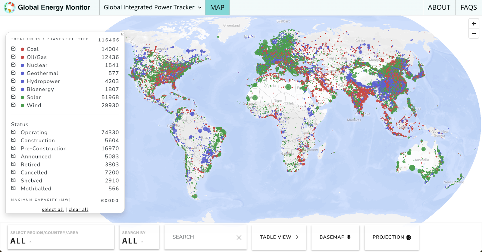
We recently worked with the team at Global Energy Monitor (GEM), who develop and analyze data on energy infrastructure, resources, and uses to provide open access to information that is essential to building a sustainable energy future. GEM came to us looking to take their existing Global Integrated Power Tracker to the next level. The designs would be used for fundraising efforts with the hopes of implementing one day. They wanted a “dreamy” design, so that users could have an open mind while envisioning how we get our energy. The sky was the limit.
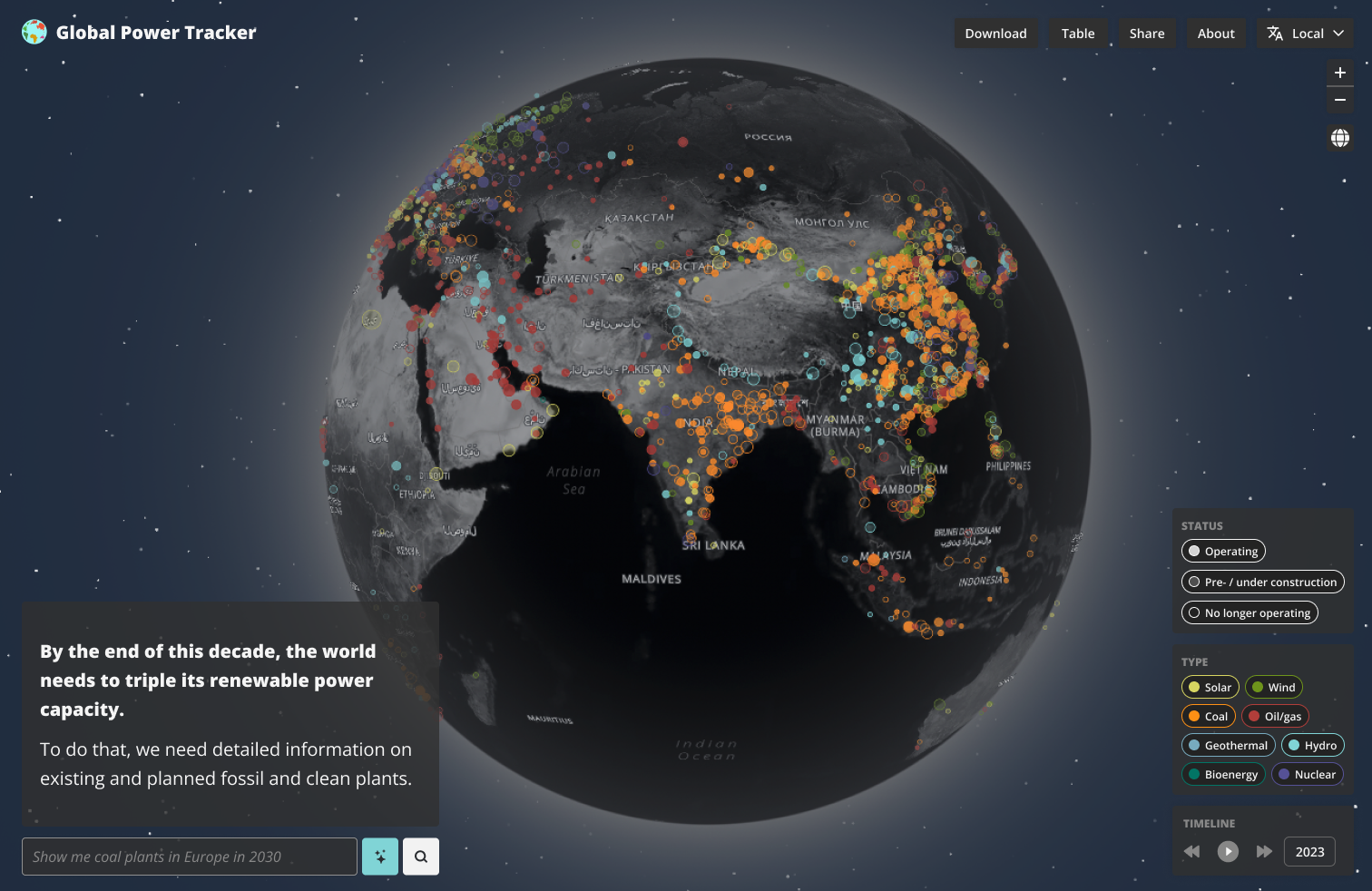
We settled on an immersive and minimal UI layout with a dark satellite map as the centerpiece. We were pleased with our redesigned static mocks, but we agreed with GEM that animated videos would really bring our vision for an enticing user experience to life. So, we got to work seeing how far we could push Figma’s prototyping tools to bring the imagined user experience to life with design prototyping.
We first added in hover states and clickable buttons by creating components for each button. When in the prototyping view, you can move your cursor over these components to see the button update. For example, one of the features in the design is a search bar, so we imagined a user who might be interested in the Philippines. This would importantly involve clicking the search bar and search button, so adding hover states makes this interaction feel more real.
One of the highlights of the Global Power Tracker is the sheer breadth of data around the world. We wanted the design to bring this to the forefront and felt that a spinning globe could be just the trick. We created these maps in Mapbox, then brought them into a custom Mapbox GL JS instance to make the globe spin (Mapbox has a handful of these in their documentation).
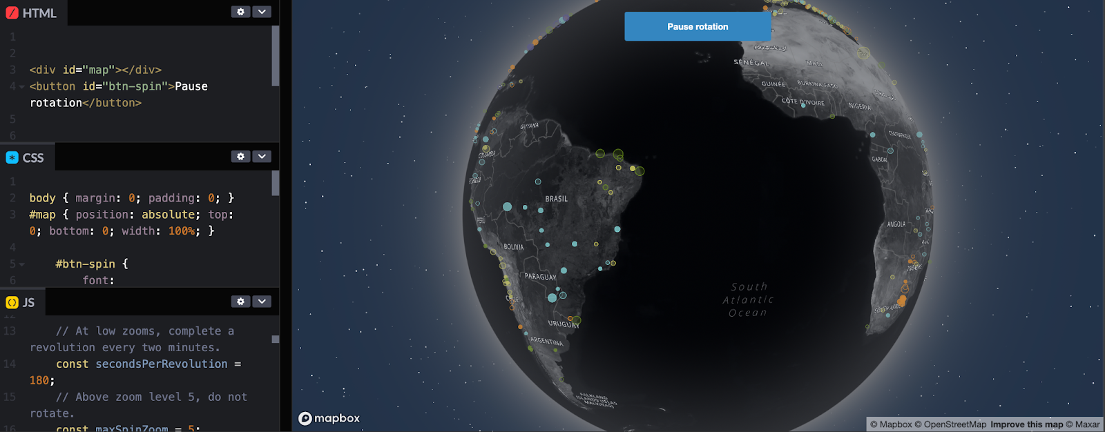
With these tools, we’re able to control how fast the globe spins, as well as where it starts and stops. A simple screen recording captures this ethereal movement and converts it into a video. From here, we loaded the video as the starting frame of the clickable prototype to simulate the feeling a user may have upon arriving at the tracker.
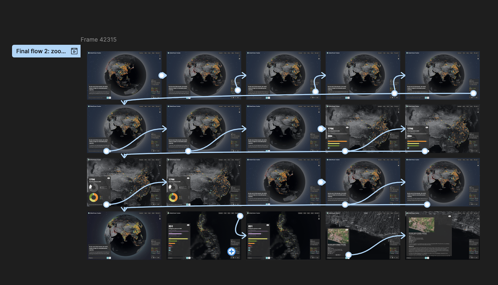
We eventually transformed our entire storyboard into an interactive prototype outlining the user experience. We were able to bring our full GEM tracker design to life by linking our storyboard mocks together with user interactions and animations triggered by certain buttons. While many of the buttons in the prototype are still gestural, we found the primary story could be told using just a few key interactions. Tying together the designs into a video allowed GEM to preview design with potential donors without needing much instruction to convey the vision and bring that “wow” factor.
A new type of product
Design prototyping allows us to bring our static mocks and ideas to life with interactivity and animation. It allows us to put our imagination onto the page, so our clients can get a better look into our brains and what we are imagining for their products. Its utility is not just for clients but also for designers and developers to align on the vision and ensure it feels right. Further, the utility of animated mocks can be an entire product in and of itself that shows a proof of concept such as we made for GEM and their fundraising goal.
Please do not hesitate to reach out at info@stamen.com if you are looking for a design prototype like this one, or generally need any data visualized!