
Imagine you’re going out of town this weekend. You check the weather forecast where you’re headed and see clear, sunny days, so you make sure you pack your sunglasses in your bag. Next, you check the public health trends where you’re going and see COVID-19 is high. So, you tuck away your face mask next to your sunglasses. Maybe you even adjust your travel plans and exchange your indoor museum tickets for an outdoor park. WastewaterSCAN has been working on making this hypothetical scenario a reality. Why shouldn’t checking health risks be as accessible as checking the weather?

Who is WastewaterSCAN?
As the COVID-19 pandemic progressed, at-home and self-testing technology became more precise. These kinds of innovations made it more accessible for people to track their own health and manage their risks towards others. However, without people needing to be tested at a facility, it became trickier to measure COVID-19 levels across the nation. One of the most reliable ways of tracking pathogen levels is through wastewater testing, which we discuss in more detail in one of our blog posts from 2023. WastewaterSCAN specializes in checking wastewater for pathogens, such as bacteria, viruses, and other microorganisms. They offer a comprehensive platform that combines innovative technology and data analysis to help optimize wastewater processes. Beyond tracking, they are dedicated to promoting sustainable wastewater management practices globally.
In 2022, WastewaterSCAN reached out to Stamen to help develop a comprehensive dashboard that tracks multiple pathogens across the United States. New data, wastewater plants, and even additional pathogens are added on a regular basis. This was a major consideration for us in our design efforts, as we needed to ensure that whatever designs and technologies we implemented could handle substantial growth and change. Our engagement with WastewaterSCAN began with optimizing a pathogen map and chart-builder for advanced super-users but eventually grew to encompass more and more users. We all benefit from knowing public health risks, so why not design the dashboard for everyone?
Adding a new user: the general public
One main attribute that our initial users – public health officials, academics, and researchers – all shared was their higher technical capabilities. This led us in the direction of creating features that could be as complicated as a user desired. Many of the charts and maps that users created would end up displayed in memos, newsletters, research papers, and so on, where users would add their own supplemental information to describe the visualizations to less technical readers. The dashboard was not yet configured for less tech-savvy users to digest the information within the tool itself.
Adding the general public to our user base introduced many complications given the wide range of goals and pain points we needed to account for. When we sat down and imagined how the general public might engage with the dashboard, we realized that much of their motivation could be bucketed into community advocacy and personal risk assessment. From there, we imagined frustrations would bubble up from confusion around the data itself. We needed to find ways of orienting users so they could navigate to their area of interest and understand the limitations of the data, given there might not be sewershed representation where they are located.
Why base the design off of a weather forecast?
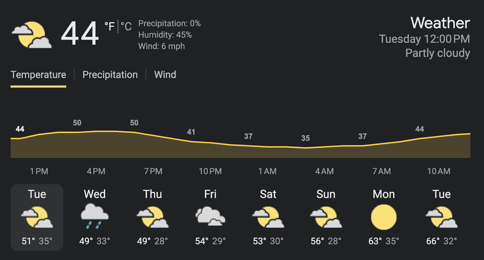
Let’s take a look at Google’s widget for weather forecasts. One of the reasons it’s so quickly understandable is because it uses the same forms regardless of your location or day. Iconography makes information obvious at a glance, and supplementary data values such as temperatures and likelihood of rain add more detail. It also uses a simple area chart to show the trend throughout the day. Finally, there is a clear hierarchy of information, meaning you first understand the big picture, which is the current weather in large font-size in the top right-hand corner. Your eye then travels down the page to see the trend throughout the day and ends with the trend throughout the week. If you are still interested after that, you can toggle “Precipitation” and “Wind” to dive deeper.
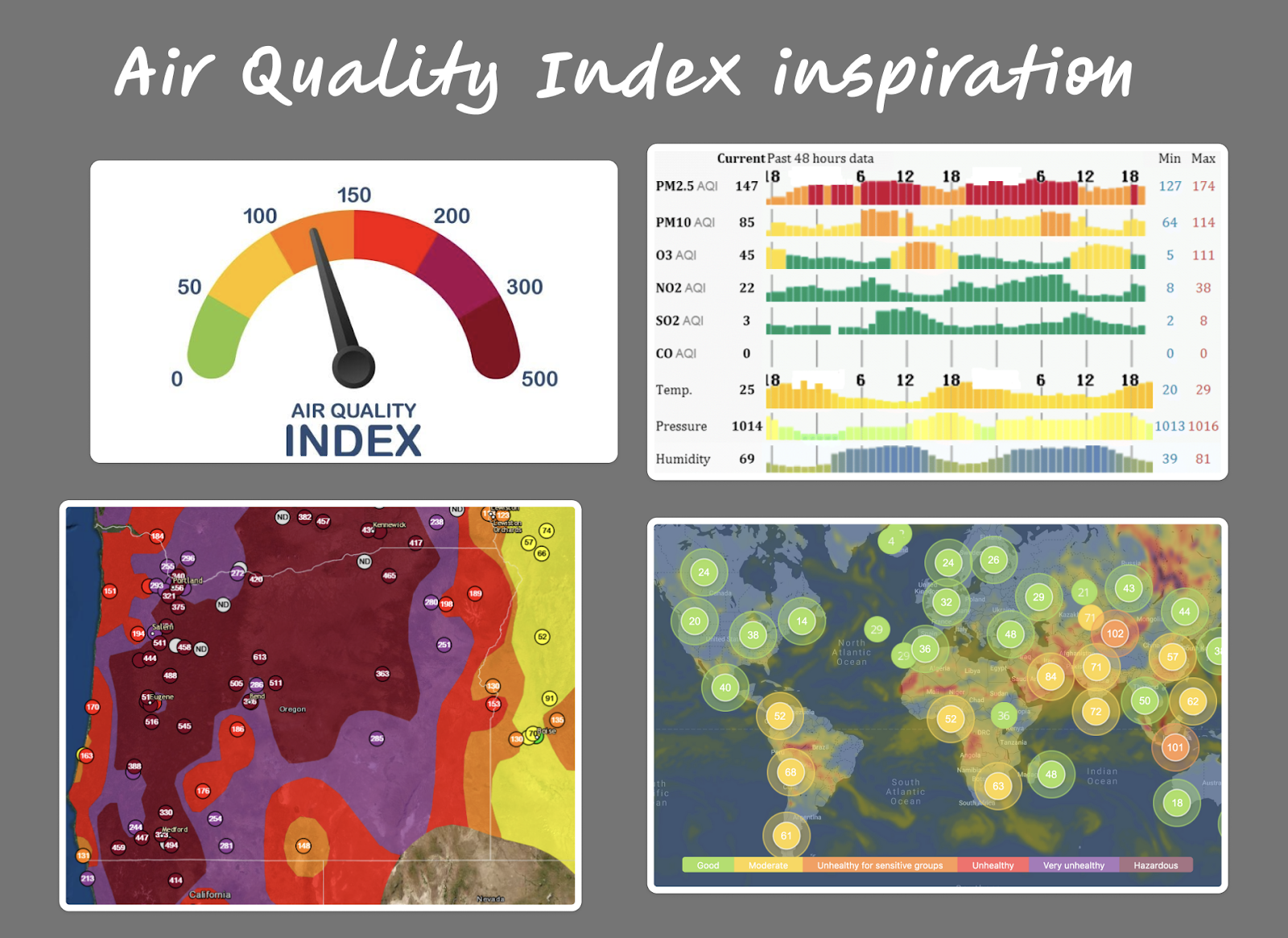
While the WastewaterSCAN pathogen tracking model is not built for forecasting, we imagined users looking at the current and historical trends for pathogens could be like checking the current and historical weather. We specifically felt the experience could be similar to checking the air quality index (AQI). Higher AQIs are likely to result in temporary lifestyle changes until the AQI lowers, similar to how high pathogen levels may impact a user’s behavior. From assessing familiar weather and AQI visualizations, we knew that we wanted to include key components such as using careful information hierarchy and simple visual forms at a glance.
Drafting a system for wastewater categories
There were two main components to consider for creating wastewater categories: trend and concentration. Users needed to understand both how high the current pathogen levels are and if they are trending up or down. Some of the combinations were straightforward such as how an upward trend and high concentration would be a high wastewater category. Others, however, required more thought such as an upward trend and low concentration, which ultimately was determined to be a medium category.
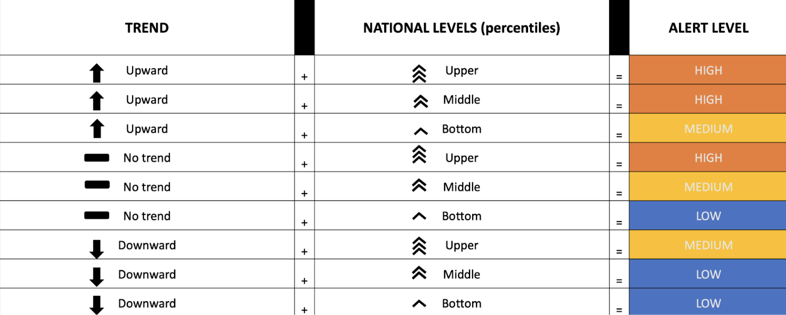
We worked closely with the WastewaterSCAN team to implement the desired wastewater category (initially named alert level) methodology and ensure that the design was scientifically defensible. This methodology developed as we implemented it, and it was gratifying to be working with researchers who were actively and thoughtfully engaging with the data and our interpretation of it. What started as a relatively straightforward linear regression over the past 21 days of data to find the trend, for example, soon split into three different methods for different types of pathogens. Using their own analysis and conjunction with the outputs from our code and the draft versions of the map, the team realized seasonal and uncommon pathogens would need distinct categorization methods.
Stamen built the dashboard on a configurable CMS that makes it straightforward for the WastewaterSCAN team to change which methodology to use for which pathogen. When they start to track a new pathogen they can easily add it to the site and determine which categorization method (if any) to use.
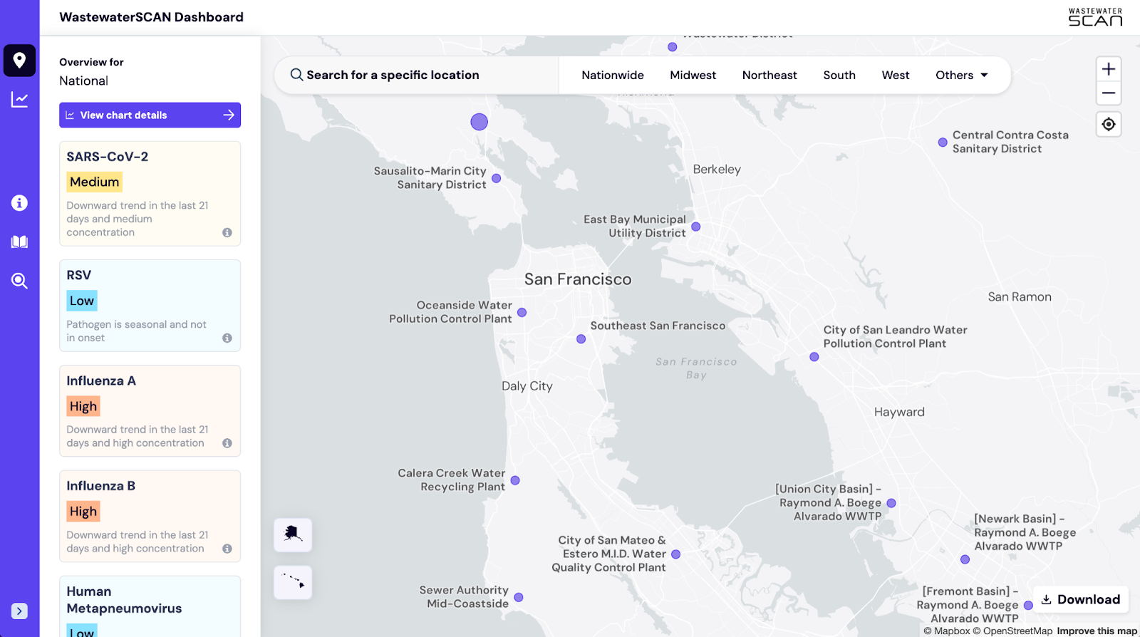
Creating the map
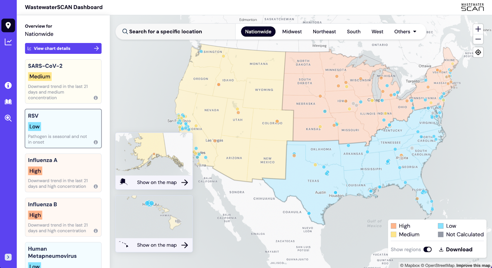
While the dashboard features two main components, the map and the chart-builder, we felt that the map was the more accessible platform for the general public to engage with. The map provides the clearest source of truth in sewershed plant representation and is a form everyone is familiar with. As you can see in the map above, there is varied sewershed representation across the nation, so we needed to be careful about how we bucketed regions. We agreed that categorization should only happen on a nationwide, census region, or sewershed level. Assigning a category to the state of Utah when there is only data for one sewershed would be misleading the user, for example. However, assigning a category to the Western region of the country (as defined by the Census Bureau) or the one plant from Utah that is participating would provide a user with a more accurate assessment of public health risks in and around the state.
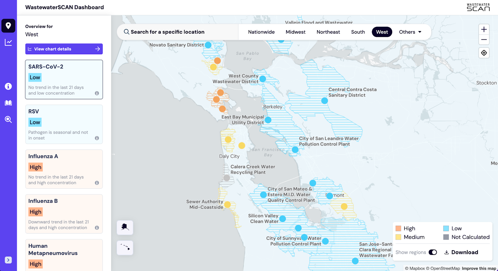
We chose a color palette with enough distinction between high, medium, and low to be digestible by the user and accessible for color-blindness. We were careful to choose colors that did not have misleading associations, such as a red/purple/blue color palette suggesting political affiliations, or a red/orange/green color palette that might provide too much reassurance with a low wastewater category. Regions are colored with a light fill that adjusts when a user zooms in to allow for the individual granularity to shine through. We opted for a patterned fill for the sewersheds themselves so the user would still get a sense of what area each plant represents without any visual confusion with the region.
Creating the sidebar
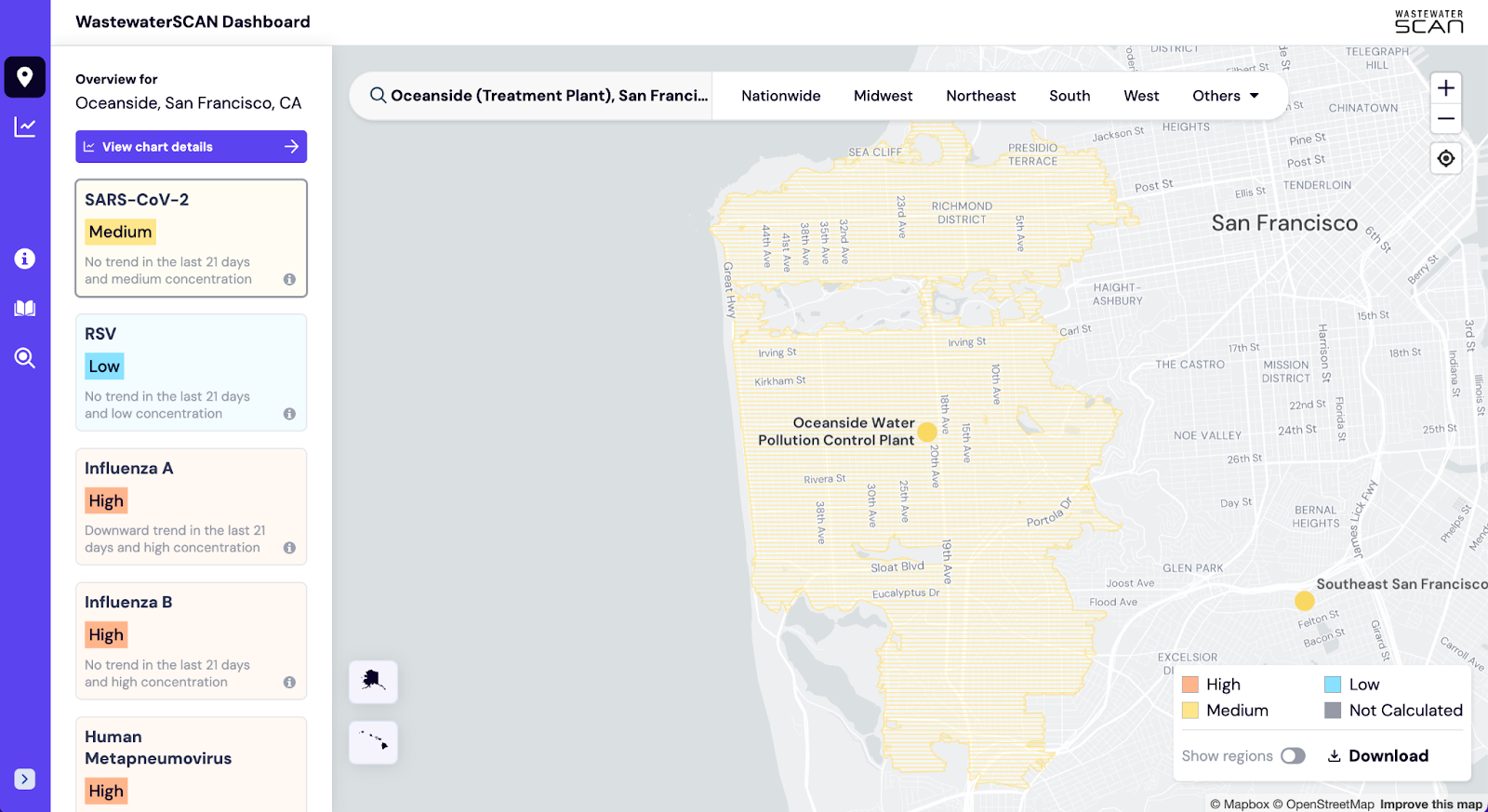
We knew we wanted to maintain the balance of exploration and investigation that the map offers. But with only the map showing pathogen categorization, we were losing the big picture our general public users might want to see at a glance. We set out to design a minimized sidebar that could give the category levels for each pathogen along with a short explanation that could reveal the trend and concentration behind the category. We even made these pathogen boxes clickable, so a user could control the map through a pathogen spotlight. These update depending on the region or sewershed plant a user searches for or selects on the map.
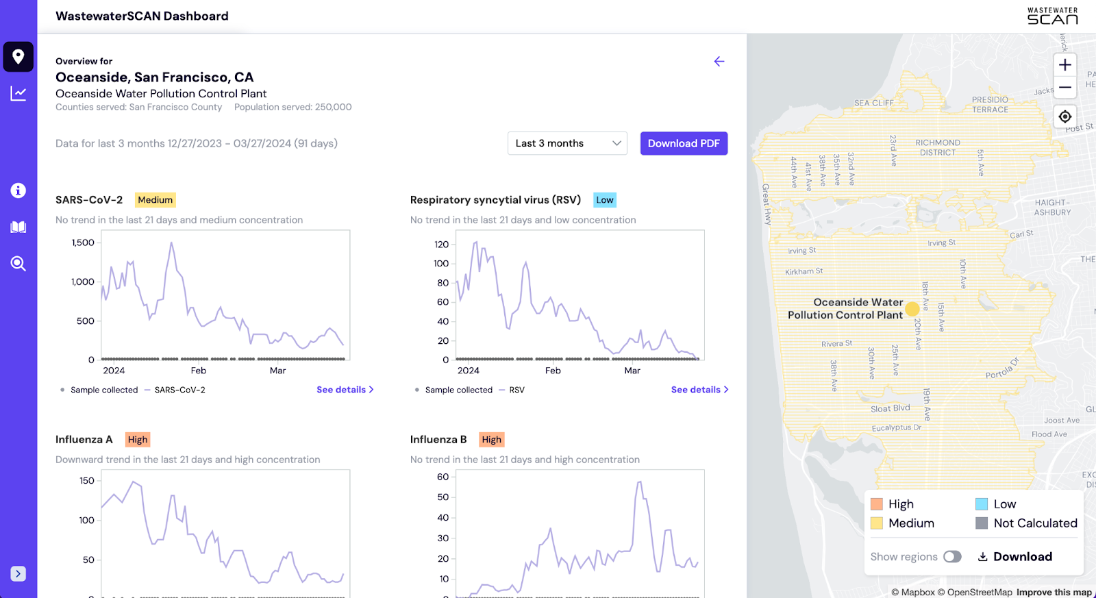
What about the user who wants to dive deeper into the wastewater category for a specific sewershed or region than a one sentence explanation? We added a button to expand the sidebar and reveal line charts exhibiting the trend and concentration of each pathogen for the current area of interest. The line chart paired with the category and summary explanation gives users a deeper level of understanding of each pathogen health risk. If they are still looking for more information, they may choose to “see details >” and view the chart in the chart-builder page with more advanced features at their disposal.
Designing for mobile
There was still one missing piece of the puzzle: most people check the weather on their phones. It only seemed natural that the general public would want to check pathogen levels and respective health risks in the same way. We needed to ensure a robust, responsive design that still provided exploration on a national level and investigation on a sewershed level. We also wanted to give our technical users a way of navigating the chart-builder page to maintain the ability to create and view impactful visuals on a mobile screen.
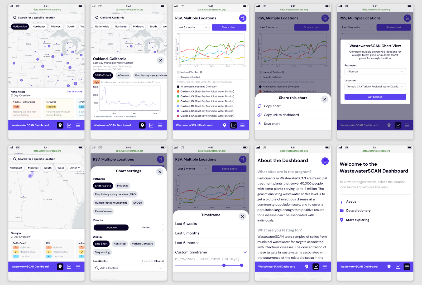
All of our design adjustments were guided by one goal: when a user opens the link to the dashboard, all they should need to do is find their area of interest on the map to understand the pathogen levels. We prioritized the map and sidebar in our mobile design. We assumed that our more technical users would have enough familiarity with the capabilities of the chart-builder side of the dashboard to navigate through more buried UI controls. To optimize space in the map view, we moved the sidebar below the map. Users can still pan around the map, select a region, and search/select individual plants. They can also choose to see the charts in tandem with the map of specific regions and plants as in the desktop version.
So what are the pathogen levels in your area?
Keeping our communities safe by keeping pathogen levels low is a responsibility we all share. We encourage you to use the WastewaterSCAN Dashboard in your daily life and share with friends as a tool in your day-to-day decision-making. If you like the experience and have similar data needs, let’s be in touch!