
by Robbyn Layne
A designer and three scientists walk into a bar… well, actually, it wasn’t a bar. And what happened when they sat down together wasn’t a joke! It was an inspiring testament to the power of data visualization and synergistic collaborations that merge beauty with utility, or rather, design with science. Eric Rodenbeck, founder of the data visualization and mapmaking studio Stamen, sat down with three scientific researchers who collaborated with his team to create and implement the VACS Explorer app—a visualization tool designed to promote research behind the State Department’s Vision for Adapted Crops and Soils (VACS), a plan for how to reduce food insecurity in Africa amidst a changing climate.
A Complex Collaboration
The Vision for Adapted Crops and Soils (VACS) is a multi-phase initiative launched by the US Department of State in collaboration with the African Union and the Food and Agriculture Organization of the United Nations. It addresses food security in Africa by developing and mobilizing investment in resilient, nutritious indigenous crops suited to the changing climate. To better understand how underutilized crops can be utilized, VACS partnered with The Agricultural Model Intercomparison and Improvement Project (AgMIP) to spearhead the development of novel climate-crop models for a short list of highly nutritious opportunity crops. AgMIP, in turn, collaborated with Earth Genome, a creator of technical solutions for climate-related issues, to explore the intersection of food and climate through data. Earth Genome then approached Stamen to help create and implement the VACS Explorer app to visually narrate the data.
The VACS Explorer app team included Jose Guarin, a postdoctoral research scientist at Columbia University’s NASA Goddard Institute for Space Studies, who provided the agricultural data and crop models essential for the visualization; Kevin Karl, a research associate at the Center for Climate Systems Research at Columbia University, who served as the project coordinator and product overseer; and Cameron Kruse, a creative technologist from Earth Genome, who put the team together and served as product manager. The design team at Stamen included Caroline Carter and Kelsey Taylor, who were represented by Eric in the discussion. Here’s how the conversation went down:
Crafting a Narrative that Furthers the Mission
Eric Rodenbeck (ER): Designers and scientists tend to be in separate silos. A lot of times with scientists, they’re very nervous that anybody could potentially misinterpret what the visuals show. But it’s important to have the information out there so that we can discuss it. It’s not about communicating it 100% correctly; it’s about getting it out there and letting people have conversations about it.
Cameron Kruse (CK): Indeed. One of the really cool takeaways that I’ve seen with this map so far, and the program in general, is that the US announced a $150 million contribution to the VACS program at COP28 in Dubai this year. This map was used to convey what this big investment was going into, and through conversations and that announcement, they were able to generate more investment from other countries as well. Because we were able to get this back-of-a-napkin sketch out there, it’s promoted and furthered the mission of VACS, which I think is really the end goal here.
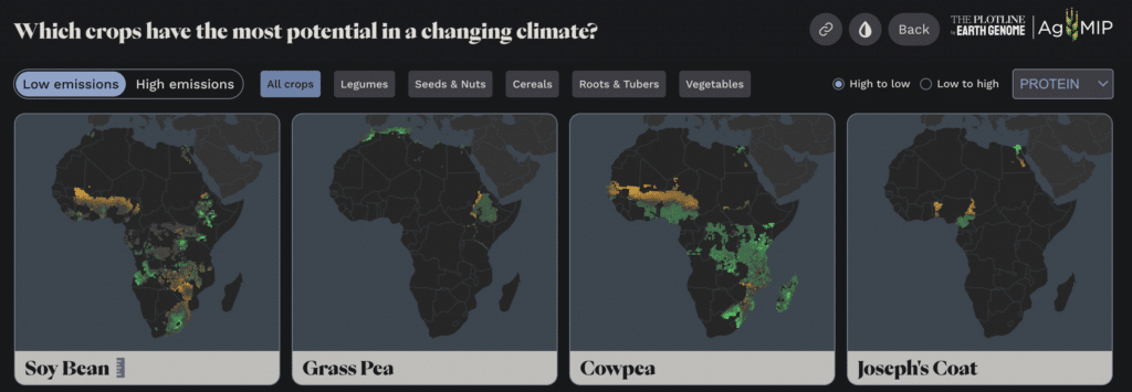
ER: The challenge in communicating about complex science to non-scientists is that people don’t know about all the different factors that go into these models — but the scientists totally do. I’m looking at Cameroon under different global warming scenarios right now. What’s involved? Is there a formula that says something like, “mung bean does well in this type of soil at this temperature, with this amount of water”? Give me a sense of what goes into the dots getting brighter or less bright.
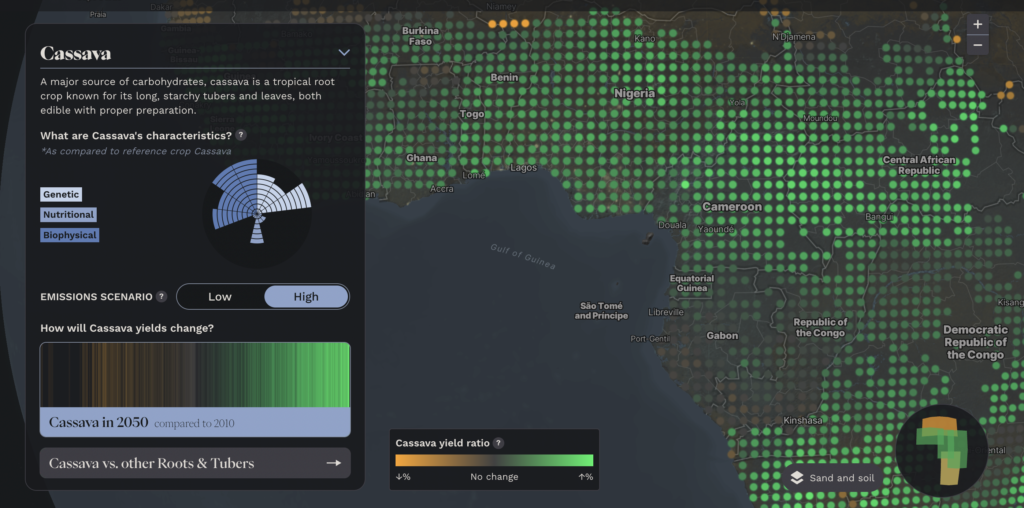
Jose Guarin (JG): These models take specific inputs such as meteorological data, soil properties, and management data. We input this data into the model to simulate different processes on a daily time step. We look at photosynthesis, nutrient uptake, water and nitrogen dynamics throughout the crop, and then output yield and biomass change. We control these factors for different crops based on species parameters, which we set and calibrate based on existing literature. For instance, we calibrated the mung bean parameters to reproduce its normal phenology and biomass growth accurately. Once we were confident in those parameters, we applied them to future scenarios.
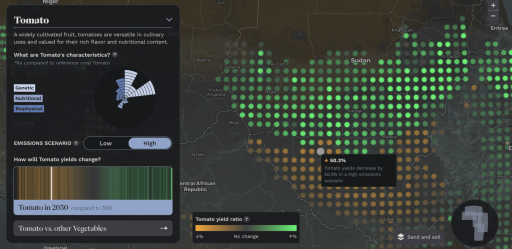
ER: From the visualization, it looks like tomatoes are going to do pretty good as the earth warms. That’s been an interesting thing to see as part of the conversation about climate change. I imagine that, as a scientist, you want to be very careful about saying there will be positive impacts of climate change on human agriculture. But it’s hard to avoid at least the potential for that by looking at these visualizations.
Kevin Karl (KK): We’re very comfortable saying that climate change will provide some benefits to different farming systems on average over time. That’s really what we’re modeling for, these average trends. What we’re not capturing in any detail is the potential catastrophic impacts of extreme events. And so that’s one caveat.
JG: That’s why we’re focusing mainly on the trends of the productivity change. The goal is to advertise to the world that we have some idea about how to make predictions. It’s not about providing a diagnostic.
KK: It’s also to show that some crops are more climate resilient than our current systems. And we want to get that message out. A big purpose here is to look at that contrast and ask, are there crops that researchers and food aid groups have overlooked? We might have crops with better outlooks than crops that have historically been distributed. It’s usually the crops that indigenous communities historically used and ate that do best.
ER: You’re looking at places where these crops already grow to figure out if they’ll do better or worse there?
Cameron Kruse (CK): Exactly. In the past, we’ve gone to communities and said, “You should eat this crop.” We’re going to give you these crops and these foods to eat with it, with little cultural reference or cultural consideration.
ER: That’s been the historic criticism of food distribution. From America to Africa, there’s a sort of colonialist lens. It says “we know better than you what you should eat, and so we’ll give that to you.” And then, of course, we show up with genetically modified crops. That whole scenario of Westerners coming in, or maybe the global Northerners coming in and trying to dictate to Indigenous Africans what foods they should be eating: “Here we’re going to help you with this. And we’re going to make it impossible for you to farm in traditional ways because the seeds are so cheap.” It sounds like this is a part of that effort. Or at least there’s a sensibility change among the people that are involved in this. They want to start spending more time thinking about what people do. They want to figure out how to help them better.
CK: Yes, what Kevin, Jose, and the AgMIP team have done is to ask, where do people really use these crops? It takes a bit of humility, especially from the scientists to think about where these crops are going to be consumed. It’s taking a step back from the idea of pushing what we think is the best food around.
KK: I’ll say it’s more than just humility. It’s us being in rooms with Africans. If we show them on a map that a crop is grown in the wrong place, we’ll hear about it right away. At the end of the day, Africans lead the initiative, which is the main goal.
An Aspirational Roadmap for a More Robust Agricultural System
ER: Could we talk about tef for a minute? I’m looking at it on the map. It’s kind of astounding. It’s not widely distributed, but it seems to do super well.
KK: Yeah, tef is a unique story. Ethiopia protects the genetic resources for tef, restricting them significantly. Recently, there’s been international interest in tef, which has caused its price to increase. As a result, many Ethiopians have been unable to afford this indigenous staple crop. None of the crops in the list are quite like tef, but there are many good reasons for Ethiopia’s restrictions on its genetic resources.
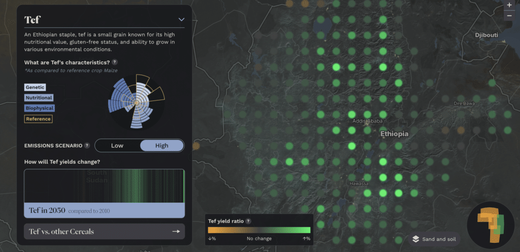
ER: There’s more tef grown in South Africa than in Ethiopia from this model. Is tef going to be more suitable in the places where it’s grown in South Africa than in lots of other places?
KK: We made a group decision to focus on the percentage change in yield. It has pros and cons. If you look at finger millet, you would see in some locations a 1200% or 400% increase. We focus on the percentage change because the models are good at trends, like yields going up or down. They’re good at simulating yields but not great at projecting exact yields. With a multi-model approach, we’d have a little bit more certainty.
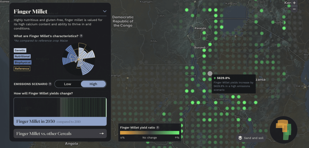
JG: We didn’t have data across all of Africa for tef or all these other crops, so the data was limited. It might only have been calibrated to a specific region. But when we account for the climate and seasonal changes, we should be able to model those trends.
ER: You make your map with the data that you have, not the data that you’d like to have.
CK: This program isn’t designed to precisely measure yield outputs from these areas. Instead, it’s about identifying our best strategies moving forward and determining how we can support citizens in those regions. Other nations will help support efforts to make better crop models and agricultural systems. That’s the purpose of VACS, right? To support a more food-secure continent. This might mean that, in the future, yields will look different than they do today.
ER: Beautiful. It’s an aspirational roadmap. If we’re going to invest this effort, these are the places where it will have the greatest impact.
CK: And it touches on so many different domains, too. Genetic research is one area. How much work has been done on corn genetic research compared to other crops? Tef is another very interesting story; there are so many domains of investment we could pursue. It’s not just about getting these foods to different areas; it’s about researching how to create more robust agricultural systems for these crops.
ER: Can we talk about how this map is going to help with that? Let’s get into some specifics, like tef, for example. We started to learn about the socio-political relationship between indigenous foods and price. Is there another good story that comes out of this map?
KK: From a biophysical perspective, we can examine a broad range of cereals and people in different geographic contexts, using this tool to say, “Oh, this crop potentially performs well in a high-emission scenario in the future.” This can help guide decision-making processes regarding where to invest in preliminary research on specific crops in regions where we haven’t necessarily been investing before. You can see the winners and losers in different geographic areas, characterizing the crops. Then people can start to make plans for increasing investments in crops that show high climate resilience potential.
We also have them on the map in the sidebar, with various nutritional and genetic indicators. So you can see, for instance, how their composition for iron and calcium or other key micronutrients for human health compares to the main staple of that food group. I’m looking now at tef, which is much higher in calcium, iron, zinc, and protein, for example. You’ll find that many indigenous crops have a higher nutrient content than some of the other staple crops historically more invested in. So, we want to try to bring in a more holistic approach to ensure we’re not losing track of these key elements of human nutrition beyond calories. Hopefully, helping decision-makers take that sort of holistic approach in their thinking is useful.
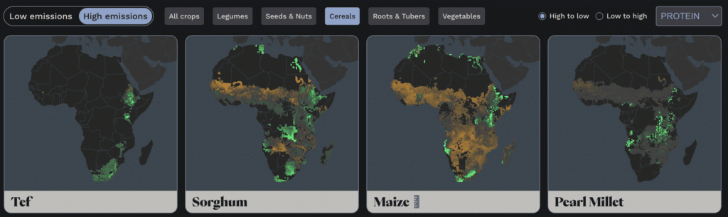
ER: I’m kind of blown away. I can look at high- to low-protein cereals as a holistic slice of this. And then immediately go in and see the places where that is going to impact. It’s not like I’m digging through a scientific journal with lots of barriers in front of me. I’m actually able to view the data in an intuitive way, and I could imagine being a policy person, a scientist, or somebody who just wants that kind of communicative tool and uses it for storytelling.
KK: It’s the team’s vision—putting together really compelling ways to approach the journey of discovering all this work that we’ve done—that’s awesome. Kudos to all those folks for putting that together.
ER: It speaks to what can happen when you get scientists and designers together. It’s one of the great joys for me — working with a team that is really open to these kinds of ideas.
CK: It’s incredibly important to get designers and scientists together. That’s one of my soapboxes. I also want to emphasize how bold AgMIP has been in taking us in as a partner, Stamen and Earth Genome. What AgMIP has been given the time to do is basically a back-of-the-napkin sketch of this really aspirational, ambitious idea. And… The data that they produce thus far is terrific, but at the same time, it is still just like a back-of-the-napkin sketch—this is our best guess of where things land. Allowing us to move forward with that and create some visuals on top of that has been really huge and is a very important part of the process.
ER: It’s an example of a brave group being willing to put their data out there before it’s 100% done and using it as a way to generate additional value for that program. If we can do that at Stamen with our partners, if we can help with that, and everybody’s willing to put their best foot forward and to do their best, that seems like the right way to approach the challenges we have barreling down on us.
I’m so grateful to be in this conversation with you. I think the work is some of the best we’ve ever done. That doesn’t happen without really excellent data and really excellent partners. So I’m really just psyched to be involved with you.
KK: And likewise, thank you again so much for jumping in on short notice and everything you’ve done. It’s really been a great collaboration.
______
At its core, the VACS Explorer does more than display data. It visualizes the impacts of climate change on different crops across Africa, highlighting areas of potential growth and concern. It also tells a story of context, culture, and the future of food security—and the power of merging science with design.
Interested to learn more about what collaborating with Stamen might look like for your company? Get in touch!