
Making data visual is an incredible tool for communication, but finding the right way to do so is something we are always interested in refining here at Stamen. In our latest episode of Pollinate, Denise Lu digs into what it means to distill complexity for the news cycle, and in this conversation between Stamen’s Nicolette Hayes and Catherine Madden, we discuss some of the parallels we’ve found with producing client work.
Transcript:
Nicolette Hayes (NH): I’m Nicolette Hayes, design director at Stamen, and I am here in conversation with Catherine Madden who is a longtime friend and collaborator of Stamen. And we’re here to talk about the big question that came to mind when we were listening to a recent episode of Stamen’s podcast, which was with Denise Lu on data storytelling and the question that we have both asked ourselves repeatedly: “Is anyone clicking?” We do all of this data exploration and we work all of this interaction into it. And the question has always been and will continue to be who sees that, and what does it mean to them?
Catherine Madden (CM): Yeah. I think knowing that we were going to have this follow-up conversation when listening to the podcast, I had this like, oh, we need to talk about hiding things behind a click because you and I have this shared experience on a project we worked with the Gates Foundation on and they actually were able to answer that question. The first year we worked on it, we spent, I don’t know, weeks developing a really elegant click-through story, and then another few days going back and forth about how to integrate it with an already very long read. That was such a tricky decision because we knew it’s probably not going to get a lot of engagement if we fold it up into some sort of accordion or dropdown. But ultimately, we made that call. And then when we were thinking about how to design the next year’s report, we got some really helpful analytics. I think they said maybe 3% or fewer readers actually clicked on it, and then even fewer than that clicked all the way through the clickable story. Intuitively, we already had a sense that would be the case and then we just confirmed it.
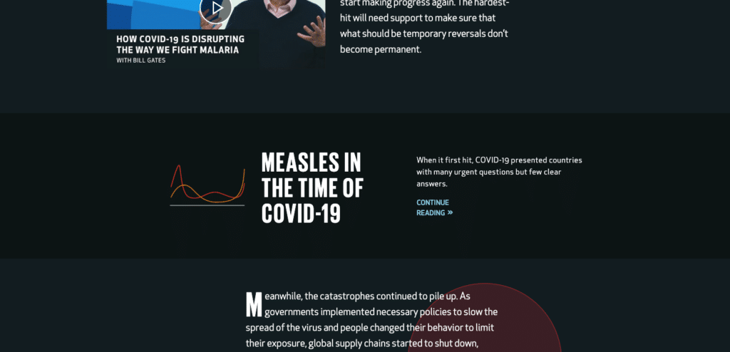
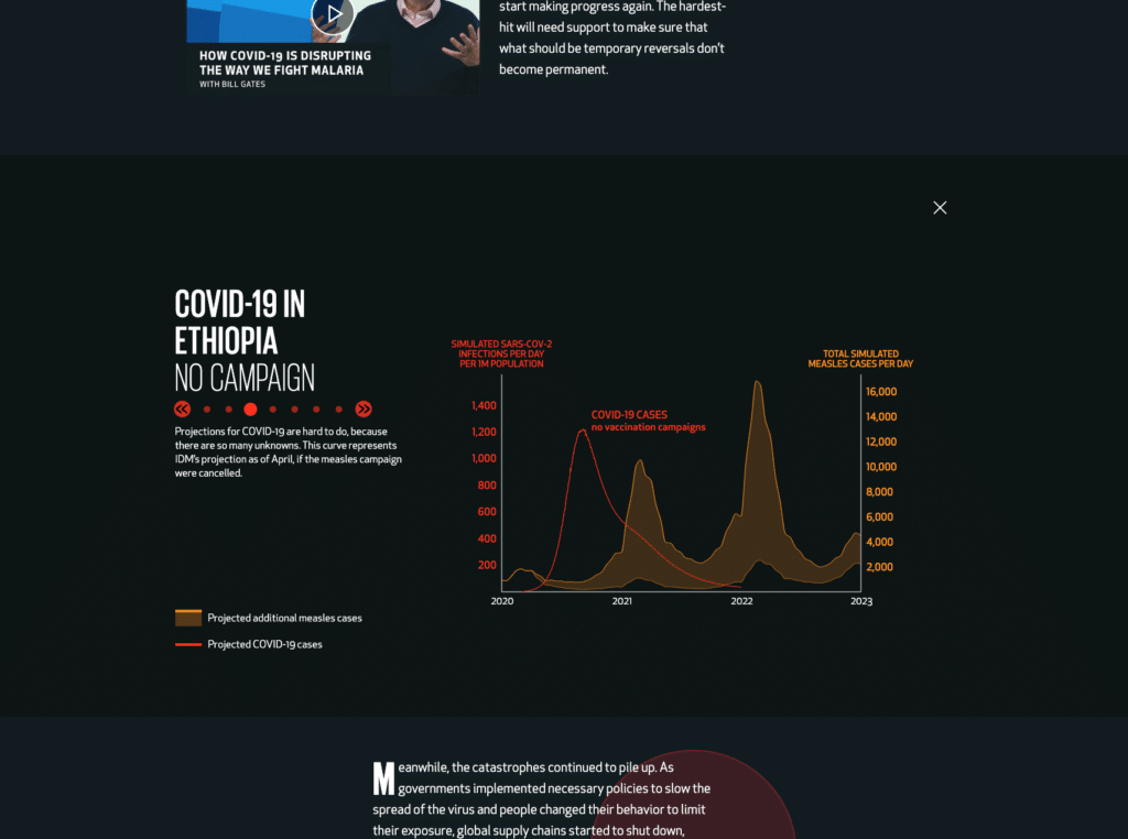
NH: Yeah. I think that that was the worst part: I knew as we were building out that experience—I think there were six steps to the story but there was six really important moments to highlight in the story! I knew it was maybe a lot—but the fact that nobody even made it to the first step, that was the one that really just got me.
CM: What really comes to mind for me is this question of how well do you know your audience? And who really is the audience? And also another thing that came to mind was this continuum that we were introduced to through Carissa Carter’s podcast episode, but we’ve also, I think, both encountered it and presented it to our clients in our own nuanced ways. But on one side of the continuum, you have explore and then the other side you have explain. Now that I’m actually verbalizing this, I think asking a user to click or inviting them to is an invitation to explore. But what we were actually doing was more linear. It was just like you have to click through to make it change. And now I’m like, should we ever ask anyone to do that again? But I think, again, it comes down to what is the purpose, what is the audience?
NH: That clarity of purpose is something that is really important to identify right off the bat because it’s true, specifically at Stamen we have opportunities to do data storytelling—that pure, engaging and really clear explainer format, which is, I think, the most similar to what Denise also experiences working in a newsroom. And for Gates Foundation, that’s definitely what they needed. They needed to be able to put the information out there, have it be immediately understandable and run from there. But again, that continuum, we also have these opportunities at Stamen to really sit someone down with a long attention span sometimes and give them all the data in a way that they’ve never had access to it before. So really, it’s not just that we want to teach you something, it’s you know something, we want to provide that next level for to you to learn even more at your own pace. Should have an example though. What’s a good example of that? The only one that keeps coming to mind is your example, from, I can’t remember the name of your old firm.
CM: Graphicacy. Oh, yes. Yeah. That was a great one. Another data visualization specialty design studio based out of DC was founded by Nathaniel Pearlman, and he would make these massive wall graphics that you had to print on a plotter, and he would sell them. And I listened to him talk about it one day, and inevitably, there’s that person in the audience that’s like, “Not a question, more of a comment,” and you just brace yourself for criticism. And I think they were like, “This stuff is really complex.” And Nathaniel’s response was, “Yeah, well, I value the appetite of this audience that I’m designing this for. I respect their intellect and their curiosity even though it’s a static visual. I want them to spend time with it and go back to it and see something different, come up with a question and then realize you can answer that question within the visualization.” And it was a really cool aha moment because I think my career, up to that point, had been in the realm of knowing the audience has a very limited amount of time. Their attention is spread thin. You have to do something quick and attention-grabbing and simplify it and then offer them additional material if they ask for it. In this case, it was more like an art piece that could be really engaging, and it valued the audience as someone who cared to spend time with it.
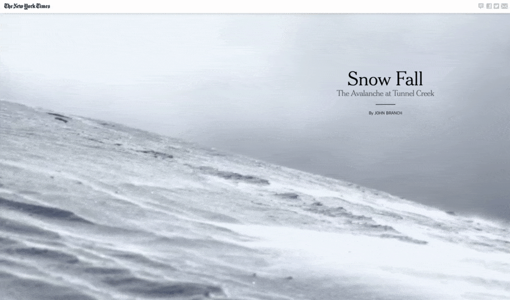
NH: I think you said two things that are key there. One is having respect for your audience, you know that what you have to share is interesting, and you know that there’s an audience for it, just then making a little bit of a leap to say that people are going to be able to meet you where you’re at. But the other side of that, is you have to give them something that’s fun to do it with. Even if it’s an Explorer or even if it’s something where the person has to do a little bit of work, you just have to make sure it’s the right work. And that’s where, I think, when I picture somebody losing themself in a poster, that feels to me like a good ask, whereas maybe looking at a dashboard that is unclear what you should click on next or where the information is hidden or any of those things, that’s the wrong challenge. If the material is challenging and the layers of the story are challenging, it’s your job as the designer to make the access to it be as simple as possible. So then, okay, maybe we’re back to no clicks, maybe that’s where Snow Fall really did sort of just knock it out of the park with a scrollytell.
CM: Yeah. I was thinking, as you were talking about that, about how Denise was saying, “Yeah, sort of the default now is just to scroll.” And what that feels like to me is just like a person sitting down and paging through a book. They’re used to this mechanical, linear process from one point to another, but there’s also nonlinear forms that you would want to invite people in. One example I’m thinking about for an Explorer piece is the work that Stamen just did for the Exploratorium, exploring what grows where in the state of California and all these different plants and inviting people in to take their own path through a really rich and visually interesting dataset and giving them total agency for what questions come up for them, but making sure that you’re like, “If you’re wondering what grows where in this specific region and you want to see a picture of it?” there’s such intuitive placement of everything that people know where to click. Or I guess in that case, they’re just touching with their grubby little fingers, right?
NH: Yeah. Touch targets, the new clicking. But yeah, of course, we made an Explorer for the Exploratorium. They don’t call it the Explainatorium.
CM: Yeah, I don’t want to go somewhere and be explained to all day.
NH: No, no. Well…?
CM: It always depends. That’s the hard part. That’s where I think another thing we talked about is just there isn’t a one size fits all process. You might think you know the audience and know exactly what you want to build, and then receive feedback or information that leads you in a different direction.
NH: Well, actually, that reminds me, again. It’s something that Denise talked about, which is the nature of constraint and deadlines, and how that sometimes becomes one of the things that shapes how far along you can get in a process. And what was really impressive about hearing her talk about that aspect—she wasn’t saying that you compromise the actual work, you compromise how tidy maybe it was to put it together. You find shortcuts that you can use in terms of taking screenshots, that kind of thing. But it’s so easy to imagine that what you’re compromising is how deep you can go in making the experience be good because I mean, that’s what I’ve seen over and over again is it just takes time to get things to that dead simple state. That’s the big job. Making something complicated, that takes a second. Making something simple that takes maybe a lifetime. So props to her.
That’s the big job. Making something complicated, that takes a second. Making something simple that takes maybe a lifetime.
NH: Which actually, it does make me think of that other moment in the Goalkeepers Report where we were trying really hard to sell seeing the data in a radar chart because we thought that that would be a really great new form to put this already well-visualized data into because it gave you all of these additional opportunities for comparison. But then in the end, the question wasn’t really do people need to know these points of comparison. It was more, can we do something besides a line chart? And in the end, if you’re really just trying to test out a form for the form’s sake, I think it would have been irresponsible of us to actually run with that in hindsight. The line chart was doing what it needed to do. There’s no reason to reinvent the wheel.
CM: To quote Jeff Goldblum’s character in Jurassic Park, “Just because you could, doesn’t mean we should.” But I think to bring this all home, an important nuance in that whole section of the Goalkeepers Report that has a lot more of exploratory graphics: the radar charts maybe didn’t work out, but then the following year, we were able to integrate a complex and more unfamiliar form of bee swarms in order for people to explore the data. And we were very intentional about the audience on that. It was journalists. We were not designing something that told a story. We wanted to design something that empowered journalists to find a story and then customize a chart that told it. Having the clarity of audience and how we imagine them using it, I think, was instrumental to getting all the buttons in the right place and creating the experience that would enable that.
NH: Well, and we put it in a scrollytell, so. Hit all the levels. First, we’ll explain it, then you explore.
CM: Yeah. And the opposite direction of Carissa’s “explore before you explain,” but—
NH: We did do that first. Yeah.
CM: Exactly. We explored, we explained, and then we allowed others to explore.
NH: Full circle. Yeah, that’s what we do here at Stamen.
CM: Yeah, it really is. It feels so cyclical and yeah, sort of an expansive moment and then a contracting moment where you get really focused and specific, and then you go back out.
NH: All the moments are so much fun, I enjoy sharing them with you. Thank you for having this conversation.
CM: Likewise!