Late last year, Stamen worked with the group WastewaterSCAN to build a new home for the group’s public-facing charts that visualize the data they collect from wastewater treatment plants across the US.
If you’ve been keeping an eye on the latest data regarding COVID-19 and other viruses like RSV, you might have noticed that there has been a shift from using tests from individuals (known as “clinical data”) to something called wastewater surveillance. As more COVID-19 testing happens at home rather than through a lab, reported data from lab tests has become less available and less reliable. But everyone who lives or works within a sewershed contributes waste to the treatment plant that services that area, and pathogens can be detected with a high degree of accuracy through wastewater solids collected at wastewater treatment plants. The CDC’s National Wastewater Surveillance System, which at times has included data from over 1,200 wastewater treatment plants, is a powerful example of using wastewater surveillance to measure COVID-19 rates.
WastewaterSCAN is a partnership of researchers at Stanford and Emory Universities along with industry and philanthropic groups that works with municipal wastewater treatment plants to test for a variety of pathogens–not just COVID-19–at no cost to participating municipalities. The goal of their tool is to make it easier for public health departments to monitor trends and take action when necessary.
The group came to us knowing that they were going to grow in a few ways:
- they were planning to begin testing for more pathogens, and
- they were growing from tens of treatment plants to hundreds of treatment plants.
The group had put together some maps and charts that were working well for a set of plants in the Bay Area, but they knew they would need something more robust going forward that would steer users away from misleading combinations and comparisons so that it was accessible to advanced and novice users alike.
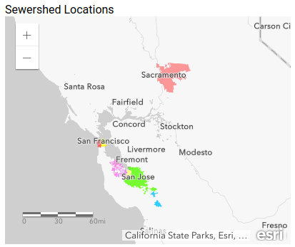
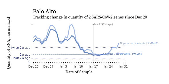
Our initial focus in this work was accuracy. We needed to ensure that we were giving the researchers in the group the right trendline and heatmap charts, and that they accurately represented the data. From here, we addressed an additional need to allow users to customize and export their analyses for outside presentation and reports by adding a number of features that elevate the tool to a chart builder, including: brushing to select a time range, showing the raw data, error bars, and in some cases specifying colors.
As is common in our work, this project offered a large amount of data with substantial facets and visualization methods. A considerable amount of the effort on a project like this involves aggregating multiple methods of visualization while also curating those methods and working with stakeholders to determine which options can be set aside. Once we understood the data and the desired use cases of the tool from our discovery process, we experimented with a variety of approaches in wireframes and prototypes and eventually arrived at the right combination of visual forms for communicating the data.
On the aggregating side of the equation, we combined line charts and heatmaps into a single view we call a chart builder. The line charts help you clearly see trends and compare pathogen levels over time, while the heatmaps best illustrate whether a pathogen was detected or not. Using the chart builder you can pick the type of chart, which locations and pathogens you want to track, the time range to view data within, and a series of other options. As a result, you can visualize this data in numerous ways in a single view whereas previously this functionality was spread across multiple pages and charts requiring the user to hold comparisons in their mind.
But the inevitable downside of providing so many options: the chart builder can get overwhelming! There are so many choices, and some of them are likely to be useful only for more advanced users. What’s more, the possibility of combining any slice of data with any other slice of data could cause usability and accuracy issues, which is why our next step was to wade in with some curation.
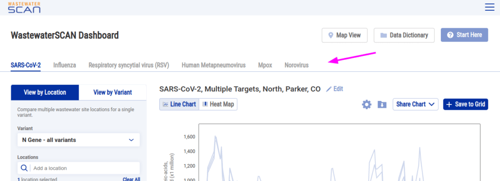
Some combinations of data could potentially be misleading. For example, showing two different pathogens on the same line chart would show you that the quantity of one pathogen is higher than the other pathogen, but that doesn’t tell you which you should be more concerned about since the lower pathogen could be trending upward or the quantity might have different meanings for different pathogens. So on the curation front, we do not offer users the ability to directly compare pathogens in one chart. We also implemented a tabbed pathogen selector to emphasize the differences between the pathogens:
Even with those guardrails in place, using the chart builder with one pathogen you could get into situations where you’re making comparisons that are, let’s say, questionably useful.
If you’re showing data for all COVID-19 variants (currently eight are tracked) on a chart, for example, and want to show all of those variants for three locations simultaneously you would end up with 24 lines on your chart. Distinguishing between that many lines is difficult. While we could have added interactivity cues to help users distinguish between them (such as highlighting all of a location’s lines on hover), this assumes that users will find that interaction (could be a big assumption) and it breaks down pretty quickly if you take a screenshot of the chart, print it, or view it on a phone.
As a result we added another limitation: you can view data for pathogens by location or variant but not both:
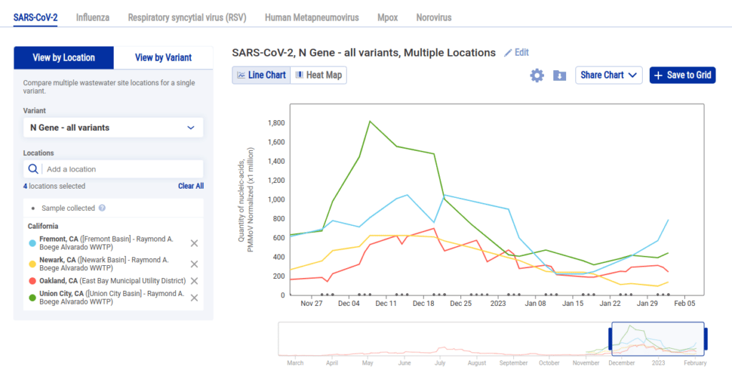
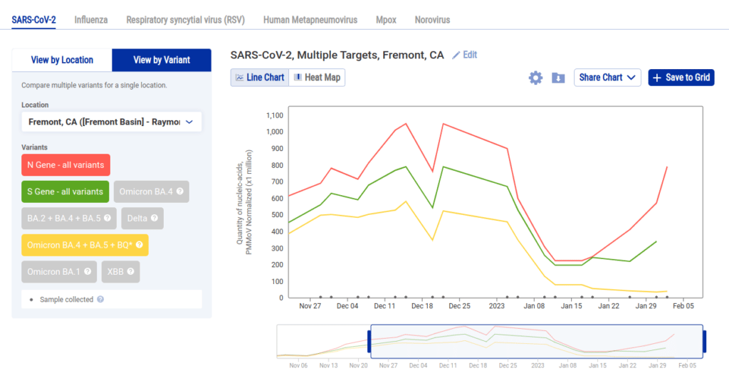
While being limited in this manner might feel like a big drawback, we were able to provide more value by allowing the user to create multiple charts and add them to a grid. So following the above examples, if we wanted to see each sewershed with data in Alameda County we can select each location and click Save to Grid to create a grid like this one:
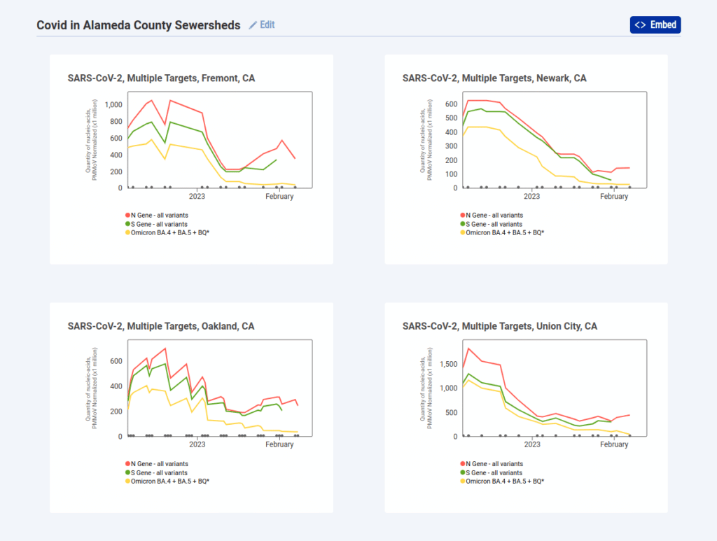
Once you create a grid like this you can embed it on a site or link directly to it like this, and the URL stays updated with your changes to make it easy to copy or bookmark. Overall we’re happy with this compromise and feel that it’s more legible than trying to cram everything into a single chart.
In addition to the chart builder and compare mode, we added a way to find reporting sewersheds near you using a map of locations. We were eager to include this map for two reasons:
- Most people don’t know the name of their wastewater treatment plant so searching for locations by text generally will not be effective.
- It’s an opportunity to educate the general public, who might not be aware of the concept of a “sewershed” (the area that feeds into a wastewater treatment plant), and seeing sewersheds mapped is an intuitive way to learn about them.
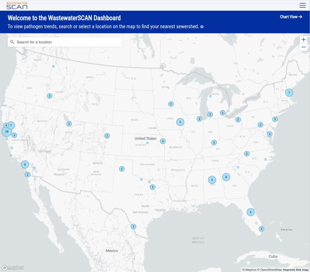
As you zoom in to an area you can see the sewersheds for those plants, where available:
And finally if you select a location on the map you get a quick summary of the status of each pathogen currently reporting at that location:
We’re excited to release this tool and share the work we’ve put into making intuitive visualizations of this data. In future iterations we’re hoping to expand on this, primarily with features that will give users a better understanding of trends and the relative prevalence of variants.
For example, when looking at a line chart of COVID-19 for all of the locations in California we’d like to add a single line that represents the statewide average for COVID-19. We would like to add a few new visualizations that show measured pathogen quantities relative to the overall samples taken. On the map, we are hoping to explore showing trends directly to give users an idea of which pathogens are becoming more or less prevalent in their region and nationally. We’re looking forward to continuing to work with the researchers and stakeholders on the WastewaterSCAN team to augment this tool in ways that are and scientifically correct and intuitive for users.
Check it out for yourself–are there any wastewater treatment plants participating near you? If so, how are trends looking there?
