
Non-governmental organizations (NGOs) collect and generate vast amounts of rich data. Those datasets hold power to help NGOs increase their reach by more clearly communicating their mission, vision, and results to a variety of key audiences, including funders, clients, beneficiaries, academics, the media, the public, and employees.
But as any NGO data scientist or communications director knows all too well, your data is only as compelling as the insights uncovered and the stories told from it.
Often, those stories are best told graphically. You could stare at a numbers report all day and never see what would become quickly apparent when looking at those same numbers in a well-crafted visualization.
Data visualization is critical. And for it to work well, data visualization must be human-centered and easily understandable. Creating compelling data visualizations is a process. The key to success is knowing what it takes to discover and tell great data stories: discovery-driven data visualization prototyping.
What is Data Visualization Prototyping?
Because modern data products are expansive and complex, the visual interface between a dataset and the human beings meant to understand it is critically important. There are compelling reasons to communicate with your data—to increase awareness, raise funds, affect policy, win new clients, or achieve another tangible goal. At the same time, your audience may have varied abilities to decode and understand the complex data being presented to them.
Designing with data prioritizes the storytelling experience and data competency of your audience at every stage of data visualization development. The design process offers its own kind of organizing constraint by serving as a real-world tether for the creative process. To create the best, most meaningful data visualization, you must let the data lead the designer, not the other way around. But in order to uncover a dataset’s most compelling stories, you’ll need to interrogate and iterate the data actively. Data visualization prototypes allow you to do just that.
A data visualization prototype is an experimental model of how your data might be visually rendered. Because it is iterative and malleable, prototyping enables you to examine the form and function of your data visuals from different perspectives before settling on a final form.
Prototyping also allows you to play with the data in the truest sense of the word. Prototyping as a practice and process is a lot like a prism. As you hold your data up to the light of a prototype, you can suddenly see “what could be” in your data and the stories it holds.
Viewed this way, it’s clear why data visualization prototyping is essential. What are additional reasons you would want to adopt this critical step into your data design journey?
5 Reasons to Embrace Data Visualization Prototyping
1. The Journey is Discovery-Driven
Data prototyping is an explorative process of rendering your data in various visuals to find the best path to tell your desired story—or, as is very often the case, uncover new stories to tell.
Prototyping allows you to pick a data visualization path and go down it just far enough to imagine how your audience will experience your data story. You may choose to follow the path further, veer off on a newly discovered fork in the road, or double back. But only by traveling the road of creation can you find your ideal destination.
The prototyping journey allows you to identify things you couldn’t possibly see when you started out. And, you may not always like what you see. Some of it may be confusing, unexpected and/or revealing. But with exploration comes knowledge. The key point is that even if you decide the visualization you have prototyped isn’t effective, you will have learned something about how to treat the data so that you can tell your story in the most compelling way possible. And, should time allow, you can pivot your strategy and head toward the right place.
2. The Process Provides Proof of Concept
Some ideas are better in practice than others. The initial concept you have for your data visualization may inadvertently misrepresent your information or tell a confusing story when it is actually rendered. And that’s something you simply cannot fully discern until putting your idea in action as a prototype.
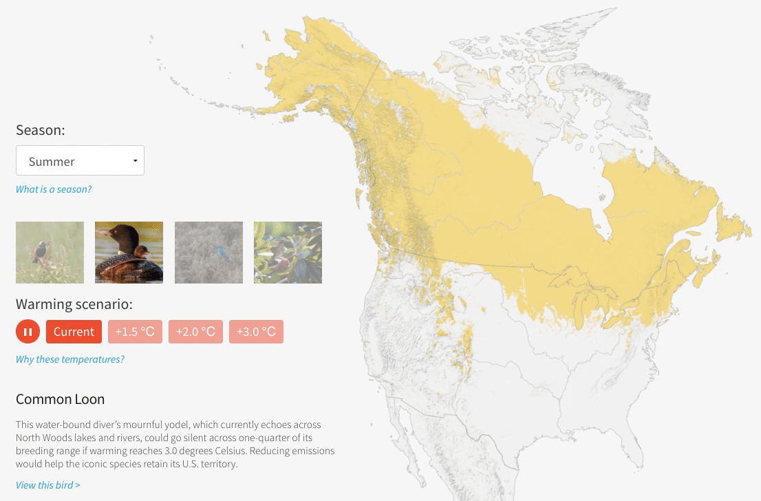
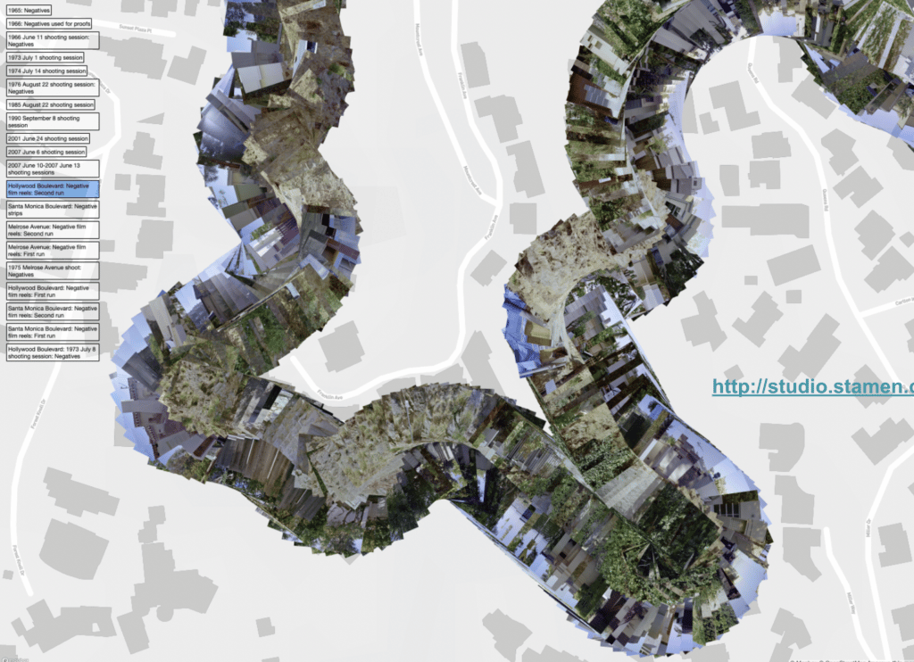
Over the years, Stamen designers have worked with the National Audubon Society on multiple occasions to help them visualize the impact of climate change on the habitats of North American birds. For one particular project, we had the initial idea of using the same map to show the macro story (a.k.a. zoomed out to all of North America) as the micro story (a.k.a. zooming in to your zip code and house). However, once we built the prototype and saw how your standard pannable, zoomable web mercator map projection distorted the northern reaches, we realized that we were inadvertently exaggerating the perceived habitat gains associated with climate change. Rather than accepting this limitation and moving on, we found a way to challenge our own technological assumptions by using different projections for different parts of the user experience in a way that was seamless for the end user.
3. The Merits of Various Designs Are Revealed
In prototyping, you can understand the relative strengths and weaknesses of various visualization types for displaying particular stories.
Consider this analogy: When you paint a room in your home, it’s easy to imagine that you’ll be able to mentally see what a new wall color will look like by simply taping up the tiny paint swatch from the hardware store. In reality, you would be better served by being able to purchase a sample-sized can and cover a large sheet of cardboard in the color, then tape that up on your wall so you can begin to truly get a sense of how the color feels and works with the light in the room, the carpet, the open space. You can’t feel it until you see it.
Just as you can only accurately judge a shade of paint by meaningfully “prototyping” it in your space, you must adequately experiment with the visual effect of various data graphics before assessing the value of one visualization type versus another. A data visualization’s merits should be judged based on how easily, efficiently, accurately, and meaningfully users can perceive the story the information is telling us. Experimenting with different data viz designs lets you quickly discover which works well, and which does not.
4. The Gap Between Experts and Amateurs Closes
Data visualization is only as good as its ability to be perceived and understood. If your visualization misses that mark, it’s a wasted investment. As a result, data visualization prototyping is a critical step. Not only does it protect your investment, but it also helps bridge the gaps between the NGO experts collecting the data and those who must consume the stories their data will tell.
Very often the clients that come to Stamen have decades of specialized knowledge in their areas of study. At times that knowledge is very technical and unintuitive to non-experts in the field. When you work with a team of designers to experiment with various data visualization prototypes, you are working with a savvy group of non-experts. We like to say that high-caliber data visualization designers are professional amateurs. Such designers are really good at listening to your complex data problems and not being intimidated by them. You are the subject matter experts, and great designers use data visualization to help you share your expertise in new and powerful ways.
Your design team becomes a proxy for the audience intended to consume your data stories. They naturally put themselves in the position of your intended audience. They know what it’s like to go from knowing nothing about a complex field of study, say, metagenomics, to being able to grasp the most important pieces of the stories your datasets have to tell. When prototyping, NGO subject matter experts and expert designers who are subject matter amateurs meld their experience, finding the right amount of technical depth displayed in consumable graphics to teach and inspire.
Prototyping Focuses on Human-Centered Designs
When you are first considering how to transform your data into visualizations, you put the data in the center of the process. Everything radiates out from the available dataset as you examine what visual forms, interaction models, and data stories can actually be supported by the data product.
Once you move on from the data visualization process and into the prototyping stage, you put the user at the center of the experience. As you interact with the data visualization landscapes you are considering, you discover how it feels to wade through and explore them; how it feels to encounter and engage in the interactions. In doing so, you can continually fine-tune to create and optimize a human-centered design.
Data visualization prototyping is a critical piece of true design thinking. It allows you to capture the promise data visualization has always held—the ability to tell a data-driven, human-focused story. If you really listen to your prototypes, they will tell you the best way to tell that story.
Design-Driven Data Prototyping Is Worth the Time and Effort
Data visualization prototyping is, at its essence, exploration, and exploration has a cost: The cost of doing it versus the cost of not doing it. The impact of discovery-driven data prototyping is often hard to report in a spreadsheet. But the practice is essential to de-risk your investment in data visualization. Consider the value of finding out early that your assumptions were wrong, allowing you the opportunity to appropriately pivot. Or, what is the value of missing an opportunity to compel your audience?
The ability to experiment and explore your data stories with data visualization prototyping has never been more available than it is today. Taking time to discover the stories your data products have to tell—and the best ways to share them—is worth it. What’s more, you will have fun in the process.