
Earlier this year, Stamen collaborated to design a custom branded basemap with our friends at Spherical, a creative technology design and integrative research studio supporting projects regenerating the health and integrity of Earth’s living systems. In partnership with ARLA, Spherical supports community workshop facilitators with their Living Infrastructure Field Kit, a space to explore the potential of a resilient Los Angeles and help communities across L.A. dream into new possibilities for the places they care about.
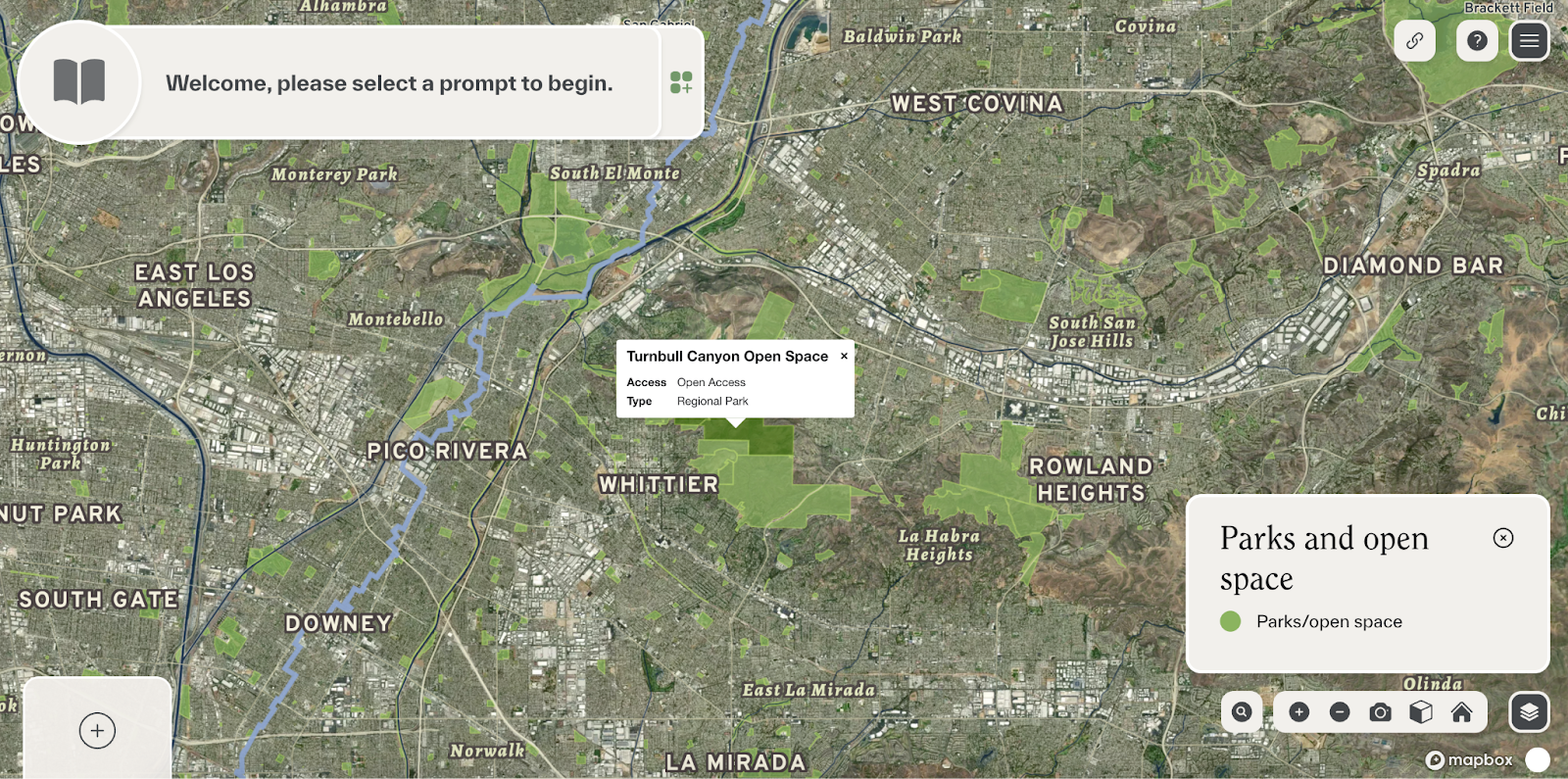
In the field kit, start with the Primer to get a sense of what’s possible when we engage with our environment as living systems. Then, move to the interactive Visioning Tool, where workshop participants can see how environmental stressors impact L.A. and start envisioning collaborative projects to put their ideas into action. You can explore the map on its own or add curated choropleth data layers, such as ozone or asthma per Census tract, to learn something new about your area.
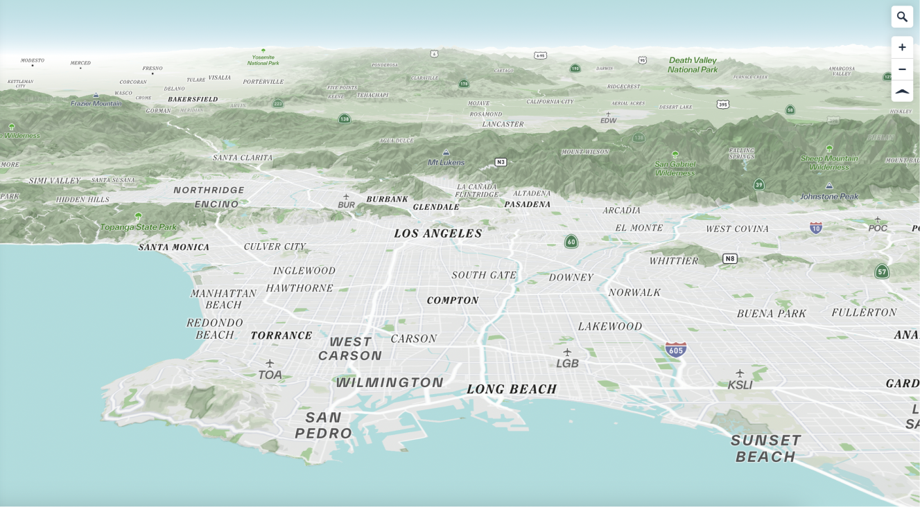
When we started working with Spherical, they had built a custom satellite basemap in-house to use for the tool. The satellite map, built in Mapbox Studio, included custom place label hierarchy to suit Los Angeles, customized with Spherical’s brand fonts. This map also gave a special nod to natural places and features, such as wilderness and recreation areas, with a specific focus on water in the greater L.A. area. Watersheds were front and center on this map, with the ability to hover and highlight a specific watershed of interest.
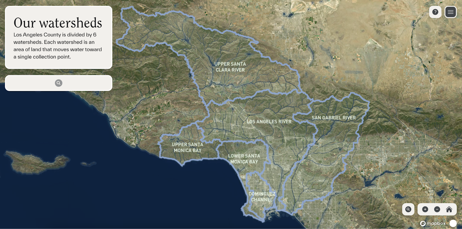
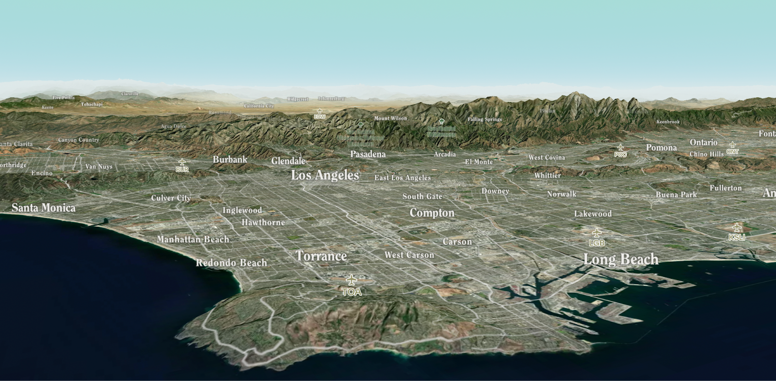
Satellite basemaps certainly serve an important purpose — they provide a familiar, no-nonsense view of the world that most people can understand right away. Some people prefer them to vector basemaps, where real-world features are abstracted into simple geometries and styled individually. When it comes to curating an opinionated experience for end users, vector maps are much more flexible and customizable. Our focus for this project was to develop a vector basemap that captures the essence of L.A. and provide the right context to understand the impact of environmental phenomena on the landscape.
Design philosophy
One major goal of this cartographic redesign was to make the map feel more like part of the overall Living Infrastructure Field Kit platform by integrating Spherical’s brand colors and typography. In vector cartography, you have to make a slew of decisions at a data level: what to include, exclude, and prioritize. For this map, we wanted to emphasize water features, local community points of interest, and landcover, alongside place labels. Most of this data was available already in Mapbox’s Streets tileset, but the landcover detail left something to be desired (more on this later).
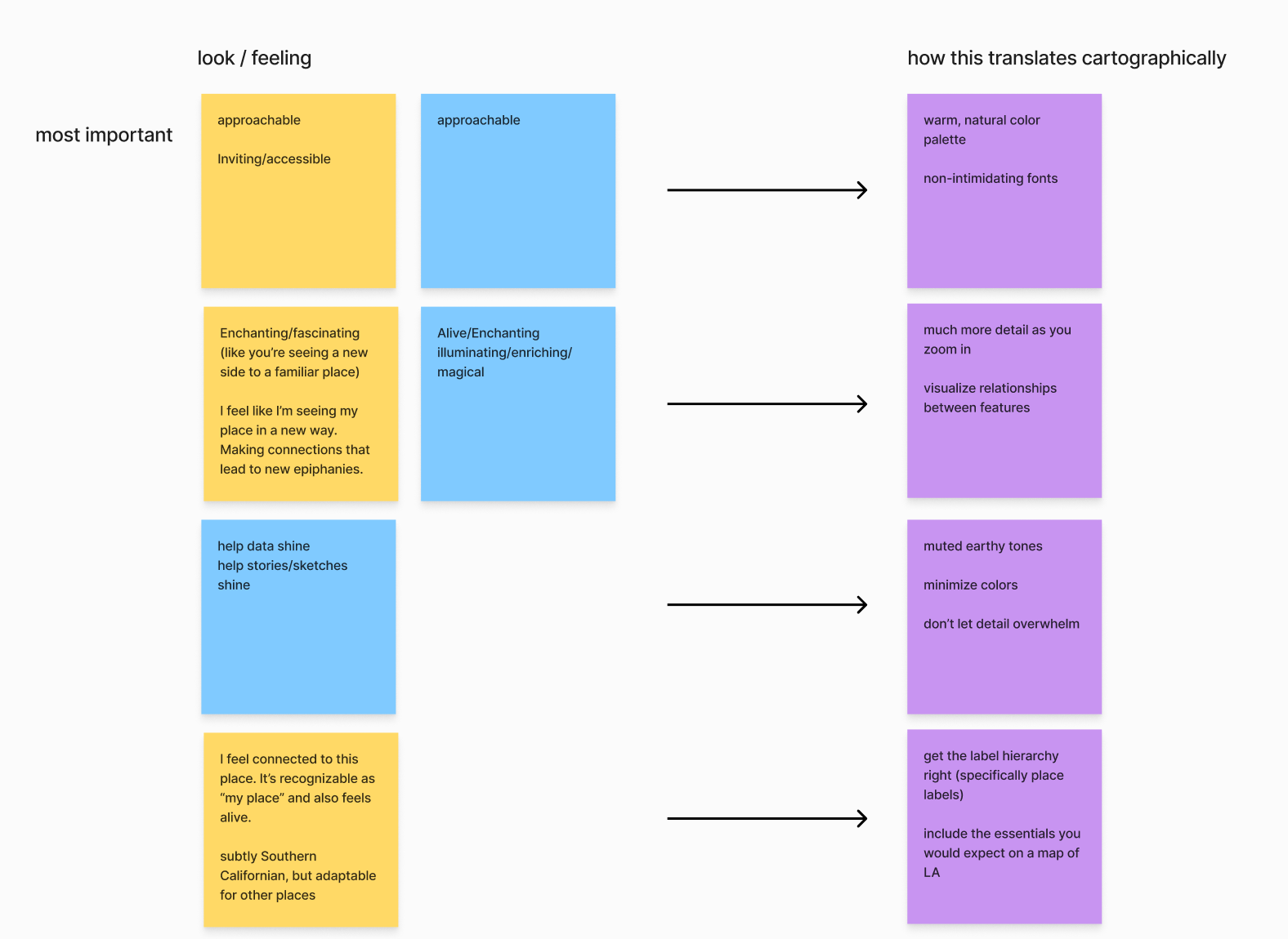
Perhaps as important as the data itself was how we presented it. This map is meant to be aspirational, highlighting possibilities for positive change. Before starting to brand the map, we did a collaborative exercise where the folks at Spherical described to us how this map should look and feel:
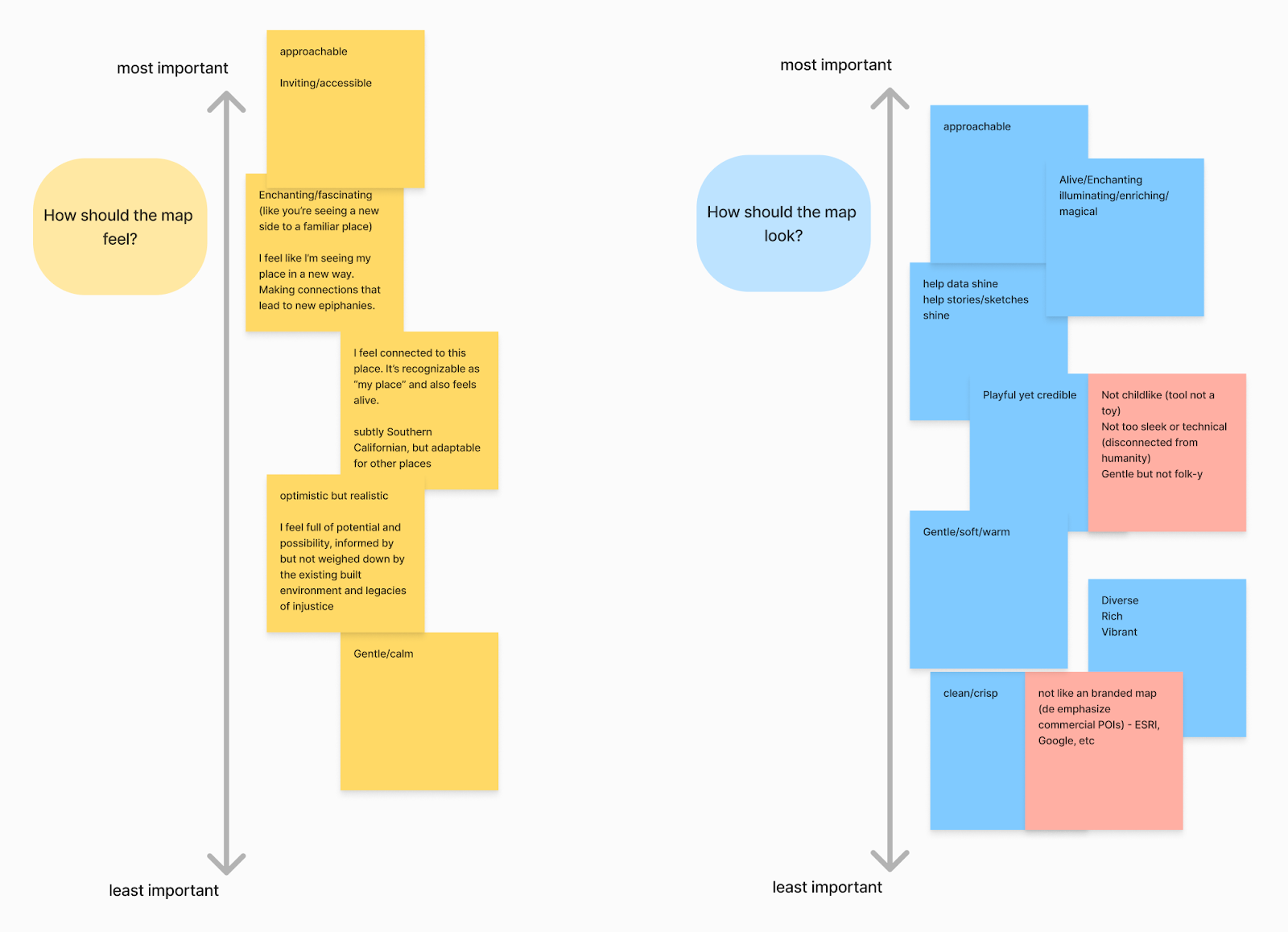
Then, we translated that look and feel into actionable cartographic tasks. How do we make the map feel “approachable” and “fascinating”? For the former, using non-intimidating typography and sticking to a warm, natural color palette helped us get there. For the latter, we wanted to encourage the user to interact with the map by adjusting how much detail you see when zooming in and out. More examples of how we were translating aspirational vibes to actionable cartography:
Putting that philosophy into practice
The first thing I often think about when designing a new basemap is the color palette. Colors are core to how the map feels and how easy it is for users to interact with the map. Often clients come to Stamen with an existing brand identity that we use as a jumping off point for cartographic design (jumping off point being the key phrase; often brand colors are not the best for maps!). In this case, Spherical has an extensive color, typography, and UI design system that we wanted to reflect in the map to some degree. Most of Spherical’s core colors are derived from plants found in the L.A. region — an excellent inspiration for a map that is meant to feel natural and familiar.
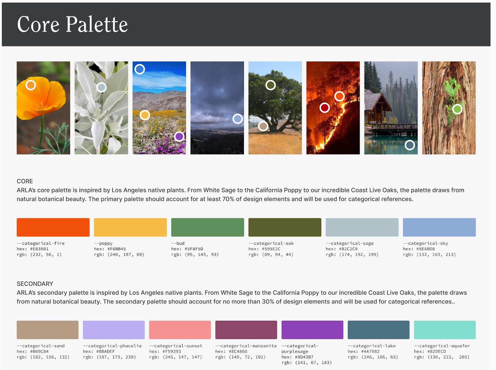
But a natural core color palette means that whatever data layered on top of the basemap will also use these colors to some degree. Given this conflict, we opted to use the core colors as inspiration for the basemap and put them to use more literally for data layers.
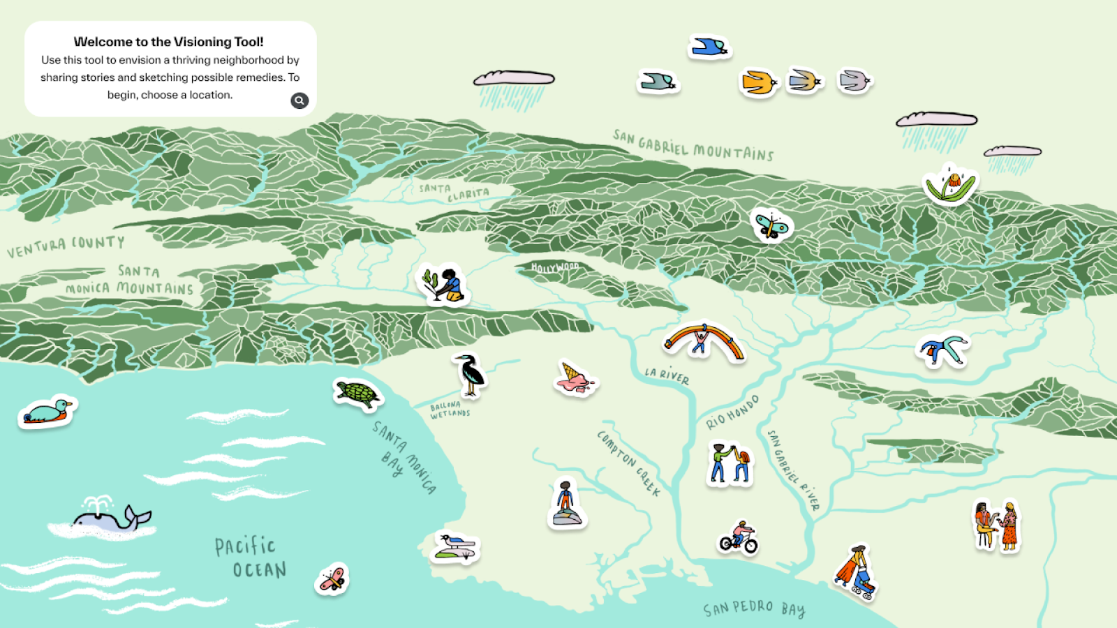
Spherical shared this illustrated oblique profile of L.A. with us, and it was clear right away that it should serve as inspiration for the map redesign. (Sidebar: The Visioning Tool makes use of illustrated stickers to supplement data on the basemap, which we love.)
To start, we sampled some of the colors in this illustration for the basemap and whipped together a first version of the color palette:
…which was feeling a bit dull. We brightened and resaturated the colors quite a bit for the second version:
This was a solid start, but the color palette still felt too dull and lifeless for the aspirational point of view this map is meant to have. We wanted to depict L.A. as lush, vibrant, and warm, which meant this palette needed some work.
In contrast to the dull color palette, the typography was feeling too strong for the dreamy vibe we were targeting. The combination of bolded fonts and uppercase was dominating the visual hierarchy in a way that we found distracting and unapproachable. Softening the typography by adjusting the case and weight made a huge difference (here, in combination with an updated color palette):
It’s easiest to see how dramatic of a transformation these tweaks had side-by-side:
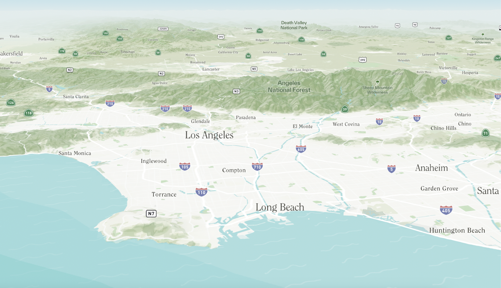
This updated version achieves the dreamy, enchanting effect we were going for. Now, L.A. feels like a canvas ready for a new vision or project.

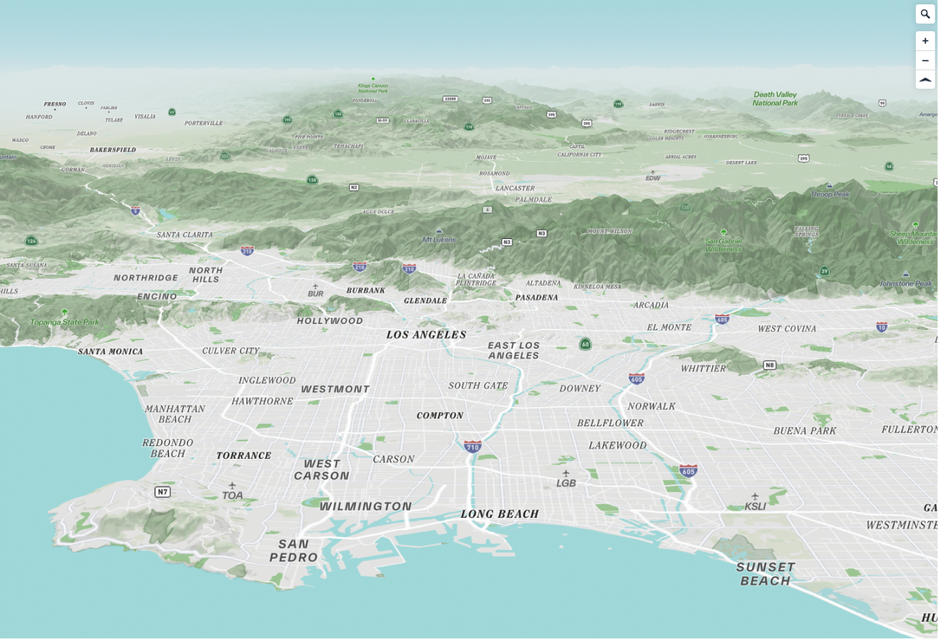
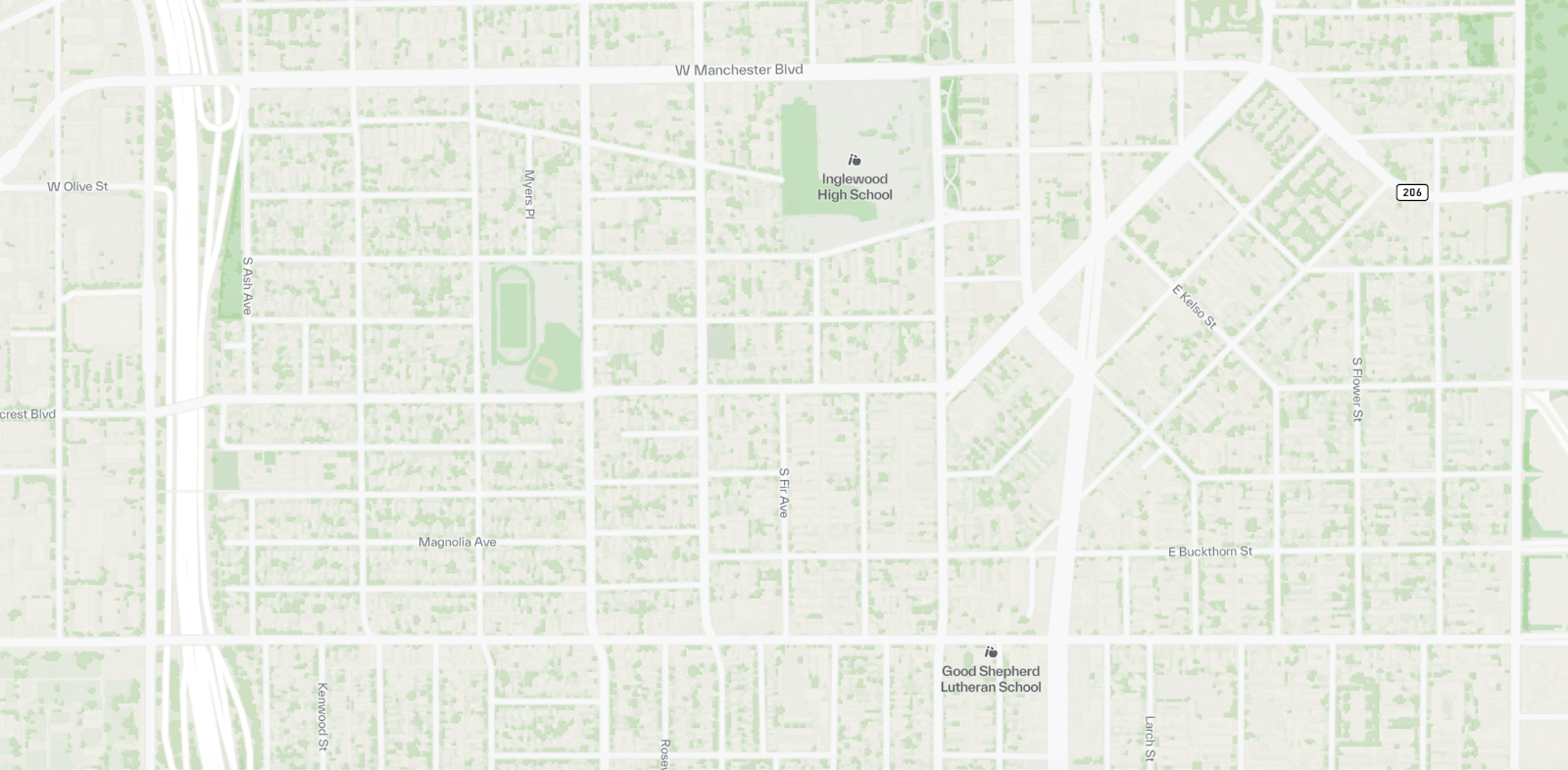
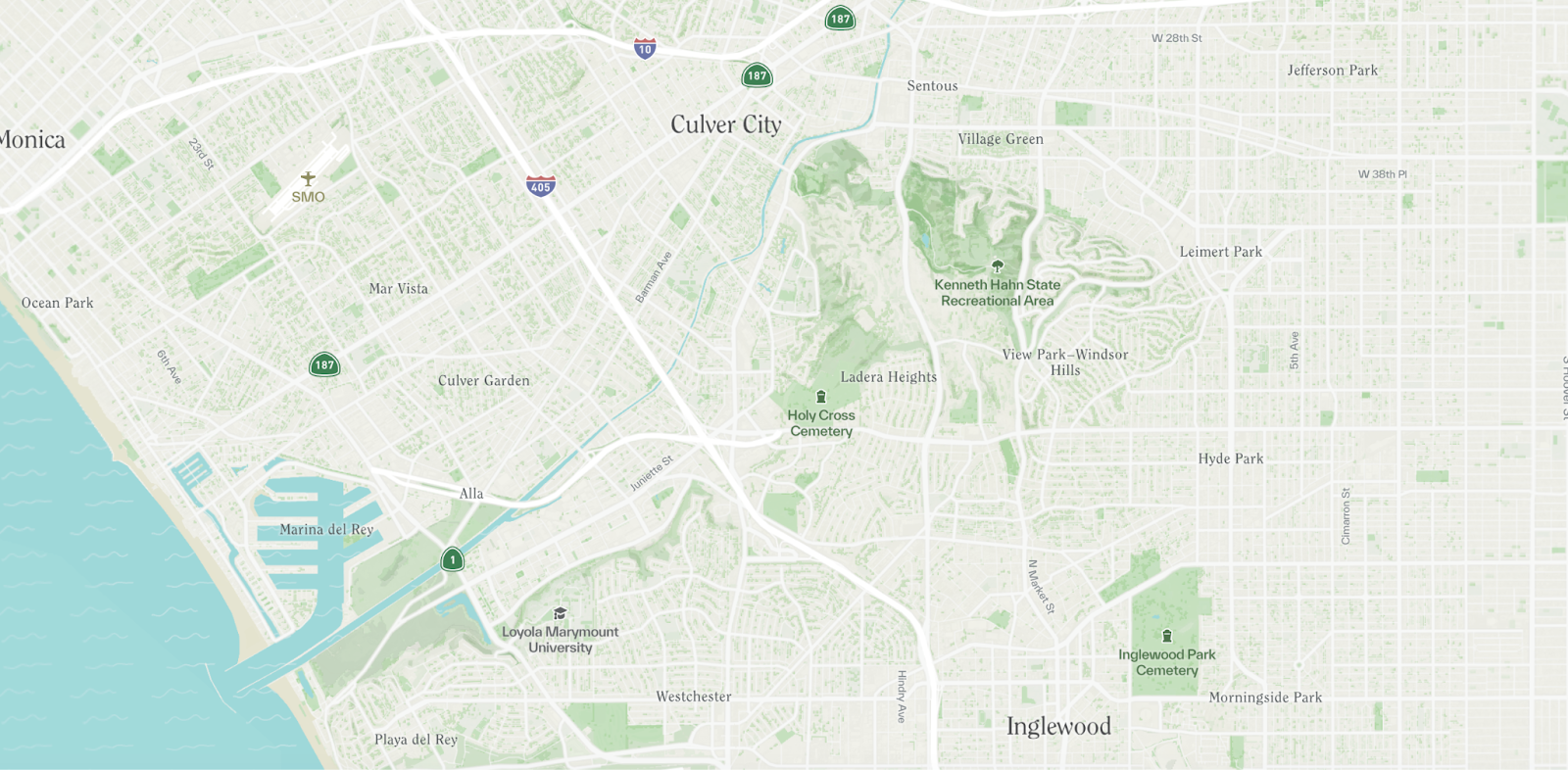
Now that the visual balance of the map has really improved, our focus shifts to providing sufficient context on the map. In general, we deemphasized most roads in the visual hierarchy, with the exception of major motorways. As we know, L.A. is a very car-first city, so the motorways provide some very useful delineations within the city.
Similarly, the terrain is very important in L.A. in general, but even more so for watersheds as one of the main topics workshop participants focus on. Using Mapbox’s 3D terrain feature, we could easily customize how exaggerated the mountains look as you zoom in and out of the map:
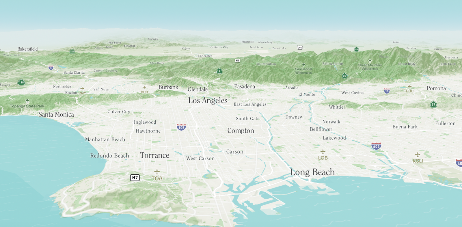
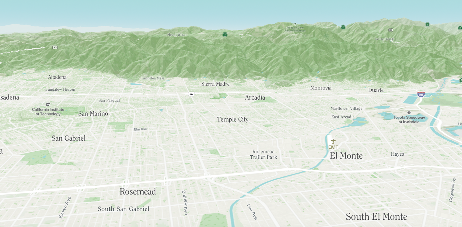
At a more local scale, it was important that the points of interest on the map are tailored to our audience and use case. Focusing on community-centric points of interest, such as schools, religious gathering places, and public facilities, was essential to provide the right context to start visualizing community projects.
Finally, one of the most interesting aspects of this map is its texture. It was important to the team that, despite its interactivity, the map should not feel digital. Softening hard geometric lines with patterns (here, in the water) and adding a raster hillshade helped the map feel more tactile.
The landcover data — custom-created by Spherical — adds a tremendous amount of detail to the landscape without overwhelming the eye. You can easily get a sense of the tree canopy, for example, in different parts of Los Angeles that would be otherwise hard to visualize on a vector map.
Postscript
We Stamens have thoroughly enjoyed working with our friends at Spherical to design, develop, and integrate this basemap in the Living Infrastructure Field Kit. We look forward to seeing what collaborative community projects originate from this fantastic tool.
Also — it’s worth noting that there are a couple of threads related to this work not covered in this blog post! Stamen + Spherical collaborated on a wholesale redesign of data layers (think choropleths and point features), as well as a parallel satellite-based version of this vector basemap. An early version of the latter:
More on the data layers and other technical challenges of this work will follow in additional blog posts.
In need of some branded cartography of your own?
Let us know! Custom cartography is Stamen’s bread and butter – we would love to work with you.