If you had the opportunity to visit the Stamen studio during our twenty-year reign at the corner of 16th and Mission you’ve probably noticed how integral collaboration is to the fabric of our business. Project teams huddled in a meeting room, whiteboard sketches happening in another, spontaneous hallway conversations, or our daily meals together around the lunch table. For years these interactions shaped the way we collaborated with each other but—as we pass year three of working fully remote—we’ve had to find new ways to work together.
In this short conversation between Stamen cartographic designer Kelsey Taylor and designer Alec Burch we discuss how one tool in particular has changed the way we collaborate across all of our teams at Stamen.
Audio:
Transcript:
Kelsey Taylor (KT): On the latest episode of Pollinate, Stamen’s own Ross Thorn interviewed cartographer Mamata Akella about Felt and collaborative cartography. This got us thinking about collaborative design and specifically about Figma, the primary tool that we use here at Stamen. I’m Kelsey Taylor, I’m a cartographer and designer here at Stamen.
Alec Burch (AB): And I’m Alec Burch, I’m a designer and sometimes cartographer here at Stamen. Since transitioning to a fully remote company, we’ve had to rethink how we collaborate with one another, and Figma has played a large role in that.
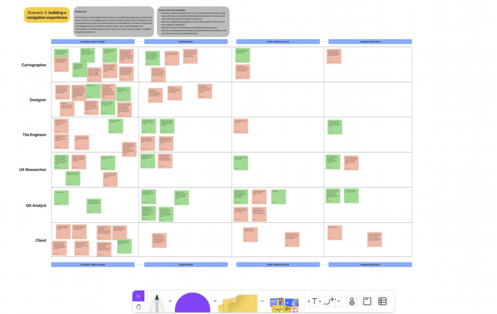
KT: There are kind of two sides to Figma: there’s Figma, the design software, and FigJam, which is more of a whiteboarding software. And we really use both, though FigJam kind of comes first. So we’ll do some brainstorming for a specific project to think about how we might solve the problem that the client brings to us, do some exercises with the client, so they have access to the whole whiteboard and can add ideas of their own. And then sometimes we’ll use it to estimate work and figure out what’s feasible to do for a given client on an engagement.


AB: Once a project kicks off, we primarily use Figma for the design process, but it’s nice to have FigJam there to jump back in and reference those earlier materials. The first part of the design process is typically sketching out all your ideas, just getting all the ideas out “on paper.”
KT: Yeah, it’s good for us to try lots of options in Figma just to get out all of the ideas and see what works or what doesn’t before we go into more sophisticated prototyping.
AB: Once we have the key screens figured out in the wireframing stage, we can use Figma’s built-in prototyping tools to stitch those together to create user flows, and because Figma is built on collaboration, it’s really easy to share these with clients to get feedback.
KT: It’s also nice that our clients can get a little peek behind the curtain and see the “Stamen Magic” at work when a project is in progress.
AB: And even after a project wraps, we like to use Figma to document the work. Showing the natural progression that the designs took over time, we can even include client feedback that we received at specific points during the project. And it’s nice just to package everything up at the end of the project and hand this off to the client.
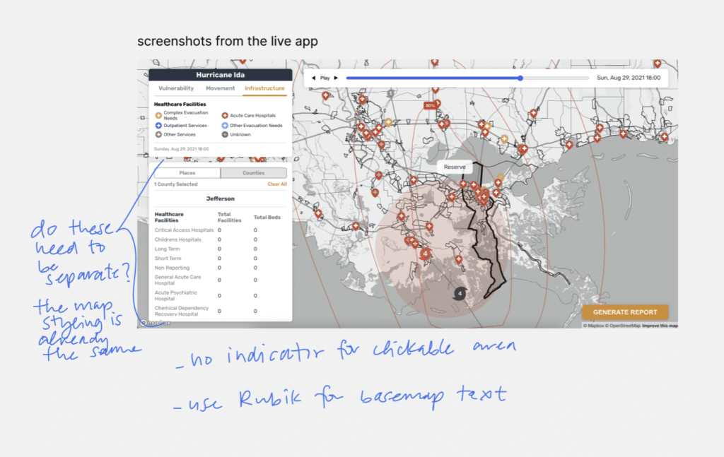
KT: Mamata said something in the podcast about sending each other a bunch of screenshots and that really resonates with me. I think being able to have them all in Figma together in one place so we’re all looking at the same thing and have the same frame of reference is really helpful and that’s one of my favorite features about Figma.
KT: Another bonus of using Figma is all of the tooling that’s built into it or that you can add on as a plugin or a widget. For example, a contrast checker we might use to check that typography that we’re using in our designs has the right amount of contrast to the background, so it’s accessible and legible for all of the end users.
AB: Figma also offers built-in libraries. Typically, these are used to manage design systems, but there’s no reason we can’t use these for cartographic design as well, and a big part of that is as we know, managing colors and font libraries. This especially comes in handy whenever you’re creating new map styles and spinning it off of an existing one. For instance, you have a light map, and that’s already documented, but you want to create a dark map style. Having all those colors and fonts already in Figma and organized, it makes that process a lot easier.
KT: And if Figma doesn’t have tools that we need already built-in, we can create them ourselves and reuse them across projects. For example, we have a tool called Figmasset that we created, where you can design map icons in Figma and iterate on them as you’re making other changes to the map, and then export them into a spritesheet and load them into your map via GitHub. That makes our work a lot easier and is kind of the glue that connects the design and the implementation process that we were missing before.
KT: As you can see, at Stamen, collaborative thinking is the name of the game. We hope we’ve illustrated innovative ways to use Figma as a collaborative tool.
