
Collaborative tools for work and everyday life are more important now than ever before. Cartographer Mamata Akella brings “mapmaking thinking” to Felt, a fresh mapping platform that allows people to create maps together in real-time. With a portfolio of projects ranging from The National Park Service to Esri, Mamata has been a force in shaping the current state of digital mapping through brilliant design and innovative tooling. In this episode, we’ll discuss the past, present, and future of collaborative cartography and how Mamata is helping Felt to push boundaries in web mapping for professional and casual mapmakers alike.

Mamata grew up in Livermore, CA (which she staunchly defends as a part of the Bay area) where her parents emigrated to from India in the 1970s. Not a stereotypical geography kid, Mamata found her way to GIS as a non-traditional student at University of California – Santa Barbara, but it was the cartographic process that enraptured her. She credits notable cartographers like her professor Dr. Sara Fabrikant and her TA Kirk Goldsberry for seeing her potential to become a great cartographer. She went on to get her master’s degree at Penn State University and eventually a decorated career designing maps on the forefront of web cartography for companies like Esri, The National Park Service, and CARTO, where she worked on some incredible maps like this one that uses petal plots to depict tiger population in India. More recently, Mamata helped Stamen launch the global basemap for Facebook. She now works as the Cartographic System Designer at Felt, bringing her expertise and passion for cartography to the next generation of cartographers!

But what is Felt? To better understand this new way of mapping, we first need to look outside of cartography.
Apps like Google Docs and Figma have revolutionized the way we interact with others on the web. They have set a precedent for synchronized teamwork, allowing people to work on projects simultaneously and easily share them with anyone with an internet connection. The field of cartography, however, hadn’t quite caught up to support such workflows in digital mapping. That is, until Felt appeared on the scene in the middle of last year. Felt markets itself as “the best way to work with maps on the internet,” empowering users to work on web maps and geospatial data in a collaborative, intuitive, and (most importantly) fun way!
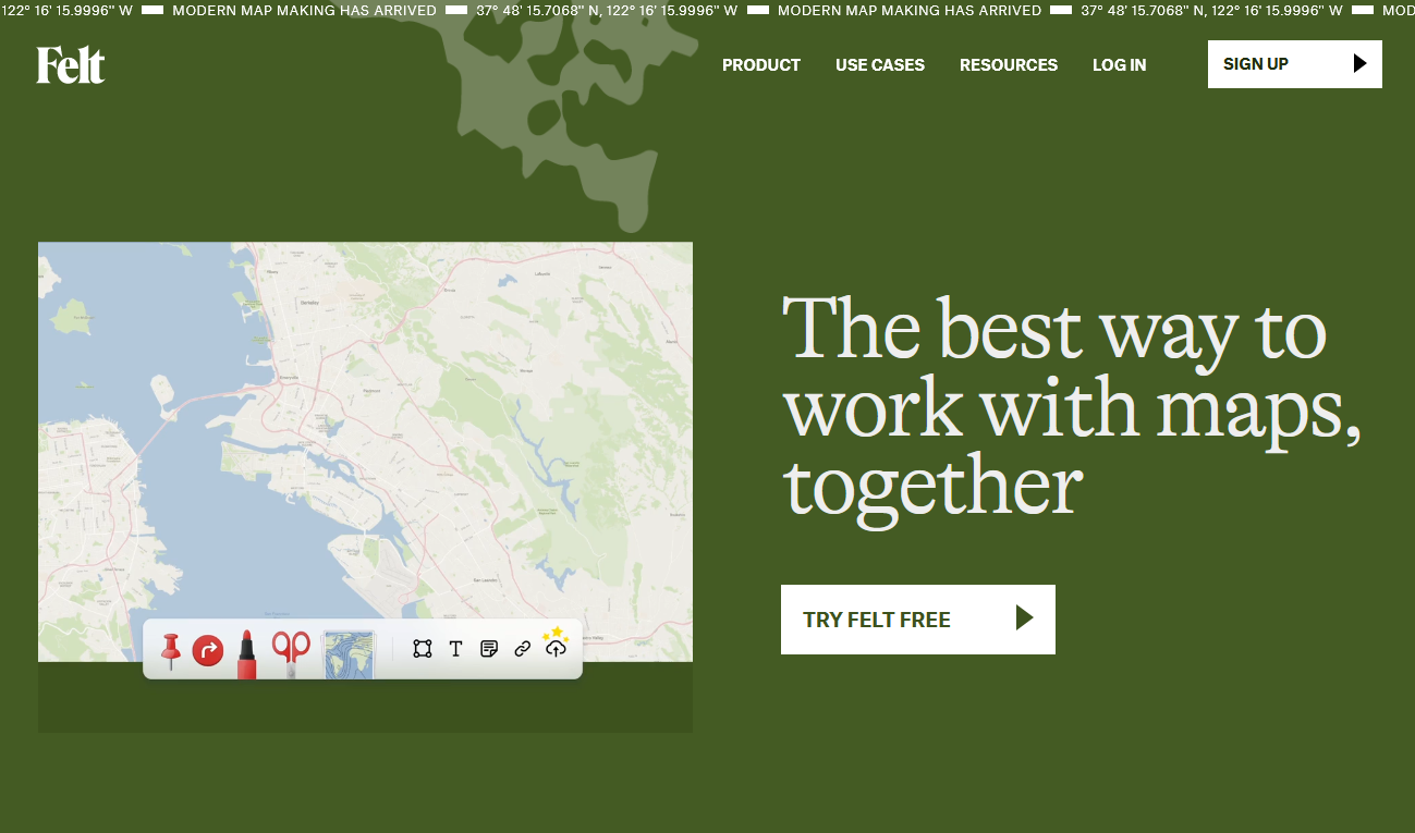
Felt is intended to serve everybody, regardless of their needs or background in mapping. With the (literal) world at your fingertips, there are endless possibilities for what maps you can make. Mamata was excited to share a few of her favorites, like this map showing The Most Popular Christmas Songs in Each State or this one of a cherry blossom survey in Berkeley!


While Felt has revamped how people can work together on maps, collaboration in cartography isn’t a new concept. Mamata was gracious enough to entertain an activity of placing mapping tools on a chart (drawn in Felt, I might add) on how collaborative the software is and if it serves an expert or non-expert audience. Her evaluation is below, but you can add your own to the map and place them wherever you want!

Felt just launched out of beta with its 1.0 release with loads of new features to serve Teams working on maps together! Visit felt.com to start making your own maps and sharing them with the world! They have a great tutorial and a gallery of maps to inspire you!
Transcript — +
[music]
You’re listening to Pollinate, a podcast on data, design, and the people that bring them to life. Brought to you by Stamen Design.
Ross Thorn (RT): Responding to the questions that cartographers are asked the most. Creating mapping tools for both experts and non-experts. And looking outside of cartography for inspiration and collaboration. These are a few of the things that come up in today’s episode. I’m Ross Thorn, a cartographer at Stamen. I had the pleasure of sitting down with a personal cartographic hero of mine to learn more about their prolific career in designing maps for the web, and to discuss the exciting strides that are being made in collaborative cartography. Please welcome my guest.
Mamata Akella (MA): My name is Mamata Akella, and I do cartography at Felt.
RT: Thank you for joining us on the podcast, Mamata. I appreciate you taking the time. And I’ve been wanting to talk about collaborative mapping. And I think Felt is a great, great example of that and we’ll get into some of that a little bit more too. But I don’t know if you just want to start with talking about yourself and talking about a little bit of your background, where you grew up, and maybe some of the early inspirations in your life that led you to cartography and led you to where you are right now.
MA: Yeah. So I was born and raised in Livermore, California. And my mom and dad immigrated to the US in 1967. So I’m first generation Indian American. And my dad, he’s a retired now geophysicist at Lawrence Livermore National Lab. So that’s kind of why we ended up in Livermore. I have two older sisters. And, yeah, we all grew up in the Bay Area. Although some people say Livermore is not the Bay Area, but it is. It’s the easternmost city of the East Bay. And it’s known for its wineries, the lab, and there’s a really famous flavor rodeo and also lots of cowboys and ranches and things. So it’s a very eclectic city that I grew up in. Yeah.
RT: Oh, wow. I never knew this.
MA: Yeah. So I feel like when I think about who I am, mostly what comes in this context, obviously, is that I’m a cartographer. In terms of early inspirations for cartography, I don’t have the traditional story of, “I’ve loved maps forever.”
RT: I can relate, yeah.
MA: My dad would always whenever we go anywhere have the road Atlas out, not like I was helping him read it. And I still get lost myself, which is always a funny joke to people. I was a non-traditional student too. So I think I was 26 when I finished my undergrad. So being a little bit older and already having experienced some college life, took some time off. And my sister told me about something called GIS. And she worked at Conservation International at the time. So it must have been like 2004, let’s say. She told me there’s this emerging technology with remote sensing and GIS because they were monitoring cloud forests in South America. And she’s like, “And there’s this whole mapping component to it, and it’s really interesting.” And so I had to do some just basic credit work. So I went to Santa Barbara City College and did that. And then I got into the geography department at UC Santa Barbara. And that was kind of when everything changed for me just in terms of, wow, okay, I found something I really like to do. And it wasn’t GIS. It was cartography. So I had a great cartography professor Sara Fabrikant and a cartography TA Kirk Goldsberry. And I could sit there and make a map for hours. And they saw a lot of potential in me and how much I was becoming better in getting good at something that I hadn’t really done much of. And so yeah, that’s kind of how I started with cartography. And the moment I kind of found out that I loved making maps, I just wanted to keep doing it.
RT: Yeah. Were you already in college when your sister recommended GIS?
MA: It was in between a year of figuring out what I wanted to do after having had this previous experience and so it was at that time when I was exploring different fields and understanding that she had mentioned this whole world to me that I didn’t even know existed.
RT: Yeah. It’s a funny thing too because most people don’t know it exists. And most people don’t know it’s a job. And I feel like this is common enough of a problem in our industry that I should probably ask cartographers, “How do you explain what you do?” And then when you receive the question of, “That’s a real thing?” or, “Haven’t all the maps been made?” what do you say?
MA: Well, I think that I’ve changed a little bit what I say depending on the person. But now I feel a better way to describe what I do, well it has been for a while, is that I build map making thinking into products so everyone can make maps. And it’s kind of like making maps from the inside out. But I get that quite a bit. And then when you try to explain the web and it’s a map, everybody automatically thinks Google Maps or something. And I always say, “Yeah, but also The New York Times and The Washington Post. And yeah, when you go on your Facebook page, all of these things– there’s all of these different kinds of maps, so. And then that kind of helps bridge this thematic cartography part of it that you can’t really describe to people maps driven by data that is an actual story that’s currently happening or not just showing what exists in the physical environment around you but also telling the stories of what’s happening around you. I think that when I give somebody just a general overview, I’m like, “I’m a cartographer.” And they’re like, “What’s that?” And I’m like, “I design maps.” “Oh, wow.” And then they mentioned some map that they know well, and I’m like, “Yeah.”
RT: There’s a whole script to it that plays out every single time.
MA: Yes. Do you do that too?
RT: Yeah. I’ve started saying just ridiculous things like, “Oh. Haven’t you heard Pangaea is getting back together? We need to keep mapping it. Continental drift happens every day.” But yeah, maybe we can wrap up your education and then segue way to your professional work.
MA: Yeah. So I did my master’s at Penn State and kind of continued my cartographic love and inspiration with Cindy Brewer who is also amazing. And I did one semester of research with her on multiscale mapping for the USGS. And at that time it wasn’t for the web, so.
RT: What do you mean multiscale mapping?
MA: So they basically wanted to see what they could do with their 1 to 24,000. And they have I feel a couple of other scales of data. So we’re talking about 2006, 7-ish. So it was mostly like they were still thinking in the print map contexts but also wanted to better understand how far can we take this one to 24,000 data before we need to transition into 1 to 5000 K data. Also, we worked with Babs Buttenfield out here at CU boulder. And she was doing a lot of thinking through how hydros should get generalized through zoom, and then Charlie Frye, who has done a lot of incredible work at ESRI, and he still works there– he was also exploring this thing. So it was the three of them. And it was a really great project and introduction into kind of what we need to think about for multi-scale mapping. And then I did an internship ESRI between my first and second year of grad school with Charlie’s small team. It was Charlie and Aileen Buckley and [inaudible] Richards. And it was the mapping center team, small R&D team. And then after grad school, I joined the mapping center and was working at– it was ESRI then. Now it is Esri. Yeah, and Esri was just getting into online basemaps and all of that kind of stuff. So being on this R&D team was Charlie, that’s really what the bulk of my initial work was, is understanding how to use the ArcGIS ecosystem to build multi-scale basemaps, cartographic data modeling for multi-scale mapping, and really demonstrating how to use this tool that had traditionally been for GIS and print mapping and that kind of stuff– how it was evolving for the web and a lot of use cases and making new basemaps. And we started something called the Community Maps Program where cities could bring in their own data into a larger online base map. And so, well, I did the first versions of all of that large-scale kind of mapping that then got templatized and made into this Community Maps Program. And so it was exciting. It was my first job. I learned a ton. I learned a lot. When I joined the mapping center teams, there was three of us. And I think by the time I left, there was like over 20–
RT: Oh my gosh.
MA: –because we just started working on so many different areas of web mapping at Esri.
RT: I love that because I want to come back to this. So maybe I’m just making a mental note for myself here– is your start of joining this team and working on this mapping platform in a collaboration. But then also, one of the projects was fostering collaboration between cities and governments, bringing their own data and funneling it through you. And I kind of want to just bookmark that, I guess. But yeah. So after Esri then–?
MA: So I worked at Esri for about three and a half years, and then I moved out to Colorado after I saw, interviewed, and was offered this job at the National Park Service working on this team called NPMap. And Nate Irwin had this vision for an easy-to-use mapping tool that could be used by both nontechnical and technical users inside of the National Park Service to tell stories about all of the national parks, and for it to be a web-based tool that they could embed maps on their CMS and all of this kind of stuff, and based on all open-source tools and technology. So it was this really grand idea inside of the federal government and a federal agency, which is very different. Not to ruin the ending of the story, but we accomplished it, and we did something really amazing. So when I first joined there, my task was to build the first National Park Service online base map. So you can imagine. So now we’re, I don’t know, 2012-ish. Again, Nate had this vision for an open-source tool set. And the National Park Service, so many people use ArcGIS, but this was something different. This was more like Harpers Ferry Center. This was more of the interpretive side of the Park Service versus the management of units and buildings and that kind of stuff.
RT: Almost like the romantic presentation of the parks in all their glory, and you wanted to evoke that with the cartography.
MA: Yeah. Yeah, exactly. So that’s when and Carto DB had first come out and so the first version of the National Park Service based on Park Tiles, I built it with Mapbox Studio. And it was a really big achievement. And then over the years, we were using Carto DB to show real-time road closures in Blue Ridge Parkway. And the park was going nuts like, “Oh my gosh, we can just go in and update and say, ‘This is closed,’ and it’s just going to show up on our map. And we can embed it in our website.” So that kind of stuff really caught on with Yellowstone and camping and any closures, a lot of things. And then we also partnered with a lot of different groups within the park service, like the air quality monitoring people telling some of the historic stories of national parks. We also worked on mobile apps for this Centennial of the National Park Service. They had this initiative where they wanted to make apps that were more accessible for people that had different disabilities.
MA: And so I got to work with Tom Patterson, who was still at the park service at that time doing the photography. So from a photographic perspective, that was a really amazing experience for me. And working with Tom, I’m like, “The web is so different, Tom. I want to try and do all of these effects that you’re doing on your maps.” And there’s very characteristic things about National Park Service maps that are the brand of them. As much as possible, I carries that over to the web. And I even went to Harpers Ferry Center for like a week and worked in Tom’s office with him and just reviewing this map because the graphic identity of the National Park Service is such a curated, beautiful brand. When you see a National Park Service brochure sign or anything, you’re like–
RT: Yeah, and you want to do that justice. You might also say that the web is sort of like a disconnected medium anyways. And so it’s like even more of a challenge to try to evoke the same sort of mystique of holding a paper map that’s beautifully designed. You want to do the same thing on web.
MA: Yeah. And also with all base maps, just trying to make one map that can be used in so many different ways, right? Whether it’s to go look around a park, whether it’s to tell an entire story about a park, whether it’s going to just be of one park or all the parks. So we were doing some pretty innovative stuff for that time and also forked the ID editor and made our own version for the National Park Service so people could go in because what we’re seeing is these smaller parts that don’t have the large GIS groups like Yosemite, Yellowstone, when you’re talking about someplace– like Klondike gold rush national historic park, they don’t have a GIS department. And so what we did is developed an internal schema that we knew would drive our base maps, too, and the other kind of data products that we had. And so that became a really big thing for people in the park too, is to go in and start adding data for their parks, which, in turn, made the maps better. And then the kind of container around all of this work was something called NP map builder. And you could go in, add data, style it. And we worked with a design firm in DC to really think through what’s these approachable way for a park ranger to be able to go to this tool. Yeah. So that was National Park Service in a nutshell.
RT: Yeah. And after that, you were with CARTO.
MA: Yeah.
RT: Which is where I first interacted with your work. I believe it was a map of tiger populations.
MA: Yeah.
RT: I was in grad school at a time, and I was working on a project trying to do some multivariate visualization. And a lot of your work was like was seminal too, how we were basing our stuff on there, so.
MA: Oh, that’s cool.
RT: 00:16:05.029 It was that pedal plot visualization. It was just a really cool and unique way to do this. And we were working with pollen data. And so it was kind of– was evocative of that anyways. And so it was a really cool solution that we were piloting for– could this be something we could include in this project we’re working on, so?
MA: Yeah. I feel like I have this three-and-a-half-year thing, but I really don’t. I think it was like four years I was at the park service. And it’s not easy to move on to another job, a lot of times too. But I went on to CartoDB, CARTO which it later became. And I had been doing a lot of base map stuff up until that point. And CARTO was not about base maps. It was about thematic data analysis and visualization. So for us– thematic cartography, which was very different from kind of what I had been doing up until that point. But it was my first dive into really working more closely on a product with engineers across– being a cartographer at a company and working with engineering, working with design, working with marketing, working with clients, and all of that kind of stuff and just having so much fun making crazy maps– the pedal plots. It’s just like using CartoCSS not to design base maps, but for thematic cartography, and then working on figuring out, okay, here are all of the patterns that we need to build into the product. I got to really think through what’s thematic cartography on the web, what is the relationship between the base map and the data on top of the story you’re trying to tell. And then you get this powerful dynamic tool like CARTO that’s using PostGIS in the cloud, and you can do all of this stuff combined with CartoCSS. Oh, my gosh. And what are all the things that we can do? So going back to, what I say now, when people ask me what I do, really building all of that thinking into the tool and workflows. So also in a nutshell, CARTO.
RT: After CARTO, you did a brief stint with Stamen as well, continuing your base map expertise. What I love seeing when I looked up your work experience here is like ESRI, national parks, CARTO. And you’re collecting all these huge– I don’t know if there’s a base map out there that you haven’t touched. I’m wondering if there’s all of these big names and mapping and all these cool things. And it’s just like, “Oh, yeah. A month away from that. Yep.”
MA: I know. Oh, my gosh. Yeah. I see the CARTO base maps a lot, even the ones at ESRI still. And you have to go good at a national park’s– national park website, see–sometimes I’m like, “Oh, man. Yeah. That’s okay. That’s okay.” I can’t beat myself up now about decisions from–
RT: You’re seeing something that you would maybe go back and change like, “Oh, I would never do that sort of outline in the future anymore.”
MA: Oh, my gosh. Yeah. That too happens at CARTO when– default cartography in a product– it’s not hard. It’s a big responsibility. Because a lot of people just run with that, right? And so you have to feel like, “Okay. We can’t account for every single possibility and map that somebody is going to make. And we can build all of the best practices into this tool that we know.” So it’s like when you see maps coming out, you’re like, oh, fingers crossed, that if somebody didn’t do anything else to it, that it’s going to be kind of okay.
RT: Right. Totally. Yeah. And you mentioned some of the tools that you had worked on before with the NP map and trying to serve technical and non-technical people so that they can both get use out of it and that it’s effective for both populations. And so that is a big responsibility and it is hard. It’s hard to try to come up with one size fits all because usually, that’s not a good solution, but you can do the best you can do.
MA: Yeah. Exactly. Yeah. So I’ve known Stamen for quite some time because when I was on the mapping center team, Stamen was working on a lot of really interesting new web maps like crime spotting or hurricane viewer, designing the Bing maps space map, and all of that kind of stuff. So I had actually met Mike Migurski quite a few times through that interaction and also we kept in touch over the years. After CARTO, when there was opportunity to come do some work at Stamen, I was already like, “Yeah. That’s awesome.” Because the work that Stamen has done all of these years currently has been inspirational to so many people. You know what I mean? And it’s always kind of pushing the envelope and just being in the company of that creative mind space is really cool. So yeah, Ross, and you and I got to work together for a little bit too.
RT: Yeah. And not only on base maps though, too. I also wanted to bring up– yeah. So we worked on the Facebook base map, but I wanted to bring up our work at NACIS together too, the North American Cartographic Information Society where maybe you can best describe how the board itself works and that you kind of went through it.
MA: Yeah. I am the most recent past president of NACIS. [laughter]
RT: That’s a great title.
MA: I finished my four-year term in October at the conference in Minneapolis. Basically, how NACIS works is there’s a board. And on that board, there’s different positions. There’s board members. There’s kind of an executive board. And I started off as VP elect. So my first year was VP elect and during that time is when you plan a practical cartography day and that kind of stuff. When did you do practical cartography date?
RT: It was 2019 and 2020. So I think that’s when you were VP elect, right? It was Tacoma.
MA: Yeah. Oh yeah, Tacoma, yes. Okay, yes, so.
RT: Yeah. It was me, you, and Elaine.
MA: Right. Exactly. Okay, yeah. And then the second year of your term is your conference planning year. So as VP, what you do is, you plan the conference. And of course, you have all the board members and NACIS has so many amazing volunteers. And it’s like the organization has been doing conferences for 42 years because 2020 was 40, so yeah, so I think we just had our 42nd conference. But it’s a lot of work and as a program planner, it’s not just getting the abstracts in and putting a program together. That is a really, really big part of it. But it’s working with the other people on the board and the volunteers to really choreograph a conference, and we’re lucky enough as the organization to have people with tons of experience like Susan Peschel. She’s kind of the rock, the NACIS rock that is behind the scenes making everything work. But my year was the pandemic, I was devastated. We thought I was going to be in Minneapolis, 40th-anniversary conference I had. And then we ended up going online, but it was an amazing conference. Again, because of all of the people volunteers, just because of NACIS. And we pulled something off pretty special online. You were there. And so with that design of that online conference, there was a few things I really wanted to do, was to make it feel like you were at NACIS. Everybody was on their computers already way too much by that time with Zoom, Zoom, and so how can we make this more engaging and participatory? So it’s not just somebody talking at you. And it gave us this really amazing opportunity to finally bring the world to NACIS that we haven’t typically had because it’s North American Cartographic Information Society and it’s hard for people to travel to the US and it’s not super accessible all the time for people. So I think we had 700 or 800 people and we started Slack and that was going nuts everywhere. Also to promote diversity, equity, and inclusion within our society, we worked hard to really bring underrepresented and unheard voices to the foreground more. And an example is just having one session without competing sessions, where you know people that are doing amazing work, people that haven’t traditionally always presented at NACIS every year, just taking a lot of things into consideration and the program design. And also making sure that people have fun.
RT: That was one of the things that I really liked about NASIS was, going there and being with some of the names that you dropped that I’m hearing about in school, like Tom Patterson, Cindy Brewer. And then it’s just like, “Oh, there they are. Hanging up their coat. Coming to the half hour.” And it’s just like, “Yeah. I’ve read your paper. I’ve cited all this stuff in my thesis work.” And it was a really cool experience to sort of just be there and be amongst folks and be encouraged to talk to other people and to sit at a table with new folks too.
MA: Yeah. I tell people that don’t know about NACIS, every map that you’ve ever used, the person that made it is there. [laughter]
RT: 00:25:37.938 Yeah. What a great advertisement.
MA: Any map ever seen or used. And you’re like, “Oh, my gosh. National Geographic, National Park Service, New York Times, any map.”
RT: Apple maps, Google maps.
MA: Exactly. Exactly. Snapchat, Facebook.
RT: Awesome. They’re there. Totally. Amongst these, now you are with Felt, which is now a name mentioned amongst those as a company that’s doing really cool groundbreaking stuff in cartography. We can transition now I think into talking about collaborative cartography in general. But I would love to hear about how did Felt find you or how did you find Felt? And what is Felt? Very briefly because then I think we’ll come back to that.
MA: Okay. Yeah. So I’ve been at Felt for a little over a year and a half and after doing the work at Stamen and with the Facebook maps and that kind of stuff, I got contacted by my now coworker, Rachel Zack, and she’s like, “Hey, Mike Migurski mentioned that you do cartography and that you’ve done base maps, and we’re looking for somebody to help us build our base maps for this company.” And when you went and looked felt.com, I’m like, “What is this?” It was really kind of hidden about what Felt was and because– yeah. Felt was still under development. It was dreamed up, but it was being dreamt up still. You know what I mean? And so I met Sam, my CEO, and Rachel, and they both were explaining what Felt was. Once they gave me a demo, and I think the thing that caught me was when I just saw them pick up a marker and draw a red mark on a map map and I’m like, “Whoa.” Just like–
RT: That is so funny.
MA: –here’s some text. And Felt was nothing like Felt is today at that point. But still even with the demo and the vision that Sam and his co-founder John had. And just seeing even in this very, very rough stage what this tool can do, I was like, “Oh my gosh. This is so cool.” I really like Sam and John and Rachael and Sam’s vision and excitement and his previous experience and everything. So I said, “Yeah, I’ll build your base map for you.” And then I started doing that and it ends up being Protomaps, which I think not many people have used it for building a base map. But there’s a lot more there too. But that’s kind of how I joined. And if I had to describe what Felt is in a brief way, it’s the first user-friendly tool that helps people and teams collaborate on maps in a simple and powerful way. And really what I think too is that it enables a whole new generation of map making so that everyone can create and share maps that matter. And that’s not even talking about all of the ins and outs of what Felt can do but at a broad level. It’s a really, really amazing tool that has not really been around before.
RT: Yeah. I think that’s a great way to describe it and touching– it hints at a lot of the things that I think we will talk about and we’ll get to. And so maybe we can just take a step back and talk about collaboration in cartography and maybe we just date this up until Felt. What did collaboration in cartography look like historically? You can kind of argue almost everything is collaborative. It could be like if I’m doing a paper map for a publication, it goes to an editor and then it comes back with edits on that map. Almost like you said digitally with Felt with the red marker.
MA: Yeah.
RT: The physical red marker, something like that, it’s a collaborative workflow. But it’s not necessarily leaning on technology like we have it today. So I was wondering, maybe what’s your favorite collaborative, cartographic tools before Felt? Or where did you maybe start to get inspired?
MA: So I think that there’s really great examples of modern tools, just to put in context, that were built with collaboration in mind and how they’ve kind of become part of our workflows like Google Docs, Figma, Notion. Those are all new generation collaborative tools, and they’ve really shown us how we can share each other’s workflows and get easy access to them and really collaborate on something together, right? And I think in the mapping world that they’re– traditionally we haven’t really had this, right? And then when you think about things with maps, it’s like sharing data or sharing mapping files. Working on a map together, that’s done over Zoom. And it’s like you’re sharing your screen and I’m sharing my screen. And then I’m like, “Wait, let me take the screen share.” Yeah, exactly what you were saying. As cartographers, too, we are– and anybody who works with maps in an organization or anything. You have to send them out for a review process like you were saying. Or you see some erroneous thing in the data and you’re like, “What is this?” And then what ends up happening is you send a bunch of screenshots back and forth to each other over Slack or email. Or you open up a Google Doc and you just screenshot a bunch of stuff. Yeah, so I think that those are some of the more complicated workflows in mapping and just being able to work on a map together. Or may I be so bold, that the world is something that’s really, really hard. There are tools like, I think, OpenStreetMap is the largest, most successful, collaborative mapping project. But the way that we’re thinking about collaboration on maps and within teams and between people is very different.
RT: I think another thing that you had mentioned before with that Esri soliciting civic data, it’s a collaboration, but it’s still funneled through a professional. It can bottleneck, and in terms of a workload, it has to go through a cartographic professional or a geospatial professional to get on there, as well as who is deeming what’s important to include in this where it’s like, “Is this not exactly what we want?”
MA: Exactly.
RT: It’s not entirely collaborative. It has a little bit of flavor of that, but I think this is a great segue into my next question. You’ve sort of hinted at these as like there are these solutions. There are these collaborative tools, but what are the biggest gaps or what were the biggest gaps that you’ve seen in some of these, and so what could be better in collaborative cartography?
MA: Yeah. That’s a really good question. I mean, you and I can be on the same map if we have an account together on something. And you can go do some stuff and I can go do some stuff to it, but if you and I want to be on that map together–
RT: Yeah, there’s limitations. If we want to do stuff at the same time, or if we have to pass it back and forth, we might have to boot each other out. There’s some things like that. I’m thinking along those lines of the real-time collaboration and looking outside of cartography. You mentioned Figma and Notion and Google Docs. These are not mapping platforms, but we can learn from them in how we think about our own industry and how we think about our tooling. And one thing that, of course, I think you know that I always talk about is video game maps. And I’m thinking of some of these games that I’ve played where there’s multiplayers on a map. And they’re looking at the same map, and they can ping something on the map and be like, “Oh, there’s enemies over here,” and it shows up on everybody’s map. You know what I mean? So these real-time collaborative use cases– I love that you mentioned part of the inspiration for Felt, in general, is looking outside of cartography and being like, “What are other industries doing better than we’re doing, and how do we serve that?”
MA: Yes. 100%. You hit the nail on the head.
RT: I think what I want to do now, and if you’re game for it, I have a little activity for us, built in Felt. So I have made this little graph for us to work on–
MA: Oh, cool.
RT: –actually, for you to– I want to just watch you work on it. We will include this in the blog post as well, to be like, “What are other people’s thoughts?” and that’s the beautiful part of this. So there’s all these mapping tools that I have listed. I basically have this chart, almost like a political compass. And the y-axis is expert to nonexpert, which is something which I love that you mentioned this before, but a technical versus nontechnical, and sometimes you need to try to straddle both. And the x-axis is noncollaborative to collaborative. And I have a bunch of little dots with a bunch of things like Google My Maps. Some of these, I had never heard of, and I’d solicited to other folks at Stamen. So I’ve got links in every one if you need to take a look at them, but there’s Placemark. There’s just Desktop GIS. There’s OpenStreetMap. There’s ArcGIS Online, Felt, Mapme, CARTO, Hoodmaps. I think they fall on here somewhere, so I’d love to see where you place these. And then there’s no correct answer, obviously, especially because they’re all in dimensional. There’s so many ways that we could break these down, but I’ve just chosen these two axis for simplicity purposes, so.
MA: Okay. So I guess I will start with Desktop GIS. So Desktop GIS, I definitely think is expert. I think the collaborative part is hard. Okay. Mapbox Studio, I would also kind of say kind of collaborative. I definitely think it’s expert audience, or just online, maybe it’s a little bit less expert. I don’t know much about the ArcGIS Online collaborative stuff, but I know that you can share your maps. ArcGIS Online, you could have your data, and you can share it, so I guess I’d say it’s more collaborative.
RT: Yeah. I used to work more some Esri products too. And they keep continuing to release this suite of integrated apps for people to work and stuff. So I kind of was a little bit broad with exactly ArcGIS online as a whole, but yeah.
MA: I’d say OpenStreetMap, you have to be an expert in OpenStreetMap. But it’s super collaborative. But then you have people from all backgrounds and everything that are mapping on OpenStreetMap and addicted to it.
RT: Totally, yeah.
MA: Google My Maps, I’d say, is definitely collaborative and more on the non expert audience. Because I know Matthew, my husband, he would send me maps of here were all the bike rides we took on Google MyMaps and I could add the ones and two, right? So I’d say that collaborative. I’d say CARTO is collaborative, just like how there are teams and organizations and sharing data and maps kind of built in there. But I’d say that it’s less expert because it can be used for a broader variety of things. And you don’t have to know ArcGIS online or just desktop terms and terminology or what the heck Base Map is.
RT: Which is yeah, definitely something worth considering itself.
MA: NP map. So I definitely say it’s more towards the non expert audience, but collaboration. I mean, there were teams and organizations in there, too, so. Okay. I feel bad seeing anything’s not anything. But okay. So I think these are the ones that I feel most confident with.
RT: Cool. I’ll bring over the final piece of Felt and I’d love to see where felt sort of lies on this.
MA: Let’s see. So, I guess it also depends on the type of collaboration we’re talking about, but all of the ways that we’ve talked about collaborating on a map, I would have to definitely say that Felt is very collaborative. And that you really don’t have to be an expert. I mean, you have to know how to use the Internet. But to make a map, you don’t have to be an expert in anything else because, again, you can pick up that red marker and draw a mark on a map, and you’ve just made your first map. So, and you can do it with your family. You can invite your entire family and all your cousins. Your immediate family, your aunts, uncles, and cousins all to the same map, and you guys can all draw marks on it together.
RT: Breanna, my partner and I, we are planning another trip to our next location and I was like, “Okay, let’s go and Felt.” And let’s see,” and I didn’t give any guidance. And it was really fun. We kind of both found some things. We Googled some stuff, and then we added it to the map, added our images. And she went through the tutorial to sort of understand how the technology works. And I think that was quite good for just getting your feet wet.
MA: That’s amazing.
RT: But then we were both adding stuff to the map and then I was doing almost GIS mapping little quizzes. I was like, “Hey, you’ve got a place for dinner. I’ve picked a place for dessert. And then we want to go to the beach afterwards. Can we route this or something?”
MA: Yeah. Yeah.
RT: It was a lot of fun. I think we’ll continue using it for our trip.
MA: I love that story. That’s so awesome. Because it also sounds like you got to bring what you do at work all day into a different part of your life, which doesn’t happen very often, right? And then just like from cartographer to cartographer, being able to say, “Oh, I want to paste this link in my map,” and doing control V and then that link showing up as a link on the map. And then being able to geolocate your photos, just drag them on there. My favorite is just being able to put YouTube videos in a map.
RT: Yes.
MA: We had a holiday mapping challenge. And one of our users mapped, what’s the top Christmas song from each state?
RT: 00:39:26.449 oh my gosh!
MA: Yeah. And then he put some of the YouTube videos in. So it’s like, “Oh my gosh, I could look at this map while listening to Mariah Carey who’s saying, ‘All I want for Christmas’ or whatever.”
RT: That’s incredible.
MA: But think about it. Sound on maps and stuff it’s such this crazy thing, but it’s a very different way to think about how we can use maps. Yeah.
RT: Right. And something as simple as an embedded video can just add so much and can be creatively leaned on just like that map and I’d love to talk more about that too. But you’ve placed in our activity, which we will share out in the blog post, you’ve placed Felt in this collaborative/non-expert audience quadrant. You’ve already mentioned this, too, is it’s inspired by that collaborative model of Figma. I would just love to know more what you didn’t say before about Felt when you’re like, “There’s so much more I can say.” What would you like to say? Like, Felt is blank. And maybe there’s a couple of them that really stick out to you as to why this fills in this literal gap here as well.
MA: So I think Felt as a completely new way to make maps on the Internet, for sure. As somebody who’s made so many maps for so many years, and worked on these tools, I worked with these tools, every time I am making a map and Felt, it’s fun. It’s enjoyable. I just have all of these ideas flowing through my head between all of the capabilities, bringing data in this kind of idea of things that sit in the foreground as elements and data that’s in the background as data layers. But being able to pull out from the background to the foreground. So pull out data to the foreground to highlight it to be able to add things like any one of our data library layers and clip shapes out. You don’t even have to go find that curated National Park Service dataset, it’s already in our layer library. And if you guys are going to plan your trip around three national parks, just clip those out and then you could get the trails in there and you can do all that kind of stuff.
RT: When we were planning our trip and cutting things out, I was just like– it just seemed so natural in that workflow. And if it’s your first exposure to maps, you almost don’t realize how novel something like that is. It’s just like, “Here’s something in a base map, clip it, pull it out.” It goes to show how much that makes sense to be able to do something like that when it’s not really served anywhere else.
MA: It’s not. And then I think the really big thing talking about the nontechnical user, too, is like, “Okay, what’s a shapefile? What’s the GeoJSON? What’s a GeoPackage? What’s whatever.” It’s so awesome that you can just make a Google Sheet with some addresses which a lot of us have or ZIP Codes or even census tracts. And from the technical perspective, A, to not have to join that to shapes. But to just be able to drag and drop that into Felt and have it GeoMatch. That takes out half of my life’s struggles when I want to map data. You know what I mean? Like, “Wait, there’s this table. Oh, crap, it doesn’t have anything geospatial about it. Now I got to sit here and figure out other than the country name.” And then for the nontechnical person, you’re saying, “That’s a great point.” They never knew that they couldn’t do that, right? They never knew that you can’t just drag and drop a spreadsheet with ZIP Codes onto a map and that it wouldn’t draw.
RT: Right. It’s kind of like a beautiful thing of like, I feel almost like an old timer in map, and it’s just like, “Well, back in my day, I had to look up Lat Longs by myself.”
MA: Oh my gosh. Dude, totally, I remember exporting to CSV a dataset just to copy all of the city names to then take it to some free geocoder online to then copy all the Lat Longs. And also from the nontechnical perspective, I think what’s super cool is, again, the drawing tools. Being able to– I mean they’re have been drawing tools on maps. So that’s not like we’ve never seen that before. But I think the way that you can use data like we’re talking about with clipping things out, as well as drawing features that you just know instead of trying to find a dataset that maybe has the data that you need to make this map that you really want to make and then being able to create that and if you want, keep it as drawings in your map and use it that way or that you could export that to data. Because it’s not just like the polygon tool and the line tool, right? It’s text, it’s images. It’s all of these different pieces that can become data in different ways. So I’m really excited about bringing more of this kind of magic to the user.
RT: I really can see that it’s sometimes even subversively suits a more expert audience than it even first appears. It looks so easy and it’s like, I don’t have to be an expert, but it’s also, I can export data out of this that I can then take into something that’s a little bit more suited for experts like this complex geospatial analysis. So I can use this as a part of that workflow for being a mapping expert, which I think is a beautiful aspect of it.
MA: And we’ve seen some really cool things. A lot of people that use QGIS, for example, use QGIS and felt like in tandem. So I think you’re right. There’s this nonexpert, let me go in and try and make this map, and it’s been amazing to see the kinds of maps that people make. And then the expert can still find, oh, I just added my data, and now, even on the cartography side like, oh, I can make a chord plus map. I can make a proportional symbol map. I can even go more advanced and use something called style language that’s more intuitive than a lot of the styling grammars we’ve seen out there for designing maps because it’s just a subset of properties that you can go advanced on and do all of this stuff. But yeah, so there’s different levels of Felt.
RT: I’d love to know a little bit more about when Felt was first thought of and kind of in these early stages where you were brought on and looking at it, what was the main goal? Who was some of the target audience? What were some of the target use cases? And then after it was released, what are some of these other favorite weird and unexpected ways that it’s been used that it’s just like kind of blows your mind? And you’ve kind of touched on a little bit of those, but I’d love to know both, what was the target? And then what’s been surprising, and what’s been really cool?
MA: So first of all, the name Felt, Sam, our CEO, this is what he said like, “There’s not a way to just draw on a map.” So Felt is like this felt tip marker concept that you see on a lot of police shows where– or not police shows only. Actually, every show I watch, I’m like, “Oh my gosh, once again, drawing on a map.” And for that experience to be fast and for that experience to be fun, there’s more to that, but I think that those are some of the guiding principles that have kind of stuck: intuitive, fast, fun, collaborative.
RT: I love that. Like I said, the game stuff is big to me, so if you can make mapping fun, I think people are going to enjoy it and going to want to do it more.
MA: Yeah, totally. And so Sam would probably have a better answer for this, but I don’t think necessarily there was an exact target audience because we’re still trying to understand this landscape and making sure that there’s something in Felt for everybody to find and discover and use. And then what are the things that are becoming really sticky? What are patterns in the maps that our users are making? What industries– Rachel, she’s amazing. She did so many customer interviews across so many different industries with people that use maps in so many different ways, not your typical I use every day, but across the gamut. And so I think that’s why we’ve seen such interesting use case like when map that’s popping in my mind that I saw today was like a cherry blossom walk.
RT: Yes, I saw that one too, yeah.
MA: Yeah, it was just making a really pretty map of that, or I think this one thing happened where we saw a lot of views was when somebody went and said, here’s all you need to know about San Francisco, and just like literally use the marker and text. And that took off. All of a sudden, everybody wanted to describe either San Francisco or their city in that way. And it just opened up so much conversation and collaboration in a totally different traditional mapping that we are used to.
RT: What I loved about those is that they were just so real. It’s just like non-expert like you said, It’s not people who are too hung up on maps, they’re just like, this is how I think about this city. And it’s on a map now. To me, that’s like the most– like one of the best use cases. And it’s just so real.
MA: Yeah. And like at that time, now you could do custom colors for elements and stuff. But at that time, there was like, I think we had 7 or 8 colors, there’s still the default 7 or 8, but that was so cool to just see that. Oh gosh, people aren’t like cartographers, like all of us. They don’t [inaudible] if they don’t have every single color. And if they just want to adjust the lightness on that one by 1% [laughter]. And putting emojis on a map, I don’t know. It’s just like blew my mind too. Not having to be some complex scripts that somebody created that you have to run. But I think we’ve also been seeing a lot of things like how teams are collaborating using a belt for breaking news stories. Again, to take advantage of not necessarily the cartographic piece, but working and collaborating on data, creating data like spot-checking things, putting comments in the map, adding images and that kind of stuff. Green if it’s been verified basically that kind of stuff. And then being able to export that to data and have that drive the breaking news story, for example, there’s been a lot of people also overlaying and superimposing different cycle plans and asking for community feedback about existing or future plans and that kind of stuff. And we have people that have never made a map and didn’t want to spend the $500 or $200 a month or whatever it may be to get that mapping tool and just going crazy because they have different kinds of backgrounds that maps are so relevant to.
RT: Right. Yeah. It’s accessible from a– not only from the tooling and like the tutorials really help you just get your feet wet and get you starting to make a map and thinking spatially about phenomena or about stories or about anything that you’d want to put on a map, but also just that it’s accessible in its price. You can sign up and start making maps that you can share with your email. And that’s it.
MA: Yeah. And it’s tutorials about Central Park and squirrels. I mean [laughter].
RT: Yes, exactly. The fact that that dataset is in there. Kelsey Taylor, a cartographer here. We noticed that because of the squirrel census map that was at NACIS and sort of became a legendary piece there and then seeing that in there, it’s like, oh yep, yep. There’s a little– it’s almost a NACIS Easter egg.
MA: Yeah, Sam’s like, we have to have this in the data library.
RT: Yeah, it’s a funny one. To bring it home, what do you have going on in the future? And what is felt have going on in the future?
MA: We just came out of beta. With that, we came out with so many new pro features. So teams is meant to help people move more quickly and stay organized together when working on maps. So if you are stamen and you have a shared set of data that you use, maps that you’re collaborating on internally, like teams will enable you all to work more collaboratively together and to be able to have that data readily available to you, be able to group different kinds of maps, share different maps, and just get more organized within the workflow and ecosystem. We’re going to keep making collaboration much better. And this is one of the really big stepping stones toward that. Also, we are looking at so many different types of data out there that aren’t so easily put on a map. So I think that that’s also another area that we’re all really excited about. We just finished supporting numeric visualizations, but there are a lot of other ways that people want to visualize data, analyze data, understand data together.
RT: Awesome. And what about you? What’s anything exciting professionally or professionally adjacent that’s happening in your life?
MA: Well, I think professionally very much enjoying working with my amazing colleagues and just kind of dreaming up these ideas and technology and working on them together as we go. And consistently being like, oh my gosh, I can’t believe I can do that. Work-wise, I have there’s a lot of cartographic projects and that kind of stuff that we’re road mapping out and figuring out what’s next after we just came off this one point of release. Personally, I am looking forward to the spring. Looking forward to more sunshine, looking forward to making dinner outside with my husband.
RT: Bring on that warm weather.
MA: Yeah, bring that warm weather. And we actually did a really great job of organizing the garage kind of builds up over the winter when it’s cold. And so I’m ready to open that up and start doing crafty things that I like to do in the garage. And the sun shining and yeah.
RT: Well, thank you, Mamata. I really appreciate you coming to talk about collaborative mapping and doing that fun little exercise and sharing with us a little bit about felt and yourself too. So thank you.
MA: Thank you, Ross.
[music]
Thank you for listening to Pollinate. Thanks to Mamata for sharing her experience and insights today. This episode was written by Alan McConchie, Kelsey Taylor, Laura Gillan, and Ross Thorn. Music for Pollinate was created by Julian Russell. You can make and share your own collaborative maps by creating an account at felt.com. If you’re a fan of Pollinate and the content we put out, please review and subscribe to the show wherever you get your podcasts. More importantly, share the show with your friends and colleagues. If you enjoyed today’s episode, tell us on Twitter, @stamen or on our Mastodon account at vis.social/@stamen. And tag us using #Pollinate or #PLN8. For a summary in full transcript of today’s conversation, along with some links and images of the maps we talk about, check out the blog post at stamen.com/blog.