
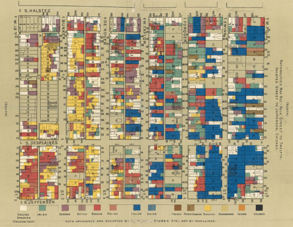
In 2021 Stamen had the pleasure of working on Mapping Historical New York with Columbia University’s Center for Spatial Research. The Center came to the table with a large and unique dataset of historical census data for the areas that are now Manhattan and Brooklyn dating back to 1850. Part of what is special about this data is that in addition to being aggregated at various geographical units (such as city blocks and wards), the data is also available at the building and individual levels.
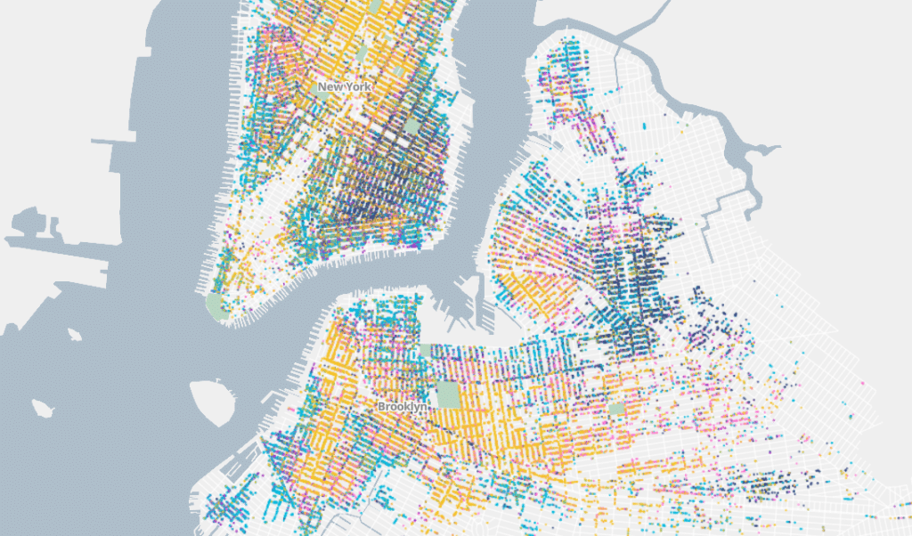
We ended up visualizing the data with a variation on a dot density map (seen above) that has some unique effects when you zoom into the street level, as we’ll show below. In this post we’ll talk about other methods we attempted along the way and share some of the technical details about how we created this map. You can also hear us talk to Dan Miller from the Center for Spatial Research on our podcast episode about the project.
Many of us who make maps in the US have dealt with census data that is aggregated to the census block or tract, and it’s a rare treat to be able to include data that is more granular than that. This data is available historically because the US Census Bureau releases data at the individual level after 72 years, but that data isn’t necessarily available digitally or associated with building points. Indeed, the Center for Spatial Research spent a few years laboriously cleaning this data (for the 1850, 1880, and 1910 censuses) and associating each individual in the data with a dwelling and associating that dwelling with a geographic point.
We at Stamen were among the lucky first to visualize this rich data. The scale and specificity of the data introduced a number of interesting challenges, and we found that many of the more obvious ways of mapping the data were unsatisfying considering how detailed the data was.
Attempt #1: Choropleths
Sure, we could (and did!) make choropleths of the data at various geographic levels, but a choropleth at the block level ignores the fact that we know the specific dwellings in which individuals lived.
And choropleths are effective when looking at one value within a dataset (such as the percentage of people born abroad), but once you try to look at more than two values in the dataset at once (say, the percentage of Irish-born people AND the percentage of Russian-born people AND the percentage of Caribbean-born people) choropleths quickly become difficult to read and unfit for the task.
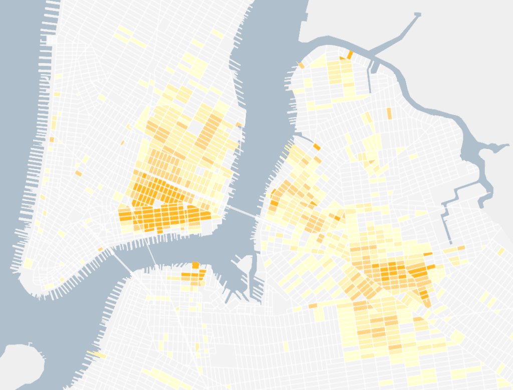
Choropleths made sense for data aggregated up to the block level, but we knew we wanted to get more granular where the data made this possible.
Attempt #2: Dot density
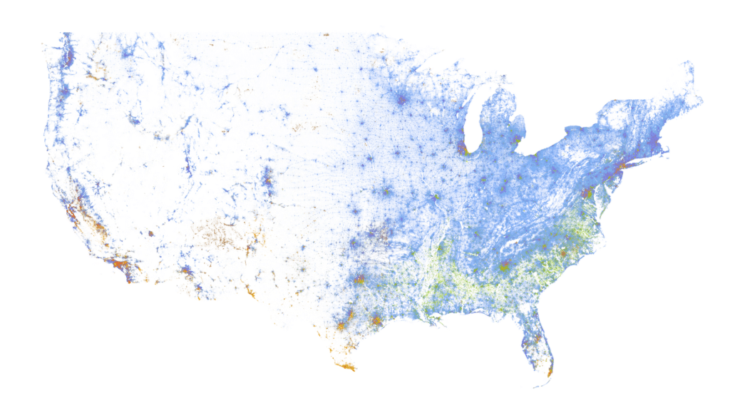
A common alternative to choropleths when working with census data is a dot density map. When making a dot density map, you place a dot randomly within a geography (such as a census tract) for each person (or sometimes some number of people, say ten), and style each dot based on the category that person falls into. A well-known example of this is the Racial Dot Map of the US created by the Weldon Cooper Center at the University of Virginia, below.
Done right, a dot density map can be beautiful and intuitive. Patterns can be discerned at a high level, and as you zoom in you should be able to see specific details that you might not have noticed when zoomed out. Once you realize that each dot represents one person you can focus on these patterns and worry less about interpreting various shades of color as you might need to with a multivariate choropleth.
Dot density maps do have some well-known downsides. Map readers tend to assume that points on a map are precise and draw incorrect conclusions, for example, one might expect that a point representing a person will be placed exactly where that person lived. As a result, once you zoom in to a scale where the boundaries of the geographic units become noticeable it seems as though people are perfectly evenly distributed throughout census areas (including places where people likely do not live such as industrial and water-covered areas) and it becomes more clear that the map doesn’t precisely mirror reality the way it seemed to imply.
We tried making maps of this style by block, and while they generally worked they were disappointing for some of the reasons outlined above.
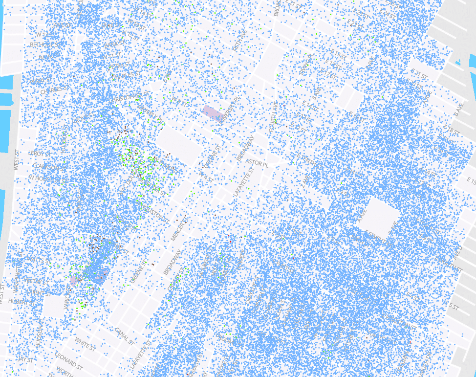
But the bigger reason that they were underwhelming was that we knew we had more detail about where these people actually lived. While dot density maps by block do give a sense of population density and the mix of people who lived in each block, the people are evenly distributed throughout the block.
As a concrete example, let’s focus on area near the center of the image above:
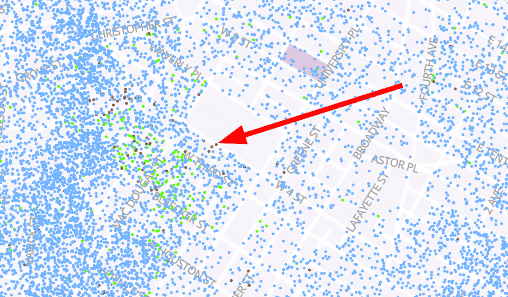
Here we see there are a few blocks with green dots (representing Black residents) spread throughout, but it is likely that building-by-building there is segregation happening on a small scale that is lost because we are looking at the data at the block level.
One way cartographers try to solve the above problems is by making a dasymetric dot map, where dots are only placed in areas that are likely to have residential buildings. For example, one might remove road beds, industrial areas, and parks from the blocks above before drawing dots within the areas. This can be an effective way to give a better sense of an area’s actual population density since dots will be more concentrated in residential areas.
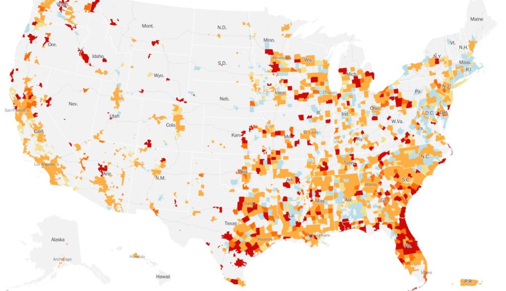
As an example, see this dasymetric choropleth map from the New York Times in mid-2020 showing where rates of COVID-19 were increasing (red) or decreasing (blue) as captured in this tweet. The areas that are shaded are not full counties but are rather the parts of those counties that are more populated (at least 10 people per square mile). While it might be a bit disorienting at first if you’re expecting to see counties, it does a nice job of de-emphasizing less populated areas such as rural portions of counties in Wyoming.
This is an option we might have explored, but we didn’t have access to historical landuse data or building footprints for the city, and we had something even better: dwellings.
Attempt #3: Dwelling dot density
As we mentioned earlier, the Center for Spatial Research associated individual census records with individual dwellings (essentially buildings) and determined point coordinates for each dwelling. This opened up possibilities such as mapping each individual dwelling as in the well known Hull House maps.
For this project we did not have historical building footprints but we did have points for each building, so mimicking the Hull House maps by filling the footprints proportionally was not considered. If the footprints were available it might be interesting to attempt something similar at higher zoom levels.
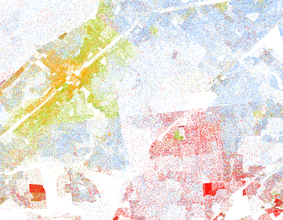
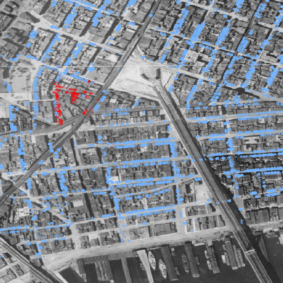
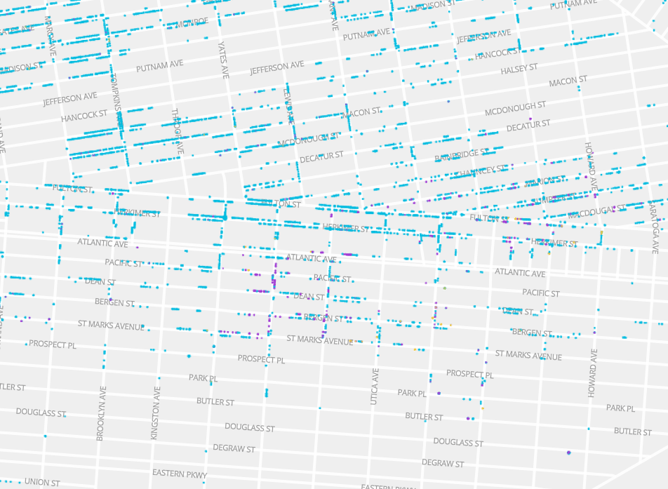
Instead we worked with the dwelling points and created dots around those dwellings. Each dot represents one person who lived in that dwelling, and in order to ensure that each dot would be visible each dot is placed randomly within a radius of the dwelling. Below is an early example of this looking at population by race in 1910 overlaid on some an orthography layer from around that time (1924). People identified as white are represented by blue dots and people identified as Asian are represented by red dots. To the west of the Manhattan Bridge you can see the beginning of Chinatown, building by building.
You can see the segregation here in a way that you would not necessarily catch in a block-level dot density map. For example, let’s look at the block at the top of Chinatown:
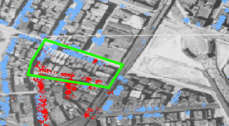
The block is pretty evenly divided between dwellings mostly full of Asian people (the southern part of the block) and white people (the northern), so a block-level dot density map would show that block as a purple mix of red and blue dots. But here it is clear that such a mix is inaccurate, and it’s even possible to see outliers or perhaps indicators of the neighborhood boundaries changing, such as the single building on the north side of the block where mostly Asian people were recorded.
We found this view intuitive and internally we started calling it the “fire drill” view of the city since the dots look a bit like people milling around the entrance to the building they live in. This method gives the viewer a way to better see the dynamics on a neighborhood level. Choropleth and dot density maps that aggregate data to blocks draw each block as the space bounded on each side by streets. In reality, someone living in a city has many more opportunities to interact with their neighbors on the other side of the street than with someone within the same “block” geometry but who actually lives on another street. As a result, when someone is talking about the block they live on they often mean the buildings on their side of the street and the buildings on the opposite side of the street.
Final attempt: Beeswarm dot density
As we were sharing our progress with the greater Stamen team our Lead Cartographer Alan offered a perceptive suggestion: why not make the dots beeswarm around the dwellings? That is, why not make the radius around each dwelling vary by the total population within the dwelling? So smaller dwellings would appear as smaller clouds of dots and larger dwellings would expand and take up more room.
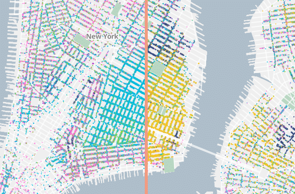
This made a huge difference in how the map looks and we find it to be rather effective. This is the method we decided to use for all of the most granular layers in the finished product.
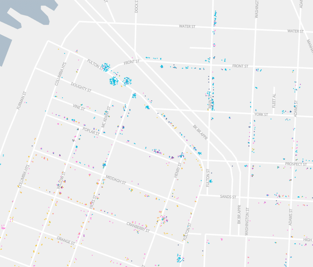
As an example of how this is an improvement, in the above screenshot of the live site one can see that there are a number of very densely populated buildings along Fulton Street while still seeing discrete, smaller buildings. We find that this method lets the viewer see both the population density, building-by-building, as well as the dynamics within and between buildings for the data that is available in these censuses.
Similar work
If you think of the dots on these maps as individual points (rather than dots representing the density of a dwelling located at a point), these maps are pretty similar to point displacement maps. Point displacement works by separating overlapping points, sometimes randomly, sometimes in a pattern that you specify such as a ring. For example, QGIS has a point displacement renderer, ArcGIS Pro calls this functionality “disperse markers,” and in webmaps you will sometimes see similar functionality such as the Leaflet plugin Leaflet.markercluster. These techniques all disperse points that would otherwise overlap, though not necessarily only points that would be directly on top of each other in the same dwelling as we have in this situation.
As Alan suggested, the effect of these layers is similar to beeswarm charts. Beeswarm charts place dots on an axis based on some attribute in their data (for example, the date an incident occurred) and stacks the points up to avoid overlap.
How to make layers like these
While most of the layers used in Mapping Historical New York are vector tile layers, making vector tile layers containing one point per person and including a variety of census variables left us with very large vector tile layers that did not perform well. Ideally, we wanted to be able to see every point when zoomed out, so the vector tile features could not be reduced to make the tiles perform better. As a result, we turned toward good ol’ raster tiles. While there is a tradeoff here–you either pre-render the raster tiles or set up a server-side process to generate them on the fly–the performance gains were worth it for us.
In our case, since the data changes relatively infrequently, it was appropriate for us to pre-render raster tiles rather than use a server-side renderer. We used QGIS to style our layers and generate raster tiles, and one benefit to this approach is that QGIS can be easier to use for those less initiated to server-side code.
Note that this workflow is relatively specific to our the datasets and infrastructure that we were using on this project, but we include some of the details here in case it is helpful. At a high level, here is the process we followed:
- Use QGIS to style the layer.
- Use QGIS to render raster tiles.
- Upload the raster tiles to the server.
Let’s look at each of these in some detail.
Styling the layer
First we load the dwelling points in QGIS, which include attributes that aggregate the census data to the dwelling level. Specifically, one point represents one dwelling that may have many residents within it, and that point’s attributes describe the number of residents that lived in that dwelling of each race, birthplace, and occupation.
Then we create a point for each person and spread each point away from the dwelling using a geometry generator. This also includes using some custom Python functions we wrote within QGIS.
collect_geometries(
  array_foreach(
    count_array("n_persons"),
    with_variable('randang', rand(0, 360),
      with_variable('maxdist', scale_linear("n_persons", 5, 100, 5, 30),
        with_variable('randdist', rand(0, @maxdist),
          make_point($x + @randdist * cos(@randang), $y + @randdist * sin(@randang))
        )
      )
    )
  )
)
Finally, we categorize the points. Since the points are generated in the previous step and they’re randomly placed, all that matters here is that we fill the appropriate number of dots with the proper color for each category. We do this by creating a “data defined override” for the marker fill where the expression is like this one for the occupations layers:
with_variable('occupations', occupation_array(),
  with_variable('occupation', array_get(@occupations, @geometry_part_num - 1),
    CASE
      WHEN @occupation = 'bankers and brokers' THEN get_color(0)
      WHEN @occupation = 'clerks' THEN get_color(1)
      WHEN @occupation = 'needle trades and garment workers' THEN get_color(2)
      WHEN @occupation = 'port workers' THEN get_color(3)
      WHEN @occupation = 'laborers' THEN get_color(4)
      WHEN @occupation = 'domestic servants' THEN get_color(5)
      ELSE 'rgba(0, 0, 0, 0)'
    END
  )
)
Custom functions such as get_color() give us a way to change all of the colors for our layers in consistently.
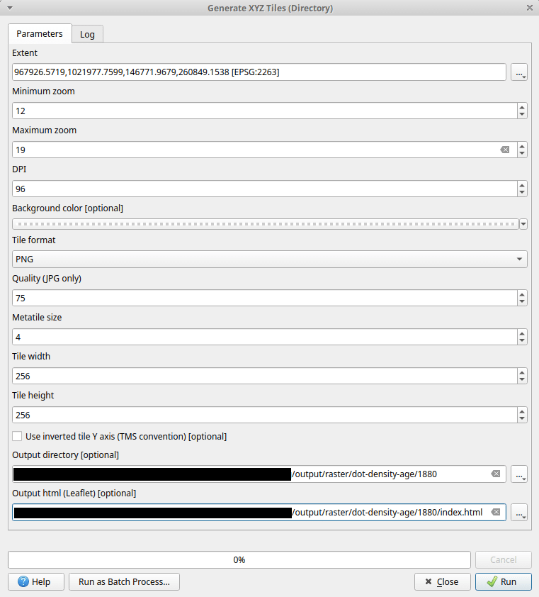
Rendering the tiles
QGIS has a built-in tool for generating raster tiles called Generate XYZ tiles (directory) which can render any of your map layers as raster tiles and put them in a directory. You can select the extent, minimum and maximum zooms, and the output will be placed in nested directories using the familiar z/x/y convention. The tool also creates an HTML file that gives you a quick way to preview the tiles to confirm that they look the way you expected.
Uploading the tiles
Once you have tiles generated as above, serving them is relatively easy. Any webserver that is set up to serve static files will work, and you can upload the entire directory of tiles to that server. In the case of this project, we are using AWS S3 to serve static files so we use the AWS command line interface to copy the directory into an S3 bucket. A Cloudfront distribution is configured in front of the bucket that manages caching and some other settings that aren’t relevant here.
What’s next
We’re excited to see what comes next with Mapping Historical New York as the project expands geographically and chronologically, and we expect that the above workflow will continue to be refined as that work happens. If you haven’t taken the opportunity to explore the map yet, we encourage you to do so! Even as those who have spent many hours working on it and looking at it, we often get pulled into exploring it and learning something new about the city.
Some of our favorite “moments” in the map include watching the spread of Chinatown mentioned earlier and seeing other enclaves take shape, such as the historic Black village Weeksville (in what is now Brooklyn):
Similarly, we love using the compare mode to swipe between years and see the ways enclaves formed, dispersed, and reformed in the three-decade increments the data shows. One prominent example of this is the Lower East Side of Manhattan, where you can clearly see much of the neighborhood go from German-born residents to Russian-born residents between 1880 and 1910:
Take a look yourself and let us know what interesting things you find in this data!