
When we started thinking about how to recreate Stamen’s iconic Toner and Terrain raster styles with vector data, Toner seemed like it would present the bigger challenge. Achieving the right hierarchy and visual balance of that style felt like a monumental task to me, an ardent admirer of Toner for many years. Terrain was less familiar to me and, at first glance, seemed like the simpler of the two to recreate. Oh, how wrong I was…
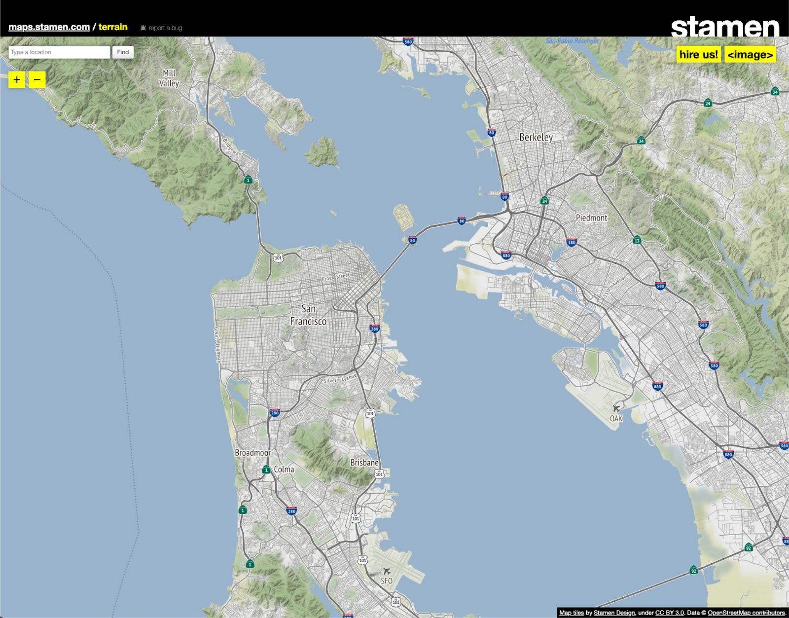
If you aren’t familiar with the style, Terrain is a global web map that emphasizes natural features over built ones. For me, its color palette and crisp hillshade are very recognizable, setting it apart from other natural-focused maps I’ve encountered before (more on colors and hillshade later). We at Stamen also love the font used in this style — PT Sans Narrow. It’s not the type of font I’d typically lean towards when designing something from the ground up, but it really works in this case.
As part of redeveloping these styles with vector technology, discussed at length in this blog post, we saw an opportunity to make some small improvements to the style while preserving its core characteristics. The yellowish color of the land in the original felt a bit too inorganic compared to the otherwise very natural color palette, so that seemed like a good place to start. At some views, the landcover’s blur effect was unsettling, to the point that it looked like a rendering issue. Although we won’t discuss it in detail here, we also saw an opportunity to improve some of the label hierarchy and styling in the redesign.
Overwhelmingly, color and visual effects were the biggest challenges in redesigning Terrain. The color palette now has to accommodate an entirely different dataset from the original map (actually, we now use two datasets for landcover; more on that later). Additionally, the new data overlaps in ways that push us to get creative with opacity and zoom transitions to achieve a similar effect to the existing map. Since the original Terrain used raster tiles, visual effects like blur are similar to what you would see with a tool like Photoshop – that is, the blur is customizable and seamless. This type of effect is not exactly replicable with vector map styles but we can do something similar.
(Re)defining the color palette
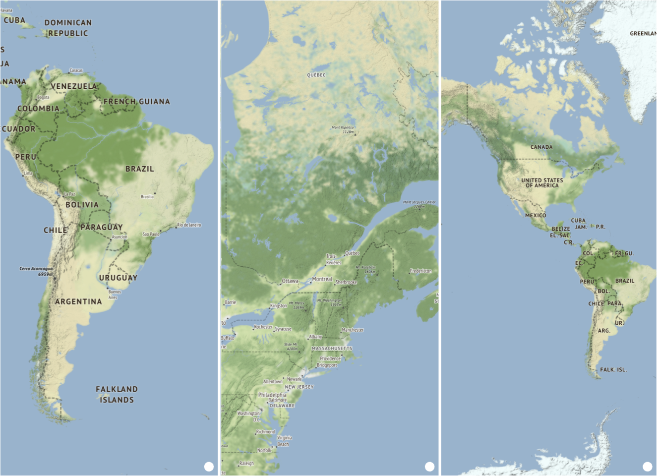
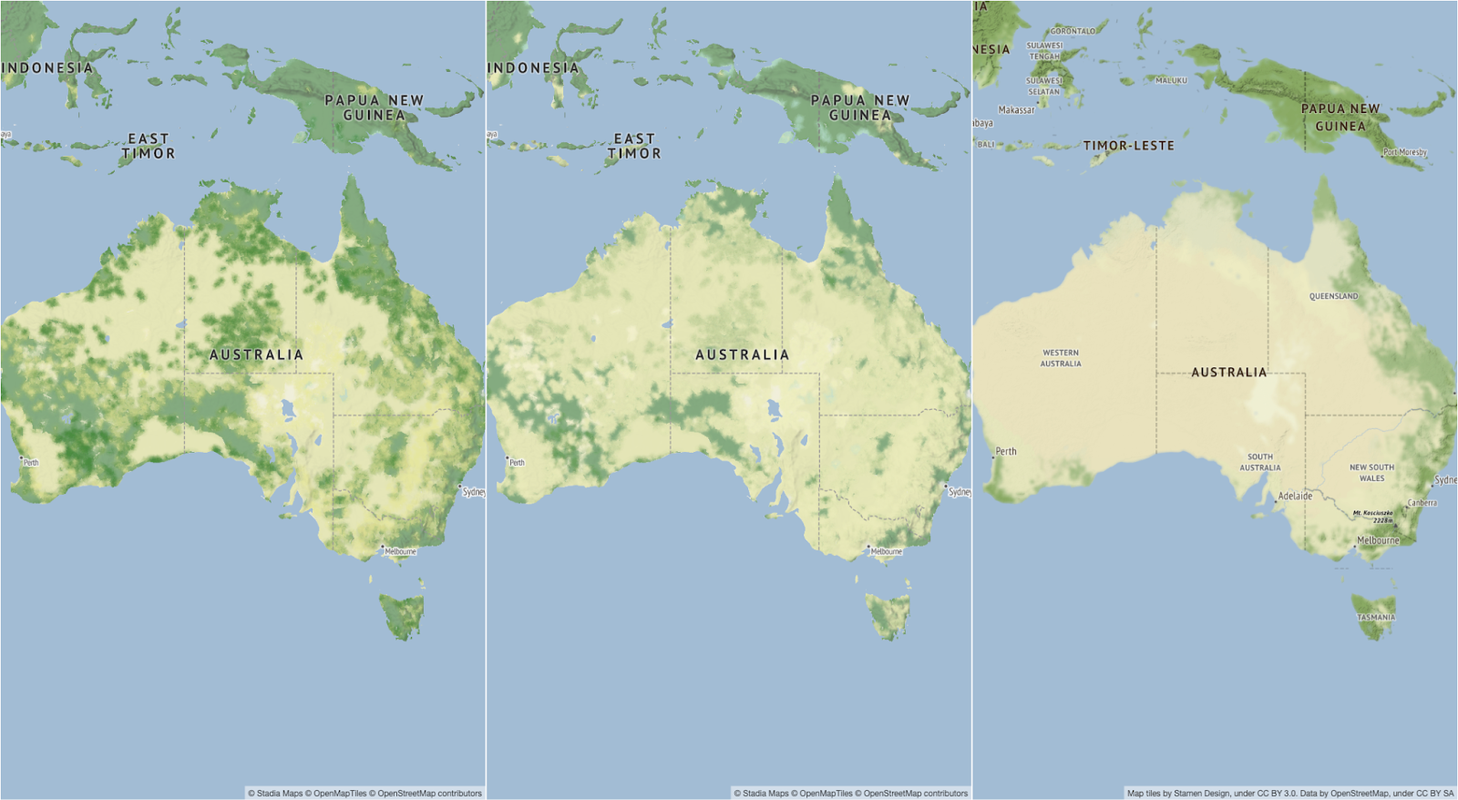
Since we wanted to mirror the original Terrain look as much as possible, we initially set up the vector version of the style to use exactly the same color values as the original. We spent a few days making some broad changes in Mapbox Studio using Mapbox vector data before transferring the styles to our internal workflows. As we expected, we had a lot further to go:
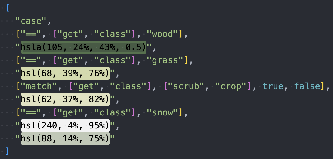
We then planned to switch to a different tile source (our Stamen x Stadia styles use Stadia’s version of OpenMapTiles) that is similar enough to the Mapbox tiles to at least get started. Up first: we needed to refine how the new data was classified in the stylesheet to reallocate our color palette more appropriately. The classes we started with were wood, grass, scrub, crop, snow, plus a fallback to cover anything we missed:
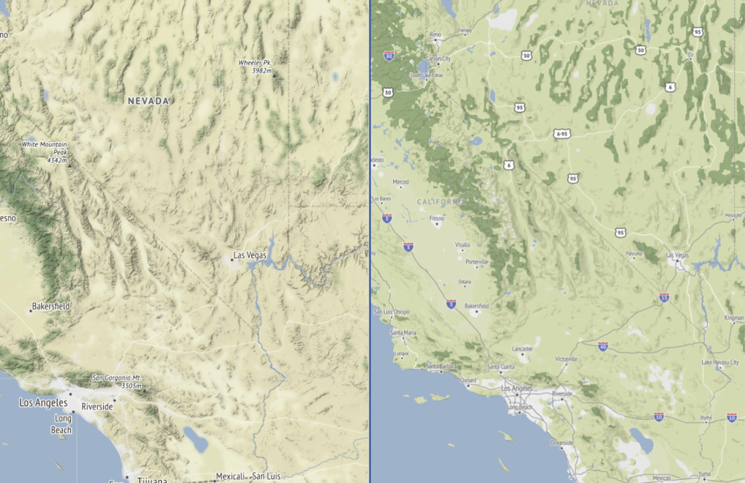
Other issues that impacted the landcover/landuse palette at this point were missing urban area data and wetlands. But first: the biggest visual challenge we needed to tackle was not having detailed landcover data at low zooms once we switched data sources. Stadia shared some coarse low-zoom landcover data that allowed us to start solidifying the low zoom look and feel:
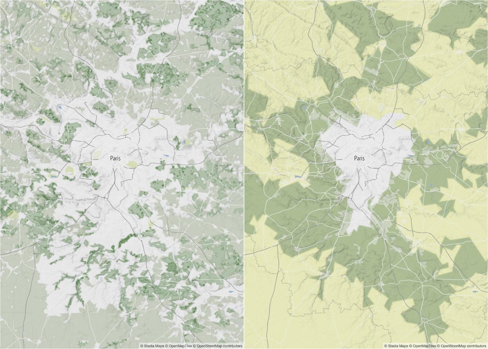
We experimented with many options, ultimately deciding to keep both the fine and coarse landcover data from z7-12. This transition allowed us to overzoom the coarse landcover data without it being obvious since the more detailed data would balance out any rough or sharp lines. These adjustments didn’t get us all the way there, but it felt like a huge step in the right direction.

The blur effect
The fine landcover data is excellent, but immediately felt very heavy. As I mentioned earlier, the original Terrain has a very soft, blurred effect that we wanted to draw inspiration from but ultimately improve upon in this new version. Adding a glow layer for each landcover layer allowed us to start softening this look, but we needed to do more.
We did some experimenting and found that multiple glow layers were really needed to achieve our desired effect. In most cases, the glow colors needed to be slightly lighter than the corresponding landcover polygon colors to avoid the splotchy effect seen here:

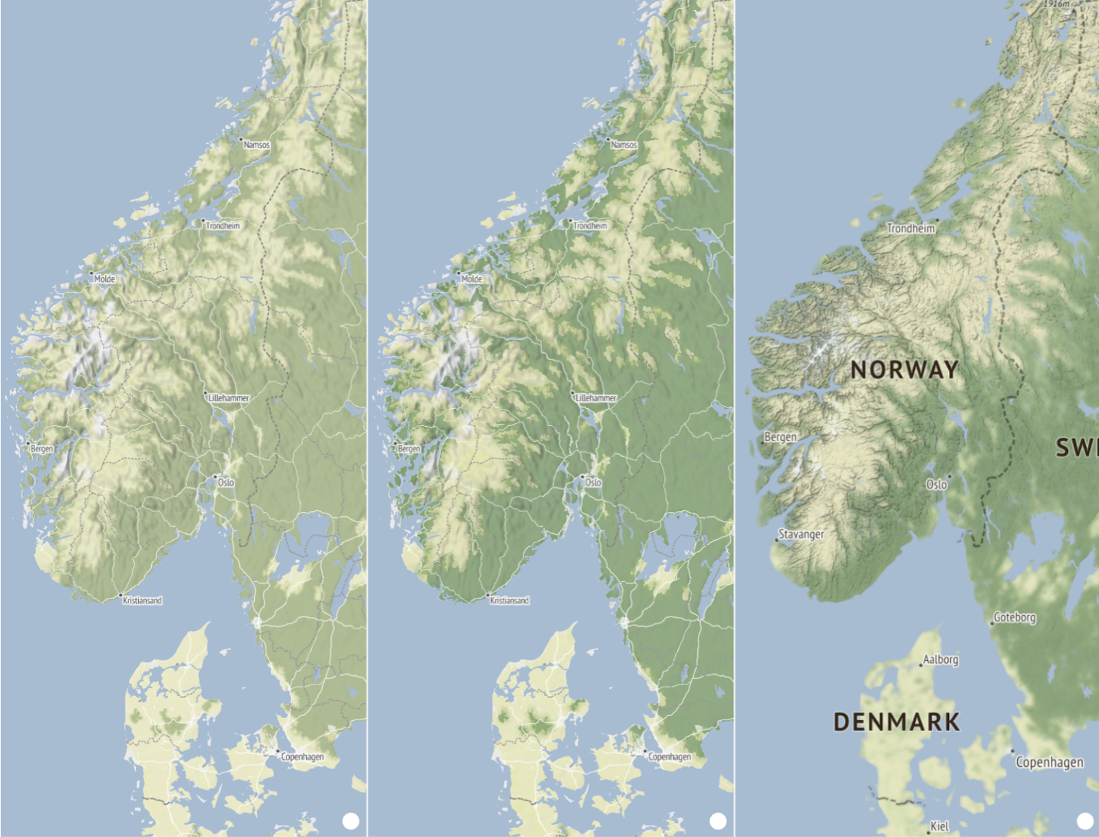
We found that the combination of slightly lighter glow colors with the right balance of line blurriness was the key to achieving the landcover look we sought. In the glow layers, the trick was to use the same expression for the line-width and line-blur properties. This allowed the blur to transition nicely as you zoom in and out of the map:
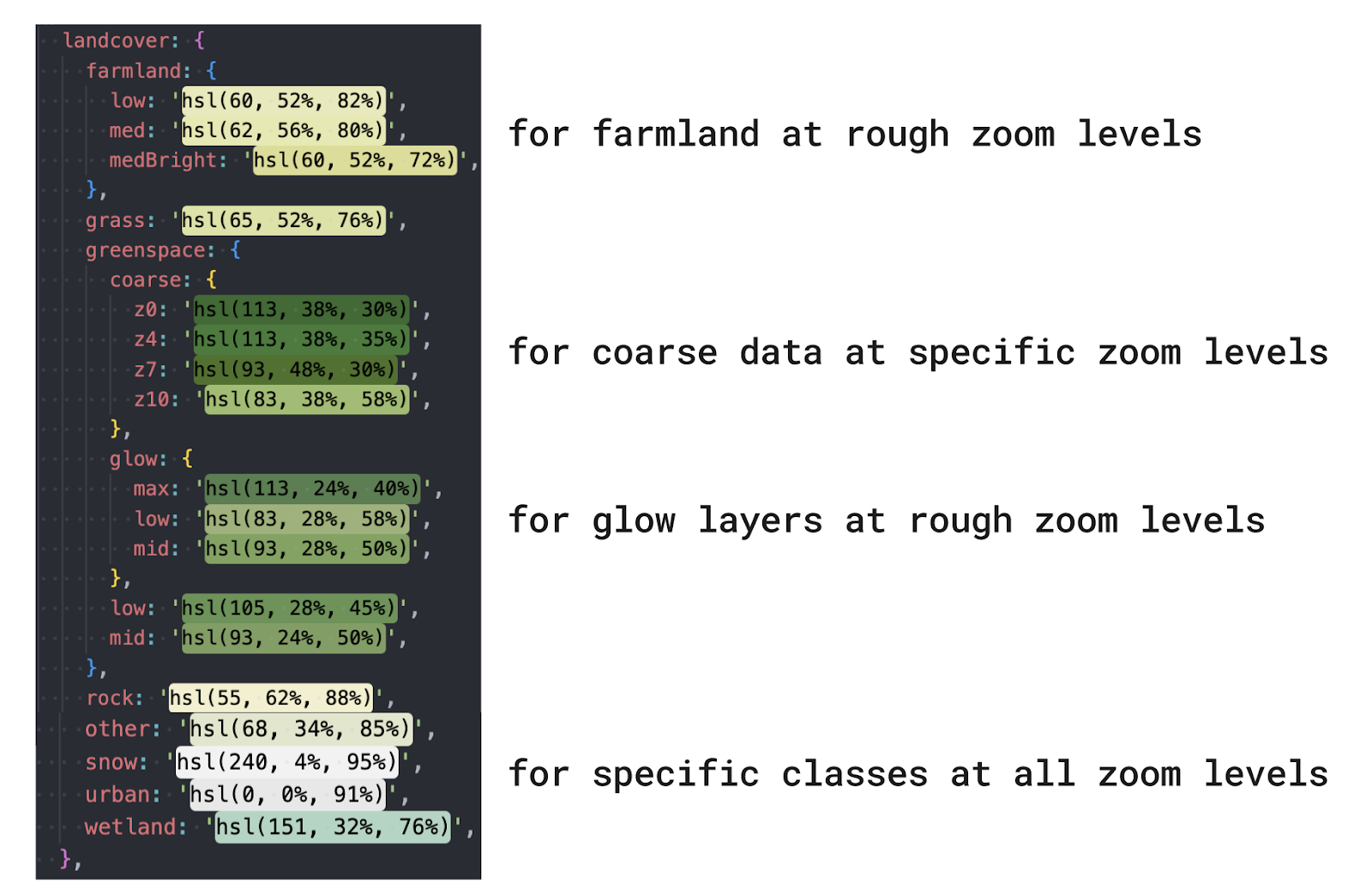
For example, in the second of two landcover glow layers, here are the line-width and line-blur properties:

The glow layers also feature some opacity expressions to help them layer nicely on top of the polygon landcover layers. We ended up using two glow layers for each landcover layer, so four in total, with some overlap from z7-12.
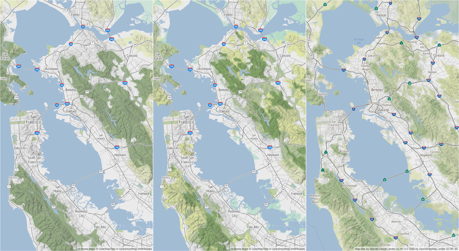
Now that we solved the blur issue, we needed to overhaul the color palette so the many features we’re layering work better together. There were some big differences between the original Terrain’s data and this updated data that also warranted a new color palette. For example, the original data allowed us to style different types of forests differently (ex. rainforests were lighter yellow-green while alpine forests were dark green), while our new data does not. Accounting for these differences, our updated color palette includes specific colors for new classes wetland, ice, lichen, farmland, barren, urban and removes unused colors for now-defunct classes scrub, crop, snow.
Between the layering, opacity, line width/blur effect, lighter glow colors, and tailored overall palette, we finally achieved a landcover look and feel that we are very happy with.

Redesigning or updating an existing map style (especially a well known map, such as Terrain) is a tricky task to tackle. Precise recreation of something great in itself is hard, but it’s even harder to take pieces of it that aren’t perfect and elevate them. The team is pretty pleased with how both the Terrain and Toner redesigns turned out – but please let us know your thoughts, too! You can start using these styles here in either vector or rasterized vector format.