
The modern cartographer needs a lot more than mapping software alone to be successful. Map solutions often require a breadth of knowledge across a team of capable people who know how to speak each other’s language. That’s something Stephanie May learned throughout her career in the geospatial industry. In this episode, the Director of Geospatial at Stamen discusses the nuances of open data and software; shares her philosophies on how a team of cartographers, designers, and developers can effectively collaborate to solve a geospatial problem; and provides an overview the suite of free and public tools that Stamen has created to facilitate such challenges.
As a young geography enthusiast, Stephanie decorated her walls with maps from National Geographic before attaining her BS in Earth Systems from Stanford University. The program wasn’t within an official geography department, but instead under the umbrella of Interdisciplinary Environmental Studies, which furthered Stephanie’s love of exploring the intersection of geography, economics, politics, and the environment. She went on to achieve a graduate degree from San Francisco State and started her professional journey at the city’s Department of Public Health where she put her interdisciplinary geography knowledge to work. It was also one of the first exposures to open data, after the department released some of their data to the public during the civic tech boom of the early 2010s.
After her map of rent in the Bay Area went viral, Stephanie sharpened her technical mapping skills in her following positions at Urban Mapping and Apple. She began seeing the intersectional threads of production cartography: working with teams of designers, data engineers, and developers all through the lens of interactive maps.
Stephanie puts this philosophy into practice now at Stamen, leading “full stack cartography” projects with an understanding that the best problems are solved through a team of people with separate, yet overlapping, backgrounds. The collaborations between cartographers, engineers, and designers have proven to be a successful recipe for Stamen, allowing us to break free of technical constraints that typically block professionals who are tasked with doing the work in a vacuum. They have also led to the creation of a handful of free and public tools to support vector map production:
- Figmasset, a tool for creating icons and sprites that instantly populate a web map, allowing for rapid feedback when designing assets.
- Chartographer, a stylesheet visualization tool that creates an interactive chart showing the style rules in any Mapbox or MapLibre JSON stylesheet.
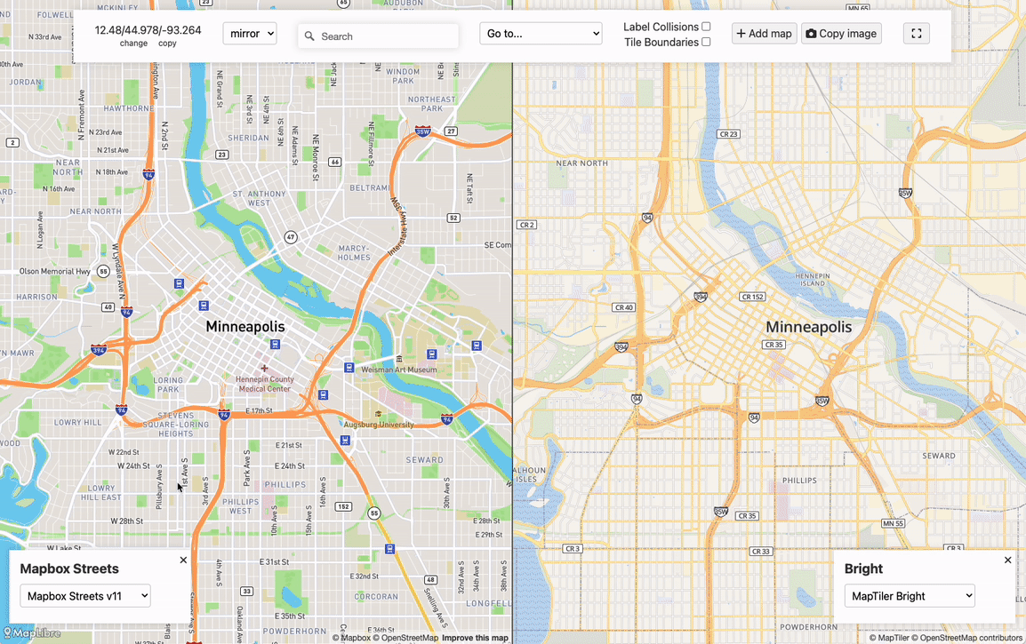
- Maperture, a map comparison tool that also supports the iterative nature of cartographic design by showing parallel views of a number of desired map styles.
These tools are available on Stamen’s Github! Give them a try and let us know if the tools or approaches in this episode might help out your cartographic workflows!
Transcript — +
[music]
You’re listening to Pollinate, a podcast on data, design, and the people that bring them to life, brought to you by Stamen Design.
Ross Thorn (RT): How the stages of grief applied open data, going viral with a map of rent in San Francisco, and how to build a team to solve a cartographic problem, these are a few of the things that come up in today’s episode. I’m Ross Thorn, a cartographer at Stamen. Today we kick off season two of Pollinate with a conversation with one of our own about the interdisciplinary nature of geography and how a multifaceted approach to map-making led to the creation of some nifty tools. Please welcome my guest.
Stephanie May (SM): I’m Stephanie May, the director of geospatial at Stamen Design.
RT: Thank you for joining me on the podcast today, Stephanie, and I’m really excited to talk with you.
SM: Yay, it’s so great to be here, Ross, I’m really excited to talk to you.
RT: We’ll jump right into it. Today, I think what we’re going to talk about is about you and about your experience in cartography and how you navigated the world of geography and cartography, both from when you were younger to your education and to your professional career as well. And then a little bit about kind of how that stuff has all sort of informed how we work on maps Stamen in this bigger conversation of these patterns that we see and the tooling we develop to accomplish all of the tasks, but you know, before we get to some of that stuff, tell me a little bit about your upbringing and when you were younger growing up and did you have any early links to geography and cartography?
SM: Sure. I grew up in Ithaca, New York. Which is a centrally isolated college town in the middle of upstate New York. My parents were not professors, but they did have a subscription to National Geographic.
RT: What’s the difference?
SM: Exactly, right? [laughter] Basically, world travelers via National Geographic subscription, and I think I was one of those kids. Is this the type of kid? You tell me. The type of kids that gets the National Geographic and shakes the binding till the map falls out, and then just puts that on the wall. I think I’m not alone in my experience. Also had this National Geographic Atlas. I guess that’s my early introduction to geography. I had this farm animal wallpaper that my parents put up when I was a baby and so my redecorating over time was to just plaster over everything with maps. I don’t know how much deeper it went than that. I think a lot of it was the aesthetics and just loving the complexity of those graphic displays. That was really my earliest experience with cartography and mapping.
RT: There’s always this mystique about maps and I think everybody is drawn to them in some ways. And then some people just pursue it a little bit more. But it’s like the same draw for everybody. It’s like these are cool. I’m not exactly sure why. You almost can’t really put your finger on why they’re so cool, but there’s something about it. It’s romantic and they’re just cool to look at and cool to have and display on your walls over baby farm animal. [laughter]
SM: Exactly.
RT: Cool. So you’ve got your walls plastered, and you move on to college and you went to school at Stanford, correct?
SM: Right. I did. I transferred to Stanford. I did a year at Rice University in Houston, which was also a really amazing institution. But then yeah, I did my undergraduate work at Stanford, and I majored in– Stanford doesn’t have a geography department, which is a whole separate podcast unto itself about the deep underlying movements and why Stanford and a lot of– all of the Ivys also dropped their geography department. But there’s some intrigue and scandal there, but there’s no geography department at Stanford. What I was drawn to, initially, is I love interdisciplinary studies and I think the negative side of that is that as a young person, I was very much a general studies kind of major. The positive side of that is that I really do like being on the edge of things and seeing how they fit together and not moving in traditional disciplines. And Stanford, when I was there, was a really great place for that. And the program that I was a part of at Stanford is called Earth Systems. It’s an interdisciplinary environmental sciences program. And it allowed me to focus on the earth sciences, but also think about policy, economics, and social science as well. So it was similar in the sense that you do that in geography as well, but it was an interdisciplinary major and program rather than being within the discipline of geography or cartography.
RT: What a great perspective to have because, like you said, that’s already within geography classes and departments, but to come at that from the top-down view of, “No, this is interdisciplinary, and within that, geography is interdisciplinary as well.” And it’s just so helpful to take that with you when you’re making maps and when you’re dealing with geographic data to understand all of the pieces that are connected.
SM: Absolutely. I think as geographers, we’re all polyglots. We all love connecting things together and seeing what emerges of those connections. And I think that not really being familiar with geography as a discipline as an undergrad. And then encountering it in graduate school really allowed me to feel– it gave me a sense of coming home when I did discover geography as a discipline, and I really gravitated towards it and towards thinking like a geographer, and I really appreciated that discipline once I found it. As an undergraduate though, I kind of had to bounce around myself. I took graduate-level engineering classes trying to figure out what was my perspective, how to find a perspective across the broad disciplines that I was interested in.
SM: And specifically, I was really interested in climate change perception, which was not really established as a field of study at that time. It was just kind of something that I observed was important, but the thing that I was the most interested in, I was studying with these world-class professors who were responsible for defining a lot of the models and a lot of the science behind the emerging study of climate change, but I was really interested in kind of one level removed from that. Look at all of these ways that people are finding to describe our world. And look at how hard it is to describe, and that really captured me at the time. It also really intimidated and scared me because as a 17 and 18 and 19-year-old grappling with the immensity of the challenges that our world is facing, for me, at that time, which was over 20 years ago now, it was really the cognitive dissonance of studying that stuff at school, and then going on break and talking to relatives and maybe more conservative places who would say, like, “Oh, is that so climate change? Is that really a thing? What’s happening?” That was a tough weight at that age.
RT: And you’re so right too in that trying to not only understand it in its entirety is something we can’t do even right now. We’re trying to understand and describe the world and then let alone describe it to change minds and describe it in ways that invoke action, which is like seven times more difficult.
SM: It’s overwhelming. Yeah. [laughter]
RT: Before we get too bogged down in the depression of climate change persuasion and news, you took your love for geography into your master’s degree.
SM: Correct. And my focus in grad school, at least initially, was urban microclimatology. So that was my first solution to the problem of how do we grapple with describing the big, big world. I was really fascinated. I still am really fascinated with urban microclimatology because it’s about– okay, let’s describe a climate at the scale of a city. Or there’s non-urban microclimatology. It’s very popular with vineyards. Let’s describe the comment at the scale of agriculture of this large farm. And let’s think about this as a climate system. And that is what my thesis work was around: Measuring and assessing and describing a microcosm, really.
RT: That’s super cool. And you also had mentioned to me earlier that that is getting published soon?
SM: Yeah, that’s right. My thesis on urban park cooling is getting is getting published in a journal called Theoretical and Applied Climatology. And that’s thanks in very large part to my thesis adviser, Andrew Oliphant, who’s also the chair of the geography department at San Francisco State. Really, so much credit goes to him to staying interested in that research. And he really has been a fantastic collaborator and someone who– it’s rare to find that in academia, especially these days, a professor who really fully wants to collaborate in the thesis research of a student. And he did that really well. And so he really gets a lot of the credit. But yeah, I’m so excited.
RT: Well, congratulations. And yeah, that is awesome. And having those relationships too in school with supervisors and advisers is really monumental in shaping your professional career as well. And so, while you were at SF State, you started working with the Department of Public Health and did some environmental exposure stuff as well?
SM: Yes, while I was in grad school, I was working for the Department of Public Health, specifically the program on health equity and sustainability. The focus of it is and has always been around environmental indicators for health that are more broad than health departments often define them in a narrow, regulatory context. The group that I worked with at the San Francisco Department of Public Health was focused more broadly on, okay, again, this microcosm idea. Let’s look at San Francisco’s– let’s look at the indicators of environmental health that are documented in the public health literature. Let’s look at traffic. Let’s look at air pollution. Let’s look at the quality of the pedestrian environment, which was one of the big foci that I had when I worked there. Let’s look at all of these things and let’s map them out and give people a sense of the relative health of this city based on the environmental factors that influence it.
RT: Very nice. Yeah. So then you got to sort of take that passion for that science communication and understand the nuances of it in an actual public sense too of– on that microcosm of climate, but still mapping out and showing the effects of different phenomena in the natural world.
SM: Right. And the other thing that came out of that work was the data. The health department had access to data and not only from health department itself, but other city data. And as part of pursuing these questions around environmental health in San Francisco and the factors affecting that, we gathered and curated a whole bunch of datasets that in about 2012, 2013, when the open data movements really started influencing cities all over the country to start releasing more of this data to the public. We were in a position where we had desirable datasets. And so that was the other thing that I got exposure to in that job, was managing those datasets, thinking about how to write the metadata, release them, how to talk to members of the public who are interested in the types of data and maybe didn’t understand the limitations or constraints like what the city had and what the city didn’t have, how much actual work was involved making it usable. And those conversations were a big part of my job as well.
RT: Yeah, that’s awesome. So you’ve got that experience with open data and you’ve had a few jobs between then and being at Stamen. And then, can you touch on each one of those maybe just briefly a little bit? I’m mostly curious here is the one after that, the job after that is you were a geographic storyteller at urban mapping. Can you just briefly tell me what, first off, what do you define as a geographic storyteller, and then maybe are there other themes, too, that you kind of carried that learning of opening up data into that job and subsequent jobs, too?
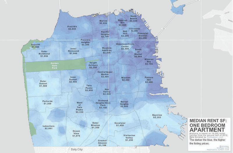
SM: Yeah, absolutely. While I was working for the city of San Francisco, I was also starting to explore the new Mapbox tools and things like that that were coming out. TileMill came out at that time. And so, as part of my work, describing these datasets, doing this health indicator work for the city of San Francisco, as a side project, I started kind of pushing for and advocating for more interactive ways of mapping and sharing this with the public. At the time, we were pretty much producing print maps in ArcGIS and posting the PDFs on the health department website. As I think everyone out there knows, change in larger organizations can be slow, so it wasn’t easy. Even though I think a lot of folks saw that there may be better ways of doing that, bringing about the organizational change that would have allowed us to produce more interactive interfaces, that was really hard. So I started just really experimenting. But I got enough support at the health department for doing that, that I started experimenting on my own. And I produced a couple of, specifically rent affordability maps, while I was working for the city. And I started going really crazy with them. Based on the other skills that I was building from working on my thesis, for instance, I learned AR to write my thesis and to process all the climate data that I was working with. And then using AR, I started exploring all of this fun, random data that I had at the health department that I was cleaning up and releasing. And I got this one dataset in particular that was around rent in San Francisco and I did a few different treatments, just trying to get at that question of affordability in the city, how it affects health, but also just, how does it vary?
SM: And I produced one map in particular using TileMill and Photoshop and Illustrator, and ArcGIS, Photoshop, Illustrator, TileMill, pulling together this map. I remember in ArcGIS what I did was I applied this method called Empirical Bayesian kriging, which we all learned about in GIS school, which is about kind of creating a level surface to describe how a continuous variable varies, but I applied it to rent in San Francisco. And I created this map and tell them, well, that looked really pretty, but it also got underneath a lot of what the other treatments of that sort of thing were showing. Instead of just showing the choropleth of rent by neighborhood, it showed the variability underneath that neighborhood level more because I was using the actual actual point data. So that map ended up getting a lot of attention. And I got a call from Bonnie Bogle, who was the COO of Mapbox at the time saying like, “Hey, so we’re not going to charge you, but this map that you’re hosting on our platform went viral.”
RT: Way too many hits right now.
SM: Yeah, incidentally. So I did feel like that was like my five seconds of internet fame, and that it was not very much. Much can be said of– I think second only to cats on the internet are maps. It’s a great way to get some media attention is make a cool map. And many of us have had that experience for a moment yeah, I made that rent map and I made these series of violin plots showing by neighborhood how things varied and I had a lot of fun with that and my quote, I think it was in Gizmodo, it was “The distribution is bimodal.”
RT: You [need] t-shirts with that. Your most famous quote on there?
SM: I need them. I need those. That’s my big comment on housing affordability—it’s so heartfelt. Anyway, doing that work. Really, it was pushing– I started that work because I was hoping to push out of this paradigm of PDF maps posted on a website. But what I ended up doing more so was developing a lot of my– starting to develop my thinking that propelled me towards the rest of my career. My office made at the time, Lindsey Realmuto, she is an epidemiologist and was a great collaborator and coworker on a lot of the projects that we did. She found this job listing on the internet for a geographic storyteller. And she said, “Oh, this is you. You should apply for this.” At the time. I think the posting had been up for like a year. It was at a company called Urban Mapping which was a startup in San Francisco that had been going for a while. Ian White, he’s a wonderful personality. He built this company largely starting with this product called Panamao, which is one of those holographic many-fold maps. He did them from urban places and you look at it one way and it shows you one map and you look at it another way, it shows you another map. He did that. And then he managed to build this neighborhood dataset that was pretty large in scope and got a lot of customers for that because that was really something that Web 2.0 was demanding at the time. It was a relatively good, consistent source of neighborhood boundaries. All the big tech companies needed that for the maps that they were– the web apps that they were starting to produce. So it was informal neighborhood boundaries. The geographic storyteller position was really more so around this new platform that Urban Mapping was building called Mapfluence, which was intended to be basically a CLI or a set of APIs that would allow you to ask geographic questions and get back maps. And what I did in that job was internally try to work with the Mapfluence product and develop insights around how the product should be built and then externally produce cool maps and tell stories. This whole story is based on the datasets that we were curating.
RT: That’s very cool, and very cool to have then access to probably the most robust neighborhood dataset for the time. Very cool job. And did it live up to your expectations as being a geographic storyteller as well?
SM: It’s still the most interesting title I’ve ever had, but I think a lot of the job titles that I’ve had have been some sort of exceptional role. There’s a tradeoff there, right? The challenge of having a title like geographic storyteller instead of product manager is that it’s hard to compare yourself to what else might be out there. Or even cartographer. What do those roles mean in relation to the broader job classes, or even narrow job classes like cartographers? And I’m actually an incredibly broad job class. But it just means that you spend a lot of time having to describe yourself and define your role.
RT: Yeah, you’re defining your job description of what it means because, yeah, it is amorphous. It’s cool. But obviously it helped you obviously get your next job at Apple and being a senior cartographer!
SM: yep. Initially, when Apple Maps first launched, they didn’t have any permanent cartography staff. And they built a team after that. I wasn’t initially recruited by the cartography team. I was recruited to work on indoor mapping and specifically to own and define a spec around indoor maps. I moved to the cartography team after a year, but my initial work there was more around defining or starting to think about what’s the right way to build a data standard around internal map data. And that’s a hard question, actually. I learned a lot.
RT: Very cool. Wow. So then you moved into a role where you’re designing a base map. Is that right?
SM: Right. I joined the cartography team at Apple at a really pivotal time. It was just before the transit map launched. And so it was at a time when there was a lot of– there was a lot of discussion when I was joining around how to meld together the different disciplines that we have to master as cartographers, how much to rely on data curation versus programmatic changes or style-level changes in order to define the map, how to kind of make all of those components play well together. But the role that I started to gravitate towards was more and more an engineering role, whereas other cartographers at Apple moved more into a data, a curation role, or a design role. Increasingly, I moved towards the production side of things. Where I spent the bulk of my time as a cartographer at Apple was on building out the style sheets and map asset pipelines that ultimately get compressed and packaged up and sent out to every single iPhone. That’s the legacy that I brought with me when I left Apple and within the subsequent work that I have done at Stamen is thinking about something that we’ve come to call production cartography.
RT: So now you are the director of geospatial here at Stamen, a client service agency where you’re sort of bringing in all of these and trying to make those connections and trying to see exactly some of those things– of these lines that a cartographer straddles and all the things that go behind the map and our package nicely. I love that visualization too. And then it’s sent out to every iPhone. I think it’s a good time to sort of talk about this transition into these philosophies, into this tooling, into these ways that we solve maps, I guess. I don’t know if that’s a cool way to say it, but it kind of sounded cool when I was thinking about it. And it wasn’t too dorky when I said it out loud, so I’m going to stick with that. The way we solve maps at Stamen, part of that, too, is we’ve got a history of mapping. And I kind of want to almost take a step back before we get to these exact routes and talk a little bit about free and open-source software. You touched on it a little bit with the work on the Department of Public Health and opening up data and using that because we at Stamen, we use a lot of that. We use a lot of these open-source products and have built entire stacks for clients using them, everything from using OpenStreetMap data and pulling that into QGIS to then make a fork of Mapbox. And it’s just so rooted in so much of what we do, and we’re very closely tied to it with our tiles that we’ve given out all of these different angles. But I kind of– for listeners that might not be familiar, can you briefly describe what is free and open-source? What is this open data boom that happened in like 2012 or early 2010s that you were talking about, and how does it apply to cartography as we know it?
SM: Yeah, so that’s a great question. And I think it’s worth pausing for a second on the distinction between open data and free and open-source software because the free and open-source software movement is much older.
SM: Fundamentally, I think what’s important about the free and open-source software movement is that it contains models for collaboration and peer review, and transparency, and for data standards, and other sorts of standards. Separately, the open data movement is something that I think it’s– sometimes I think suffers from being lumped in with the free and open-source software movement.
SM: I think that the open data movement of the 2012 era rose at the same time or in conjunction with the civic tech movement. It certainly was part of the milieu around the world that I was in at that time and also that Mike Migurski, one of the early partners in Stamen alongside Eric Rodenbeck. He came out of that very strongly believing in that civic tech movement and the open-source software movement.
SM: And so it’s the two things I think are parallel, but they’re not identical. And I think a lot of the problems that we’ve seen in open data movements are an attempt to cleave too closely to the free and open-source software philosophies because data is hard and data is messy. And I think you manage it differently than you manage software and it’s important to understand that. So they’re related, but they’re somewhat separate.
RT: And I suppose there are also a couple too because a lot of times, people hear open. And usually, people from one side, if someone’s like really into open-source stuff, they’re like, “Oh, open data that I can use in my open-source projects,” or things like that. So they’re often the people usually are into both of them, but they are separate. And I think it’s great that you made that distinction. You said something about how we treat open data versus how we treat open-source, they should probably be different. And can you expound on that a little bit on what you meant by that?
SM: Yeah. Absolutely. So open-source. What we mean when we say open source is that you can read the source code and understand it and work with it and build it into your applications and fork it and do whatever you want with that. To build a very parallel system with data is really ambitious and really hard. And it progresses along different lines because open data is more typically free data and that’s really what people mean. It’s the data that the public can gain access to its data in the public domain.
SM: And anything in the public domain, it comes with its own legacy and it comes with its own costs. That’s a big part of the difference. So I think you’re absolutely right that people who are attracted to the open-source movement are also attracted to the open data movement, but those things don’t just like them automatically cleaved together and make your life easier. Actually, they make your life way harder. Real-world data doesn’t conform to the expectations and standards of software engineers or software engineer. It doesn’t.
RT: 00:27:21.269 Very true. Yeah.
SM: It’s often collected for a different purpose than you’re ultimately using it for and there’s a lot of cruft in it. And there’s risks that you could aggregate it in a way that’s no longer true to– it doesn’t represent a true conclusion. They’re practices with how you manage it and use it. There’s a level of responsibility that’s required there. There are risks that you might infringe on someone’s privacy or mislead. And those are all things that are not necessarily part of a software engineering discipline. They certainly are something that are part of any cartographic discipline is needing to understand that and the responsibility that comes with representing data, using data to tell a geographic story.
RT: Yeah. I think, making that connection too between open data and cartography as well, it makes the most sense and I’ve mentioned it. We’ve already talked about it a little bit too is OpenStreetMap, probably the biggest open data source for cartographers of geographic data. There’s so much nuance to understanding that. And it has become so big and it is a worldwide thing, which is great. And it also makes it so hard to work with at sometimes.
SM: One thing, I think earlier, you were alluding to– Stamen has a very long and storied history with maps and a lot of that comes from not shying away from open data and all of the mess that it entails. And that story is intertwined with OpenStreetMap. I think the early forays into the mapping space were in partnership with the budding OpenStreetMap community, and Stamen has had a large role in telling the story of what can be done with huge messy datasets like OpenStreetMap because you have to ask yourself the question, “Given the amount of resource that’s required, is it worth it,” right?
SM: I mean, so so many people who are outside of– so many people who are outside of this mapping space that we’re in have for 15 years now, I’ve been using Google Maps for free. Google put out Google Maps for free and amassed a huge amount of complexity that underlies what went into building that product. It was a brilliant masterstroke on Google’s part to do that. But the legacy of that is that people underestimate how much money and time goes into building and maintaining something like that. And I think there are phases in anyone’s journey into this space that we inhabit, parallel to the Kübler-Ross stages of grieving. There’s the denial phase, or I don’t know, just the phase where you very innocently believed that we just want something like Google Maps. How hard can it be? You can probably do it over the weekend. It’s probably not going to be hard. And then there’s anger, like, “What do you mean it’s going to cost that much?” or it would take that long or what I’m saying is actually impossible given the constraints of what data is available and what you would have to do and see in order to layer it and produce the kind of product that you’re describing. There’s depression. There’s like, “Okay, I guess I’ll just go with my Google Maps screenshot mash up. I guess that’s just going to what I’m–” yeah.
RT: [laughter] Oh, my gosh, that’s just too real. [laughter] It’s 2022 and there are still Google Maps screenshots that people use, big companies use, as their maps.
SM: Yeah, and a lot of it, I think there’s bargaining, like, “Okay, fine. We’ll do this much but not this much. We can’t go too deep into this question because it’s too big and too hard. We’re just gonna isolate the part of it that we can. We don’t want to– this is what we’re gonna do.” And I think gradually, we’re getting to acceptance. We are seeing more and more. I think if you think about the last 10 years, especially, the inroads that this industry has made into all kinds of– there’s so many companies out there that understand their reliance on maps is fundamental to their business model. There is an increasing awareness among nonprofits and coming back to my first study of climate change and sustainability, all of these things really rely on and understanding that it arises from embracing the complexity of data and how to represent it and how to get to a place with it where you can communicate that complexity in a way that other humans can understand. And the acceptance mostly comes in understanding that that process isn’t perfect, that it involves a lot of interpretation, and that it’s rented a car.
RT: I love the parallel too and I think it’s a great chance to then kind of jump into this philosophy because so many times we’ll get clients that want to talk to us because they want something other than a screenshot of Google Maps, or Google Maps. They’ve got cost barriers. They’re rebranding and they kind of want maybe something a little bit more bespoke. So with that precedent of Google Maps that you mentioned, there’s a lot of alternatives that have come up in the past 10 or so years as well. Like Mapbox and Leaflet and these other free and open-source mapping solutions. Can you talk a little bit about maybe why you think that the geospatial industry needs these tools and solutions?
SM: Sure. The popularity of OpenStreetMap and of various other forms of geographic data, open data, or even data that can be purchased and incorporated into geospatial applications, it’s opened a broader understanding for what the value of having those common data stores is. Right? And that is, it’s very expensive to create all of this data. So having a central repository and working to maintain that central repository makes a lot of sense because that’s not really– and it’s not really in anyone’s interests to be competing at that level. You can start to see the evolution of more of an open-source model where a data store like OpenStreetMap gets this application layer on top of it, potentially. I think that’s what’s, say, the overture announcement. You can see why are these big tech companies coming together and working together to produce these data releases and make them public. Some of that is a very genuine desire to honor the license, which is also what their legal departments require, but also a very genuine desire to go beyond that and give back to the broader communities of people who have contributed that data and just give that out. But what the value of that represents for those companies is that they have now created a dataset that they can actually use. They cleaned it up from what it is at base and made it into the data that they can actually use, and then they’re sharing that out. So speaking to the data angle, the geospatial industry relies on data. And the more we can pull our resources to satisfy the common needs that we have, there’s efficiency gains for everyone from doing that. All of those different agencies and organizations that have come to depend on maps for their internal operations, for their logistics, as well as for their end-user platform and display requirements, need to have a greater level of control of the whole stack. That’s the best way that I can answer your question. I think that the open-source part of it is more of a philosophy. I don’t think everyone conforms to that. There’s a lot of closed source in building these sorts of things. As you said, it’s seeming way much more attracted for the open-source philosophies and to the opportunities and synergies that come from being able to operate as a small agency within the more open parts of the framework.
RT: Wonderfully put. And I couldn’t have said a better segue into what I want to talk about with this episode as well, is these philosophies, these frameworks, these tooling solutions that we’ve come up with when people approach us with those problems and with those questions of can we make our own MapStep? How can we divest from something that’s costing us a lot of money or make something more bespoke? And so if you’re a cartographer who’s approached with something like that, of these problems and solving these solutions, what are the basic needs that you have to accomplish your task and to accomplish the ask of the client.
SM: Yeah. So one term that we’ve been throwing around quite liberally recently, both internally and then our public talks, is the full stack cartographer terminology. Alan did a whole hour for the map-scaping podcast recently. I cited it in my conference talk at NACIS a couple of months ago, attributed it to Gretchen Peterson, who’s been a really powerful and interesting voice in this field of photography for a long time. In terms of how we at Stamen approach this challenge of being full stack cartographer for our clients, that is one that we are still really defining because it’s harder. There’s more to it as we’ve gained more access to more areas of the stack. I think historically, photographers have been limited to kind of whatever domain is given to them by whoever is holding the reins on the technical side of things.
RT: Right. You mentioned before of being shoehorned from the exporting PDFs from GIS. And that’s just what’s on the web page. And that’s what we’re limited to.
SM: Right. And those are the organizational limitations. Those are just based on who’s defining the project and what they understand about what cartographers can do. And from our side as well, what do we understand these cartographers can do if– it’s very intimidating. If you’re expected to be a full stack developer, as a cartographer, that’s not a skill set I’ve ever seen anyone master fully or well, to be both a cartographer and a full stack developer. So how do you build the collaborative workflows between people with different roles such that we, for our clients, can gain the right level of access? We usually do it through interdisciplinary teams. So we have a design technologist. We may have a backend geospatial developer. We may have another designer. We may have various levels of technical cartographers, who all, at Stamen at least, need to be able to get into the gears of the machine. And be able to iterate in there in order to produce the best results, right? I think there’s a common perception that what we do as cartographers is pick colors at the end. It’s also a common perception among designers. So it’s something that’s plagued work at Stamen, geospatial and non-geospatial alike, is that cartography-like design is a process that starts at the very beginning. At the very inception of a project in order to be done well. There are decisions that need to be made about the architecture that are ultimately going to define the map product that you produce. And who does who makes those decisions? Are those engineering decisions versus are those product decisions versus design decisions? Ultimately, they’re cartographic decisions. And so I think as cartographers, a lot of what we’re doing really is filling that gap.
RT: I’ve talked about this at least in terms of trying to grasp what kind of decision this is. And as a cartographer, that’s my title. And it’s straddling these lines. And it’s sometimes hard to grapple with, should I lean a little bit more towards development? Should I lead a little bit more towards design? And do I have to? And some projects may be yes, and some projects may be no. But also, like you said, you can’t be too full-stack sometimes, right? There’s, you’ve got one stack, and that’s all you get.
SM: Very well said. Yeah. At Stamen, we tend to stuff teams on projects. And we have project managers as well, who are helping to define those rules and also helping to keep those roles fluid. So that as the designer, you aren’t isolated from the engineers. And as a cartographer, you’re not isolated from any of it. And the advantage of having these things be done as a team effort is everyone can kind of lean back into their wheelhouse and push forward something from what you know. But you can also dabble in other people’s wheelhouses and kind of dabble at the edges and negotiate those edges within a team that’s dedicated to the client project, but that’s internal to statements so that those boundaries are easier to blur than they would be. If you’re isolated within a department. Which is what happens for a lot of our clients is that their organizational structure dictates what boundaries they can blend. It happens I think for other sorts of vendors and other sorts of agencies where you can’t really blur the line between the roles that belong inside the company itself versus your role. So if you have a team of people with the component skills and you’re working and collaborating within that team, then you can negotiate those boundaries and kind of come up with an overall product solution.
RT: What you said too of the way that a team is structured in that way, and when you mentioned like a client might not have sort of that team to support them and sometimes you’ll hear stories of companies and they’ve got one GIS person. And then the company is like, “Oh, can you make this web application with this map and stuff?” And it’s like, I mean, maybe I’d have to literally learn a bunch of stuff for it. And then there’s some great out-of-the-box solutions for some things. But sometimes the solution is never as cut and dry or the ask is so nuanced that you need something else to help you bridge that gap. And so having these fringes of like, “Okay, I’m a cartographer, but I really like to maybe try to dabble in development,” luckily, there’s a developer on the project or like this is how we structure them at Stamen. And so I can be like, “Hey, can you maybe have a paired programming session with me?” And I can take this task real quick and it’s a little minor one, but I’m learning, and you’re capable enough to sort of do all this stuff on your own too.
SM: Exactly right. I’m learning, but also, hey, I’m a cartographer. I know enough about front-end development that I can check out your branch in GitHub and add a little something to it that gets at what I need to do. And we can communicate and collaborate in those terms which cuts through so, so, so, so, so much. Because so much of this sort of cross-disciplinary work is about understanding the boundaries of what each discipline actually can do. And what are the real boundaries versus what are just the cognitive boundaries based on what I understand? And that type of communication is really essential to innovation in this space and really essential to getting underneath what’s perceived as possible to come up with the really clever solutions. And I think that’s really where the magic happens on all of our project system and is finding those insights and finding that work. And it comes from working closely, that closely. And being able to speak a little bit of someone else’s language.
RT: Mentioning having a pull request. And so we actually have some tooling that is out there, is public-facing for people to use. We’ve blogged about them. And I just want to talk a little bit about them and about what they look like and kind of what is their use case. So can you maybe talk about the tooling solutions? Briefly list them a little bit in what they’re for?
SM: Yeah. So based on the experience that I’ve had and some of the recent client niche that we’ve carved out subsequently over the last few years, we’ve gone really deep on workflows for vector tile cartography, which is a pretty interesting niche, but it’s one that we really know well. Specifically, these are workflows around building the map assets that are necessary to style a map beyond the data itself. These are things like style sheets, spreadsheets, which are for icons and highway shields and things like that and fonts. Those sorts of assets are the things that photographers know very well. And an engineer, for instance, creating their own map may be very naive about. So specifically, we’ve now done this for a number of clients, soup-to-nuts, advised them on how to build their own vector tower stack. And the part where Stamen technically has the most ownership and the most domain and the most to contribute is around the other asset pipelines besides the data pipeline. The tools that we’ve started blogging about are tools from our workflows. These are things that we use as part of the work that we do, but that we’re happy to share in various forms to assist those who also are on this path of building their own maps from original data, so creating tiles and then needing to style them. The first one worth mentioning is Figmasset. This is a tool for developing spreadsheets, ultimately. That’s in the engineering parlance. That’s what you’re doing, is this spreadsheet is something that the renderer uses to place icons and highway shields and that sort of things on the map. Now, in order to develop that spreadsheet as a– you need an environment where you can get up close to it and look at it at pixel level, exactly what it is that you’re creating, and make small changes, and also be able to see it on the map. So what Figmasset does is it’s an integration with Figma that allows you to create an icon in Figma and then refresh and see it on a map and go back and forth between those. Anyone can do this. The tool is public and we’ve blogged about it.
RT: And presented about it.
SM: That’s right. That’s right, yeah. Kelsey Taylor and I presented about it at NACIS. We did that demo for an audience of cartographers. And as cartographers, designers are confronted with this as well. You’re expected to produce something without the ability to really see it. Any designer knows it’s not about just having a brilliant idea and then producing a work of amazing genius. It’s about like, “I think I have an idea. I’ll change it.” Like, “No, no.” If you don’t have a feedback loop set up where you can visually see that change as instantaneously as possible, your work product suffers. There’s a limit to what you can do. It’s just really as simple as that.
RT: Yeah.
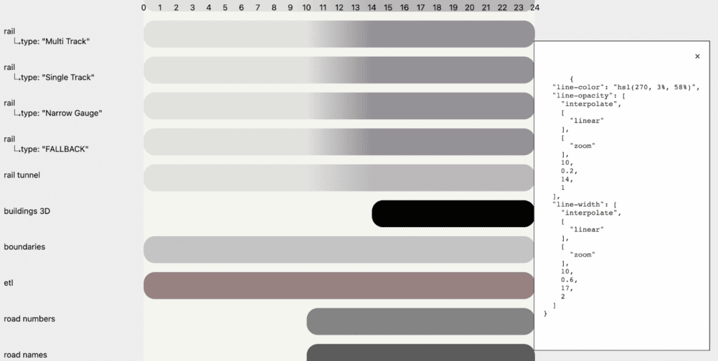
SM: And so with that understanding and insight underlies all of the tooling workflows that we produce and regularly use at Stamen and in the forms, all of the work that we do. And that’s because it’s so absent from most environments where maps are created. That aspect of tooling is really not well-understood and not well-captured with the more traditional methods you might do this. And that’s because this is changing in the world more generally. But traditionally, at least a lot of print design, you just open Illustrator and you make a bunch of layers and you have complete control over everything. Whereas, when you’re designing for interactivity on the internet and in the digital world, you need to be able to play with these different streams of information that are coming together. In real-time, it really has much closer to the source. And you can’t build an out-of-the-box tool for that, because it’s always going to be different. You have to build processes that are going to allow you to draw those elements together and then quickly iterate on changing them. Another tool that’s come out of our workflows that we’ve blogged a bit about, this came out initially out of a close collaboration between Kelsey Taylor and Eric Brelsford, similar to Figmasset as well. In both cases, these tooling workflows came from a collaboration between cartographers and engineers. And the common theme there– I guess that’s really the story of Figmasset, the story of cartographers more so like, “Okay. Well, so how do you visualize the style sheet?” Cartographers is another tool that we’ve produced. You can go to cartographer and try it out for yourself. Drop your map library or Mapbox style sheet on there and get a visual representation, get a visual chart based on what are these instructions for rendering.
RT: For folks who may be more adjacent to the industry. So like a lot of these is a style sheet. Literally, just lines of text that is telling the map how to draw things, how to draw these features, how to draw the data that it’s getting, and how to color it, how to give it a certain thickness.
SM: Right, so map style sheets are generally defined in a variety of different structured data formats. Most recently, JSON. The style sheets that we’re dealing with now, which are Mapbox compatible and not Blueberry compatible, these are giant ordered lists of JSON objects. And that’s great if you are a JavaScript application. If you are human, and you’re trying to read these things, you will lose your mind. And there’s great tooling. POPUP Studio really kind of obscures this out so you don’t ever have to deal with a JSON. Maputnik is a great open-source tool that will load in one of these JSONs and allow you– give you a bunch of toggles and sliders and things like that to be able to manipulate the values. But that also introduces a lot of craft and a lot of– it’s very hard to distinguish the decisions that you’re making when you’re using a tool like that. That are just kind of necessary for iterating on what you’re producing versus what’s the actual necessary structure of that information in the JSON for the application that’s going to use it. So at Stamen we tend to try to stick close to that JSON and try to keep that JSON pretty pure but then how do you visualize it? How do you actually see it? And one tool that we’ve developed for doing that is Chartographer because what Chartographer does is it takes that JSON and it makes that a chart. It shows you. Okay, based on the rules that you’re defining in the JSON how does this color vary over zooms? One of the different variables that you’re defining? What are these colors? How do they line up? And it gives you kind of an overall chart of all the math variables that you’ve produced, which it’s an output that allows you to see, okay, here’s the design system that I’m starting to develop and starting to use. You could use that to build something a little more user-friendly, a legend that’s more user-friendly, or you could use that to audit and be like, “Oh, wait, wait, I see all these inconsistencies and how I’ve defined these rules across my 47 different layers that multiple cartographers have touched.” So it also serves an audit function.
RT: I’ve seen from other base map cartographers too, people who are in the sauce of JSONs, it’s like, “Am I a cartographer anymore or am I just editing JSONs all day?” And I love that. This sort of bridge is that. I like to think about the Chartographer application as, you’ve seen art pieces that are a deconstructed blank and it’s just got– everything kind of set out next to each other and I’ve never looked at a car with all the pieces set out. This is like a map, a deconstructed map with all of the pieces set out.
SM: Yeah, absolutely. And then the third tool that we haven’t blogged about, we haven’t really released yet. You can get there. You can get to the repo. It’s not ready for prime time in the sense that it works for us internally. There’s no guarantees that it would work for anyone else yet because it’ll take a bit more work and a bit more development before we’d really be ready to support a bunch of external requests for what it needs to do. It’s a very powerful tool for us internally. What it allows you to do is create an arbitrary number of windows with different maps in them. Be those different locations or different map styles so that you can view those things side by side. You can put them in the outline of a phone shell or some other UI to get a sense of how they look side by side. The core use case for this is in a development context. Let’s say you’re making a change to the style sheet, you want to be able to see, okay, here’s how is in production, or here’s how it is in the published version. And okay, now I’m working on making a change. Did I change it? Did I change it? It’s the same sort of workflow as I described in Figmasset where you need to be able to– you need that rapid feedback in order to see whether the solution that you’re creating is robust. You need to be able to go to another example of it. Okay, does it work here? Side by side, I’m viewing– that’s the core reason why we developed this. It’s really a simple web viewer, essentially. So you can just spin it up on your local machine, be making changes in a text editor that you want to be making, and then reviewing those local changes side by side with the published version. And that facilitates the iterative development of map features in a way that you can kind of vary. That you can be confident in what you’re changing and how robust your implementations are. It’s also something that you can use to share out with colleagues and say, “Hey, here’s the before and after.” It’s something that you can use to rapidly prototype different sorts of changes and stack them up side by side in more of a design or product context. So it’s something that has a lot more uses. At the core, really what we use it for is the sort of iterative style sheet development. And like Cartographer, it’s another way to visualize the change that you’re making.
RT: And the tool’s called Maperture, and just like what you said, it’s not only good for the iterative development, but also to communicate the change you made, to show your client, to show colleagues. And it looks nice enough to do it and to use it as a tool like that. Going back to that theme of the communication between different people on the same team, as well as to your colleagues and to your clients. This opens up that bridge to make that communication easier. Thank you, Stephanie, so much for chatting here. I just kind of want to wrap this up a little bit. And one thing that we’ve talked a lot about at this podcast too and last season especially was, we talk a lot about power in mapping and dataviz. And that all still exists. But then within mapping itself – and we’ve touched on this a lot on a professional level – there is this lack of empowerment sometimes surrounding workflows, surrounding tooling. Are we just shoehorned into ArcGIS, to Illustrator, to PDF and posting that to a webpage? But I love that Stamen sort of sits at this unique position with being tapped into tech, with these designers, developers, and cartographers all working together with their prowess, bringing their experience and their past frustrations with running into these roadblocks previously. This episode and these tools that we’ve talked about and will continue to talk about in the public sphere, just sort of really add that empowerment for cartographers and people who are map-adjacent to kind of make their workflows easier. So thank you so much for talking about it today and for being a part of the team that makes it happen here. Is there anything else that you wish to say about them?
SM: Yeah, no, I think what you just said you said it really well. I think as cartographers tooling empowers us, but it can also constrain us. And so a lot of what my approach has been to driving forward the tooling and workflows that we develop at Stamen has been around keeping the problems that we’re solving very close to the client problems that we have and to the insights that we need, rather than trying to build an across-the-board solution, or a playground that will contain everything a cartographer would need to work with.
RT: Well, thank you so much. It’s been great chatting with you. And great learning more about this and seeing it happen in real time. So I appreciate your time, Stephanie.
SM: Yeah. My pleasure. Nice talking to you too, Ross. [music]
Thank you for listening to Pollinate. Thanks to Stephanie for sharing her experience and insights today. This episode was written by Alan McConchie, Damon Burgett, Katie Kowalsky, and myself, Ross Thorn. Music for pollinate was created by Julian Russell. You can find the public repositories for the tools we discussed at github.com/stamen. If you’re a fan of Pollinate and the content we put out, please review and subscribe to the show wherever you get your podcasts. It also really helps us out if you share it with your friends and colleagues. And if you like this show today, tell us your favorite part by giving us a shout-out on Twitter at Stamen, using the hashtag Pollinate or hashtag PLN8. For a summary in full transcript of today’s conversation along with some visuals of the maps and tools we discussed, check out the blog post at stamen.com/blog.