
Stamen has had the pleasure of developing Mapping Historical New York with Columbia’s Center for Spatial Research since 2021. We’ve written about it a few times, including most recently last fall, but here we wanted to expand on the technical implementation behind one layer on the map.
The map displays census data in New York City from 1850 to 1940. You can view the data aggregated to the census block level or you can zoom in to view each individual within a dwelling.
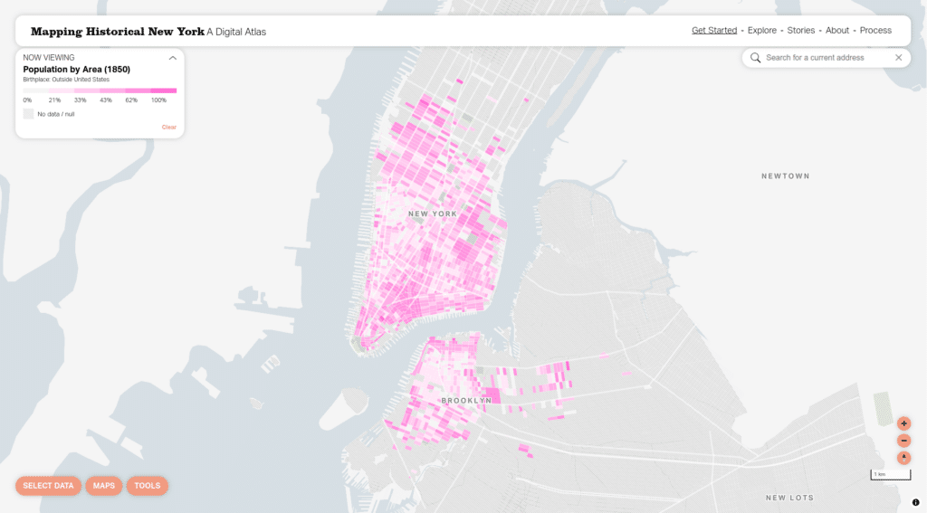
It is unique and powerful to have the ability to view the data as granularly as you can here–you can get a sense of how populations mixed (or didn’t) within a block or an individual building. Here we’d like to dig into the specifics of how we are displaying data at the individual level.
First as raster
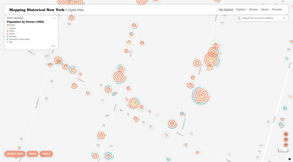
The original version of the map included an initial attempt at the above layer that looked like this:
At the time we wrote about this technique and called it a beeswarm dot density map. Where a dot density map typically arranges dots randomly within a polygon (such as a Census tract), we used the extra context of knowing the location of the buildings individuals were counted in to cluster their dots around those buildings. This way you can readily find buildings that had large populations within them, and you get a sense of where people lived at a small scale.
We detailed the technical approach to this original version of the beeswarm dot density in our post. These were pre-rendered raster layers. Raster layers for this type of map can make a lot of sense: they perform well on the client side, and they are relatively simple to implement client side. However, raster layers have a number of drawbacks. Creating them was a slow and error-prone process, and once you have rendered them you cannot change the colors or categorizations without fully re-rendering them since they are static images. On the client side the raster layers are not interactive, so a user could not click to learn more about a particular dwelling.
When we had a chance to revamp the map in 2024 we knew we wanted to revisit this layer in particular and attempt to solve some of these issues by vectorizing the beeswarm dot density.
Then as vector
Vector map layers are rendered in the browser, so they give mapmakers and users a great deal more flexibility in terms of interactivity and cartography. We knew we wanted to vectorize this layer, but the method for doing so wasn’t immediately obvious.
One technique would be to generate a set of vector tiles for each year and topic (birthplace, race, etc), where points are arranged around the buildings. Then we could serve the new vector tiles and load and style them like any other vector tiles. This approach could have worked, but it would have created some large vector tiles (one point per person in New York) and we wouldn’t be able to arrange the points based on dynamic categories–we would have been dealing with some of the same limitations that come with raster tiles. So we proceeded to look for other possible solutions.
As part of the revamp work Stamen migrated the map from Mapbox GL JS to MapLibre GL JS. Our intention with the site is to make it as self-reliant as it can be. The site uses no external data or services and we wanted to upgrade the mapping library without requiring a Mapbox account. This migration had a handy side effect of giving us access to a MapLibre-specific feature called addProtocol, which allows you to intercept requests for vector tiles and return new vector tiles based on the request.
Since the vector tiles for buildings already existed with the necessary data about the number of individuals within each by category, we began experimenting with using addProtocol to:
- Load a buildings vector tile
- For each building in that tile:
- Create a point for each individual within the building
- Arrange the point in a concentric circle around the building
- Add just enough data to the point to style it (the category)
- Return a new vector tile with the points we created for each building
Each of the above steps requires some solutions that might not be obvious, in particular if you haven’t worked directly with parsing and serializing vector tiles client side. For steps (1) and (3), we use mapbox/vector-tile-js to parse vector tiles, then we create GeoJSON feature collections, serialize them back to vector tiles using mapbox/vt-pbf, and return them to MapLibre to be rendered.
With step (2), the difficult part is placing a point for an individual in the proper location. You can get the building’s latitude and longitude from the original vector tile, but consistently placing an individual point the same distance from the building point is meterInMercatorCoordinateUnits() somewhat tricky because using degrees (the unit latitude and longitude are in) are not an appropriate unit for measuring distance. The ground covered in degrees vary by the latitude you’re measuring at, and latitude and longitude degrees differ from each other. It’s preferable to decide on an offset in meters, then convert the building’s latitude and longitude to MercatorCoordinates and use meterInMercatorCoordinateUnits(), then offset by the number of meters you’d like to offset by, then, finally, get the resulting latitude and longitude. More concretely:
// lngLat is from the building feature
const originMc = maplibregl.MercatorCoordinate.fromLngLat(lngLat.toArray());
const metersInCoordinateUnits = mc.meterInMercatorCoordinateUnits();
// offsetXMeters and offsetYMeters are the number of meters you want
// to offset the original
const newLngLat = new maplibregl.MercatorCoordinate(
originMc.x + offsetXMeters / metersInCoordinateUnits,
originMc.y + offsetYMeters / metersInCoordinateUnits,
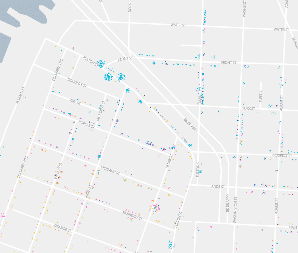
).toLngLat();Once we had the above fundamentals in place we experimented with a variety of shapes that we could generate. A few of the shapes we tried were rectangles with individuals randomly placed, rectangles with individuals sorted by value (such as birthplace = Ireland), and circles with individuals sorted.

Through our experimentation, we found that using sorted concentric circles conveyed more information about the buildings while minimizing overlapping shapes that would hide information about adjacent buildings.
Here are the same three variations as above but zoomed in a bit so you can see the details:

As we knew would be the case, moving to vector tiles gave us a great deal of flexibility. For one, now everyone on the team, including Kelsey who worked on the interface and cartography this time around, was able to quickly experiment with styles and revamp the color palette. Vector styling also gave us the opportunity to selectively show points for people who didn’t fit a selected category (the “other” category). Rather than overwhelm the user with gray points all the time, the map shows “other” points only once you zoom in a bit.
Users have a lot more control now, too. They can hover over a category (in this case birthplace = Ireland) to see just people who match that category:
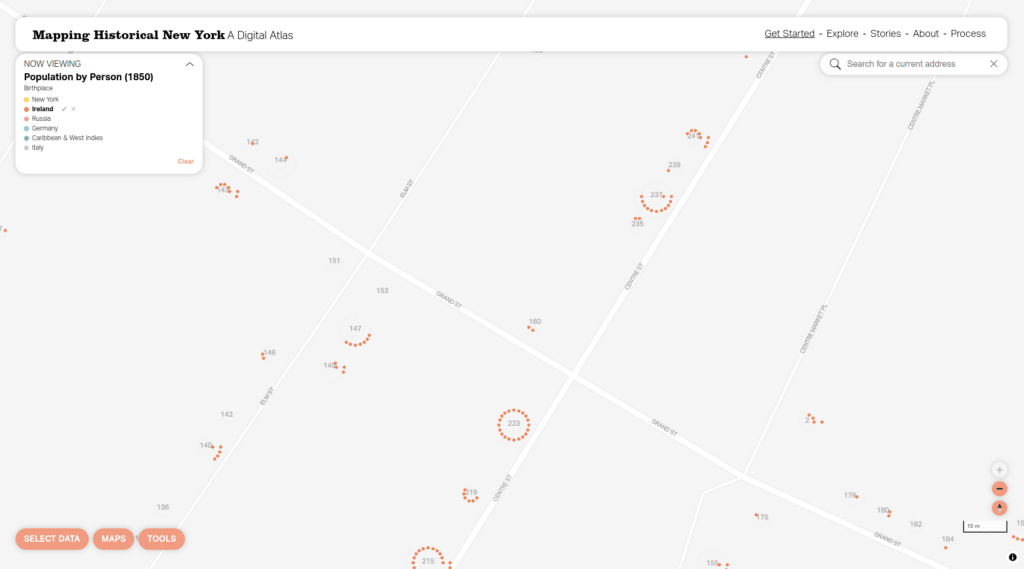
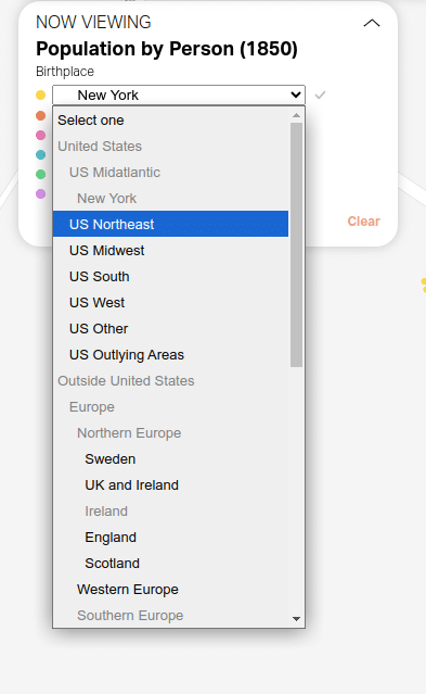
Whereas with raster layers users were constrained to the predetermined values within a category, with the vector layers users can edit and remove categories. This is a big change for categories like birthplace that have many values that were previously inaccessible:
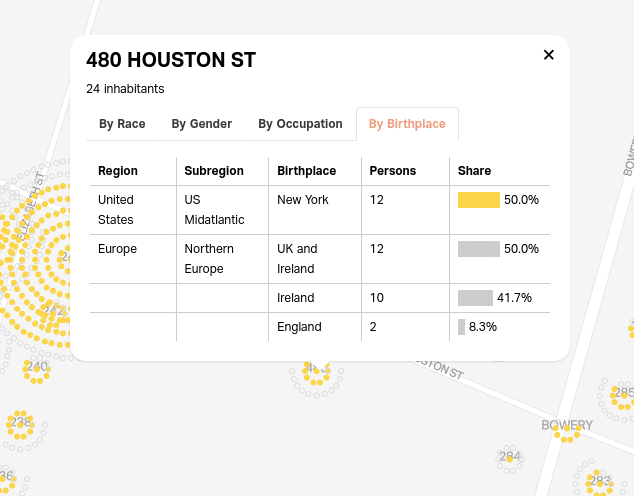
Finally, users can click on a building to view a full breakdown of who lived there:
Hope you found this deep dive into the techniques behind Mapping Historical New York useful! Please check out the map and get in touch with us if you want to talk about visualizing your data.