
At Stamen, we work with clients to improve their interactive cartography experience, frequently building full basemap solutions for large corporations who have very specific needs and exacting standards. Doing so means wrangling complex global data into beautiful, performant maps, controlled by elegantly written stylesheets. Most web maps have a near-endless amount of detail that can be tricky to design for without sophisticated tooling.
After finding all the issues and inconsistencies that come from collaborating on massive stylesheet JSON files, we thought it would be useful to see a visual cross section of a style. Enter Chartographer, a visualization tool that breaks down different stylesheet properties by layer and zoom level for easy analysis and debugging. Now instead of panning and zooming around the map to find and identify issues, or scrolling through thousands of lines of JSON looking for mismatched zoom numbers, you can visualize how layers are styled at all zoom levels in a single view. Stamen specializes in both interactive cartography and data visualization – why not combine these skills to make a data viz of interactive cartography?
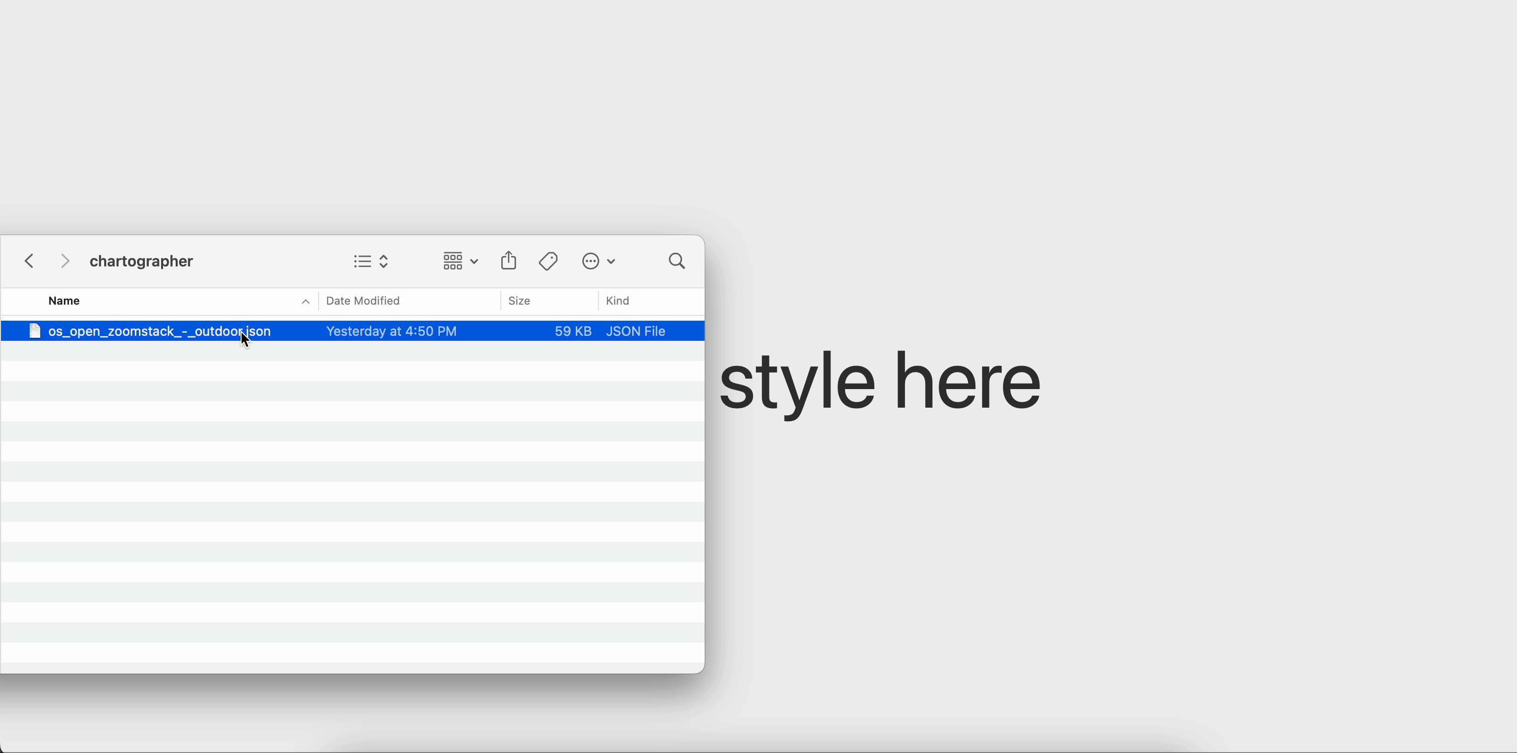
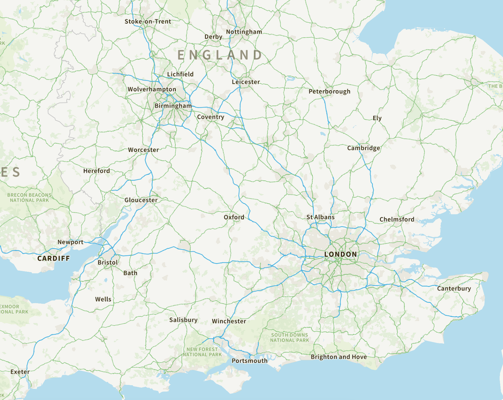
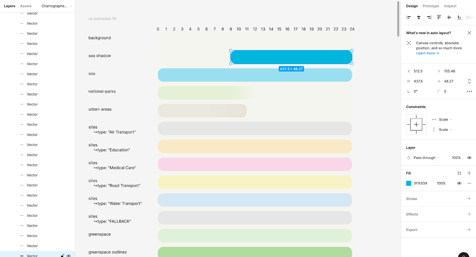
Using Chartographer to generate visualizations of a stylesheet (for example, let’s use the Ordnance Survey OS Zoomstack map) is simple – just open chartographer.stamen.com and drag and drop the style.json into the browser window.
Chartographer has three tabs for visualizing a map cross-section: fill, line, and typography.
- Fill renders certain paint and layout properties for all layers in your style by zoom level.
- Line helps break down how your line layers change in size and color across zoom levels.
- Typography renders all possible symbol layer label and icon combinations in your style.
Let’s explore each of these in turn using the OS Zoomstack map as an example.
Fill
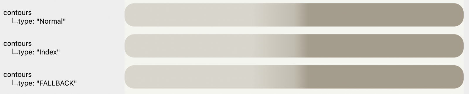
The fill tab visualizes properties for all layer types, such as color and opacity, over all zoom levels. The chart background uses the background-color property from the background layer in your style to help provide an accurate setting in which to understand the chart. Each horizontal bar reflects a layer or match expression output in your style. Here, for example, national parks and urban areas each have their own layer in the style, but there are many different styling possibilities for the sites layer:
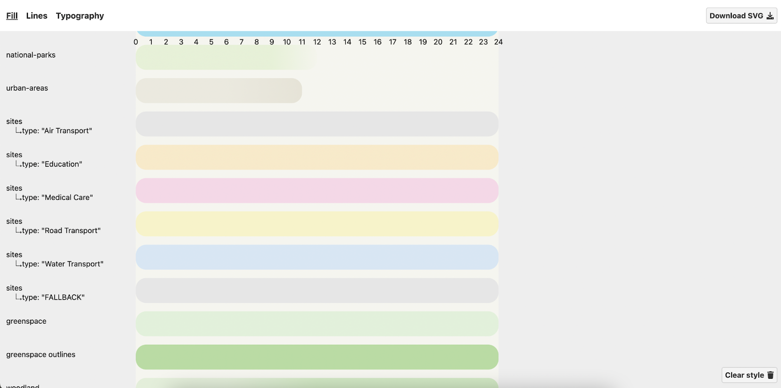
Each site subclass reflects a value in a match expression, including the required fallback value:
[
  "match",
  ["get", "type"],
  ["Air Transport"],
  "#e6e6e6",
  ["Education"],
  "#f7eaca",
  ["Medical Care"],
  "#f3d8e7",
  ["Road Transport"],
  "#f7f3ca",
  ["Water Transport"],
  "#d8e6f3",
  "#e6e6e6"
]
The x axis on these charts is the zoom level, where 0 (on the left) is fully zoomed out and 24 (on the right) is fully zoomed in. You may also have interpolate expressions, where a feature transitions from one color or opacity value to another across zoom levels. Here, the line opacity changes as you zoom in:
[
"interpolate",
["linear"],
["zoom"],
9,
0.25,
12,
0.45,
13,
0.7
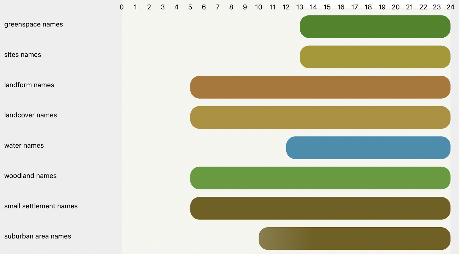
]Perhaps the most useful visual cue the Fill tab provides is layer visibility. There are a handful of ways to show or hide a layer in a stylesheet – Chartographer helps you quickly identify when you will actually see a layer rendered on the map. Here, I can see which name layers first appear at z5 (landform, landcover, woodland, small settlement) and which aren’t visible until z10 or later. This quick visual makes it much simpler to identify inconsistencies or unintentional styling in your stylesheet.
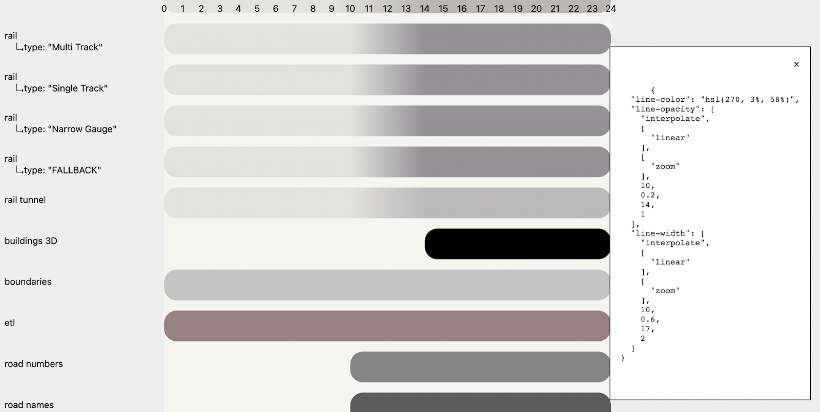
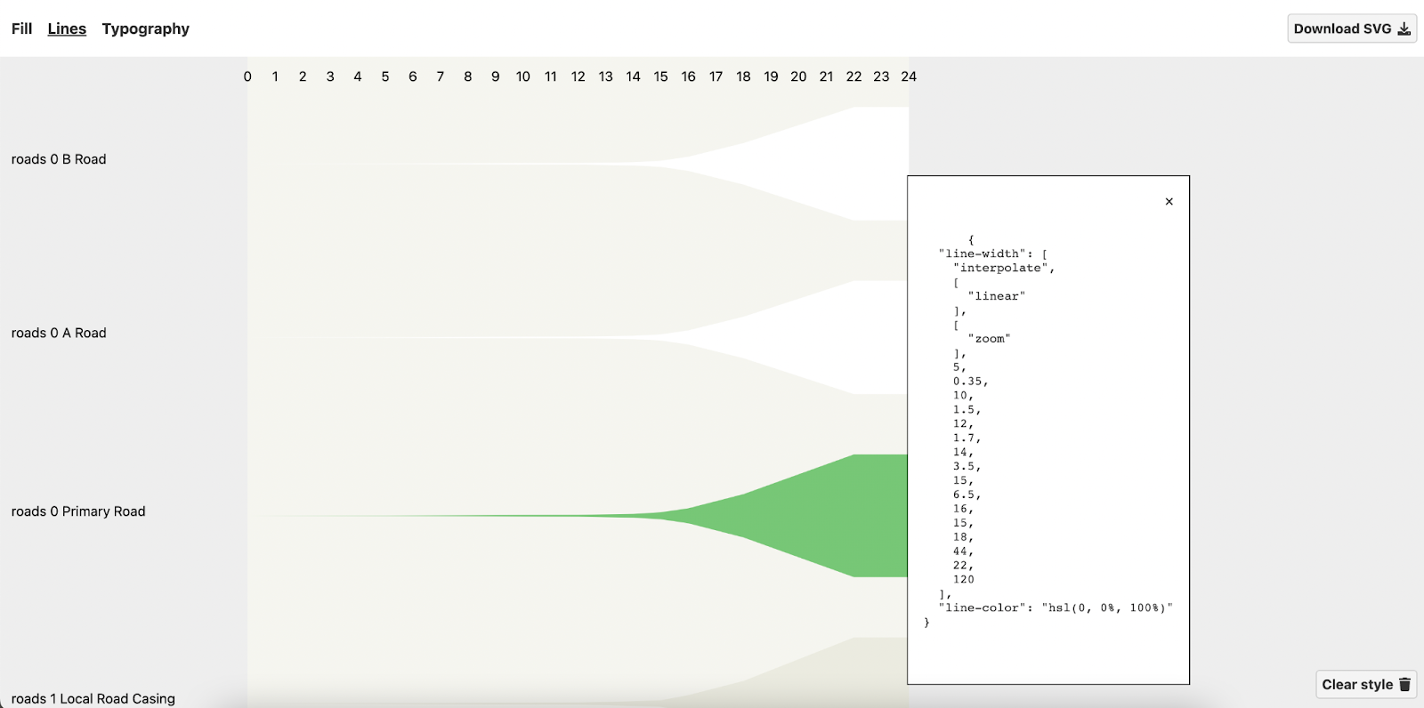
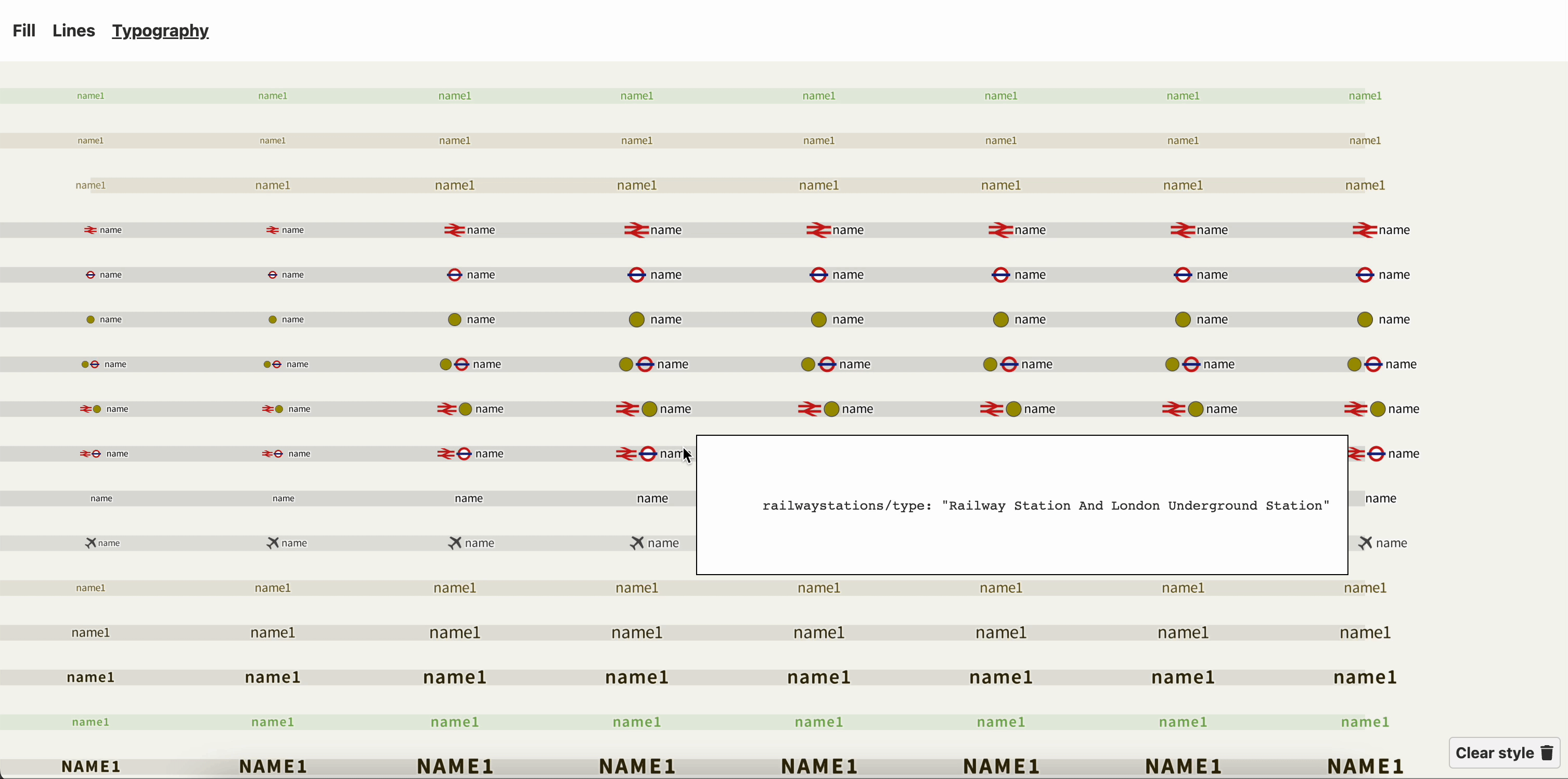
If you want to know more about a particular layer, click its bar to reveal a tooltip with the stylesheet properties currently rendered:
Finally, if you’re interested in preserving this chart for later analysis, you can export it as an SVG. We find it useful to bring the fill chart into software like Figma or Illustrator, where we can easily sample colors for use beyond just the map.
Line
The line chart is a great way to understand how your line layers transition by several paint and layout properties as you zoom in and out of the map. A lot of features here are similar to the fill chart – line color, opacity, layer zoom extent, properties are available on hover. The primary use case we’ve found for the line chart is to understand how line widths change across zoom levels. Line width interpolation expressions can be very complicated and hard to read, especially when a style has dozens of them for complex features like a road network.
This visualization provides a lot of insight into how each feature appears across zooms and relative to other features nearby in the layer order. Here, I can tell that the primary roads are green and ever so slightly wider across zoom levels than the A and B road features:
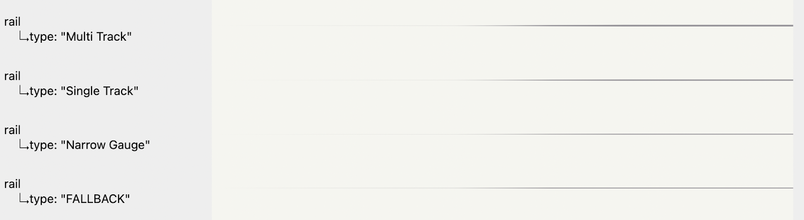
Here, I can see that different types of features in the rail layer are styled slightly differently from one another – a difference that might be hard to identify visually on the map:
Similar to the fill chart, you can export the line charts to SVG for further analysis.
Typography
While all tabs within Chartographer are useful for debugging, I find that the Typography chart provides the best snapshot of my style. The Typography chart uses Mapbox GL to render both labels and iconography for all symbol layers in your style. It will show every symbol combination possible in your stylesheet, including all fallback options.
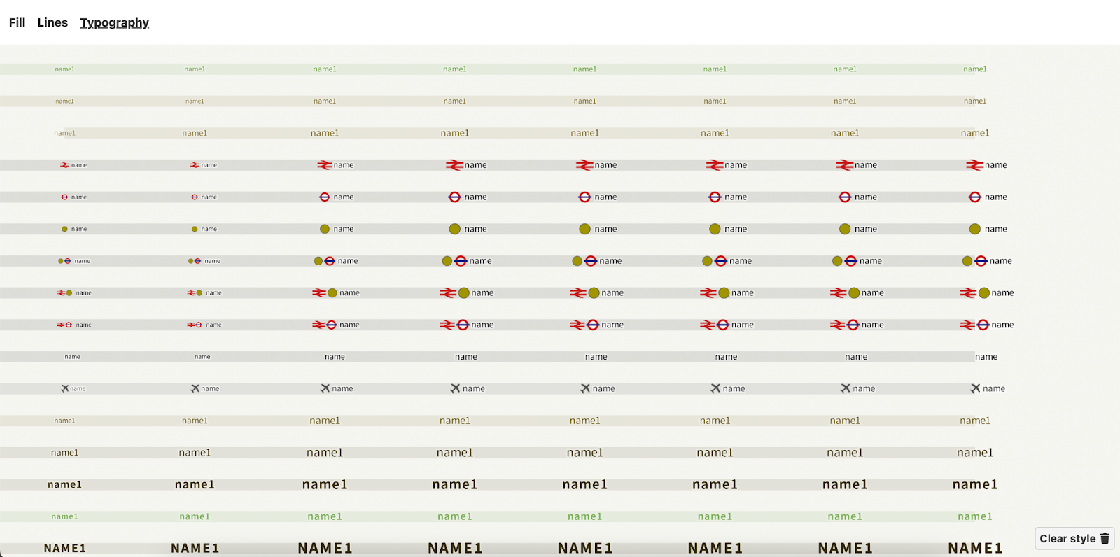
By default, the Typography chart uses the text-field property to render each label, but you can edit them individually for a more realistic example of how a feature might look on your map:
Unlike the other Chartographer visualizations, there is no SVG export option for the Typography chart (yet!). Other features that we don’t currently support include fill or line patterns and sharing interactive outputs.
Try it out
Have a map style you’d like to visualize? Give Chartographer a try and let us know how it goes! Tweet @stamen or send us an email if this helps with making a map legend, finding style inconsistencies, or if you just like the name of this tool. Find a bug? File an issue in the GitHub repository: github.com/stamen/chartographer
Chartographer is just one of many in-house tools we use at Stamen to make our cartography team more efficient and productive. We plan to share more of our cartographic tools on this blog in future months. Stay tuned!