
Like any good product, a basemap is something most people don’t notice when it’s well-designed. Typically providing context beneath a navigation route or other geographic data, the basemap is arguably the most widely-consumed type of map in modern cartography. However, today’s average map user might tilt their head when they hear the term “basemap” for the first time. In this episode, Stamen’s lead cartographer, Alan McConchie, talks about his passion for sharing map knowledge with a humble approach and explores some examples of basemaps that help us to define this unsung hero of the mapping world.
Alan inherited a love of maps from his family, who often had maps on the wall when he was growing up. While in college, his Pop vs Soda mapping project reignited an interest in the medium and he later found himself in grad school studying crowdsourced mapping in the geography department at the University of British Columbia.
After finding his way to Stamen, Alan began running cartography workshops with other “expert amateurs” like himself who had a desire to share mapping knowledge in what became Maptime. He also became a steward of the three free and open-source basemaps created by Stamen: Toner, Terrain, and Watercolor. Funded by the Knight Foundation, these maps were intended to support journalism, but were (and remain to be) free and available for anyone to use.
Alan provides a quick definition of a basemap being “a premade, mostly generic map for putting other things on top of it” but also explains that there’s much more to it than that. Having worked on several basemaps, from Carto to Facebook, he has learned that the data and design in a basemap rely heavily on the use cases it supports. However, in some situations, basemaps are used to support visualizations that the cartographer doesn’t necessarily know when designing it.
Understanding the endpoint of how and where a map will be used can be crucial in creating a more dynamic and fruitful map experience. Alan gives a great recommendation that whenever possible, a cartographer should create a “holistic map experience,” where even the lowly map that sits underneath everything else can play an important part.
Check out the many basemap projects we’ve worked on here at Stamen. Got more thoughts on basemaps? Let us know on Twitter! And if you enjoyed today’s episode, please help us share it to anyone who might be interested!
Transcript — +
[music]
You’re listening to Pollinate, a podcast on data, design, and the people that bring them to life. Brought to you by Stamen design.
Ross Thorn (RT): Defining basemaps, working as a professional amateur, and mapping places without even looking at them. These are just a few things that come up in today’s episode. I’m Ross Thorn, a cartographer at Stamen and today’s host. I chatted with a fellow Stamen cartographer about their journey and one of the most ubiquitous, yet somewhat invisible, cartographic artifacts in the modern world, basemaps. Please welcome my guest.
Alan McConchie (AM): Alan McConchie, the lead cartographer at Stamen, also the director of training, apparently. Because we also do workshops at Stamen sometimes.
RT: Oh, wow. Yeah. I think I want to get into this a little bit more later. But you were pretty integral with Maptime as well, right?
AM: Yeah. Actually, it started probably in my first year or two at Stamen. Really it was led by Rosy (Beth) Schechter, who was the education and outreach person at Stamen at that time. But yeah, with her and Lyzi Diamond and Camille Teicheira. Really, the four of us got started with Maptime at Stamen because we wanted to learn different mapping tools. We wanted to learn what was going on in open data and open geographic information, and started teaching each other classes and made it an open meet-up for anyone to show up and learn together with us.
RT: That’s awesome. How long have you been at Stamen when you started that?
AM: I think a year or so. I think it was pretty early on.
RT: I think you had talked about this in a NACIS talk, of describing yourself and many other mappers that you know as professional amateurs or expert amateurs. You kind of use both of those terms. But basically, taking this humble approach to mapping and understanding that you don’t know everything, and also that many people who make maps that we see are not traditionally trained.
AM: Yeah, exactly. I think of those four of us who kind of started the group, I guess Lyzi had also been in graduate school studying geography as well, and I had taken classes in cartography. And so some of us had that background, but we all had this ideal that maps should be democratic. Maps should be something that anyone can find themselves in the map, and be able to make a map themselves. We had that dream of being able to reach to that. So we really wanted to just let anybody, whatever their expertise, figure out how to make a map, or make it so that it wasn’t threatening to try to get involved in making your own maps or understanding them at least. And that is something that– on another level of just how Stamen works as well, is that we in some ways take that mindset with our work. In that, we’ll work for a client, and we’ll come into the engagement with the beginner’s mind, to use the zen term, of just we don’t know anything necessarily about the data that we’re going to be mapping, and we’re just going to learn it as amateurs who have done this a bunch of times. But every time, it’s new. So every time, we’re just good at being amateurs or trying to be good at that.
RT: Do you still feel that way? And do you have to consciously maintain that mindset sometimes? Do you find yourself in traps where you fall into, “Oh, I’ve done this a million times, whatever. There’s nothing fresh about it.” Or do you have to sort of discipline yourself into being, “Okay, I’m going to think fresh.” Or does it come easily?
AM: I think you always have to be doing both. You always have to come at it thinking fresh. Because I think there’s some aspects of every problem that will be new and some aspects of it that will be familiar. So maybe I’m making a map about forest fires, and I don’t know anything about forest fires, but I know about maps. And so there will be analogies that we can make like, “I’ve seen a map that has a totally different type of data that does something similar that might make sense here.” But then we have to talk with the expert about the forest fires, and they’ll say, “Oh, that bit of information doesn’t work that way.” Or, “There’s this other thing that you need to understand about how these data sets relate.” And then that will trigger something else for us that will be exciting. And have come up with a better answer for how to map that.
RT: Yeah, I think that naivety can really spark some inspiration. But definitely grounding yourself in it with the experts to be like, “Okay, is this appropriate? We came up with this really cool idea. Is it actually good? Is it useful?” That’s the most important part for the client that you’re working with. With Maptime, you mentioned that you’ve had some geographic background. Can you give me a little bit more about that? Your education and even your upbringing that maybe inspired you to even start pursuing those courses?
AM: Yeah. Well, I think probably like a lot of us in Stamen, I grew up being interested in maps, fascinated by maps. In particular, my family has all been people who love maps. I had a cousin who worked in a map and flag store, and my grandparents had a giant–
RT: Is that a franchise? Map and flag store? [laughing]
RT: Maps and flags are often sold together. It’s kind of interesting. There’s definitely a crossover.
RT: Yeah. What is it, vexillology or something?
AM: Yeah.
RT: I think it strikes the same thing of– the same chord in people.
AM: Yeah. Although, if anyone wants to hire Stamen to design and make flags– I don’t think we’ve ever done that before, but I would be happy to do that.
RT: An excellent plug!
AM: Yeah. So as a kid, I would visit my grandparents who had a National Geographic– those giant wall maps, basically, it’s like wallpaper on one whole room. And you can just get up super close to it, and see the half-tone printing on the wall. So I was always really excited by maps and inspired by them. But I think it took me a long time to realize it was a job you could do. Around the time I think I was graduating from college and was studying a bit of computer science, I made a website called the Pop vs Soda page, which is a survey online where you basically say, what’s your zip code or where did you grow up, and do you say pop or soda or Coke, or some of these other terms for– the generic term for sweet carbonated beverages. And not knowing anything about how to actually make a map, and what software to use, I kind of just made something from scratch at that time, and then for years never came back to making maps. That was a project that I would love to keep revisiting. And sometimes, I’ve used the data and tried to do something with it more recently. But it was something that looking back at it now, it’s like, “Oh, yeah. From the very first principles, how do I put points in the right spot on a page on a website?” Without checking to see if anyone had ever done that before or if there was software to use. And then, I think it took me quite a while to then start to think, “Maybe I should see if I could take classes in this thing?” And I did some grad school classes, and then ended up in graduate school at the University of British Columbia in the Geography Department, and studying crowd-sourced map making. So this was around the time of the late 2000s, after Google Maps had been created and OpenStreetMap has been created, and things we will probably want to talk about more. And also, the Web 2.0, which is also a super old term. But the idea of the second generation of the web where anyone could create their own content and the beginning of the social media era.
AM: So I was kind of studying that from a geographical perspective. How do all of these volunteers and amateurs online figure out how to collaborate, and create geographic information together that they can agree on, and how do they decide what is important and how to represent it? So yeah, I was in grad school for several years studying that, taking the very few cartography classes that are actually offered these days. That’s not a thing that really you can study in very many places. And then starting to meet people at places like Stamen who are actually working in this field, and managed to get into actually doing this work instead of studying it. And so this is how I landed at Stamen. And I was interested in education and interested in the ethos of what the other people at Stamen were creating with Maptime.
RT: I love that the Pop Soda map, which is– it went pretty viral, right, pretty soon after you had published it? Or, quote-unquote, “published it”, put it out there.
AM: Thinking back, I think I probably made the survey part of the code and didn’t know how to make the map for a few years. So I think the very beginning iteration of the map was a survey page, and it had, “The map is currently broken or under construction.” For a couple of years. That’s kind of what you need to do to collect information, to have something to map. But yeah, I think around 2000 or 2001, I got interviewed on CNN Headline News, back when they actually had news. And they just wanted a little– at the end of every half-an-hour, they wanted a couple of minutes of feel-good interest piece. And so they just, “This is an interesting map about an interesting phenomenon.” And it’s hard to say whether it’s an interesting phenomenon. I mean, it’s linguistic geography of how people use different words for things in different parts of the country, different parts of the world is really fascinating. It tells you different things about culture. Also, it’s not super important. And yet people really get attached to this type of thing, probably because it’s so unimportant. People really get passionate about people using the wrong word to describe carbonated beverages.
RT: It kind of falls into both being not important at all of– that people get attached to it, and love to arbitrarily hold stock in something, and to prove themselves right or whatever. But to me, also, one of the most important things is understanding that these things like culture and linguistics know no geographic bounds. And so understanding the soft boundaries of language across space is really important to me to find out– I’m from Wisconsin. I say bag and not bag. And people have always given me so much flack for it. But I love understanding these differences. And, “Oh, you say this this way, I wonder why.” And then you can actually research some of the history as to why you enunciate certain ways, and why you hold out different vowels. So I think even the most unimportant maps, I think, mean a lot.
AM: Yeah. And it is a way to get at– it opens up personal stories or a story about where did you grow up, and what is important to you, and what’s your culture like? So even the idea of asking this question, I think first started when I was a freshman at college and first meeting people from different parts of the country. And this became my little icebreaker question. When I was first introduced to somebody, I could ask them, “So where are you from? And do you say pop or soda?” And it was an easy way to start a conversation, and learn a little bit of something about them. So it was a great way to collect data, make friends for an introverted guy when I first went to college.
RT: That’s amazing. Well, speaking of seemingly unimportant maps. I really want to talk to you about basemaps. And maybe we can ground in that what it is. Because I find myself explaining it a lot to friends and family that really don’t understand different nuances of maps and stuff. And they always ask, “Haven’t all the maps been made?” Or I’ll describe what I do as, “It’s kind of like Google Maps.” And then they’re like, “Oh, then I guess I can blame you for the next time I get lost.” And they chuckle at me or whatever. But I think basemaps themselves are somewhat of an invisible map and might seem unimportant. But I was wondering if maybe you can just put in your own words, what even is a basemap? And can you give me a little breakdown as to how we can categorize it, and how we think about basemaps in cartography?
AM: Yeah, it’s a good question and it’s a tricky one. And I think it will probably lead us down some more paths of the history of mapping and things as well, as we try to unpack what we mean by basemaps. But the quickest way I would probably try to explain it. So first of all, basemaps really only are meaningful when we’re talking about web maps. So maps that are on the internet. If we’re thinking about maps that are printed out on your wall or in an Atlas, the notion of a basemap isn’t quite as relevant. It’s mainly on the internet when you have a map that is designed to have some other information plopped on top of it fairly quickly and easily. And it grew out of– I would say probably when we start thinking about the term basemap was around 2005-ish, around when Google Maps first became super popular. Or it was launched around that time. Because before that we had things like MapQuest, where you would have a map. If it wasn’t at the right field of view for what you needed, you would click a little arrow at the edge of the page somewhere, and then the page would go blank. It would load up a brand new map that was zoomed over a little bit to the side, or if you zoomed in or out. Basically, it was creating a new map for you every time you requested something. Which is slow. It meant that it has to go and get the map data, do whatever it does to add colors to the roads, and put the text on it, and then give you a brand new map. So the thing that really happened– and I don’t know whether Google quite invented it, but they definitely popularized it around that time, was to realize if we make a generic map of the world, and chop it up into a bunch of little chunks – these chunks that we call map tiles – and keep those saved and ready to go at any time. Then when a person comes to the website, they want a map. They say, “I want the map of this area.”
AM: The server just grabs those tiles that are already made, sticks them together, and serves them back up to you super-fast. So they’re already made, and you get a map much quicker than you had before. So that was one of the things that– Google Maps was amazing compared to MapQuest. And it meant that as you pan around the map, it would just grab one of those tiles slightly off the screen, and slide them in there. And you felt like you were panning across an infinite map when it was really just adding new chunks right before they pan into view. Because the basemap tiles– these map tiles were already premade. You could put little markers on top of them. You’d put little red push-pins to say, “Here’s the address that you just looked up.” Or, “Here’s your start and your destination.” You could draw a line showing, “Here’s where you’re going to walk or you’re going to drive.” So yeah, because of this need to make preprocessed, ready-to-go maps that would sort of live in the background to something you’d stick on top of it, the maps also had to be sort of generic. You wouldn’t really know if this is going to be a map for finding restaurants, or a map for driving to school, or a map for going for a hike. You had to have a map that is going to be in the background and will work for any possible use case. And then you don’t know what’s going to get dropped on top of it. So that’s basically what a basemap is. A pre-made, mostly generic map for putting other things, drawing other things, on top of it. And those other things are more dynamic, they’re more flexible. They might change based on what the user does. But the basemap will stay the same.
And things have evolved a lot since then. So after you make one generic basemap, it’s not that hard to make two or three. So you might make a basemap that’s mostly got roads. And it may be another basemap that’s got satellite background. One that shows terrain, where the mountains are from the hills, those types of things. So you might have a few different options. And then as we’re getting more towards more recent developments in cartography, last five or maybe even ten years or so, the way computers are faster, and the way we’re handling data has changed a little bit. The notion of a basemap is starting to get blurrier and blurrier now. It’s still really relevant in a whole lot of situations. It’s still kind of the fundamental way to think about how most web maps work.
RT: Yeah. That’s kind of how I think about them, too. I suppose if you were to break things down into thematic cartography and reference maps. They are one of the most probably analogous comparisons to a wall map. Like you had mentioned, of, “Oh, this is just where some things are.” And it kind of serves a greater purpose typically. But you kind of mentioned some roads or satellite imagery. And I think that’s a great question, of, “What do you put into a basemap when you make one? And how do you make the decisions of what should I be including here?”
AM: Yeah, I think it’s tricky because the thing with basemaps is you have to guess at how people might be using them. And this kind of also circles back to what we were talking about at the beginning. Where the way Stamen usually works for a client, they will have a very specific thing they need to map, whether it’s. “Show where wildfires are.” Or, “Show some demographic data.” And we’ll be understanding what their problem is. And this is the sort of thematic type of mapping that you’re talking about. But with basemaps, you kind of have to make them– have them ready to go. And then you don’t know when a client is going to call you and say, “I need a map of wildfire.” And you better hope that your basemap shows where the fire observation posts are, right? And maybe your basemap doesn’t show that. So yeah, you’re kind of designing for the imagined sort of most generic use cases. So people generally need roads. You want the name of places. You want things like parks and types of things we call land use. Where this is a big school. The types of things that are happening within this university campus are different. So maybe we color that differently, so you can tell it apart from the neighborhood right next to it. Those are the kind of things that most basemaps have. But they don’t always have to have any one particular thing.
The other thing I think we didn’t really talk about is that basemaps and the way tiled maps work is that you have this notion of different maps that are pre-rendered, pre-generated for different zoom levels. And so that’s a whole other set of things. When I’m zoomed out, and I see all of North America in a few map tiles, I probably don’t need streets. I might not even need highways. Maybe I only need country borders and where cities are. So all of those different levels of how zoomed in you are, are also pre-generated maps. And so maybe when I’m zoomed into a neighborhood, I could see mailboxes and crosswalks if I had that type of data. But you definitely wouldn’t include that at the lower zooms, the sort of more zoomed-out map.
RT: I always love to compare things back to navigational maps because they’re probably some of the most used maps. Even old road atlases, too. When you have that road Atlas, you’ve got literally a message in a bottle. The cartographer had to make a lot of calls because no matter how close you bring your face to the map, it’s not going to change. But now, we have the luxury of having basemaps that can be dynamic for how close we figuratively, virtually bring our faces to the map, which is a brilliant solution.
AM: Yes. In a good navigation atlas or printed map, you’ll probably have– one page will be the whole state of Wisconsin, and then on the back half, you’ll have a bunch of smaller maps of every city that show different detail. Or you might have locator maps that will show, here’s where Wisconsin is in North America. Those are kind of different levels of zoom, if you think about it, I guess just for the print cryptography world.
RT: Yeah. I’m going to ask you a question here that I don’t think I’ve ever heard asked. That doesn’t mean it’s a great or really thoughtful question either. But what is your opinion on a basemap? Because I know that sometimes people make basemaps or projects with basemaps, and they often even differ on its definition of what should be included. And sometimes, it’s maybe a lack of understanding of what it actually is, but also could be just a completely different way that we think about interactive maps. And so kind of like what you’ve mentioned, we often think about basemaps as something that goes underneath some of the other data or experiences that we’re trying to create with the data, and the meaningful stuff kind of plopped on top. But if we visualize it like that, in our minds, as we’re creating this, we automatically segment out that mapping experience and layer it as basemap, and everything that goes on top. Is that a paradigm that you think could be challenged? And I know that you worked on a project recently with Amira Hankin, a designer here at Stamen, and she told me how Stephanie May, another brilliant Stamen cartographer, challenged the team to rethink about how you were developing the map. And less of, “This is just a basemap.” And more of a total map product. So could you tell me a little bit about that experience, as much as you can. And is this a notion that we can challenge of the basemap being something that’s just underneath, or as a part of the whole mapping experience?
AM: Yeah, I think I would probably say whenever you can create a map that is a holistic experience where every part of it is re-thought and specifically designed for a use case, you should. I don’t want to say basemaps are a necessary evil, but they’re a thing that makes so many maps possible when it would be overkill to design everything in the map from scratch. So that being said, we’re really seeing more and more– companies that are making maps or people who are hiring us to make a map or just asking us for guidance on how they should plan their mapping future, what type of services people will want for maps. This paradigm of the basemap and then the stuff that goes on top of it. Yeah, I would say we should leave that in the past. Use that when you have to. But if you at all can, make the whole thing work together. And we’re seeing this happen for– again, Google Maps has pioneered a lot of this stuff in terms of the wide application of this. But things like if I am searching for a thing, and I’m going to navigate there by bicycle, by the time I’m asking for bicycle directions, the map has changed. And it’s starting to show me where the bike routes are rather than where the freeways are that I can’t use as a bicycle. It’s the point where the basemap kind of changes but the information that you are highlighting on it is also sort of embedded. Google will show you more points of interest. Things like restaurants and stuff that are along the route that you might be likely to take.
So the whole thing becomes much more dynamic. It knows what you’re doing. Or as you’re asking for the map to do things, you’re using it as a tool to accomplish a task, everything in the map, the basemap, the stuff on top, all of it, it all should be changing so that there is no more notion that the basemap is staying the same while stuff on top is changing. All that being said, it’s harder to do that. It means you have to put a lot of effort into designing how the map should function for that use case of, “I’m navigating by bicycle.” Or, “I’m reading local news stories.” Or, “I am looking at the spread of a wildfire.” Those are all things that– it means a team of designers and cartographers has to work on the map to make all the pieces make sense for that. And when there’s resources to do that, and we’re talking about big companies like Google and other large players that are building these really powerful map experiences, it’s worth it to do all that. And to really erase that notion of the basemap and the content.
RT: That purpose is probably that huge driver. And I think many– if I could default to anything, of any sort of mapping decision I make, it’s default to, “What is the purpose of the map? Is this serving the purpose of the map?” And sometimes, in a mapping experience, especially if it’s dynamic and it’s changing as the user inputs different things, the basemap as a component doesn’t have to be a static thing. And that’s, brilliantly, what we talked about is that it changes on zoom. It should also change on use case. So if I’m looking at a map, and I’m doing those bike routes, and then I zoom out or I go to a different– maybe there’s an example of the news story of I’m looking at something that’s really related to natural stuff, and I really want to evoke that, I should change that from a streets view map to something that’s more of terrain view. And so I think you’re right, in that, that purpose is going to be the driver of that experience, and how we need to think about basemaps as a part of the whole experience, rather than just a default to show other data. Speaking of basemaps, too, I know you’ve worked on a lot of basemaps that have been used in so many different places. And I’d love to talk to you about the Stamen basemaps. And I know that they were kind of started before you got there but you’ve done a lot of work on them themselves. And so could you maybe just give me a little background on the Stamen basemaps, and what was their purpose, and how did they come to be?
AM: Yeah, I think there’s really three pretty famous Stamen basemaps that we still– I don’t know if we still “support”–we still offer them. They’re getting old, they’re showing their age. But around 2010, 2011, so a few years before I started– I think because of the type of work Stamen does, so people will hire us to make a visualization, a data visualization, or a map of something. We needed to have basemaps to be able to do that work. So we couldn’t just do everything on top of Google Maps. And so part of the thing is Google Maps works great for most use cases. But it’s not aesthetically designed for certain types of things that we would need it for. There’s costs involved. You have to pay Google if you use it if you have enough traffic that uses their tiles, that type of thing. So to make the work that we needed to make as a design studio, we needed to have basemaps that we could put our things on for client work. And it was also around the time that the data sources were evolving to the point where they were useful, that we could actually make a basemap. That’s something we haven’t really talked about either, is that to make a basemap– pretty much all basemaps– although I guess by definition they wouldn’t strictly say this, but most of them are worldwide. Which means you’ve got every street in the world and every place name, every town has to be in a database somewhere for you to make a map that has a map tile for every street everywhere in the world.
RT: That is so interesting because I’ve never thought about that. Whenever I look at one, I assume it’s going to be worldwide. I’ve never really thought about that.
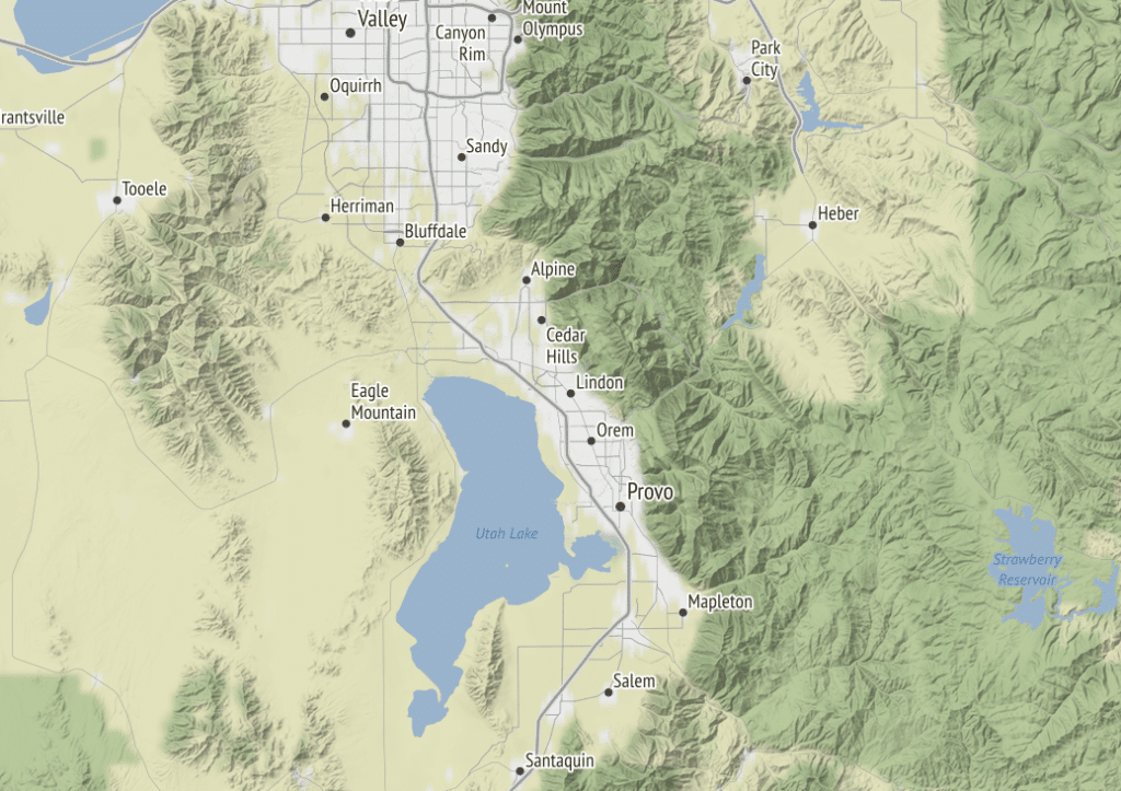
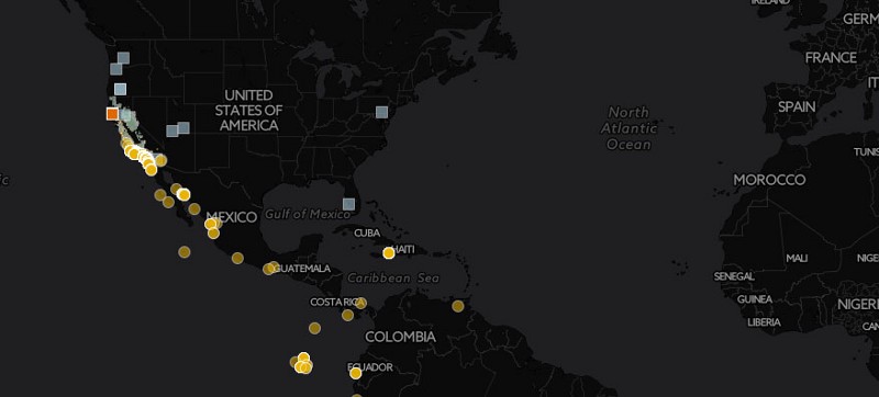
AM: Yeah. And it doesn’t always have to be. So at Stamen, we made a couple of just California basemaps because we were working with the parks agency, and they just needed– if anyone tries to pan out of California, they’re not going to see any information on top of the basemap. So they don’t really need the basemap to be there either, right? So of the three basemaps that Stamen developed around 2011– we should talk about each of them in turn. But there’s Toner, which is a black and white one suitable for putting really colorful data on top of. There’s Watercolor, which is really artistic, looks handmade using really, “How do we figure out a way to programmatically put watercolor effects on a map?” And then the third one, called Terrain, actually was US-only when it first launched because– the data for what the shape of the hills are and how tall they are. And I think also the landcover data, so where the forests are, where the farms are, where the grass is, where the tundra and permafrost. We only had data for the US, so that was US-only for a few years. Yeah, so they don’t have to be worldwide, but often they are. Because usually, if you’re making a basemap for an unexpected future use case, you don’t know whether people are going to need it everywhere in the world.
AM: So getting that data for every street and every street name in every town in the world is hard and expensive. And so companies like Google are driving around with huge teams of people in cars taking pictures of every street and collecting the locations on a GPS, and knowing where the streets are and what they’re named. So basically, to make a basemap, you would have to get that data from somewhere, buy it from somewhere or license it. And around the same time, actually, that Google Maps first launched, there was a group of people in the UK who started thinking, “We can create our own database of roads and map information for the whole world just by ourselves, as volunteers.” Handheld-GPS units were really getting to be common at that point. People were just riding around London on a bicycle, recording where the streets were geographically with their GPS, writing down on a little notepad what the name of the street was, and when they turned, and then putting that into a database and building up a database of the world. And that became this project called OpenStreetMap. And it’s really inspired by Wikipedia. So if you think of Wikipedia is an encyclopedia where every article is just written by a bunch of volunteers who just decided that this was important to do, and shared the task of doing all this work. OpenStreetMap was, “How do we take that same approach to collect a database of where are all the roads, and what their names are everywhere in the world?” Which is a big task. So for a long time, it was pretty sparse. For a long time, it was just like, “Oh, it’s just a bunch of streets in London, and maybe a few other cities.” Right?
AM: So you need people to be contributing that for years before you have anything even remotely that you could start making a worldwide basemap of. And sort of around 2010, around 2011, the OpenStreetMap data was finally mature enough or there was enough of it that Stamen’s team at the time said, “Okay, we can actually use this to make our own basemaps without having to pay anybody for the data.” And we also had a grant from the Knight Foundation. I don’t know if this is the only thing that they’d fund, but they are supporting journalism, in particular. And so they realize that there’s a lot of people– a lot of journalists writing articles that need to be able to put maps in their articles. And so they wanted to fund a way that we could create these basemaps that would be customizable for them to use. So Knight Foundation wanted to fund us to make these maps available for anyone to use, for any purpose. Specifically for journalists to use, but really for anyone, to make maps really easily and cheaply. So that became those three maps that we developed at that time.
RT: That is very cool. Did the Knight Foundation sort of guide you in terms of the maps that would be useful? Because I know these three different maps are vastly different and beautiful in different ways. And there’s a lot of things that I like about each of them, too. So how was the decision and the purpose that we’ve kind of been talking about synthesized?
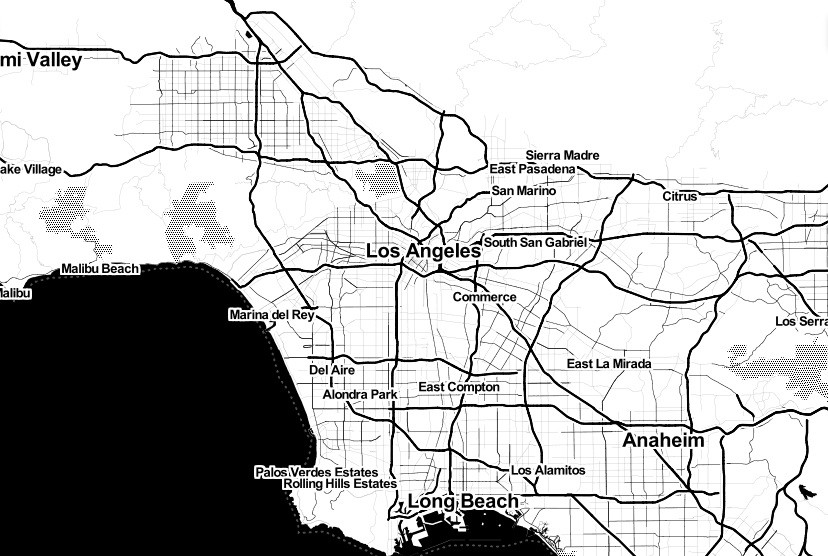
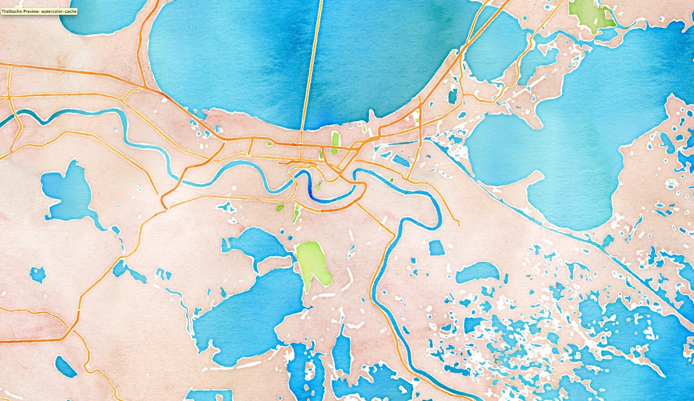
AM: Yeah, I think it was probably a lot of back and forth at that time. And there had been other people trying to– or not trying to, but successfully making basemaps on OpenStreetMap data in the few years right before that. And some people were trying to make a business out of it. Seeing, “Will people pay for maps using this free data set?” And so the idea was out there to make maps on OpenStreetMap data, and make tiles that people could use. And I know, again, all this happened a little bit before my time, that the Night Foundation grant started also with us building a tool that made it easy for anybody to just geocode data. So geocoding is when, say, I’ve got a spreadsheet that– here are some police reports, and here are the addresses. Just having the address is actually not enough to put it on a map automatically. You need some process to know what an address is, figure out what is the latitude and longitude for that address so that you can put a dot on a map. And so we were making a tool called dot-spotting, which was just basically making it really easy for a journalist, who might have a table of 100 addresses, to plop those onto a map. So the black and white map we called Toner, I think was developed first, with this kind of goal of a map that is really clean, really minimalist, really easy to print in black and white.
RT: Yeah. That’s a good point. I wouldn’t have thought about that. To be able to take that from the interactive place. And if it needs to be for journalism, it’s perfect.
AM: Yeah. And also to be able to support visualizations on top of it. So if you have something where I need ten different dots of color to communicate different types of things that I’m showing on my map, and I put those on a Google map, which the Google map already has greens for parks and it’s got yellows for roads and blue for water. You have these colors competing with each other. It makes it harder to read. So to make a map that is just good for having colorful stuff on top of it didn’t exist in that way at that time. So definitely, Toner was created first. And I think in the process of working through this grant, and seeing what was most effective and most appealing to the journalists, to the public at large, to the Knight Foundation itself. This idea of providing these maps and showing really what could be done with pushing the boundaries of what a basemap could look like when you have access to the raw data, and you have control, using open-source tools, of the whole process of rendering that data into a map. Because again, if you wanted to customize how Google Maps looks, you are really limited, or at the time, you really couldn’t do anything. They wouldn’t give you the data. You couldn’t take the data and say, “I want streets to be three times thicker, and I want to remove the parks.” Right? You can’t do that. But if you have the raw data from OpenStreetMap, and if you’re using open-source mapping tools, like we were doing and developing at the time, you can make a map look like anything.
And so that’s where I think the Watercolor example came from. We really wanted to make a map that’s beautiful for use cases that are maybe less serious than a Toner map or more artistic. But also just to show look at what anyone could be capable of given data and tools that are available for everyone to modify and extend however they want it to. So that’s really what– I think Watercolor just wanted to just put a marker for, “There’s a whole new frontier of what can be done now.”
RT: I love both of those maps. One of my favorite parts about the Toner map is the way hierarchy is achieved in such a limited fashion. Color is so useful to us as humans to perceive differences. And when you take that out as a designer, and as a cartographer, that is extremely challenging. I’ve worked on monochromatic maps as well, and they’re challenging to be able to make those calls and to do that. But the Toner map, I think, just does it so well, of using different sizes, different widths, and textures. So I think that’s great. But you mentioned Watercolor, and my favorite thing about Watercolor is this rejection of that authoritativeness that reference maps always carry. This is a reference map in itself but it’s not 100% accurate in some ways. Because there are roads that are literally bleeding together, and it’s just gorgeous. And it’s a good challenge to another paradigm of that authoritative map that is so relevant to many people.
AM: Yeah. And as a literal metaphor of, “It looks like a handmade map.” And when you think about it, the data is kind of handmade by a million volunteers who are all just doing this, not literally by hand, but in a computer sense, it’s not a computer really doing it. It’s all volunteers deciding to draw the line from this point to that point, and deciding to type in here’s what the name is. It’s all handcrafted in some sense.
RT: I didn’t even really think about that. But now that you bring that up, it’s a beautiful metaphor for maps, and for any sort of design or data visualization. That there are humans behind much of this. And I guess, now that’s still questionable. But there are humans sometimes behind machine-learning that’s behind some of this, too. And it’s people who are making decisions. And what comes with those decisions, what decisions are made, and from what sort of perspective? So it’s a beautiful comment on that.
AM: Yeah. OpenStreetMap is a very obvious example of everything in a map being created by humans in some sense. But yeah, I think you’re also getting to the point– there was just a more fundamental– we all, I think, hopefully, absorb this idea that maps often try to present themselves as objective and created by the hand of God or whatever. This is what the world is. When really, every single map, every single piece of data was collected by a person who had a point of view or was processed or modified or whatever by people who were in situations, who had perspectives, and who had particular drives, and people paying them to do certain things. And doesn’t necessarily make it bad. It doesn’t make it wrong. But it just means that, yeah–
RT: You have to critically look at that. You have to definitely understand that. And I think we fall into a trap of that. Or I guess we as the public, and American public, especially, every four years, when we look at political data, we fall into the trap of, “This is objective, this is the data as it was.” But every time that happens, I try to make a post on social media of, “Hey, let’s take a breath. Let’s look at these critically. We have to understand what’s going on behind them.” And I think that frame of view often gets put more towards thematic mapping, but less so on reference mapping. But I love that that’s happening. And I’ve definitely heard and seen conversations about that with OpenStreetMap, and with other sort of authoritative-looking maps. We have to understand that there are people behind this, and there are people with an agenda that might be benign, but sometimes it’s not. Sometimes, it is for a specific purpose, for some sort of gain. Those maps are just beautiful, and incredible work done by Stamen on those. And I’m saying that as someone who came to Stamen after that, too.
AM: Yeah. It’s a little bit, not quite discouraging, but it’s like, “Will we ever really live up to that Watercolor map?” I don’t know. I’ve been at Stamen for eight years, and I feel, among the mapping world that we both live in, generations from now, I don’t know, that’s what people will remember Stamen for, is that Watercolor map, if nothing else.
RT: Yeah. And I think there’s some sort of beauty in that, too. Like you said, of this democracy that we want in cartography, and that you’ve worked towards. I love that notion as well of let’s make these tools and these products for everybody to use. And now, we’ve got a lot of those. You mentioned Google Maps before, at that time, didn’t allow you to customize. Now, you can. Now, there’s Mapbox. Now there’s these other sort of software that let people have a lot of control over this basemap that we’re talking about. It’s a beautiful thing, but it’s also like, “Oh, man, will we live up to this monumental piece in cartographic history?” You’ve touched on some of these maps, and you’ve worked with these maps. And speaking of, will you live up to it? What inspires you to make a new style? And do you foresee yourself making another style? And if so, what might be the purpose?
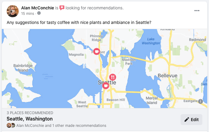
AM: We’ve made other styles since those three maps. We have done some that are more in the fun direction. So not long after that, I think we used some of the really new, at the time, Mapbox tools to make a really fun-looking map for Pinterest, which I don’t even know if it’s still live anywhere on Pinterest. But it looked like a lot of the textbook– it was kind of stamped on, there was all these textures. It looked kind of– it was almost like not quite fabric. But it was really playful and we did some randomization so the labels would be sort of off-level, so they looked a little bit handmade. So there’s still, I think, room for fun maps. Although, the use cases, again, become more and more narrow. Although, the Watercolor map, I continue to be shocked where people are using it when they probably shouldn’t. People putting scientific research results on this Watercolor background map. It’s like, “Well, you might have used Toner.” But people just love it which is fine. And then we’ve done other maps. We did a couple of basemaps for CartoDB. Which is now called CARTO. And they’re data analysis, business intelligence on maps type of thing. So those are more a light and a dark version, sort of another generation of Toner, but a little bit less dark. And you and I are continuing to work on a basemap for Facebook, which will need to have a particular feel to it. It needs to feel like Facebook. But again, Facebook has so many different types of uses within all the different types of things you can do within their apps, and their multiple apps as well. That there’s already going to be multiple flavors of the basemap as well.
What do you need when you’re checking into a place? What do you need when you’re looking for recommendations? What do you need when you’re showing that you just traveled across the country? So I think basemaps are probably less relevant in the future. That basemaps are just part of a map. I think that there is a risk of just wanting to make wilder and wilder basemaps that are not really useful for much. So now it is kind of easier for people to make basemaps primarily using the Mapbox tools. Mapbox really makes it easy to do a lot of customization. Also at the expense of there’s some things you just can’t customize as easily. So you can make all kinds of really cool textures and all kinds of different color choices. But to make it so that it’s easy for you to make those changes, you cannot really easily change what all the labels are or where they are. Those types of things.
RT: Right. And you couldn’t do things like blending the roads together to give it that hand-created look.
AM: Yeah, exactly. To create Watercolor, even today, you would still have to really extremely modify all of the open-source pieces that it takes to render a map. And you have to run that on your own servers to be able to do it. Because no one else is going to host something that’s that flexible. I really did also like, for a few years, this company, Mapzen, was doing some much more experimental basemap support. And you could do things where the basemap would warp into different map projections, or it would curve into the distance, or wrap it around a sphere and do all kinds of strange things with it, too. So there continue to be people who work on experimental types of basemaps. But yeah, I don’t really know– we don’t really know what they’re going to be used for. And I guess it depends on when the next specific use case wants something experimental. There’s new ways to make that now. But it would be for a particular use case rather than, “Here’s a weird experimental map that we’re just going to offer for other uses.”
RT: Yeah. It’s exciting to know that some of those things aren’t totally accessible, too. And it just goes to show you the brilliance of some of those decisions that were made in these Stamen maps, too. Not everyone can still just do this. It’s brilliant, and it’s wonderful that people can make basemaps super easily. But I guess, kind of taking that little reservation of, “Okay, so we’ve still done something that still remains unique to this day.”
AM: Yeah. The other thing is also, I think, there’s always a bit of a tension with basemaps that I think we haven’t really touched on either. Unlike most other types of maps, it has to be programmatically done to work for the world in a way that the cartographer themselves never sees every part of the world. So when you and I are designing a basemap now, and we’re typing in the rules for, “If a city is this population, draw it with this font size, and put it to the left.” Whatever. We have to do that, and then just say, “All right, we put those rules into the process, and then map tiles come out the other end.” I may have never checked to see what that looks like for a particular combination of cities in Siberia or something. And we just have to trust that it’s working forever, everywhere. And that’s a real different way of thinking about how maps work. For a print map, I would assume that anyone who ever makes a print map has had a chance to look at every placement on the whole map. Or if we’re making other types of maps. We haven’t really touched on the other sort of track of how maps are made these days with more JavaScript database libraries. D3 is another kind of way to make maps that are not a basemap. But there’s something that you, as a cartographer– you see the whole result. So you know what the end thing looks like. I’ve just never seen every piece of the result of this thing that we’ve made, how do you kind of get that hand-curated touch when you can’t touch everything on a map that’s of the world in high detail.
RT: That is absolutely wild. I don’t think I’ve ever thought about that. I’ve literally made maps, technically– or one map, but technically, maps of places I haven’t even looked at. And I’ve made decisions to make that. That’s a brilliant realization for me. Thank you for that. I have to go think about that now.
AM: It’s going to keep you up at night now. You’re going to be like, “What?”
RT: I’m going to have to try to check a country every day, “Did I check Tanzania today?” Alan, thank you. This has been a wonderful chat. I really appreciate you taking the time to chat with me, and give insight into this ubiquitous part of mapping that I think is not even really noticed enough. So thank you.
AM: Thank you. This has been a huge pleasure.
[music]
RT: Thank you for listening to Pollinate, and thanks to Alan for our conversation today. Music for Pollinate was created by Julian Russell. You can find the Toner, Terrain, and Watercolor basemaps at maps.stamen.com. If you liked the show today, we’d be grateful if you shared it with friends, family, and other folks who might find it interesting. You can also tell us on Twitter at Stamen, using the hashtag PLN8. For a summary and full transcript of today’s conversation, along with some other visual examples we talk about in the episode, check out the blog post at stamen.com/blog.