Elden Ring has been the buzz of the gaming world since its release in late February. As the latest title by From Software, it’s the studio’s first foray into an open-world role-playing concept for their extremely popular and infamously difficult games (typically referred to as Souls or Soulsborne games from two notable games in their catalog, Dark Souls and Bloodborne). It’s also the first of these games to include a map, which really excites us at a cartographer studio with some avid gamers.
UPDATE: With the release of the Shadow of the Erdtree expansion for Elden Ring, there is a new map to talk about! There are also a few things we wanted to mention that we missed in the first evaluation of the map. Check out the addendum in the Final Thoughts section of the post!
Ross Thorn: My name is Ross Thorn! I’m a cartographer at Stamen. Chances are, you’ve never heard of me, but if you have it’s for one of two things: taking second place in the Rhinelander Public Library’s Worm Race or for my various work making fictional maps or researching playful maps.
Katie Kowalsky: And I’m Katie Kowalsky. I’m an ABBA superfan moonlighting as a cartographer/PM at Stamen. I’ve always loved video games and building my PC during the pandemic reignited a spark in me.
K: Obviously Ross, you’re the scholar on paper here.
R: And you, Katie, are the Souls expert.
K: Well, you know the pandemic happened and during lockdown my friends started replaying Souls games and I became the live audience member for them on Discord/Twitch. I fell in love with Miyazaki’s game design and that’s probably because it’s such a blast to watch.
Obviously my friends and I (and all the gamers at Stamen) have been excited for Elden Ring—because AN OPEN WORLD SOULS GAME?! GEORGE R.R. MARTIN? MORE CREEPY MONSTERS? The first day was phenomenal, if only to see everyone start to realize a Souls game has a FREAKIN’ MAP. I’m fine, I can calm down.
R: Definitely. In my humble opinion, the other souls games are literally unplayable /s
K: Well that’s just because you’re a cartographer. We should caveat that there can be amazing games that don’t need to have maps. Maybe.
R: Not every game needs a map and maps should be used thoughtfully as a tool. That’s what I want to explore in this series, seeing which maps are successful in some of the hottest games and what makes them tick. We’re going to judge these maps on four criteria (that I threw out there in some research): interactivity, immersive, incomplete and interpersonal. We’ll explain what these mean as we go through them, as these are the ways that maps designed for play and entertainment differ from more traditional maps.
K: Something I think is important to highlight is that we don’t want to focus on cartographic aesthetics per se, maps are tools and video games use them as such. We care a lot about treating maps as not just the de facto choice for our work. They need to make sense for the context and some of our best work doesn’t have a map.
When we are working on maps at Stamen there are so many choices that get difficult to articulate around how maps work and how to make them seamless for the end user. And I think, where we end up getting a lot of our inspiration is from video games because they naturally struggle with some of the same things we do, as we’ll talk about.
R: All right, now I’m very excited to talk about this, let’s get into it.
Interactive
R: So interactivity is how a player can make changes into the display of the map. That can be done in several ways through the map interface itself: adding pins and markers, panning and zooming across the map, etc. What’s cool in gaming is that you can commit changes to the map by just playing the game. One of the classic examples of this is finding map fragments and that’s a huge part of Elden Ring (we’ll talk more on this later).
K: Ahh, got it. Yeah, discovering locations like sites of grace to be added to the map is crucial for one of the map’s main functions of supporting fast travel. This mechanic guided by grace is cool, it really helps give a sense of “where next?” even without tons of icons like other open world games. I wish wayfinding apps existed.
R: Totally! It allows for wayfinding without hand holding which I think is great. So many games give you a straight beeline of where to go next. While Elden Ring provides more guidance than other Soulsborne games with grace and the map, it hardly could be considered hand holding in the context of modern gaming.
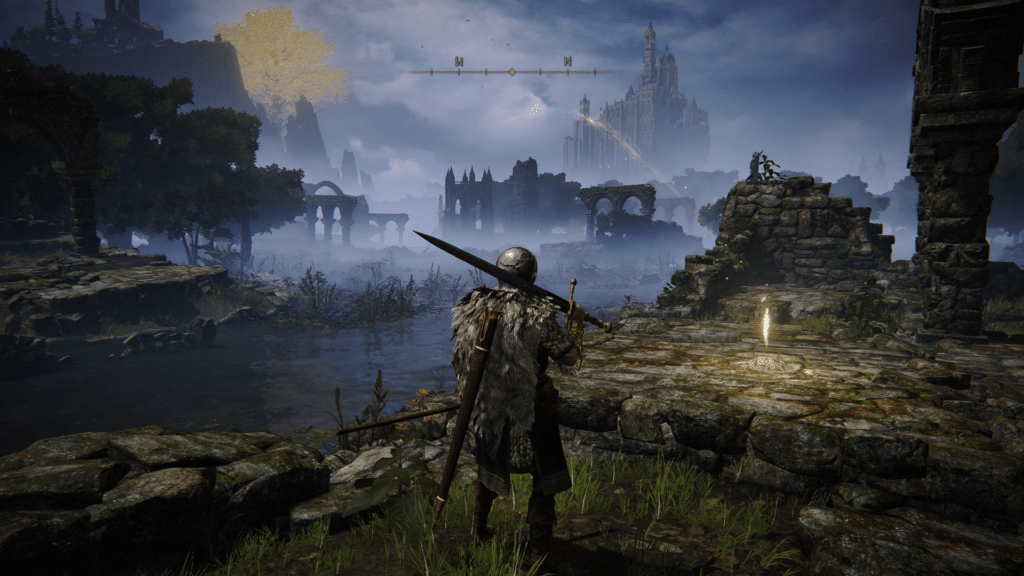
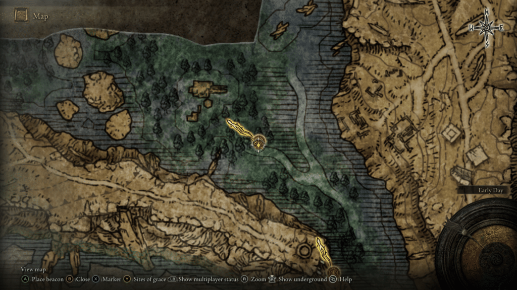
R: Its quests sort of remind me of my favorite game The Elder Scrolls III: Morrowind and I think it could draw inspiration from something like that. An NPC would tell you something and, if you’re lucky, they’d give you directions just like you’d get them in real life in 2003. And some NPCs do give these wayfinding directions in Elden Ring, but it’s something I wish there was more of because it feels like a minor puzzle to solve in itself.
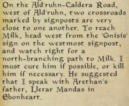
K: There are also some maps that you can find in the game that have locations marked on them for various quests. What I love about these “simple maps” (as they’re called in the game) is that they give you the endpoint of a quest, but you still have to play geographic “Where’s Waldo?” to find where those locations are on the larger map. It’s another cool mechanic of guiding you like grace, but still allowing you to get that serotonin boost from finding it on your own.
R: Speaking of grace, one thing I don’t like about the grace icons is that they sometimes point in completely opposite directions and don’t get removed when you’ve accomplished quests, which is really confusing especially since you’re not given a quest log to keep track of things and they sort of leave the map a bit cluttered.
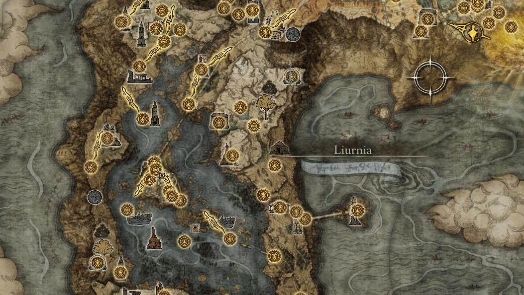
K: So what about just interacting with the map interface itself?
R: Those types of interactions are pretty average here, in my opinion. You can do all the standard map interactions we mentioned above: place markers and beacons, pan, and zoom. I guess one of the less common interactions you have here is to cycle through a list of sites of grace to travel to.
K: And like real-world mapping, it varies with what device you use to physically play the game. When we make maps at Stamen, we have to consider if the user will be on a phone or computer and give them the proper tools to use the map for whatever the case is (sometimes, it’s both). If you play Elden Ring with a keyboard and mouse, you’re going to have a different experience than someone with a controller.
R: Yeah, exactly! And both are supported in Elden Ring, but it seems like they tend to push you towards using a controller (in most aspects of the game).
Overall, the interactivity in the map is solid, but nothing really new or groundbreaking.
Immersive
R: Games typically want players to be immersed in them. I feel like that’s nothing new to say? But there are different ways to be immersed in a game. You can be immersed in the act of playing a game and be further immersed in the story and setting of the game. So things like a sensible button layout, a sleek and seamless UI, and even a comfortable controller and chair help you focus less on the world around you and better immerse yourself in the act of playing a game.
This, in turn, helps you go a step further and be better immersed in the setting of the game and the identity of your character. There’s a bunch of actually cool academic research with some of this stuff by Laurie Taylor and James Gee, but just like most quest-giving NPCs in Elden Ring, I’ll let you find those on your own. But the map in the game should immerse you in both the act of using the map itself and the setting and story of the virtual world.
R: Soulsborne games stake their reputation on inducing frustration. Or sometimes, full-blown rage. They set a precedent for difficult gameplay that many people actually find enjoyable. And that’s something I love about these games. It’s a phenomenon that is preached against in any other type of UX outside of gaming.
K: So interesting that the entire culture of Dark Souls could be summed up as “just deal with it” and to accept all the various frustrating elements from hard bosses to … confusing UI. It’s interesting that bad UI can reinforce this aspect of the game’s culture and it’s plausible that a frustrating UI and UX could be by design.
R: Yeah, and it totally could be! Designing an experience for your players to fail and try again is a crucial part of play in games. That said, video games still lean on more traditional principles of UI and UX as they still use menus, maps, and displays that sort of exist outside of the virtual world.
And that’s where game maps tend to live, typically as a start menu or mini-map (but there are some cool exceptions we’ll touch on). In Elden Ring, it’s a unique start menu map that takes up the entire screen but doesn’t pause the game, which is a crucial detail. Especially since you can’t invoke the map (and thus fast travel) while in combat, making those situations that much more dangerous.
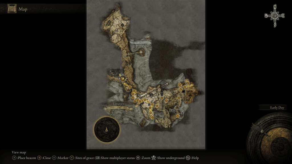
R: One of the main critiques I see from folks about the map is that you can’t close it by pressing the same button you use to open it. Which I thought was super interesting, cuz it’s something I never do. I always just use whatever the “back” button is. But it reaffirms the fact that users often have their own conventions and expectations when it comes to using interfaces.
And since we’re talking about interfaces, I want to say that I don’t think this game needs a mini-map or maps of dungeons. Sometimes it’s nice to reference when exploration is a big part of gameplay, but I think it does just fine with stopping to look at the start menu map and then navigating there on your own.
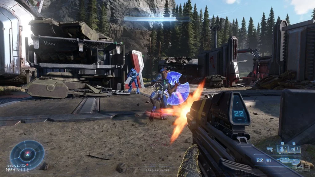
K: And to the point of immersing the player in the setting of the game, a medieval character isn’t really going to have a mini-map guiding them like Master Chief has a radar to show enemies in the Halo franchise.
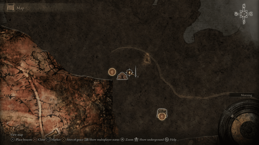
R: Absolutely, you know, one other critique I have is that beacons placed on the overworld or “underworld” (henceforth used without quotations) will appear in both worlds when placed. However, they don’t show on the other map when toggling between them in the map. There might be a use where you need to go to the location of something in the overworld just in the underworld, but if there’s not, it provides more confusion and should probably be fixed.
K: Yeah, I mean it’s funny because I feel this frustration in the real world too- how we switch between layers in indoor maps can often just be a toggle and I’m excited to see how other games handle this challenge- I think video game maps are where we’re seeing the pushing of UI to a new level and hopefully it can shape what we do next.
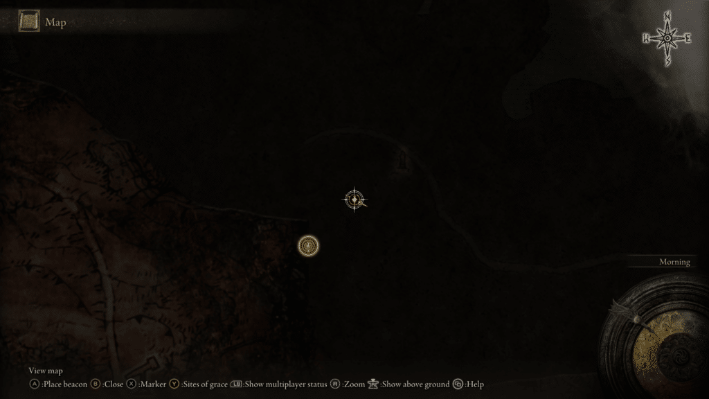
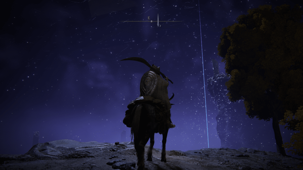
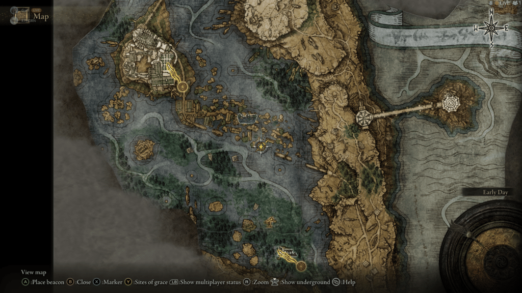
R: For that deeper immersion in the setting, I think the map and gameplay in Elden Ring do quite a good job. Finding parts of the actual map and the beautiful hand-drawn aesthetic really feel like it’s an in-game artifact that your character and you are using as one. And seeing the subtle seams of the map fragments is just *chef’s kiss*. The details of all the features like swamps, ruins, caves, and other landcover are also done incredibly well. My favorite part of the whole map-using experience is unlocking a new part of the world and seeing an interesting landmark drawn on the map that inspires me to go and check it out in the virtual world. It invokes this feeling of exploration that I don’t think I’ve felt since I held the paper map of Morrowind that came tucked in the game case.
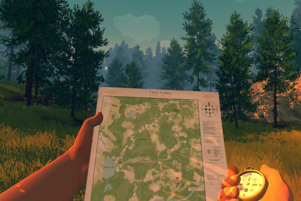
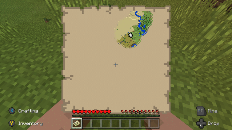
R: Something I’d love to see more in games, particularly those where invoking the map doesn’t pause the game, is maps like those in Firewatch or Minecraft where your character holds a paper map and looks down at it so you can actually use it. To me that’s so effective for player immersion.
Incomplete
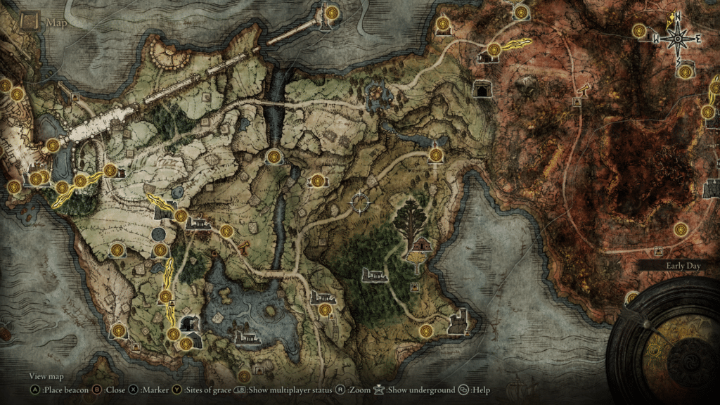
R: As we touched on with interactivity, one of the best drivers for gameplay is having an incomplete map that is filled out through actions of the character. Finding pieces of the map in fragments throughout the world that fill out the map fosters a really great interplay between the map and the game.
K: Yeah, I think one of the definitive examples of that is how The Legend of Zelda: Breath of the Wild does this. But I think what’s nice about the Elden Ring’s Map is being able to see into the fog of war areas slightly- it’s not a complete blank slate. It’s so enticing and I felt like the Leo Dicaprio meme shouting at my friends to go into that new area.
R: Yeah, that’s sort of crucial in how Elden Ring makes this work: being able to see into areas where you need to find the map and also showing where you need to go in that uncharted area to find the map fragment. I think they did a really lovely job with this.
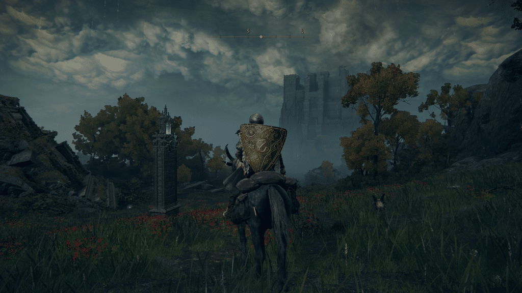
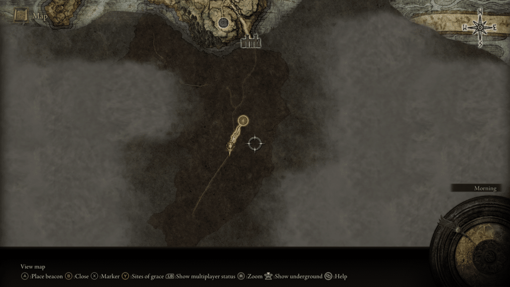
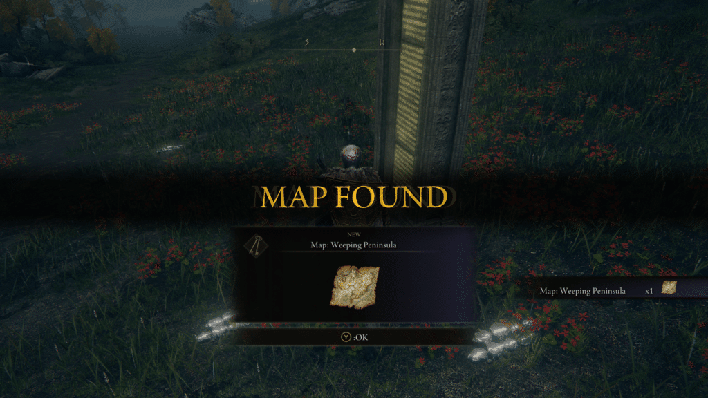
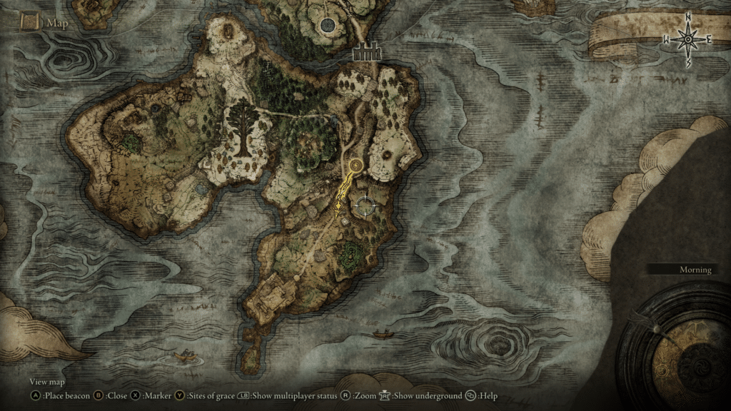
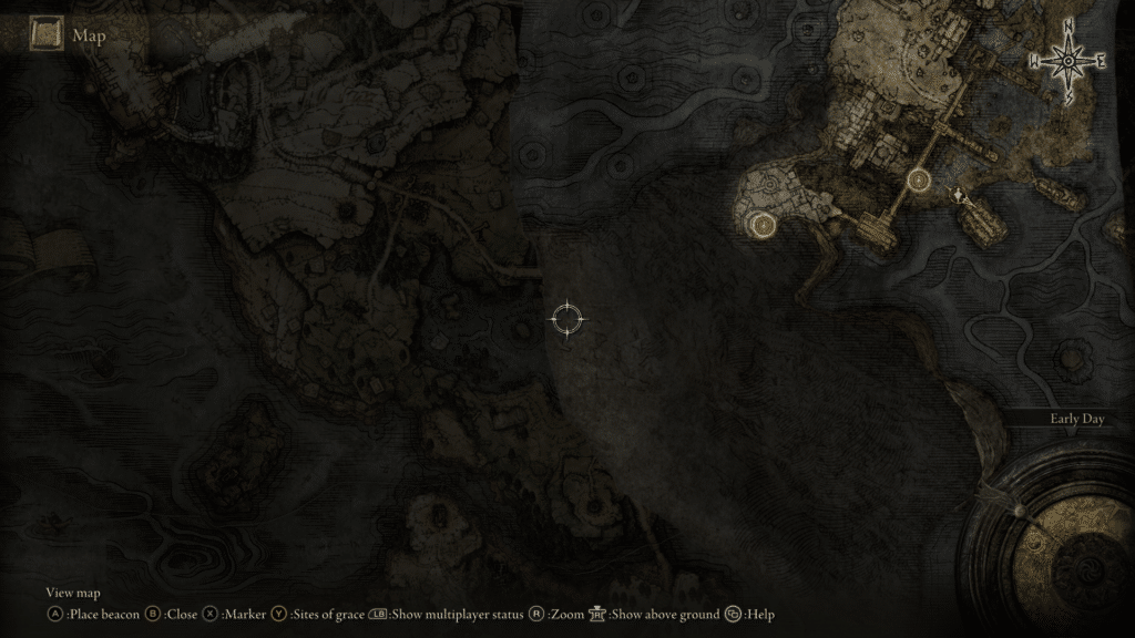
R: I love that there are two fog of war effects working together (in the second picture above): one being more of an actual cloudy overlay that obscures areas you haven’t been to and the other being the missing map fragments underneath that fog after you’ve traveled into that area that provide some context to where you can find them and the main roads to help guide you a bit.
K: It’s also great how this map balances wanting to increase the sense of exploration and provide hints to guide you towards the next area. Of course though, in typical Souls fashion, there aren’t the plethora of hints that other maps like the Witcher provide.
R: For sure, it’s such a motivating thing to have an empty map with no hints other than the implicit suggestion to go explore. Coming back to maps in the real-world this is one of the aspects of playful maps that seems most challenging to apply in real-world cartography.
K: I can definitely see this extending to more mapping use cases and become a really interesting interaction that can be used to tell a story. Just like there’s an explosion of maps for navigation and social media, I think narrative driven maps like The New York Times story “Snow Fall” are also some of the best ways we can do this.
R: The game also faces a cartographic challenge we’re starting to see more in the real world as well and that’s how to correctly layer maps or features that are directly on top of one another.
K: Yeah, as indoor and AR mapping are becoming the new hotness in cartography, the industry is facing some challenges that video game maps have been doing for a while.
R: And that’s what makes me reserved about how Elden Ring goes about showing the overworld and underworld map. You can see them side by side when you’re underground and at some points in the game, it’s a bit confusing and jarring when you even find a new map fragment.
Interpersonal
R: For multiplayer games, the map can become a crucial part of communication for players. This is something battle royale games have really done well. The map is a medium for players to talk, really. Using markers, beacons, pings—whatever you want to call ‘em—allows for players to strategize and communicate about in-game actions to be done without even needing voice communication.
K: This is where I have to trust you on that, battle royale games are not my cup of tea, but I think there’s something interesting to be said about that mechanic. More and more we’re seeing social media use maps as a method of communication, from the Snap Map to Instagram showing people’s stories. Location can be a way to find a cool event or a new restaurant, or in the case of video games, where an enemy spawn location may be.
R: Yeah, those are great examples! And there are so many other use cases where this could be used in real-world situations. This is definitely an area where traditional cartography has some catching up to do. But it’s happening! Collaborative mapping tools like Felt in early access and Alyssa X’s Mapus are really exciting to see.
R: Now before anyone tears me apart for even bringing up battle royales, it needs to be said that gameplay and the multiplayer experience in Elden Ring is nothing like (nor intended to be like) that of battle royale games. With any map, in-game or IRL, the purpose of the experience should be used as a north star for any cartographic design decisions. Multiplayer in Elden Ring is less about exploration and more about fighting bosses and challenges together, and typically in one location. But I still think the map could better serve multiplayer. Allowing shared use of the map is a start.
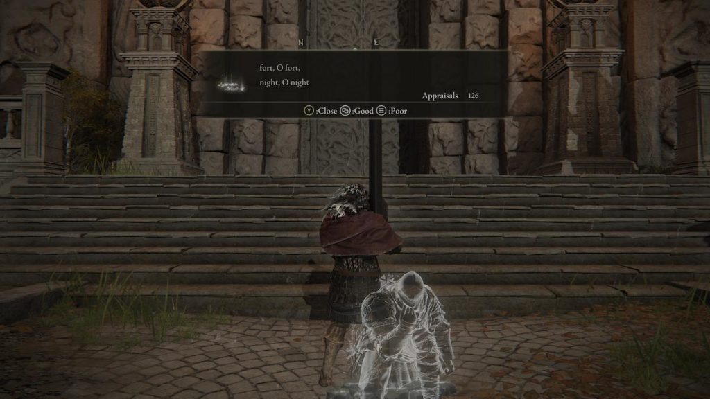
K: I think what’s interesting is how the entire From Software conceit is to build highly interpersonal games through the messaging system or being able to bring in players to help in a boss fight or risk being invaded by another player.
R: That’s a really good point! I definitely would have overlooked that.
K: It’s so interesting and I’d love to talk about how Elden Ring does this really well, but it’s a bit out of the scope cartographically. It’ll be great to see how other genres do this, I’m looking forward to it.
R: While the game does show some information on multiplayer status and where active PvP or cooperative play is occurring, it really doesn’t do a whole lot for multiplayer otherwise? It’s kind of disappointing, but again, maybe I’m just hoping for something else in the gameplay that just isn’t there that I want the map to support.
Final Thoughts
R: Something I will forever hang my hat on is that video games have a lot to teach when it comes to maps. They have been dealing with challenges we’re now actually seeing in real-world mapping like AR and VR.
K: Or with navigation and wayfinding experiences or social media maps, etc. Some of the projects we work on in Stamen are getting to this point where I wonder if we’re just video game designers who moonlight in cartography. The intersection of traditional mapping and data viz and what the “future” looks like is often seen in video games. It makes it of course, very fun to do research in our spare time through games like Elden Ring or Breath of the Wild, but there’s a level of seriousness that I think we’re starting to take as an industry towards looking to video games for inspiration.
R: Exactly. I think we are headed towards a monumental crossover between these two fields. And just like video games can lend knowledge to fields like cartography, I love that it’s a dialogue where the mapmaking industry can contribute to gaming as well. And arguably has been impacting gaming implicitly for decades.
And that’s where this blog sort of comes in! I know things can get heated when critiquing games and things people care about. These are just some of our thoughts on games, maps, and how they do or don’t work together. Elden Ring and all the souls games are very clear evidence of how design leans a lot on subjectivity. Some people consider aspects of these games to be flaws while others love them and will hold to them until they’re resurrected at the next site of grace. And that’s okay.
K: I think this crossover has made me find a new way to love mapping and increased the amount I enjoy video games! Seeing how maps can act as a way to push the story’s narrative or provide interesting mechanics is exactly what we’re seeing in all sorts of mapping. But through video game maps we get to do our research at our own leisure, relaxing and being immersed in a great story.
R: Fantastic points! Gosh, this has been fun. Okay score time—overall, I think the map in Elden Ring scores a 6 out of 10 (I ain’t doing decimals). It’s got some really cool qualities and is especially good at supporting gameplay through its incompleteness. The immersiveness and interactivity just felt pretty average and it just didn’t score well in interpersonal. Without that interpersonal aspect (which may not deserve equal weight as the other parts just because of the nature of the game), I think it would bump up to a solid 7, so take your pick for what you like better.
K: I wish we had a way of quantifying just how “!!!!” it feels to include a map in a Souls game, but that’s alright. I think a 6/10 is great, we’re seeing the first attempt by From Software to include this and it’s decent. Aesthetics are great, the novelty is exciting, but we’ll be eager to see improvements. There already have been some nice improvements like tracking where NPCs are and where they move throughout questlines.

R: It’s definitely promising that the devs included map improvements in one of the first major patches and I hope that bodes well for the future of the game!
Shadow of the Erdtree Addendum
R: The Shadow of the Erdtree expansion takes us to the Realm of Shadow, separate from realm of the base game, The Lands Between. With this change in geography comes a new map! It boasts the same gorgeous linework and artistry that the original map has and lots of the same icons and functionality. There are a few new map-related things (and some map functionality and design we missed the first time around) that we want to cover!
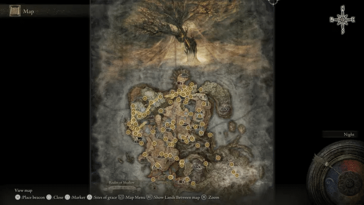
R: The beautiful map uses the same style and techniques as the original map. The intricately illustrated hachure marks denote the physical geography. The colored landcover indicates what the land might look like in a certain area and is sometimes useful with regards to poisonous swamps or otherwise hostile geography that could damage or kill your character. You also unlock portions of the map in the same way, by finding fragments at pillars throughout the world.
The map also features a stylized illustration of the Scadutree at the top of the map, which reminds me of some maps of yore that use mythical imagery in the marginalia. The map, however, doesn’t include as many regional labels as the Lands Between.
Many of the icons work in the same way, however, there is a new symbol on the map for Miquella’s Crosses and a new map-themed way to find them. The character Hornsent gives you in-game map artifacts that show locations of these crosses across the landscape. I love when inventory items are maps that can be consulted to help you in gameplay. These are also abstracted in a way that makes them a bit difficult to find their location. While I commend them for not making these map artifacts similar to the in-game map, I wish you could at least zoom in on them more, as the map features are hard to make out in the menu.
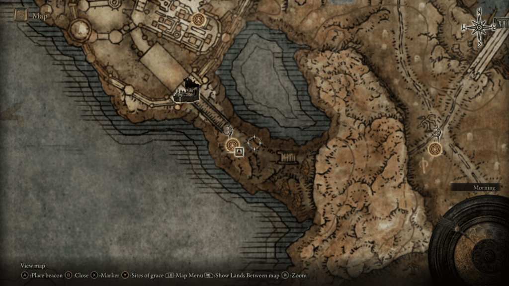
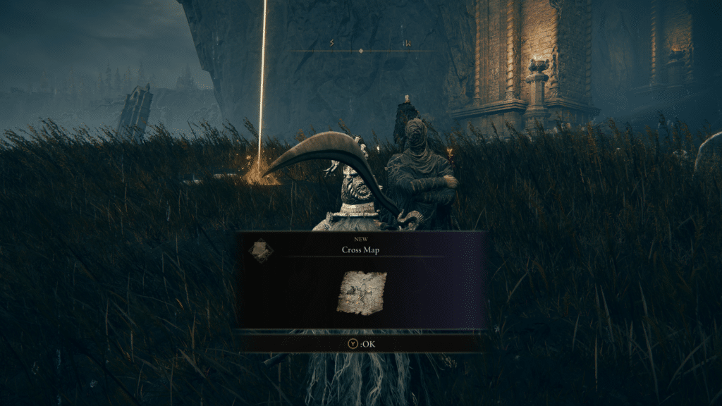
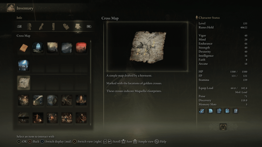
R: As far as I can tell, this is the most noteworthy map functionality that is added with the expansion. However, I would like to also mention two things that we didn’t cover in the original post above.
The first is map markers! I’m a bit embarrassed that I missed this before, but in the spirit of playing a game by FromSoftware, you’re gonna miss a lot on your first playthrough. The map markers are gorgeous little icons that you can place to annotate the map to your liking, allowing you to interact with the map in ways that are meaningful to your personal journey in the game. There are ten different symbols and you can place up to a hundred markers on the map. My favorite part is that they look like wax stamps, which bolsters the immersiveness of the map. Not sure how practical it would be to place wax markers on a paper map you carry with you, but it fits how I would imagine my character would annotate a map in a medieval setting.
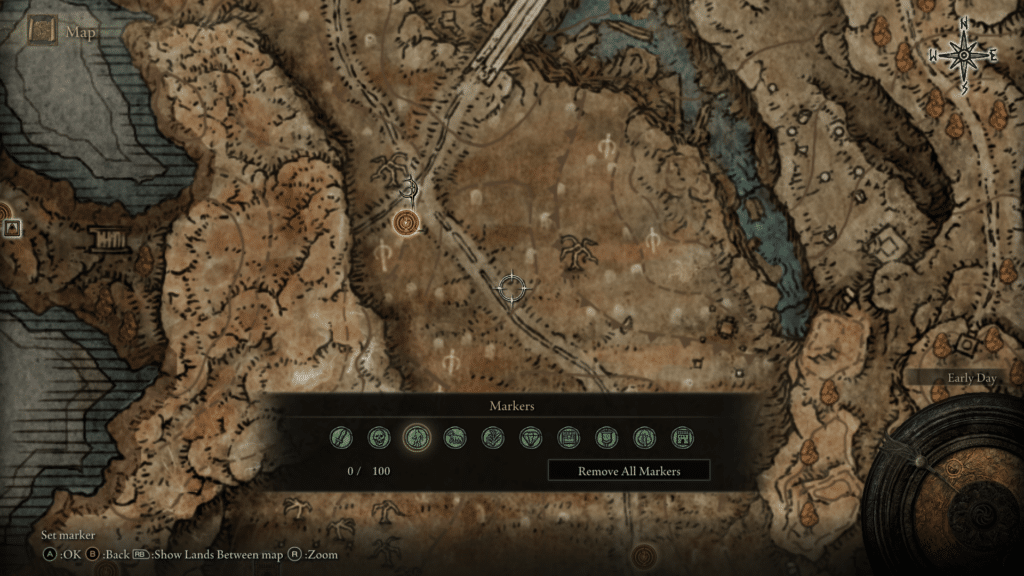
R: The other map design feature we missed was the presence of isolines (or what appears to be isolines). An isoline is a line on a map that is used to represent a metric of constant value across space. Common examples include contour lines that show elevation or isotherm lines that depict temperature. If you follow a single line on these types of maps, the phenomena you are mapping (elevation or temperature) will be the same along that line.
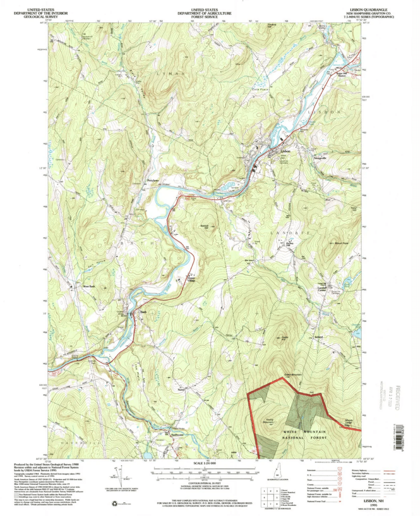

R: This is an odd choice for this map for a number of reasons. It’s not clear what the isolines represent. As mentioned, they mostly represent elevation changes (an example of this in games can be found in The Legend of Zelda: Breath of the Wild and Tears of the Kingdom, which we evaluated as well). If we assume they represent topography, they fall short in three ways:
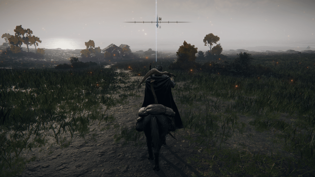
First, they don’t represent topography accurately. This isn’t as big of a deal in a game where the topography doesn’t affect your stamina. In the example below, my character stands on an isoline and a map beacon is placed on the same isoline a short distance away. According to the context clues and symbology of this map, there should be a slight hill between the lines, but it should degrade into the same elevation once you reach the other section of the line. However, from the beacon to my character’s location is just a steady incline, meaning that the line does not accurately depict topography.
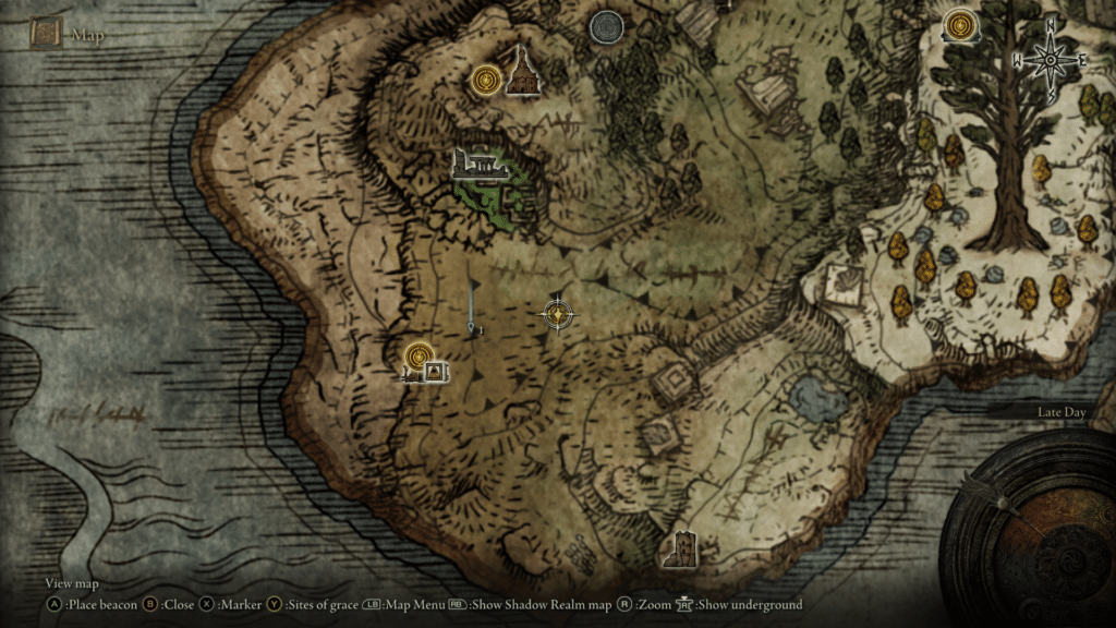
Secondly, contour lines would be redundant and somewhat counterproductive to the hachure technique used to show cliffs and elevation changes in a more appropriate style. Our friend Andy Woodruff has a great writeup about hachure lines in cartography, but they are an old way of sketching topographic changes. They look incredible in real-world maps and on the Elden Ring map, informing you of the changing landscape but without too much accuracy.
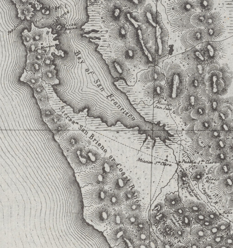
R: Redundancy in symbolization is not bad on its own. Contour lines are often paired with hillshading to reinforce the symbolization of the land. While hachures are a form of hillshading, the linear nature of both don’t work well together.
Finally, the lines are not well-styled. From what I can tell, there are 4 different styles of lines on the Elden Ring map: a solid line, a dashed line with long dashes and short gaps, a dashed line with short dashes and short gaps, and a dashed line with long dashes, short gaps, and triangles oriented a particular direction on the line. While I enjoy seeing challenges to cartographic conventions, the challenges need purpose and good execution for me to buy into them. These don’t have it.
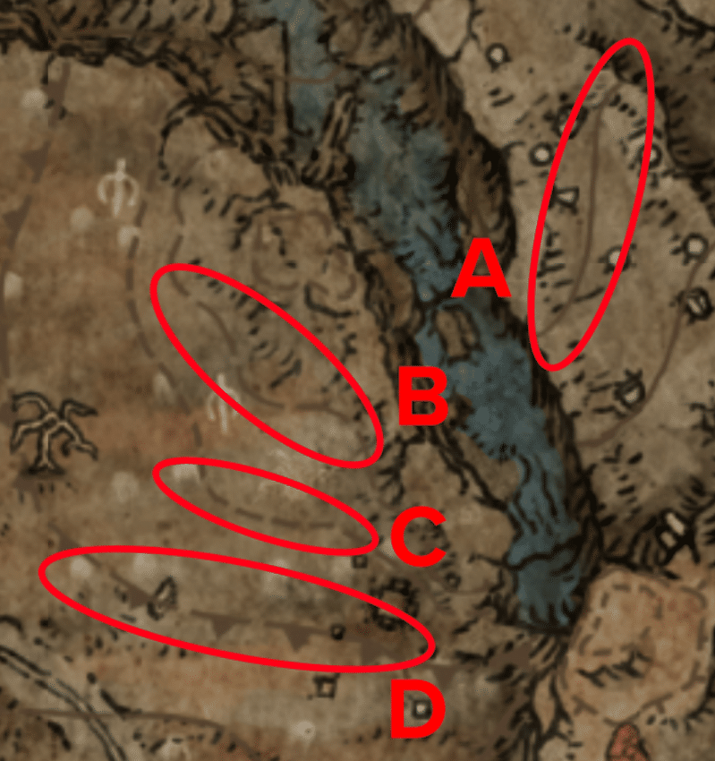
The lines themselves are somewhat aimless as well. As I mentioned, gradual topographic changes that contour lines denote aren’t useful for gameplay in Elden Ring. A map can have design choices that are strictly ornamental, but they should also look good. While they should definitely be toned down as to not dominate the map, the mid-tone brown of these lines works against the immersive nature we get with the black ink and washed watercolor look the rest of the features employ.
On the other hand, if they don’t represent topography, then what do they mean? And why include them at all if they don’t really ornament the map in a good way?
R: With the new map features and the design aspects we missed before, the score remains! The map is gorgeous and solid, but leaves quite a bit to be desired in some regards.
Score:
Interactive: 6/10
Immersive: 6/10
Incomplete: 8/10
Interpersonal: 2/10
Overall: 6/10
(or 7 if you don’t count interpersonal)
We hope you enjoyed this detailed look at the map in Elden Ring from a cartographic perspective and we hope to do something like this again in the future. Got thoughts on anything we said? Prepared to call us maidenless chumps and PvP us outside of Limgrave because of a terrible take? Or would you like us to evaluate another map? Tweet at us either way (respectfully of course)!
