
You can tell a good story with words. But a great story compels an audience through thoughtful visualizations. In this episode, Denise Lu walks us through her career in journalism—from her involvement in a student publication in college to her current role as Senior Graphics Reporter at Bloomberg News. We discuss what makes cartography and dataviz unique in a newsroom, the responsibility a journalist has when distilling complex events into a handful of graphics, and how giving a passionate PowerPoint presentation to your friends over Zoom could lead to an interactive article for one of the world’s largest media outlets.

Denise achieved a degree in journalism, but it wasn’t until her internship with The Washington Post that she discovered the power of graphical storytelling, learning a lot about cartography and data visualization from her colleagues on the job. After a few years of full-time work with The Post, she moved to the New York Times and most recently, Bloomberg News.
“You can trigger that ‘a-ha’ reaction in readers much more quickly…if you can manage to tell something in a visual way.”
Denise Lu
Throughout her career, Denise worked on some incredible pieces that we talk about in the episode. Her favorite pieces are those where she can take a “seemingly mundane” topic and incite a reader to care about and start noticing it in their lives. Things as unremarkable as subway tones or bilingual street signs have multitudes of stories behind them that can be fun and lighthearted or poignant and wistful.
In journalism, perhaps more than many other platforms, stories have a wide reach and the potential for real impact. For instance, after reading Denise’s piece about bilingual street signs disappearing from Manhattan’s Chinatown, New York City Councilmember Christopher Marte introduced a bill to protect these signs and reintroduce more into the neighborhood.
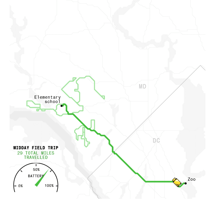
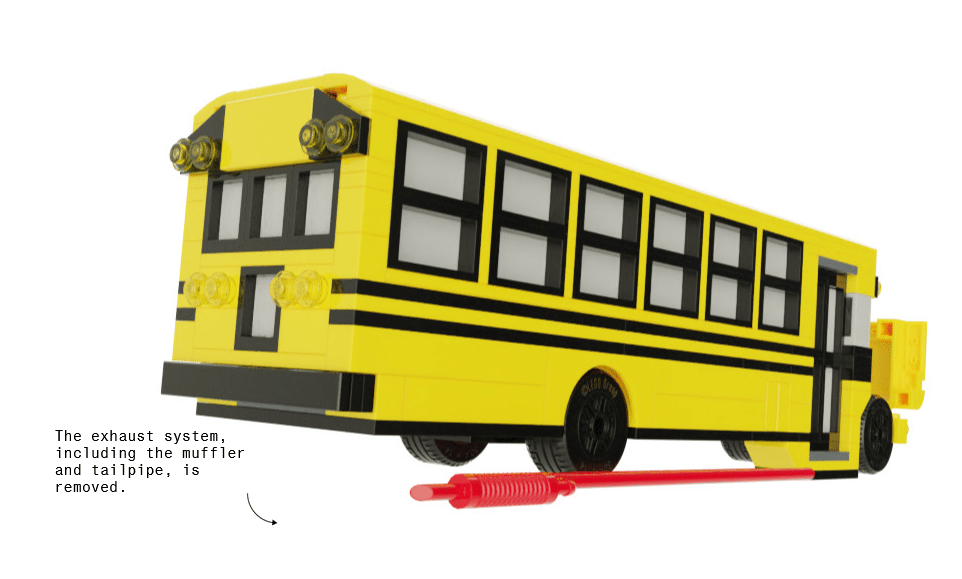
Some of Denise’s work touches on serious issues, but uses optimistic and playful visualizations to showcase potential solutions. In her latest piece in Bloomberg News, she covers the push for converting school buses into electric vehicles to help address the climate crisis. But it’s not all doom and gloom, but instead an uplifting (and fun) look into the promise of the solution. In the article, Denise and her co-author Zahra Hirji use a few visualizations to explore the electrification of buses: a cartogram (which is a type of map that warps geographic area based on data) to show new and existing electric buses in the USA by state, an animated bus route map to portray the predictability of buses and why they’re a good electric candidate, and my favorite visualization of the article, a demonstration of how an existing bus can be retrofitted with electric parts with the use of LEGO bricks.
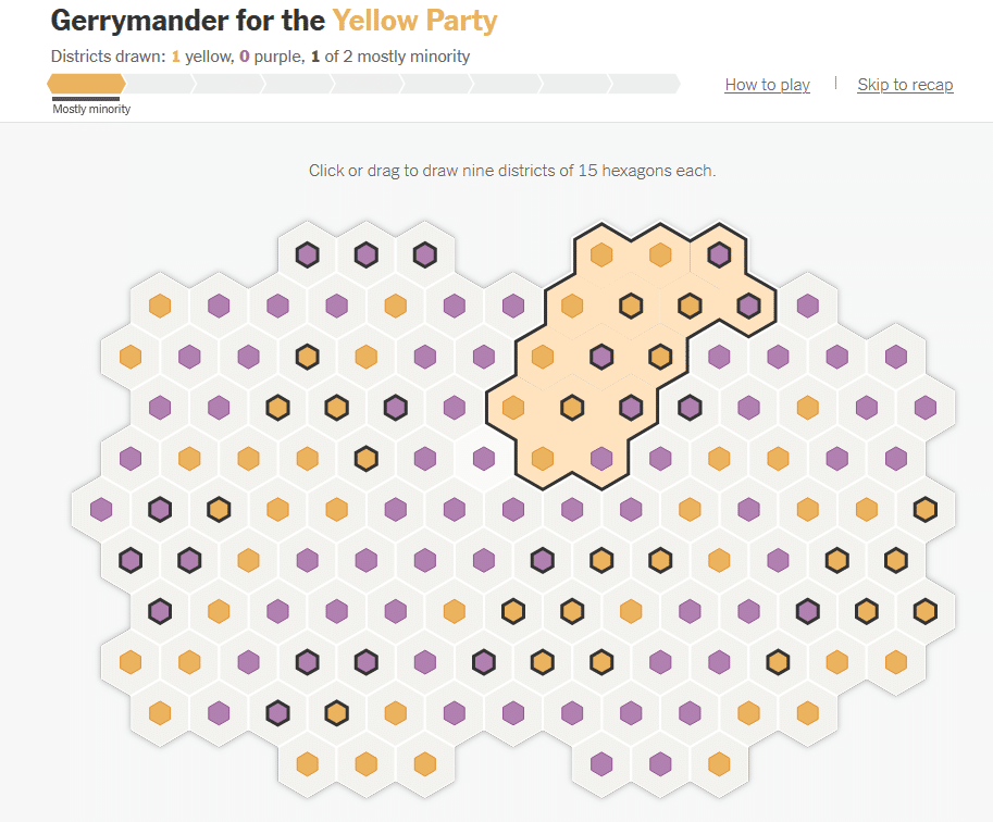
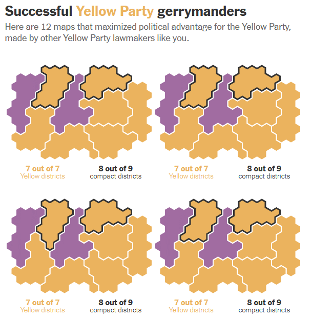
While visualizations can bring elements of fun to educate on important issues, Denise also reflects on the responsibility needed when creating graphics for a wide audience. In another project called “Can You Gerrymander Your Party to Power?”, the reader is tasked with redistricting a fictional state to benefit their fictional political party—either the Purple Party or the Yellow Party—that is randomly assigned by the game. But it’s more than just a game. It’s an educational piece that teaches the concepts of redistricting, how difficult it can actually be, and the underhanded—yet widely practiced—boundary-drawing that politicians use to maintain power. Denise explains that it was very important to her team to mitigate the biases in the game by not using a state that isn’t real and through colors that are not associated with the major political parties, allowing the users to come in and learn about redistricting with a more open mind.
Check out more of Denise’s incredible graphics work on her site, as well as on Bloomberg News, The New York Times, and The Washington Post!
Transcript — +
[music]
You’re listening to Pollinate, a podcast on data, design, and the people that bring them to life. Brought to you by Stamen Design.
Ross Thorn (RT): Using LEGOs to visualize a process, what a cartogram is and how to use it, and how the major political parties in America got their colors. These are a few things that come up in today’s episode. I’m Ross Thorn, a cartographer at Stamen. I had the opportunity to chat with a talented journalist about creating maps and graphics for news stories. We discussed four visual stories and how personal interest and responsibility come into play to make an exciting and rewarding career in journalism. Please welcome my guest.
Denise Lu (DL): My name is Denise Lu, and I am a senior graphics reporter at Bloomberg News.
RT: 00:00:59.583 Thank you, Denise, for joining me on the podcast. It’s a really cool topic. It’s one of the things that I’ve seen in a lot of lots of journalism examples. So I think it’s really worth noting and worth talking about data viz and cartography and journalism. And we met at NACIS in Minneapolis this past year, and it was really fun to hang out with you there and getting to know you and looking at your work since then. So I’m really excited to have you and would just love to learn a little bit more about you. And so if you could, maybe tell me about your upbringing and you know some of your early life and just your own personal interests and maybe then how you started to navigate to cartography and graphics.
DL: Well, I guess I can start with how I was not born in the United States. And I feel like that’s a big part of my identity and– but yeah, I mean, I was interested in storytelling, and I actually wanted to be an author, like a fictional author, when I was growing up, but I found that it was hard to make up stories that were interesting. So I was like, “Why not find real stories out in the world and just tell those instead?” So I went to school for journalism, and it’s interesting because, during school, I didn’t really know about other forms of journalism besides writing, written journalism. And when I was in school, I had some friends who were doing this kind of non-words journalism, like graphics journalism data viz. I didn’t really know much about it. I didn’t really look into it that much. It didn’t interest me, honestly, that much. I just focused on just regular journalism. I actually wanted to be a music journalist when I was in college.
RT: Really?
DL: Again, didn’t pan out, but ultimately, for the better. So it wasn’t until I was part of a student publication. And for that, I think a lot of journalism kids can agree. You just learn so much because you have to do so much on your own. We learned production and editing and writing just so much more through that than through the actual classroom. So through that, I kind of dabbled in some very minimal web development, and I took a few classes in the field but not enough to really get me started on anything. And it wasn’t until I had to do an internship through my school that I was very lucky to be placed in the graphics department at The Washington Post for. And so that’s sort of how I got almost kind of thrown in this field. I didn’t really learn too much about it, but it sounds like something that could be more interesting than just writing. So yeah, basically, that’s how I landed here. I was in the right place at the right time. But I learned basically the entire job on the job. And I feel like that a lot of people in this field are kind of like that. It’s like so much of what we do. It’s not like people learn in the classroom. And that’s what I think makes this feel unique, is we have people from so many different backgrounds like cartographers. And I mean, I’m not a formally trained cartographer. I came from journalism. We have people from architecture, people from data science, and just all these different fields. But there’s something to do in this field for everybody, and I feel like so many people learn this job on the job, which makes it kind of cool. You’re almost always having to figure out how to do things from scratch or on your own. It’s almost never like you know exactly what you need to do right away.
RT: It seems a little scrappy and then you’re going out to get things, and I definitely want to talk about that too because some of your work– that’s really evident in the work you’re putting in and like, “We don’t really know. Let’s go find out.” One thing I want to come back to is you learned a lot of this on the job and a lot of the graphics and you knew some people who were doing some graphics things, so that’s not really part of your traditional journalism education was the graphics portion. It was mostly writing.
DL: Yeah, it was mostly magazine writing, which like I said, I don’t know how much of that I’m using now. But we had some extracurricular programs where kids can do this kind of web development stuff or learn how to do data journalism. But I would say, at least when I was going to school, I either didn’t seek out these opportunities in a formal classroom or it just– I don’t know, I didn’t learn so much in a formal classroom. And I feel like still to this day, I mean, as I just said, and as you touched on, it’s almost hard to sit down and teach myself something in a vacuum when it’s not applied to a real story I have to do. So yeah, I didn’t learn much of this in school. And talking about cartography, I mean, I still don’t think I’m a cartographer. But talking about map making, I didn’t really know much about map making until I started that internship with The Washington Post, and I sat next to one of the best cartographers in this field. And I don’t know, you just taught me everything about map making, and I didn’t know what QGIS was. I didn’t know what GIS was. So it’s just like everything was new to me. But it was really exciting to learn about it.
RT: That’s so cool. And I love hearing that too, is that you were kind of thrust into this and are learning this on the job. And I didn’t know what map making was, but here you’re making maps. You’re making graphics. You’re also making really cool maps and graphics. But one of the things– so I did go to school for cartography. And one of the things that we talked about a lot was maps and journalism. And we’re looking at these graphics that were made by news departments because sometimes some of the most cutting edge– or they’re pushing boundaries in different ways of reporting and how we tell stories with maps and spatial storytelling. So I think it’s really cool to hear your experience of just kind of going at it, and then like, “Here I am learning about the people who have just been kind of thrust in there too and they’re making strides.”
DL: Yeah. I mean, sometimes I feel weird making maps when I don’t have a degree in any of this. I don’t know. At this point, I feel pretty confident, but sometimes I really am just like, “Am I doing this right? I don’t know.” But there’s always people to check with and stuff like that.
RT: You said you don’t really feel like a cartographer.
DL: I would not call myself a cartographer. I feel like you need a real degree to call yourself that. I don’t know. I make maps. That’s all I can say.
RT: Yeah, I mean, that’s all I do too. So I think if you look at the work we’ve done, we do the same thing. So I hereby declare you officially a cartographer if no one’s ever said it before.
DL: Thank you.
RT: I mean, you’ve been to a cartography conference. You make maps. What else is there, honestly?
DL: A degree would be nice. Yeah.
RT: So going on to Washington Post with an internship, can you tell me a little bit more about where you went from there and kind of how you got to where you are now at Bloomberg and maybe some of the highlights of that whole process?
DL: Yeah. So I started at The Post, like I said, not knowing anything. I feel like I was really learning, honestly, throughout my time with The Post. And for a while, I was learning graphics and also maps, but also data analysis and data journalism and all of that because like I said, I didn’t learn a lot of this in actual college. I mean, I knew what a lead and a nut graph was. That’s what I learned in college. So I was at the post and I was lucky enough to stay on the post after my internship. At first, I spent a couple months actually embedded in the metro department, which was really cool because I was helping out with some of their data upkeep and that was really cool because I got to actually work really closely with some of the Metro reporters, which I feel like sometimes it depends on where you’re at and what department and what newsroom. But sometimes I feel like the graphics people can be a little siloed. So I feel like it was really cool to actually be seated inside the department and attending their meetings and also working really closely with them on their stories.
DL: But I moved over to graphics. I was there for a couple of years. And I learned really so much in my time at the post just web dev, storytelling, design, all of that. It was really cool. And I later on went to The New York Times where I was there for almost five years. Doing more or less the same thing. And obviously learned so much from the Times as well. I don’t think I need to even verbalize this, but it’s like a place where so many brilliant people are working at, and it’s like, you’re sitting amongst the people who are creating the tools that are the standards for the industry. So it’s really awesome. You can just turn around and chat to those people. Yeah. And then recently I moved over to Bloomberg where I’m excited to do the kinds of storytelling I want to do and be more experimental in the kinds of stories and the ways of telling those stories. So yeah, that’s how I got to where I am, I guess.
RT: What is the type of storytelling that you want to do?
DL: I don’t know. I think like, I feel like I’ve only done this a couple of times in my career, which is find some really interesting story in something that seemingly mundane or like people don’t usually notice, but then tell it in a way that’s like really fascinating and delightful for readers, but it’s on a subject that hopefully most people can also relate to. So it sounds like kind of a weird combination of things, but like I feel like the stories I’m most proud of sort of hit all those notes where the seemingly mundane thing that people don’t notice or a lot of people experience it, they just don’t look into it. But then finding stories behind that and finding a quirky kind of unique way to tell that visually.
RT: Yeah. And then the people– the readers will come away like, ”I didn’t know I cared about this. And now I kind of do. And now I’m noticing this.”
DL: Yeah, that’s the exact kind of reaction I really hope to hit with every star. That obviously is really hard to achieve every time. And there’s tons of stories I’ve done where it’s just straight news stories, which is also fine, but I feel like I only done it a couple of times in my life, and I would just like to do more of that.
RT: One of your pieces is like that for me where I’m like, ”Oh, I didn’t really know I cared about this.” So the work you’ve already done is doing that for sure. I’d like to transition to talking about mapping and data viz in journalism and what are the nuances of it. And one thing you specifically mentioned is you learned a lot in data storytelling. What is that? What makes good data storytelling? What do you think hammers that home for making stories meaningful?
DL: Well, I think a good story, no matter what it is, is people coming away with some sort of aha moment where they’re taking something away from it. Or it’s like they are seeing themselves reflected in the story where they haven’t before. I think that’s also really important. But yeah, I think in terms of data viz or data journalism, that’s about using data to achieve that. And I think a good visual for one is like it has to be easy to read. And then you can trigger some sort of like click in their head of like, this is an aha moment. But I think some of the best data viz is either visually stunning or just super easy and you wish that you had done it instead. The best kind is like super simple data is that I don’t know why I didn’t do it.
RT: Yeah, it seems so obvious and you’re like–
DL: Yeah.
RT: Yeah, this makes sense.
DL: Right.
RT: You said you’re not from a trained cartography, even graphics background. You kind of learned everything on the job, but I guess I’m curious as to what you notice is looking at graphics, and cartography, and maps, and other fields. What do you think is really unique about those mediums for journalism?
DL: When I was going to college and I didn’t know other types of journalism existed outside of written journalism. Obviously, there’s an audience for just written journalism and I think there’s some stories that are just best written out in words, but I don’t know. I feel like you can trigger that kind of aha reaction in readers sometimes much more quickly or in a bigger scale if you can manage to tell something in a more visual way than reading words. I’m thinking about things like scale. It’s hard to convey with words, right, but once you just see it, it clicks in a reader’s head. It’s so easy. It adds to a story more than anything if you can find a good way to tell something visually or with data to back up your claims.
RT: One thing also that stands out to me too for journalism as an avenue for these graphics is sometimes, you’re demanded to do both print and digital too, just the actual physicality of that medium like making this story, we’re making this graphic. Sometimes, we’re making maps. I work on base maps a lot of the times. We’re just making these for slippy maps, particularly, like yeah, this will never be– really shouldn’t ever be print. Sometimes, it can be as a locator map, but that’s besides the point, but for some of your stories too, they’re both in print and they’re both in digital. What are some of the challenges of creating a story that has these graphics for both, especially when that’s the goal in mind is this will be in the paper, this will also be a web page?
DL: Yeah. Not only do we have to do things for web, but we have to do things for all sorts of imaginable devices as well. And so obviously, that’s super tricky sometimes when you just have to make sure everything works well and looks good and achieves the same goals on all screen widths. I mainly focus on web, but obviously, I have adapted things for print and it’s kind of cool to do things for both. Web, obviously, you have interactivity and you can hide things and show things. You can play with their expectations that way and there’s so many cool things you can do with certain software like 3D or that sort of interactivity where it’s harder to do in print, but then for print, sometimes, I feel like it’s actually really freeing as well when you have huge double trucks where the level of detail that will never exist in pixels on a screen and that’s also really cool to kind of lose yourself in to have that level of detail. I did this one map once where you needed to put your nose into it with the newspaper to actually see the details and I feel like that was a really cool thing to do because, like I said, even online, you never can see such a big map in one screen at the level of detail that you have it at in print. So yeah, I think both print and web, they have pros and cons, but it’s cool to do that for both.
RT: That’s really cool. Encouraging real manual zooming as you bring the paper close to your face instead of just double-clicking or a scroll wheel. These interactions that are sort of expected, it’s like no, we’re going to be having the people bring this close and we want them to do that and it’s going to be a better experience for that. That’s really interesting. For some of these projects, I’m very curious too about how that work actually gets done. We were kind of exchanging emails and going back and forth about some of the projects that we could talk about and it sounds like there’s a lot of collaboration, there’s a lot of planning, ebbing, and flowing of some responsibilities. Can you just maybe tell me a little bit about how do these projects come to be? How do they evolve throughout the inception and to their publication?
DL: I think the biggest thing is that every project is different and obviously, it’s depends on what kind of deadline you’re working with and also what kinds of skill sets each project needs. So sometimes you might need an illustrator. I can’t really draw things.
RT: Same.
DL: So we’ll have to get someone who can actually do that or sometimes you need some sort of 3D specialist which I also can’t do, so you have to bring someone like that on. There are many people on the various teams I’ve worked on. I feel like everybody has more than one skill, obviously. There are people– I can make maps, but I can also write front-end code. I can also do other things. That it all just depends on what is necessary for the project to come together. And I think the cool thing about this field is no one really cares about how it’s put together. They just care about how it looks in the end, right? We don’t care if it’s done through this technology or another technology. We just want to make sure that at the end it’s a graphic that tells the story that we needed to tell, which is also nice because I have together things all the time and it might not be the most efficient thing or the best-looking code I’ve ever written, but in the end, it’s doing the job that it has to do. So yeah, it all depends on, I think, what the deadline is, what the story is, and I guess who’s available. Sometimes I’m just writing front-end code, sometimes I’m just the one person making the map, sometimes I’m not doing any of that. I’m calling people up and doing reporting or sometimes I’m more of a producer role and just kind of putting the page together. So it all depends.
RT: You do writing, you do graphics creation, you do production of a piece. What’s your favorite hat to wear? At least right at the moment, it doesn’t have to be a blanket statement, I guess.
DL: I mean, I think at this point, my writing is not that great. It was never that great. So that’s not to say I don’t enjoy it, but I think I’m just better at the not writing and stuff. Sometimes it’s really nice to not have to write code for a certain project and let somebody else do that and really focus on designing a cool chart or focusing on the cartographic elements of a map. But then sometimes it’s also nice to do things that are, I guess, less manual if you’re just coding something up really quick. I don’t know. I don’t have a favorite. I like both.
RT: Yeah. Sometimes that rotation is kind of the favorite part anyways of just not having to have a favorite is the favorite part.
DL: Exactly. And I think that’s what’s exciting about news is you walk in and sit down and you never know what exactly you’re going to be doing that day.
RT: Yeah, you mentioned deadlines too. And I’d like to talk about that because I’m not heavy into journalism. I worked with Planet Labs for a little bit. I was preparing satellite imagery for media outlets. And sometimes it would be we’re working on this story that’s we’re hoping to publish by the end of the month, and so that’s the deadline for me, and that’s their deadline you know. And then there’s also like this happened today, can we get the imagery of that? We want to publish tomorrow. I’d love to hear a little bit more about that from you.
DL: I mean, it all depends. But I think earlier in my career, I’ve had shorter deadlines. When you get put on breaking news, it’s really nerve-wracking. Sometimes mass shooting happens and you didn’t expect that to happen and you just get put on that and you have to put out a locator map or something or do reporting on that. Other times, it’s the day after a reaction. Okay, a mass shooting happens today. Someone’s made the map, but what about what other data is we can crank out for the day after? I think that kind of speaks to the speed at which we have to work at sometimes. You don’t really have time to really nitpick over everything and what is the most efficient way to write this code? Sometimes you just have to slam it together and that it works. But of course, I think other times, obviously, when I’m working on things for more than a month, which honestly is kind of rare, those are the ones where you can actually spend more time and iterate on your design. And is it the best code that I can write? And things like that. So I feel like other industries that kind of do similar things that we do, I feel like as news folks, we just do accomplish so much under the deadline that we’re at. As long as you don’t look under the hood and see that it’s all just like–
RT: Nested if else statements is the entire thing. It’s reminding me of one of the talks I’ve seen, maybe someone you worked with at Washington Post, Tim Meko. He had given a talk once of just the power of screenshotting. And he was just like– he went through a bunch of these stories like, “That’s a screenshot. That’s a screenshot. That’s a screenshot.” And it was just really funny as like the observer, sometimes you often think it’s like, “Oh, this is so complicated. This is so–” but a lot of times it’s hacked together. And it still turns out really good.
DL: Yeah, I worked on a project with him and many other people where it was the whole thing was basically a bunch of screenshots. But it was the only way that we could do it. And like, “Why not?” It looks fine. What is the difference?
RT: Totally. Yeah. If it gets that story across, and like you said, they don’t care how it’s done, they just care that it’s done and it looks the way it does.
DL: Yeah, exactly.
RT: Yeah, I’d love to ask you too about some of the inspirations and trends in the field of journalism. When we were meeting to prep this episode, we have a couple of people here at Stamen who kind of meet together to come up with some of the questions. And one of the big ones that came up was the Snowfall story, Nicolette Hayes is our design director and she was like, “That was pervasive.” It was everywhere. And it was always the Pinnacle of the scrolling telling experience. And she almost got kind of sick of it. So first off, how do you feel about seeing the snowfall and it’s impact on the field, but then also, where do some of these trends happen? And what are you seeing right now and what’s holding on?
DL: Yeah, I remember Snowfall coming out because I was in college, and again, this is when I didn’t know anything about the field, but then I had friends who were sort of learning about this, and they were all gawking over snowfall. And I was like, “What is snowfall?” It’s funny because now I feel like scrollytelling is back almost, not that it ever left, but I just feel like so many things now are scrollytelling whether that’s a good or a bad thing. I just published a story that’s got two scrollies. But I do think it’s kind of interesting because at the time of snowfall, people were like, “Wow, you can do multimedia journalism, that’s engaging and it actually tells a story. And it’s actually really integrated with the story.” Which I think is the most important part of that. It’s like the visuals were actually the story as opposed to an afterthought or “art”. It’s actually part of the story. And I think within the decade since snowfall, it’s like we’ve gone to more complicated interactive since then. We went from snowfall to like, “Oh my God, we can do all this sort of interaction.” So let’s make so many interactive things to now kind of going back down to no one’s actually clicking on those things. We should just keep things simple and scroll as king or something.
DL: I just feel like clicking on things is I feel like such a taboo now. I mean, I don’t– maybe this is just me, but someone’s going to listen to this and be like, “That’s not true.” But I just feel like it used to be a couple of years ago. You’re like, “Oh my God, here is this dashboard or something.” or these charts where you click and something changes or something, And now it’s like, you don’t want to hide information behind clicks, right? And it’s because no one’s actually taking on them. And like I said, I think the best kind of database is ones that are just simple. I think we’re going back to static with ai2html and things like that. And people as much as we’d like to think they’re clicking on things, they just aren’t, whether they don’t want to or they don’t know to click on them. And it’s best to just show them. And I think that’s kind of why scrollytelling is coming back. You still want to have that sort of revealing moment or something where you don’t show everything at once, but then it’s the most natural interaction, it’s just scroll. It’s such a natural interaction to do. And I don’t know, I feel like that’s why we’re kind of going back to that. I guess not that it ever went anywhere, but.
RT: I guess yeah, keeping it as a pillar because I totally agree. I think that it’s one of those things where I look at a story and I see this page and I see that I can scroll because I’m not seeing all the information. So that’s what I’m going to start doing. And it still feels like I’m traveling through this story and I’m causing it to happen. So it’s got this empowerment, it’s really easy to do. I want to ask you about– this is a stylistic trend and I think it’s been kind of pretty effective. One of the first places recently that I’ve seen it was in COVID pandemic visualizations and showing a gravity of a situation, breaking margins, showing a graph, going through the header, going into the title, and how powerful something like that is. And I’ve seen you’ve done this or something like this on your Puerto Rico blackout.
DL: Oh my God. Yeah. It’s funny because one of my colleagues was asking, “When’s the last time you saw something where it breaks the scale?” And I had to dig that one back up. Yeah. That was a long time ago though.
RT: Yeah, I really enjoyed scrolling through it, and it does so well at showing the gravity of something. Especially when there’s that much of a disparity between the norms or whatever and sometimes there’s literally no other way to show it. If I’m going to show this at scale, it’s going to break margins. And it becomes that much more powerful.
DL: Yeah, we saw a lot of that during COVID. As you mentioned, just because so many scales in so many ways we’re kind of broken for that phenomenon. Like I said, scale is just something that is so hard to explain in words, but once you visually see it, everybody can just relate.
RT: So you mentioned also, too, a very vast array of topics in journalism. Everything from things like– you’ve worked on from squirrel populations and to these subway tones to things like war and politics and disaster. And I’m just kind of curious as to like, what’s it like working on this array of subjects? I don’t know how to phrase this, but what are your favorites? And not that like, “Oh yeah, I love working on devastating stuff,” but also sometimes those are the most important stories to tell.
DL: Another thing that I really like about this job is that because we kind of specialize in graphics or visuals, most people on at least the teams I’ve worked on don’t really have a beat or something like a regular words reporter normally would. There’s pros and cons to that. But every time you start a story, I’m starting from scratch. Sometimes I’m reading Wikipedia on the most general parts of whatever topic I’m working on, just to wrap my head around it. And we almost kind of have to become experts really quickly. As much as we need to understand whatever we’re reporting on but then to simplify it also for the reader. It can be kind of daunting for sure, but it’s also very rewarding, I think. But yeah, that said, obviously breaking news is something that we have to do depending on what team you’re on or what kinds of teams you’re on. But it can be really hard sometimes when you have to do that kind of reporting. But from a production point of view, when you can put out something so fast and it’s accurate and you’re the first to put it out, that’s such a rewarding feeling. And then you can move on to your next project. So it’s kind of nice sometimes, but I would say breaking news for me. it’s too stressful at this point. I kind of like working on the topics that are kind of more mundane and everyday, but finding the stories within that that people don’t often hear but can somehow also relate to.
RT: Well, yeah, I think that’s a great transition because I’d love to talk about some of your works here and this one for me in particular really actually resonates with what you were just saying of– I love public transit. I don’t live in a place that has subways or trains or something like that whenever I go to someplace, I love taking that. And now I’m going to be listening to these tones and like, “Oh, that’s a descending third.” So tell me a little bit about the subway tones. And it’s one that you published a little piece on your own blog, and then you also published it in The Times. Can you just tell me a little bit? What is this piece? And how did that happen? And maybe how did it come to be?
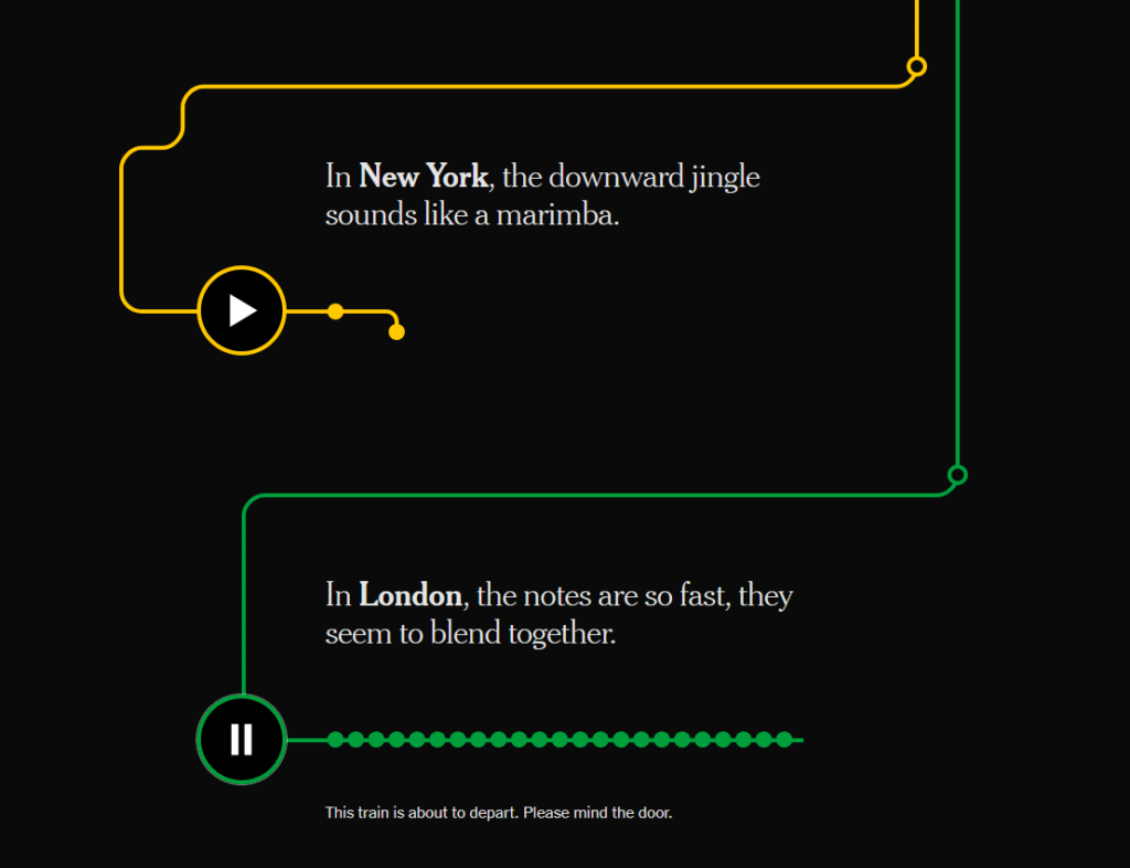
DL: Yeah. So the piece is about the sounds that trains make when they’re entering a station in different cities. And it’s kind of a random topic that I’ve always thought about in the back of my head, especially when I go to a new city. Because when you’re living in your own city, and you ride the train every day, it’s like, “I don’t even notice it anymore.” But then when you go to a new city, it’s like, “Oh my God, I’ve never heard that before.” But then, of course, everyone else is like, “Doesn’t even blink.” So I just always thought that kind of experience was really interesting. This is like 2020 when we were still in lockdown. This is really embarrassing. I think everybody was doing this. Everyone was going on zooms with their friends, right? And because we can’t really see each other, I made a little PowerPoint for my friends. It was Basically, this like a little TED talk for this stupid topic. And as I was putting that together, I just got really into it. And I just decided to do a Medium post about it. For which I made some really kind of made-up weird maps. So you can tell I just had a lot of time on my hands. But it combines so many things of my interests of transit, traveling, music theory, maps, all of that kind of thing. But what’s interesting is, I don’t know what I expected with this post. I put it out there, and then I tweeted about it. But then people were coming out of the woodwork. Random people, obviously randos on Twitter.
DL: But it captured this audience where everyone was commenting like, “Oh, I noticed you put in this for this Canadian city, but have you heard of this other one for this other Canadian city or–?” They were giving me fun facts like, one of the city’s tones is based off of an Aaron Copland piece or something like that. And it was just so cool because it found this audience– like you said, something that you didn’t care about two seconds ago, but now you deeply care about, or it’s like people who were like, “I care about this. I can’t believe someone actually wrote about it,” or something like that. And I also got a bunch of responses from readers being like, “I ride this train every day. I never thought about this chime this way.” I got a lot of emotional responses, which was kind of fun. I didn’t expect that to go anywhere, but then one of the editors at The Times reached out to me. Someone on The Times graphics team had shown her that piece, and she was really fascinated with it. And she asked if I’d like to do it for surfacing, which is– the whole idea about that column is that it writes about subcultures more or less. And yeah, we kind of modified it a bit for The Times. We had this really great reporter go and actually report and interview some of the folks behind the sounds and stuff like that. And it all came together because we had two really great digital designers who helped build a really cool interactive piece with it.
RT: I’m scrolling through it now and just for listeners, too, and will include links to this as well, but it’s got this transit map look to it. And as you scroll, these stops and these lines start to develop. And then you can hit play on one and then see the transit map actually kind of act out the intervals of these sounds. And I love that. This is one that I will be like– every time I get on a train and I hear doors closing, “Ding, ding.” “Oh, yep, yep. Okay, that’s kind of like Paris’ or whatever. One of those.
DL: Yeah. That design was cool because we were trying to think what kind of thing we could build for this. And we realized that transit maps and also music notation, they both make use of circles and lines. And so we were just trying to integrate that. Yeah, it was really fun.
RT: There’s there’s a couple of these other ones too that I think are really good examples of things in this realm of cartography. I’d love to talk about your Chinatown signage piece, and if you could maybe just introduce that, and tell me a little bit what that’s about and, yeah, kind of a little overview.
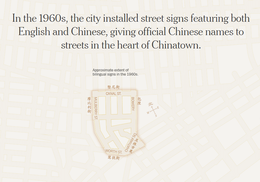
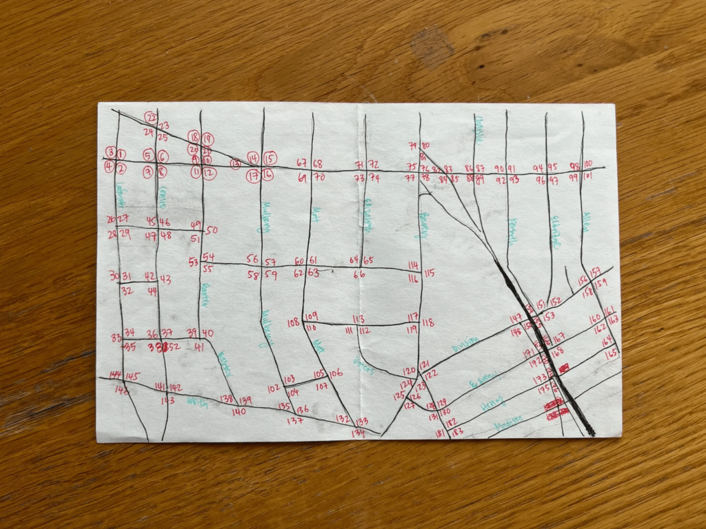
DL: Yeah, so this is a piece I did with another reporter, Aaron Reiss, for The New York Times. And this is about how we found that the street signs in Chinatown in Manhattan, which have both English and Chinese on them, have decreased over the years. And the story is– that’s kind of the takeaway, but we sort of also wanted to step back and give folks kind of a history on the expansion and the diminishing of these signs and a little bit more about how they came about and the Chinese diaspora history behind some of these signs. For this, it’s actually a really cool kind of reporting that we did, which is– well, one thing is, the only reason this story even exists is because the City of New York does not actually have formal data on this, so we had to go collect our own data and make our own map for this. And that just entailed walking through every intersection in Manhattan, Chinatown, and jotting down where the signs were.
RT: This is definitely what came to mind when you were sort of talking about, “I don’t know how to do this. We don’t know how to get this. Let’s go get this data. Let’s go out and put some boots on the ground.” Because Stamen has done a few things before I’ve gotten here of manual mapping and manual data collection. And there’s these bus routes for big tech companies in the Bay Area. And I loved seeing that image of that paper map that you had just drawn out for your reference. Kind of also what you said too around the– you wanted to dig deeper– and I feel like in a story like this you could say, like, “Oh, yeah, we’ve noticed the signs have been disappearing.” And you made it so much more meaningful, like, “Let’s look at the history. Let’s go back into when these signs were introduced.” I don’t know. Can you tell me a little bit more about the data collection and that research process?
DL: I would say that Aaron is very steeped in this. He has years of reporting experience for this, which was great. It was a bunch of just gathering whatever we can from the Department of Transit, Transportation in New York and also tracing back sources from actual people who were alive back then and when these signs came about. And so much of this was also because the city doesn’t keep any database for this, we were trying to figure out when certain signs were put in and when certain signs were taken out, and we were digging through historical photos, archival photos. Aaron had these books that he was looking through. So just it was a true sleuthing effort of trying to find these signs in the backgrounds of old black-and-white photos and things like that.
RT: And movies, that was one of my favorite–
DL: Yeah, that was really funny. I thought one of the coolest things was noticing that these signs were stenciled calligraphy of this guy in Chinatown who wrote all of them out. And you can see that every character is different and unique. And I don’t know. Just learning about that history through this was really cool for me.
RT: It’s a cool story too, and this one also had seemingly quite a bit of impact too. I know in the NACIS talk that you gave on this, it was mentioned that there was some cool things that kind of sparked around this.
DL: 00:35:25.118 Yeah, we got some really great responses from the Chinatown community. And I guess one of the more impactful immediate things was that a city council member saw our story and decided to put in place a process for creating these bilingual signs, which did not really exist before, believe it or not, even though there’s tons of bilingual signs in New York. And they also put back in one of the bilingual signs in Chinatown, which, honestly, it’s kind of just symbolic, but it was still pretty cool that it happened. At least we put one sign back.
RT: It’s cool to do work on a project that then results in a change of the real world. I feel like maybe this is just a meta-cartography thing. Is something happens in the real world and then I make a change in my map but then you all had this story where you mapped something and it made a change in the real world. And I think that’s really powerful.
DL: Yeah, it was really cool. Honestly, I can’t think of another example where I’ve had such an immediate direct impact I can see. So that was really cool.
RT: Yeah. So there’s more stories I want to talk about. I want to talk about two more here as a touchstone for people listening. One of them is your most current work at Bloomberg with electric school buses. And I think it’s got some cool examples. You had mentioned that it’s not the “mappiest.” But there’s a map in it and there’s also some mapping techniques too that we can talk about. So tell me about this piece.
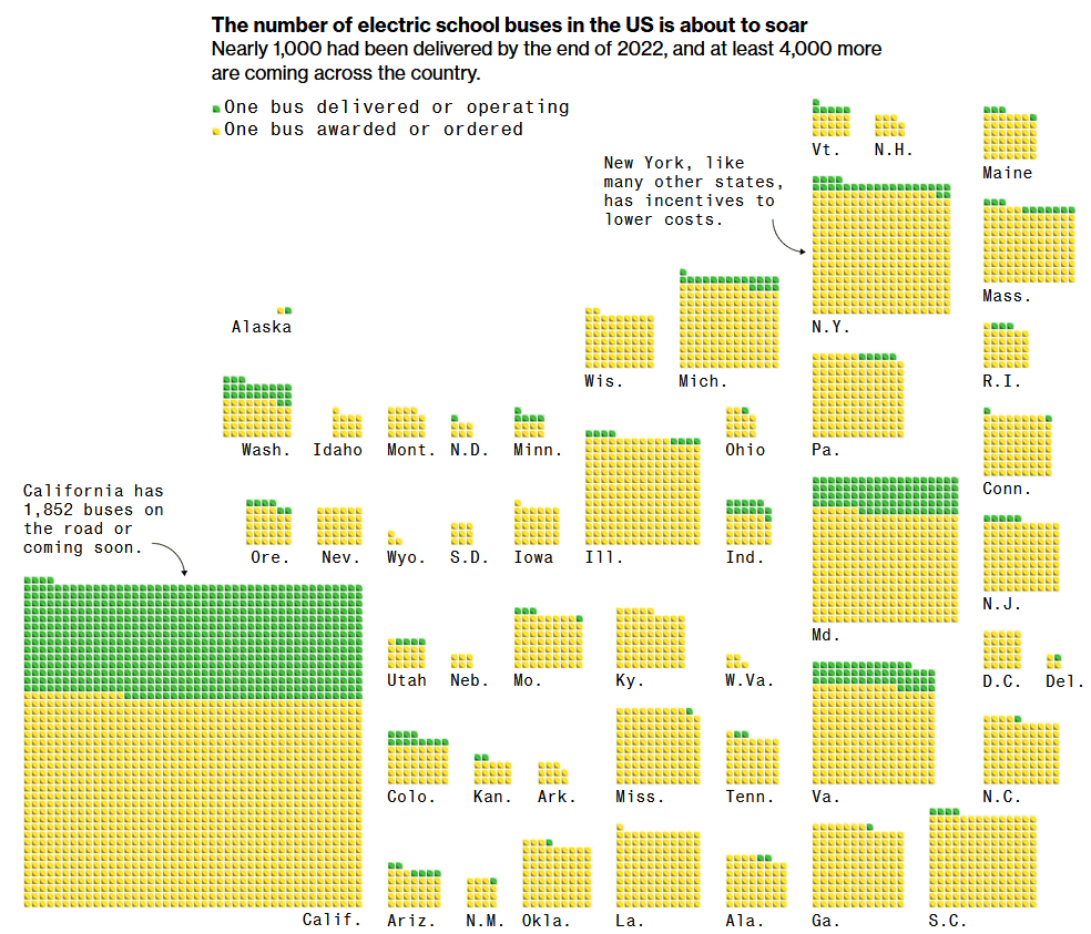
DL: Yeah, so this is a piece I worked on at Bloomberg with another really great climate reporter. The whole thing is about how schools are kind of adapting these electric school buses and also why they’re so good as kind of an easy thing to electrify. And the main thing for this was doing a visualization showing how some of the diesel buses get retrofitted. I guess actually I totally forgot there is another map component aside from the cartogram. Yeah, and we wanted to show how electric school buses are actually a really great vehicle to electrify because the way that they run they have predictable routes, they have predictable stops, they have a break in the middle of the day. It’s actually really easy for them to be electrified and adapt to this new system. And so we decided to show kind of a day in the life graphic with a little animated map showing the routes that a specific bus takes. And then there’s this cartogram also in the story which shows just how many electric school buses are coming to states across the country. And actually, I had a lot of fun making it honestly but it was a little difficult because, I don’t know, cartograms are really hard sometimes because you have to configure them so that they look good but also convey the data. I struggled a bit with how to organize this in a way that looked good but also– because you want to keep things in kind of their rough geographic location but then it was really hard to figure out the right way to do it. But I had some great edits from an editor to help with that, so.
RT: I’d love to talk about this program and kind of cartograms in general. This piece has one that you’ve worked on and a few other projects that you’ve worked on have them as well. Just for listeners, a cartogram is a type of map that alters the geography of something based on data for that geographic area. And this one – and I’ll describe it just as well – is a bunch of these yellow and green little units like boxes, dots, and they’re sort of stacked representing each bus that was awarded or ordered for a state and then how many of them were electric.
DL: Almost. It’s basically how many electric buses have already been ordered and also how many electric buses have already been delivered more or less.
RT: Oh, okay, gotcha. It’s kind of funny these cartograms to me they’re sort of this missing link between charts and maps. And actually, we have an episode and it was an episode with Carissa Carter last year who wrote this book called The Secret Language of Maps. And broadening the definition of what a map is and cartograms to me they still act as that missing link of there’s a graph or a chart and a map and right in the middle is a cartogram. And I feel like I see them most often in journalism and most often associated with political topics. For instance, you had a piece with the Times about how the Republicans won the House. And there was a cartogram in that one where it shows all these squares representing political power. And why do you think they’re so useful? And why do you think that they’re often used in this sort of context?
DL: Yeah, I think cartograms are really great when you want to show some sort of data that’s geographic or has some sort of geographic pattern, but then with the way that our country is, the states with bigger area on a map, in a regular map, tend to be the ones that don’t have a lot of people in them. Obviously, not all the time, but that’s kind of generally what it is. And oftentimes, that is the map that people recognize. So there’s definitely pros to using a map like that, real geographic map where people can recognize where the states really are in relation to another. But sometimes it’s really hard to convey data when most of the data are in kind of the states that take a very small areas on a map. For example, the Northeast is very small, it’s a very small area on the U.S. map if you’re just looking at a regular map. But then, of course, a lot of people live here. And so what you said about politics, that’s a great example. This sentence has been said: land doesn’t vote, people vote, right? And so a great thing about using a cartogram is that you can show data on a more or less geographic relational level. But that’s not skewing the data so that some of them seem overrepresented.
RT: Right. Showing the data that really matters, it’s not acreage–
DL: Exactly.
RT: –it’s voting power, it’s people, it’s congressional seats and stuff like that. I don’t think that can be said enough because every four years I see something that’s like, I don’t know, something that says impeach this or– it’s like, oh my gosh, we still have to keep saying it.
DL: Yeah, I think that’s the thing about maps is, we sometimes struggle with that as data is, people, is you want to show something, but then sometimes by doing that, you’re making something that’s more complex, and it’s harder for people to understand. Some people might not understand a cartogram so easily because it takes a little getting used to, like the states aren’t where you’re used to them being. But then the other risk is, a geographic map might be giving some things more weight than they should. We always have this balance of, you want to show things right in a cool way and an accurate way, but then you don’t want to have it be so hard that people who are not looking at charts all day can’t understand. Or people who even are looking at charts all day can’t understand it, you know.
RT: Totally.
DL: Yeah, it’s a struggle, I feel like. But with cartograms, I feel like it’s a struggle every time because you’re kind of coming up with a new placement every single time, depending on the data.
RT: Yeah. And it’s one of those things, too, that in some ways, it’s easy to, oh, we can just make this sort of look like the shape of the state. It’ll be like, if you squint, it looks like California or Illinois or whatever. But you don’t have to. And sometimes it’s more effective not to. It’s such a cool phenomenon, and it serves a lot of these stories really well, especially the ones we just mentioned, and showing these proportions and geography at the same time, so. One other visualization in this electric school bus piece I want to talk about is the LEGO brick visualization for that bus.
DL: Sure. We wanted to do a visualization showing the process for retrofitting a diesel bus to be electric. And that basically entails taking parts out and putting parts in, right. So in my head, I was like, what if we just did that with LEGOs. That’s kind of what kids do anyways. They take apart things and put things together through LEGOs. Well, I wanted to create it with real LEGOs. It didn’t work out. But then I Googled and I found this online software called Mecabricks. And you can basically build virtual LEGOs. I’ve never used Blender, but I assume it’s what Blender is like. But then, for– you can actually pick out the bricks that you need with actual LEGOs. So it was really cool. And I, obviously, I had never heard of this. I never even really used 3D software before, but it was really fun building this bus. And what’s cool about building it virtually is that it doesn’t have to actually be real, almost. I was following a tutorial for making a real LEGO bus. And I just like baked so much of it because it didn’t have to actually be structurally sound, right? So it just had to look like a real buzz. And of course, I also made my windows opaque because it’s empty on the inside. So yeah. So it was really fun. And I’m really glad it worked out using this kind of LEGO analogy to show this process because I think it’s easy for people to understand. You’re taking things apart, you’re putting things back together.
RT: I am currently scrolling it right now and just it is fun to just go back and forth and see that little gas cap open and close, and I’m controlling this little stop-motion visualization and it’s such a unique and creative way to show it too. And which brings me to probably one of my favorite things, that I don’t think I knew you had done this at the time that I first saw it, but the next piece that I want to talk about, the final piece I want to talk about is gerrymandering your party to power. My quick expression of love for this is I played it multiple times and I learned a lot because I’m a big nerd for games and maps and wherever they intersect. And I’m passionate about educating on how maps are used for power. And so sort of what we were just talking about is land doesn’t vote and we have to tell people that. And it’s education about how maps work and how we look at these expressions of power within maps. And so can you just tell me a little bit about this project?
DL: Yeah, it’s a project that is basically a puzzle that people have to solve. We put the reader in the shoes of someone who has to redistrict a fake state. Basically, the goal of this story was to teach people about redistricting and why it’s so hard, actually. And originally, we knew we wanted to do something on redistricting. You don’t get to do redistricting graphics very often because it only happens once every ten years. So we wanted to do something. And we were, well, what if we made them actually redistrict a real estate like Georgia or something? And we were looking at– there’s actually websites that allow people to play around and do that. And there’s actually tons of many different websites and they’re all very complex and well built actually because they’ve taken into account so many different things. Clearly, people have spent years building these websites. And that is when we realized we can not do that because it would have been really hard to actually use a real state because there’s so many different implications, real-life implications using a real state, right? You have to, first of all, use real data. You have to take into account real geographic features.
DL: Once you put something in real life, not only is it really hard because we have to deal with taking into account so many real things, real datasets, and real implications, but also people are inherently biased and everyone will go into that with all sorts of different things about what they think of the state, what they think of where the lines should be drawn and things like that. And we also didn’t want people to kind of come in already biased one way or the other. So we decided to make a fake state and obviously, it’s so much easier to do that because our little map that we have is a couple dozen hexagons, right? We don’t have to use a real state. And they’re all magically uniform and they all have the same population. We can just keep things simple and consistent so that the main focus is the actual learning process of how the redistricting works. And we didn’t have to complicate it with like, “Oh, but this district has like a certain number of people,” or whatever. We could just keep things really simple. So that’s why we decided to set it in a fake place, make a fake map. And also use two colors that are not traditionally associated with political graphics which I don’t know if you know this, but the red and blue, those two colors became associated with the two major political parties because of graphics that The New York Times graphics department did.
RT: Oh, I didn’t know that.
DL: Yeah, Archie Tse, the director there. The colors do not use to have those meanings until the time started doing graphics with certain colors.
RT: This is, again, too, of these graphics that are being made having real-world implications. Wild.
DL: And I was like really adamant about this. We really didn’t want to use red and blue for the exact reason of we didn’t want people to come into this inherently telling them that, “Okay, you’re a Democrat and now you have to do this,” or “You’re a Republican and you have to do this.” Because then people just come in with their biases, right? And even if you’re truly playing the game and you’re being told that you’re a political party that you don’t actually identify with, you might not try as hard, right? Or you might– I don’t know. But you know what I mean? So we wanted to get rid of everything that’s not about the process. And so we decided to use two fake political parties, yellow and purple. And then they can just not have any biases and still the main focus is to try and redistrict the state. That was a really long project to work on, but I’m really proud of the way it turned out. And we also got a lot of great responses from folks being like, “Oh, my God. It’s actually really easy to disenfranchise certain people.” And that’s exactly the kind of reaction we want. It’s easy to take advantage of people, and that’s what happens in real life. And we wanted to show people this, right? What you just did, it’s like a really simplified version of what’s happening right now in real life. And it’s almost like, “Okay. Pay attention to this process.” And I feel like most people hear redistricting and they’re like, “What is that?” People don’t even know what’s happening. I didn’t know all these different things that state legislatures had to consider when they redistrict. And I actually had to read up on all of that. And I think that’s what we wanted to do with this project. Just this process can be skewed or taken advantage of by certain folks. And I think the best way to show that is to actually make people do it themselves, and they have this kind of visceral reaction to it.
RT: I can’t say enough good things about this too, especially with how you handle mitigating biases. But then also really getting at the point right away, like you are one of these parties and you are trying to gain power. This is how you do it. And then it’s spoiler alert, this is happening. Right now in Wisconsin just had a major election and there’s this Wisconsin fair maps coalition that is fighting against gerrymandering in Wisconsin, particularly. And so it’s really exciting to see some of these things happen and that just ongoing conversation of this is something that we could fight against, and it’s happening.
DL: Yeah. That was a good project to work on. And actually, for that, we ended up making a print piece. So go back to what you said about how do you adapt something so interactive to be print? It was actually really fun to think about that for this because we wanted to just do a paper puzzle. We wanted people to like draw the districts with pencil and we had to come up with– okay. Like online, you’re calculating the score for them, but then you can’t really do that on paper. So I took inspiration from what if we did like a Yahtzee kind of scoreboard or something, you know? So they can calculate– like a worksheet to calculate the score for themselves. Those are the kinds of things that we had to think about for adapting this to print.
RT: That’s wild. Yeah. I didn’t know that it was also paper, but very cool that you were able to translate it with that. One thing I do want to talk about, too, is– you touched on this a lot and I’m really glad, too, of the notable design decision of the colors and stuff. But I kind of want to extrapolate out of that in making sure the users don’t have biases. And then design decisions in general around touchy subjects. I had looked at this piece one day of the war, Ukraine and Russia, and trying to be as much of an objective standpoint as possible. But I see that Ukraine is like a light calming blue in Russia is a bright red color. And hearing you say that consciously recognizing like, “We want to make sure that our users can come at this,” is there a notable things that you’ve seen about that or have any thoughts about responsibility in journalism anyways?
DL: Yeah. I think the Ukrainian war everyone’s doing maps for the conflict, and nobody thought it would last this long. We’re more than a year in now, and people are still making maps. And I was not making so many maps, but I was definitely on the reporting teams for the conflict for a bit at the times in the graphics department. And yeah, every kind of decision you make for those maps, you are saying something with these maps, and you just want to be careful with how you’re saying it, what you’re showing, even aside from the colors. But we have data from research groups showing control maps of who’s, quote-unquote, “controlling the area” in that region of certain places in Ukraine or Russia. And you have to think about, “Okay, are these areas shaded in solid? Do we put a dotted line showing that it’s fluid?” This is like a situation that’s changing day to day. You have to think about, “Okay if we make it solid, what are the implications for that when a reader who’s just jumping into this story without any sort of background, what do they think that the map is saying when you color a certain way or when you shade it a certain way or when you have certain arrows going in certain directions?”
DL: It’s like these things that I feel usually might not have so much weight to them. But when they’re about a conflict that is literally happening right now, where actual people are at stake here, it’s really difficult trying to figure out the right decision to make for certain things that you’re putting on a map. Do we put certain dots where they are? What is the level of detail or zoom for this map that we need to show? Because we have this lat/lon from whatever research group, but how accurate is that really? And do we show what’s happening, where the troops are in the Ukrainian side? Do we show all these conscious decisions that we have to talk about and make? Because like you said earlier, maps can be so misconstrued if people wanted them to be, right? And so you really have to think about what you’re putting on the page and how you’re actually showing it because even for people who are well-read in the conflict, they might be misreading the maps.
RT: Yeah. There’s a responsibility in showing that example that I think you said between a dotted line and a solid line. It’s something that seems so choreographically mundane can mean so much in sensitive topics like this, in that these pieces are being read by millions of people. And every decision that you’re making like a journalist has power and has power to persuade in how people are thinking about these. I love hearing you say how thoughtful you are in approaching how we’re representing this. And back to this current one we’re talking about, how we’re representing two fictional parties of a little hexagon people. We want to make sure that we’re careful with that. Big kudos to you for that.
DL: Yeah. I think that’s kind of the thing throughout all of this is like. At the end of the day, so many people make graphics and database. That’s not necessarily in journalism, right? But then we have, for example, where places we get data from research groups, they’re also making maps and graphics. But they have a different target audience than we do. We’re making things for the general public, and that’s anyone from a person who’s reading up on this every single day, who has a PhD in whatever warfare studies or something, and then to someone who knows nothing about the conflict, and they’re just finding out about it. But we have to serve those two people and everyone in between. And I think that is kind of what makes our job so different from other folks who are doing graphics within a scientific research field or like a consulting group or something like that. Yes we’re all making data viz and graphics and whatever. But at the end of the day, we as journalists have to make it so that anyone can understand, a mass audience kind of understand it, and also we get a point across that’s accurate and also not biased. It’s hard sometimes, but it’s worth it.
RT: Totally. Well, thank you so much for talking about these pieces and going deep in all of these different concepts around them. I learned a lot from you talking about these and I’m curious, what’s sort of next for you? What’s going on for you? What’s getting you excited? And it can be professionally, it can be personally.
DL: What’s getting me excited? I’m actually not a fan of the warm weather. I hate summer. I don’t know. I’m trying to see if I can do kind of more personal projects. I don’t know if I’m actually going to fulfill that goal, but I feel like so much of my stuff that I do is for work and it’s sometimes hard to remove myself from that, but I don’t know. I really like that stupid little subway thing I did for my medium and it’s like, “Why did I do that?” I don’t know. Maybe it’d be fun to do something else just on my own for fun, but I don’t have anything in mind.
RT: Just make another PowerPoint for your friends and maybe it’ll–
DL: They’re tired of me. [laughter]
RT: –stem out from there.
DL: They don’t want another one.
RT: Well, Denise, thank you so much for joining here, and really appreciate you taking the time to talk with us today.
DL: Yeah, thank you so much for having me.
[music]
RT: Thank you for listening to Pollinate and thanks to Denise for talking about her experience and work today. This episode of Pollinate was written by Erik Rodenbeck, Laura Gillen, Nicolette Hayes, and Ross Thorn. Music for Pollinate was created by Julian Russell. You can see more of Denise’s work at deniselu.com and at Bloomberg, Washington Post, and New York Times. If you’re a fan of pollination and the content we create, please review and subscribe to the show wherever you get your podcasts and share it with your friends and colleagues too. If you enjoyed today’s episode, tell us on Twitter at stamen or on our Mastodon account at viz.social/@stamen using #pollinate or #PLN8. For a summary and full transcript of today’s episode, along with some visuals of the graphics discussed in the episode, check out the blog post at stamen.com/blog.