
One of our biggest projects last year was an update of our classic basemap styles, working hard with our partners at Stadia to adapt these maps to modern infrastructure and keep them running for years to come. As of October 31, we completed the transition and all our basemap users are now using Stadia’s infrastructure. You can read more about how to continue to use our maps here, and there’s an FAQ about the transition here.
We’ve blogged about this process before, in particular the design challenges involved in updating our Terrain style to new data, but we haven’t talked as much about our equally-important Toner map style.
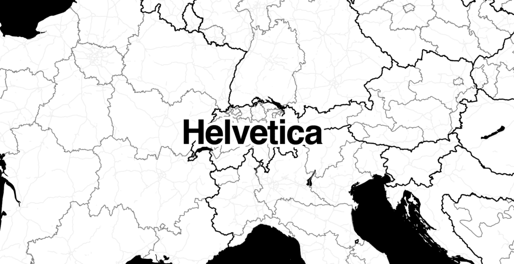
A Swiss-inspired basemap
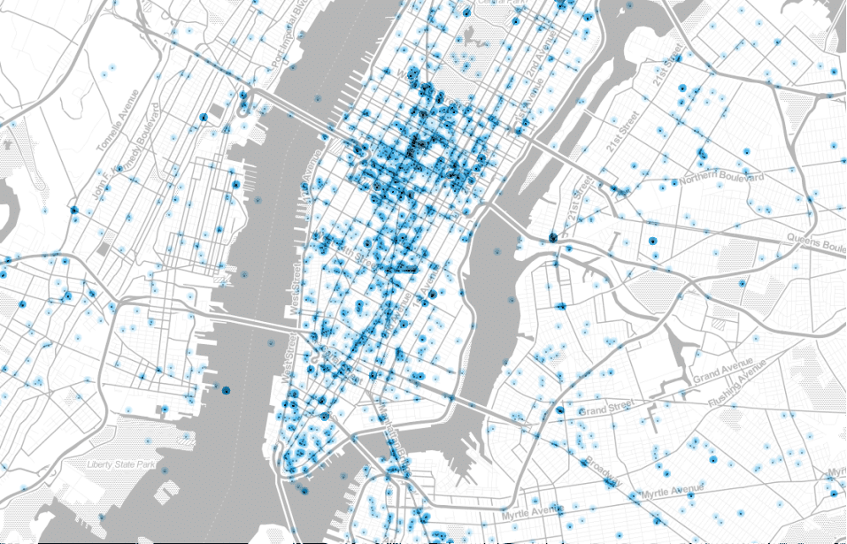
We designed Toner to be a bold, elegant map style that is stunning when viewed on its own, but also recedes into the background when used as a basemap for data overlays. It needs to be simultaneously beautiful and invisible.
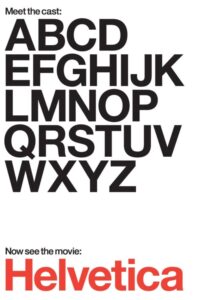
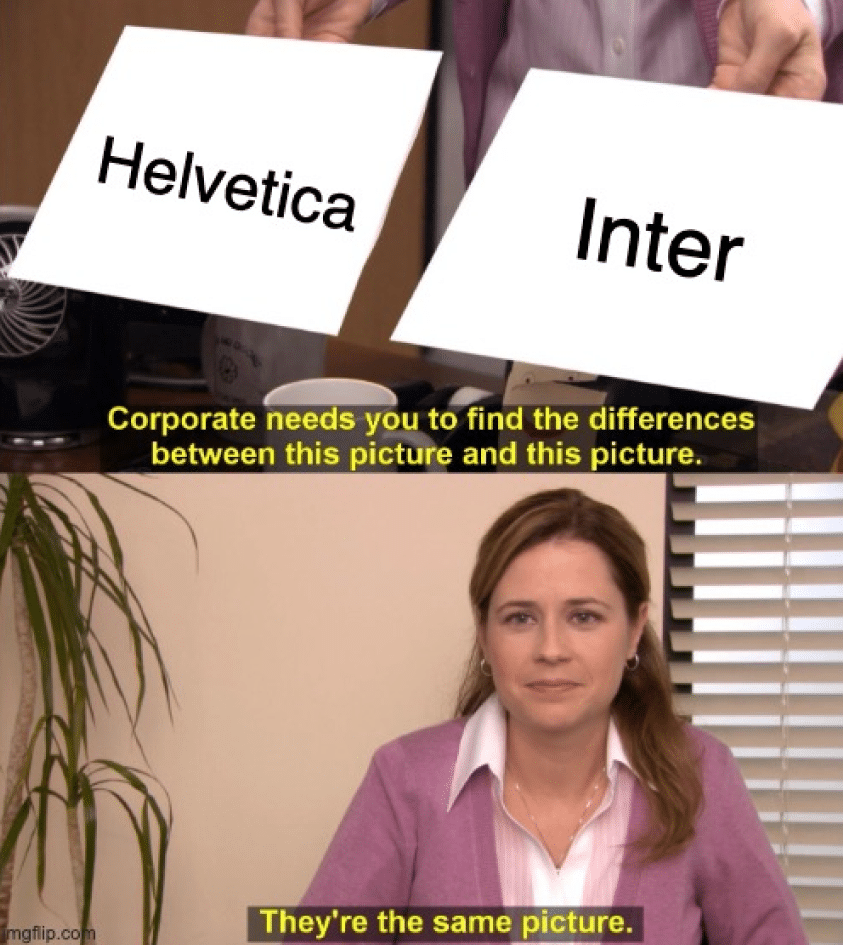
“Beautiful and invisible” could also describe the famous “Helvetica” typeface. Like the clean, minimal Toner basemap, Helvetica is “known for being the blank page or the empty vessel”, yet still full of grace and gravitas. Helvetica is so famous they even made a movie about it.
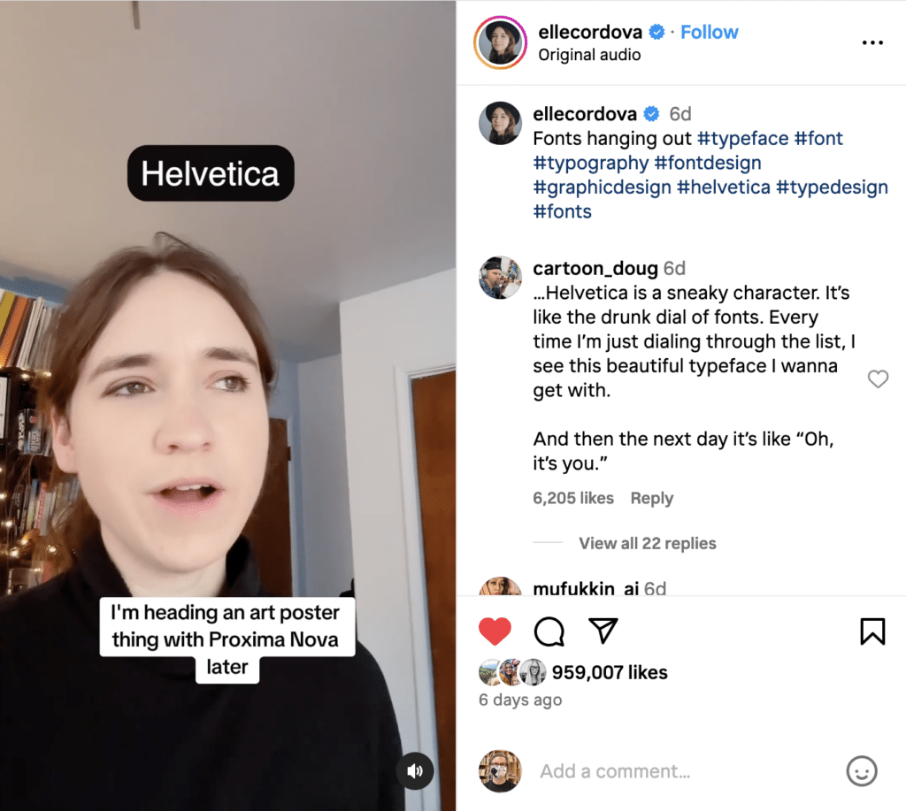
What other font could have the starring role in a comedy Instagram reel about personified typefaces?
Designers love Helvetica. Or at least, most of them do. Like black turtlenecks and horn-rimmed glasses, it’s almost a stereotype that designers are supposed to love Helvetica, to the point that a lot of real designers are totally sick of it.
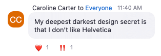
But at Stamen we still love it, even if for some of us it’s so post-ironic ironic that our love of Helvetica becomes sincere again. It has been our brand for over two decades, and our passion for Helvetica shows no sign of waning.
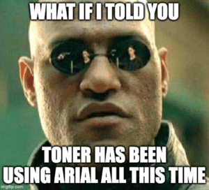
What if I told you…
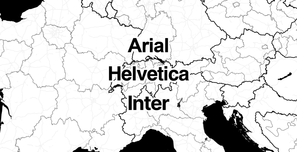
But wait, I have to make a confession. In fact, despite Helvetica being so closely associated with Stamen’s brand and ethos, our Toner map style has never actually used Helvetica. Instead, we had been using Arial all this time!
Arial started as Microsoft’s knock-off of Helvetica, but with some adjustments to make it somewhat better when displayed on computer screens (which the creators of Helvetica never needed to worry about when it was designed in 1957). There’s also of course a complicated legal history of why Microsoft wanted to use Arial instead of Helvetica, which I won’t get into here.
In general most people can’t tell the difference between Helvetica and Arial. You can test yourself with this fun online quiz on the Ironic Sans blog, which takes famous corporate logos that use Helvetica and replaces them with Arial: https://www.ironicsans.com/helvarialquiz/
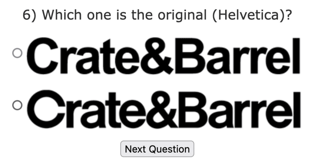
Once you know what to look for, you can spot the differences, but overall the distinction is subtle, and especially on a raster tiled map like the original Toner, it doesn’t make much difference.
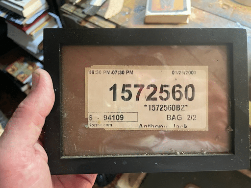
Arial looks so similar to Helvetica, it has fooled even the best of us. Eric Rodenbeck, Stamen’s founder and biggest Helvetica booster, has a framed luggage tag that he has saved for sentimental reasons, but also as a lovely visual artifact of typography. Unfortunately, after I’d just spent some time playing the Helvetica vs Arial quiz, I had to regretfully inform Eric that in fact his luggage tag was using Arial not Helvetica:
Why did we originally use Arial instead of Helvetica for our Toner map back in 2011? To be honest, I don’t know. Although neither Arial nor Helvetica are free, open-source licenses, perhaps we thought that the license to use Arial was more appropriate for our use case of generating rasterized map tiles and serving them on the internet? Or we thought that Arial had better unicode coverage? Or perhaps we just had Arial installed on our computers and we didn’t have Helvetica.
In any case, when the current team of cartographers at Stamen opened up the old Toner code repository (since none of us were around at Stamen when it was originally created) we were horrified to see that Arial-Unicode-Regular.ttf file looking back at us when we opened the repo’s fonts folder.
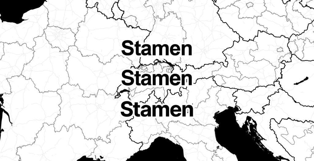
Enter Inter…
When it came time to rebuild our Toner map style on Stadia’s modern platform, we were faced with a choice: should we stick with Arial, or finally switch to Helvetica? Or should we use something else?
With all of our basemaps, we try to follow the open-source ethos as much as we can, from our insistence on using open data from OpenStreetMap and the Natural Earth project, through to our use of open-source rendering libraries like MapLibre. And yet, for Toner, it would feel kind of odd to use a proprietary font stack for this flagship open-source map, whether that’s Arial or Helvetica. And that’s to say nothing of the actual legal implications of using these fonts…
And plus, our Terrain map style has always used an open-licensed font called PT Sans, even before our migration to Stadia. It would feel weird for one of our map styles to use open-licensed fonts, but not the other.
When we looked around for fonts that have a similar feel to Helvetica, but are open-source, we quickly landed on Inter as the obvious choice. The more we looked at it, we felt that Inter was much more of a dead ringer for Helvetica than even Arial is.
“But there are some subtle differences,” you say. “For example, Inter has some angled finial forms that are not parallel to the baseline, unlike Helvetica’s flat finials, but nowhere near as many as the surfeit of non-perpendicular terminal geometries in Arial.” And to that we say, “you’re right”.
To learn more about Inter, read Matt Westcott’s “An Ode to the Inter Typeface”. It’s also exciting that Inter is under active development, with the release of version 4.0 just a couple of months ago.
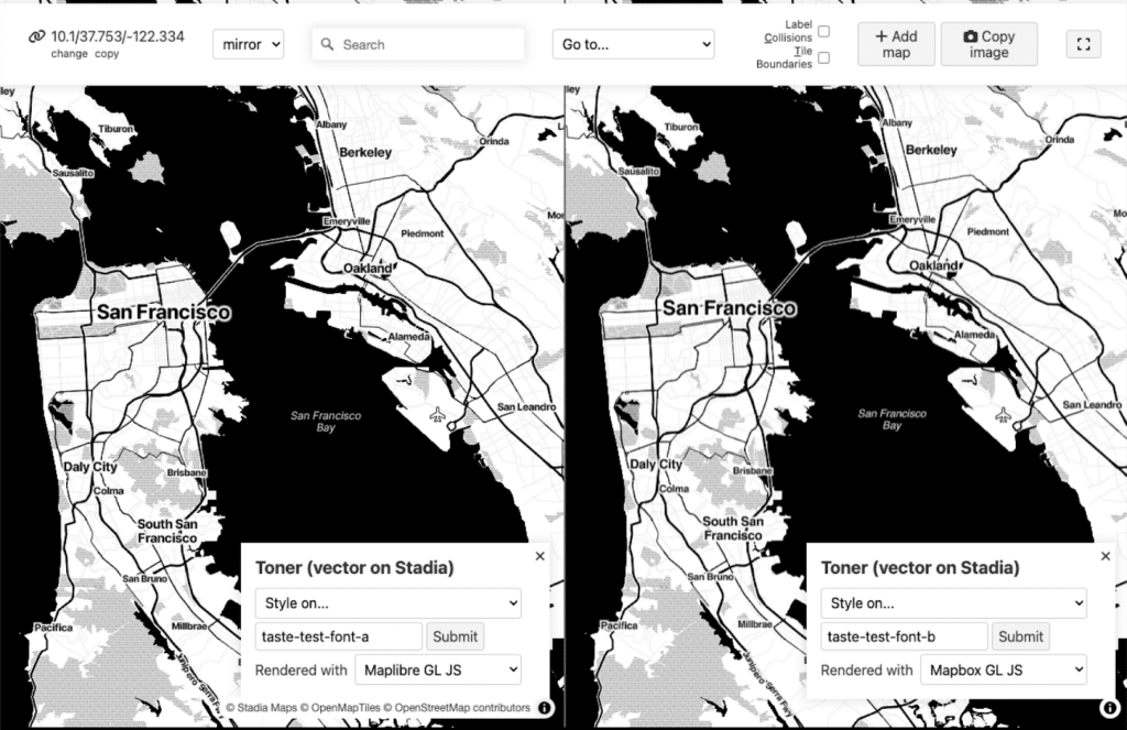
We’re pretty happy with Inter, and we found that doing some internal A/B testing, nobody had a preference, and with the exception of a small rendering quirk spotted by eagle-eyed Stamen alum Brandon Liu, nobody could even tell the difference.
So what do you think about the new map? Do you think you could tell the difference?
In a way, I’m a little sad that we’re not using the OG “brand name” Helvetica typeface in our maps, but on the other hand this journey through the world of fonts taught me is that Helvetica is much more of a myth, a legend, an attitude than it is a particular set of font files sitting on your computer. The dream of Helvetica is alive in our Toner map, even if Helvetica itself never was.