
The other day at Stamen we were talking about a recent post by esri’s John Nelson called “Create a Light or Dark Version of Any Map in Two Seconds” using ArcGIS Online Map Viewer. So of course we were wondering how we could do the same for Mapbox GL styles.
We often have to design dark-palette maps for our clients (going all the way back to the Dark Matter version of Positron we designed for CARTO way back in 2014) and usually creating a “simple” dark mode adaptation of a light basemap is a lot more work than it sounds. But what if there was a quicker way to at least get started with a darkified version of any map?
Nelson’s trick is an ingenious one: instead of simply inverting the colors on a map (which creates a “dark” map, sure, but one where all the hues feel completely unnatural) you do two steps: invert, and then rotate the hues 180º on the color wheel. The result is that green parks are still green, and blue water is still blue, but light greens become dark greens, and white symbols on the map become black, and so forth.
For example, what if we start with a light green color like #99CC66 (which has a hue of 90, and lightness value of 60). (Color wheel image from workwithcolor.com)

Inverting it leads to a dark purple #663399, (with hue 270, and lightness 40).
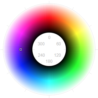
Then the “hue-rotate” step brings it back to a green color again, but darker this time: #669933 (which has the original green hue of “90” and the inverted lightness value of 40).

To apply these two filter steps, Nelson uses some functions that are built into ArcGIS Online, but what if you’re designing a map with some other tool?
First we tried to write a script that parses a Mapbox GL stylesheet and inverts every color. This is tricky in a couple of ways: for one, colors can be defined in several ways in the Mapbox GL spec, as hex, rgb, hsl, etc. So the same color of pink might be written as #ff0099, or rgb(255, 0, 153), or hsl(324, 100%, 50%). We need to parse these colors no matter how they’re written and correctly invert and color-rotate them. Luckily, there’s a handy node.js library called “chroma.js” that can parse these colors for us no matter how they’re formatted.
The other tricky part is walking through all the nested JSON structures within a Mapbox GL stylesheet to find all the spots where a color might be defined. It took us a few tries to get the invertoratorator to recursively iteratorate and invertoratorate, but once we got that figured out, voilà, we have a new stylesheet that’s an exact copy of the old one, just with all the colors inverted and color-rotated. Try it yourself here.
That’s great, and this is exactly the first step you need to do if you want to make some further adjustments to the stylesheet by hand to make a really polished, production-ready dark-mode style. But what if we wanted to do something even quicker? Soon we realized we could do it with a CSS filter in one line! This is actually a lot closer to what John Nelson is doing in his ArcGIS examples, but by using CSS we can apply it to any map or webpage.
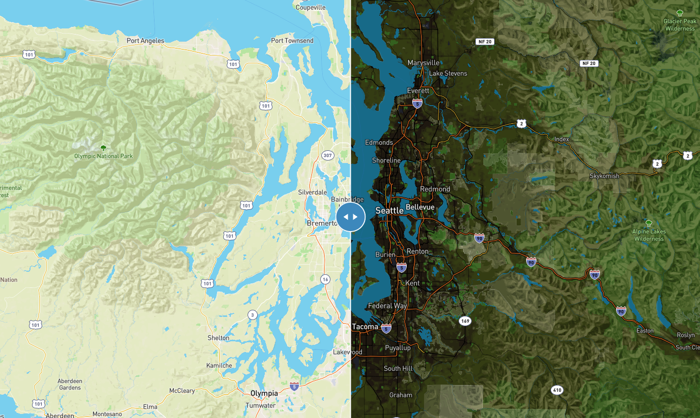
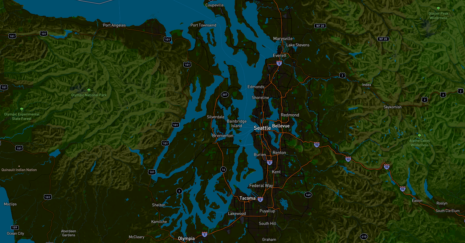
Here’s a shot of the same area, using the CSS inverter:
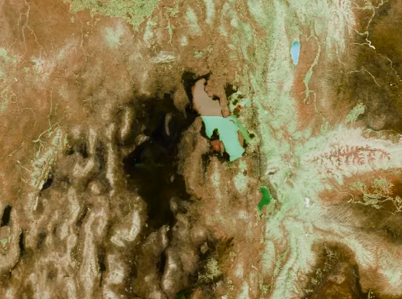
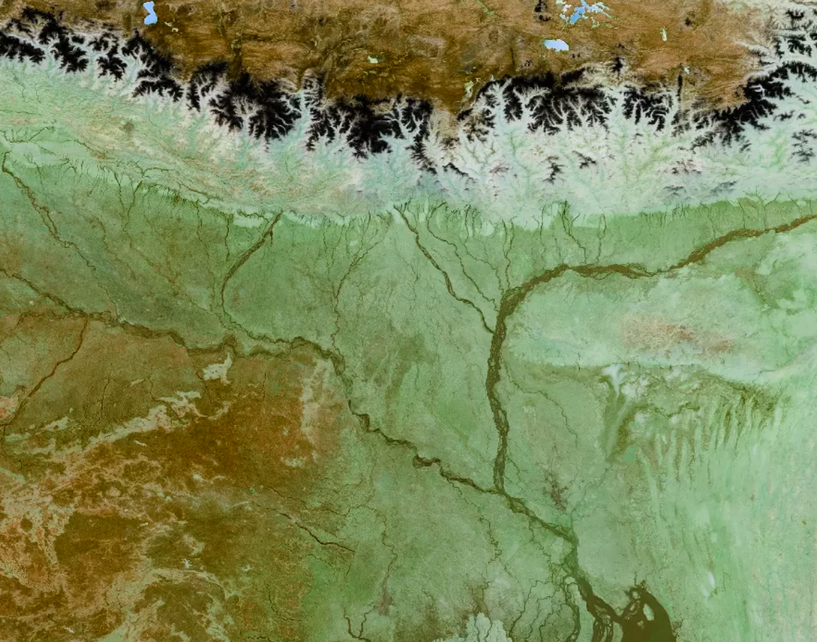
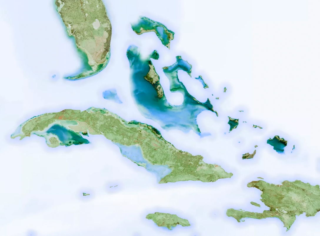
And it also looks super bizarre when you apply it to a satellite map!
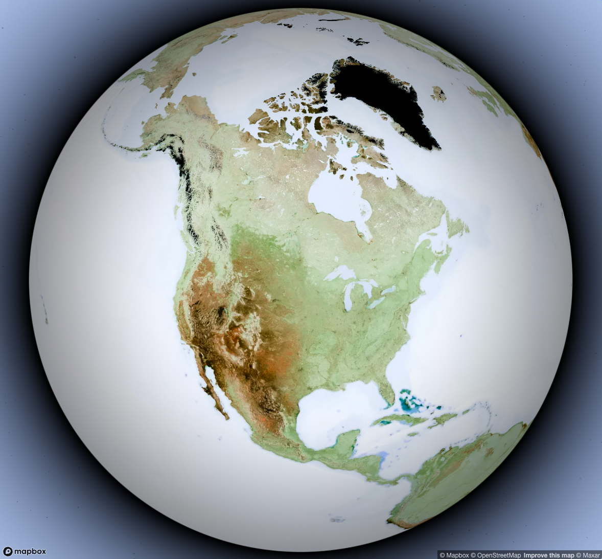
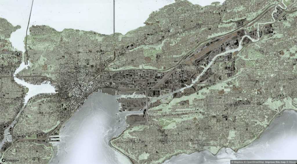
Building rooftops which are normally white or light gray become very dark, evoking the black building polygons of USGS Topographic maps.
Glaciers become an ominous black color, but in some ways mountainous terrain is easier to interpret in this inverted view, because shadows now appear to be on the south slopes of mountains (at least in the Northern Hemisphere)
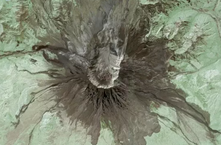
Here are some interesting bits of the map we found while panning around the whole world. Try it yourself and let us know what interesting things you discover!
We also realized that you can get this effect for any web page by using Chrome Developer Tools! Just navigate to whatever web page you want to invert, open the DevTools, select the <div> that contains the thing you want to invert, and then add a line to the CSS for that element:
filter: invert(1) hue-rotate(180deg);

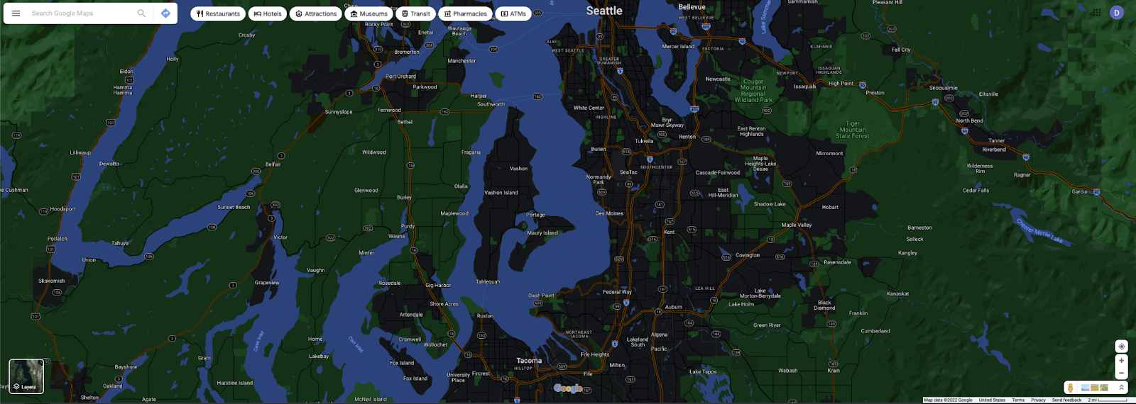
Now, for example, we can see what this effect looks like if we apply it to Google Maps…
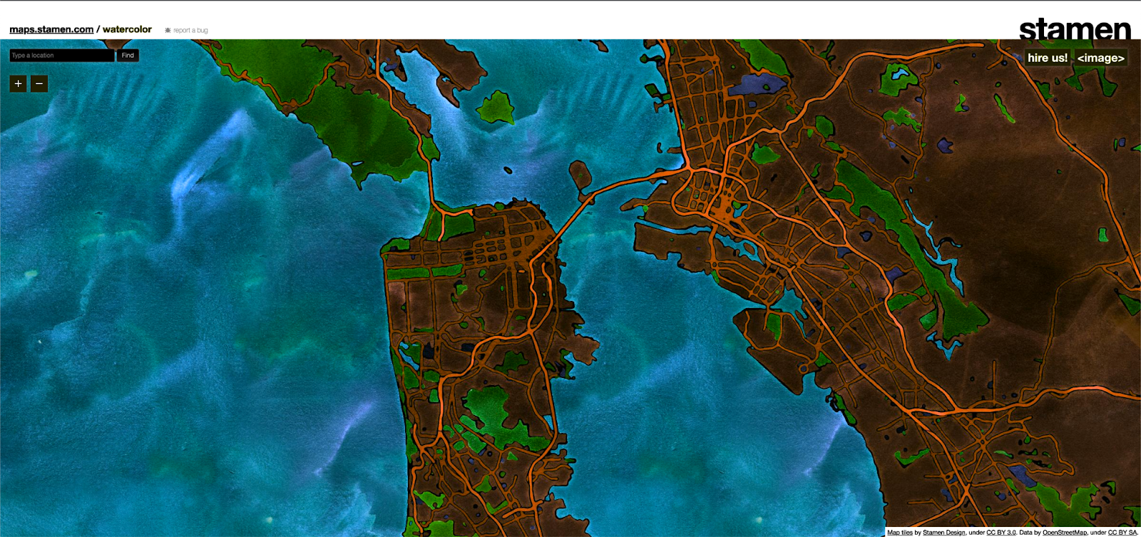
Or Stamen’s Watercolor map style…
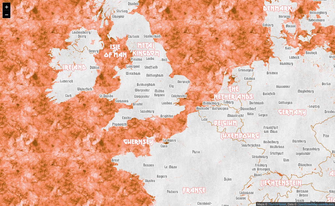
Or maybe you think your favorite heavy metal map style needs to cheer up a bit?
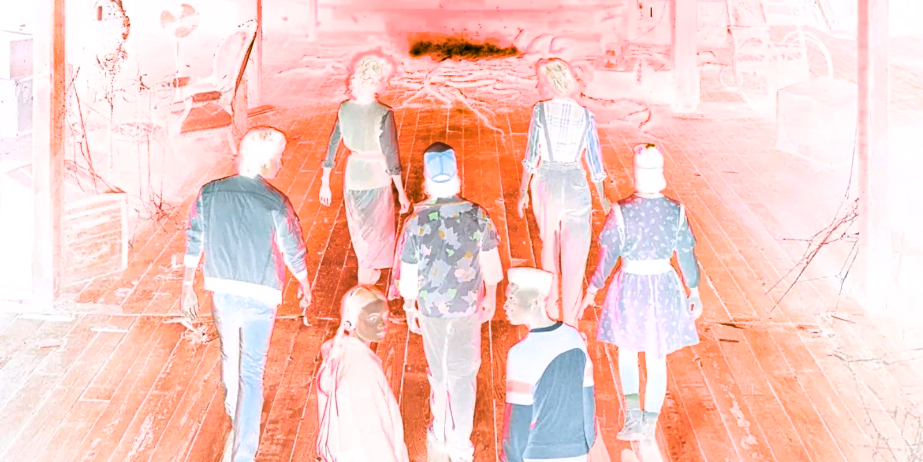
And heck, why stop at maps? Is Stranger Things a bit too scary? Open up DevTools and fire up the inverter when you open Netflix:
You can apply it to your favorite cat meme…
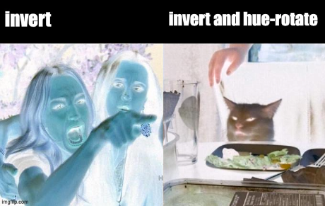
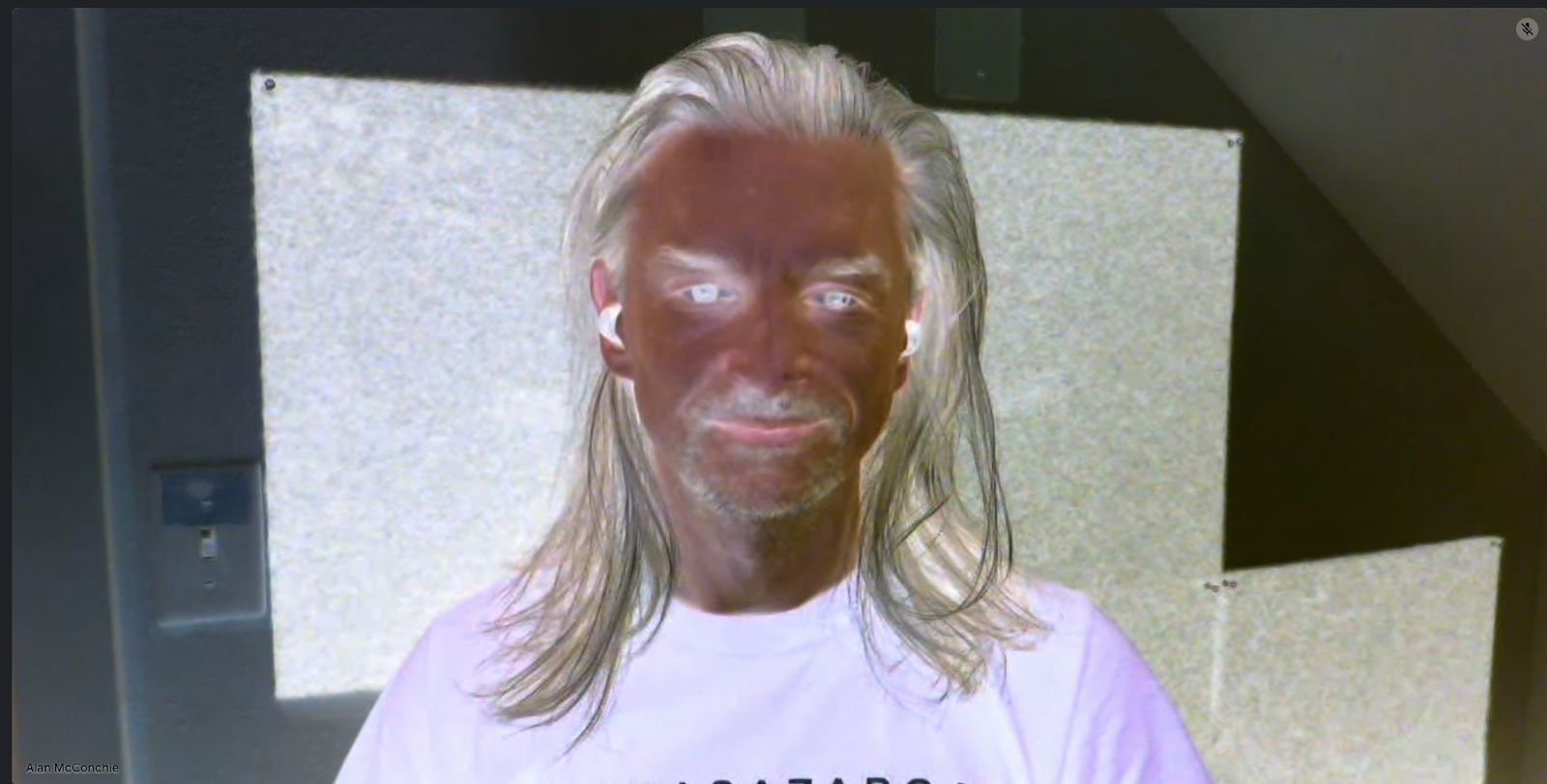
or pictures of your coworkers on Google Meet…
This is a bunch of fun, but it’s also an important first step in designing dark mode maps, saving a lot of menial effort that is necessary when embarking on a dark mode styling project.
We’re looking at adding this as a feature to some of the in-house mapping tools that we use to make our cartography team more efficient and effective. Some of those tools we’ve already blogged about (such as Figmasset and Chartographer) and we will be open-sourcing more of them in coming months.
And again, we want to make sure you check out John Nelson’s original post on this topic, or watch his two minute video on YouTube which explains the concept in more depth:
Got questions about how you can use color inversion in your own mapping project, or if you’d like to hire us to design a dark map style for your product? Get in touch!