
In August 2023, Stamen started working with the Economic Innovation Group (EIG), a bipartisan public policy organization dedicated to forging a more dynamic and inclusive American economy. The focus of our work was their keystone product, the Distressed Communities Index (DCI) interactive dashboard.
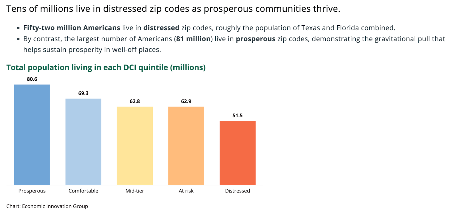
The DCI highlights economic disparities in U.S. communities at several geographic levels, grouping the population into five quintiles of well-being from prosperous to distressed. The index uses seven socioeconomic characteristics and indicators to generate a distress score between 0 and 100. Lower scores reflect more prosperous communities, while areas with higher scores are more distressed.
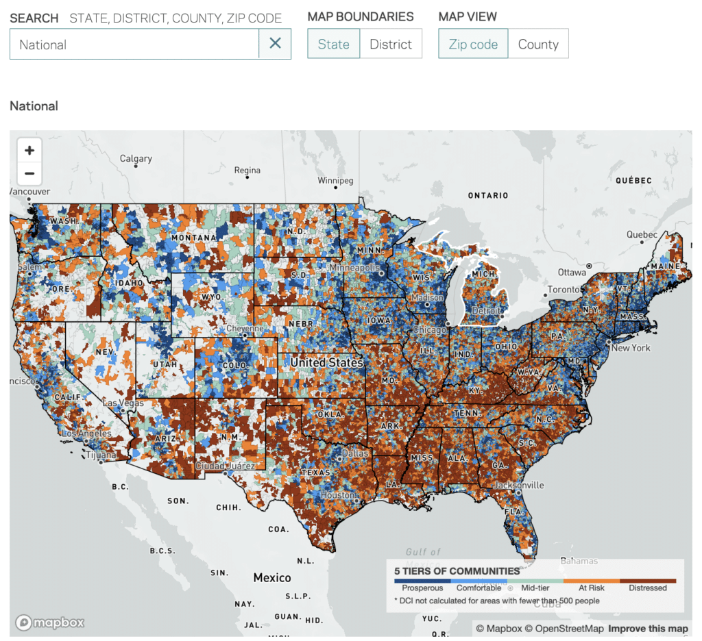
When we started working with EIG, they had an existing version of the DCI dashboard already up and running. Like the current DCI, this version featured a choropleth map that allowed users to view different geographic levels (zip code or county) and summarize the data within different boundaries (by state or Congressional district).
Below the fold, there were a handful of data visualizations that helped users better understand the data they could see on the map. These would differ somewhat depending on what boundaries you’re using to summarize the data and which geographies you’re actually viewing on the map.
Our task was to design and develop a new-and-improved DCI dashboard that maintained the core functionality of the previous version, but improved the visual design, user experience, and general legibility of the data.
Overhaul visual design
There were several improvements we knew we wanted to tackle right out of the gate: page layout, consistency of visualizations, a more interesting visual articulation of what makes up the index, and the color palette.
Layout
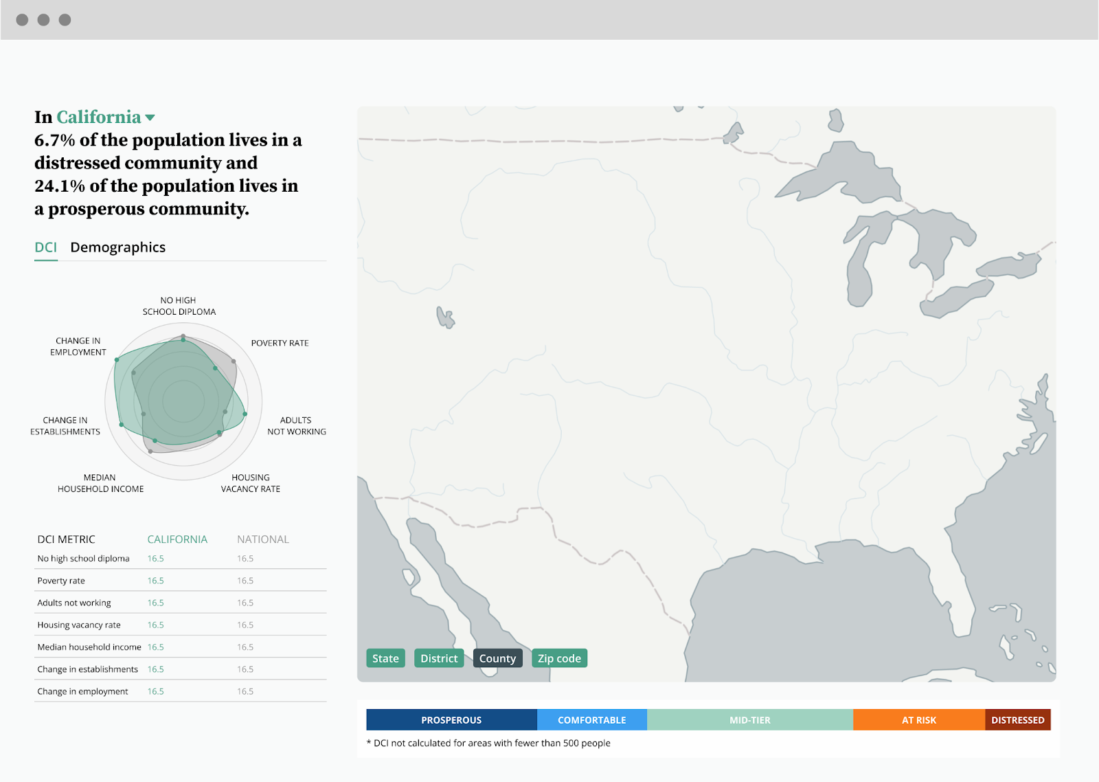
When designing a new layout, we wanted to include everything in a single, full-page experience, where the user doesn’t need to scroll to see all of the content. Previously, the data visualizations that accompanied the map were all far enough below it that they weren’t visible unless you scrolled down. For a user, being able to use the map and the data visualizations simultaneously in one view will help them understand the why behind what they see on the map. Docking a sidebar to one side of the full page experience and allowing the map to take up the remaining space seemed like the right balance:
Data visualizations
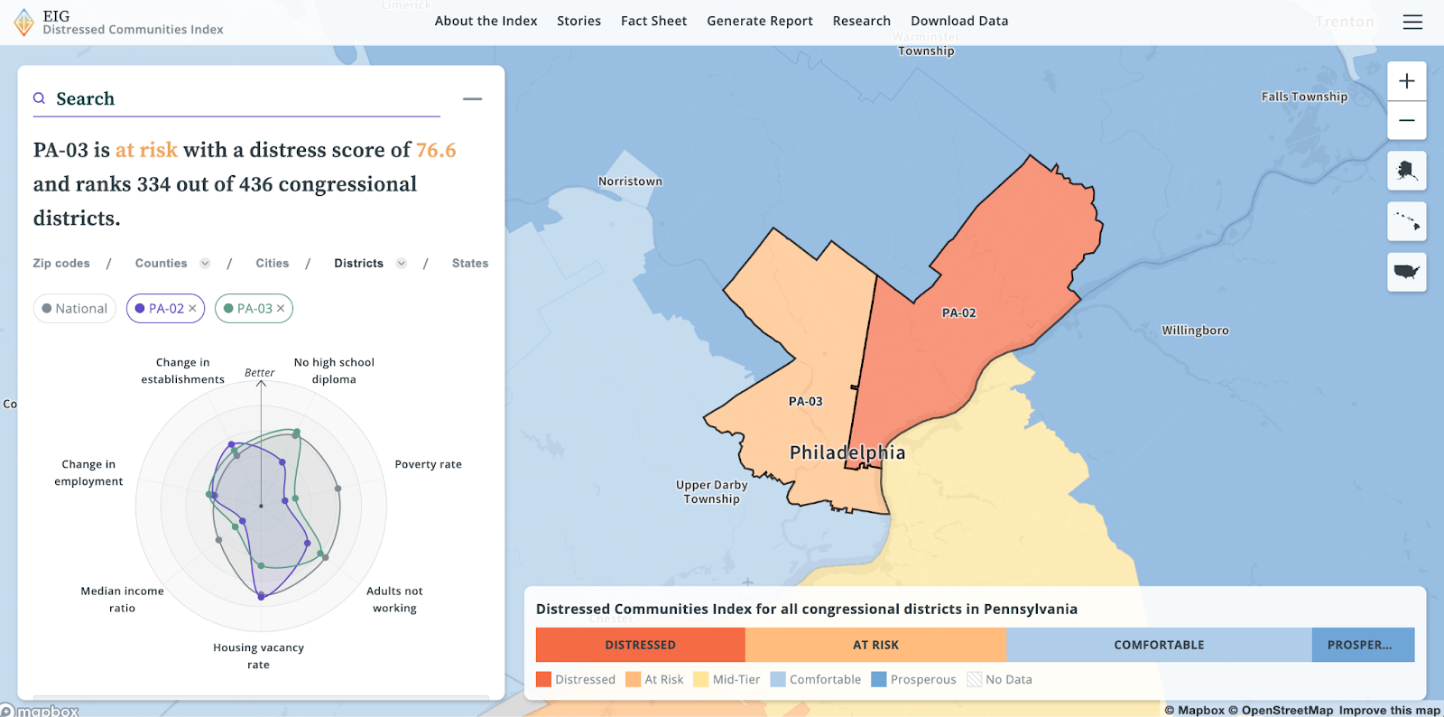
As part of the redesign, we wanted all geographies to feature the same set of data visualizations in the sidebar. Having to learn and relearn new charts when switching geographies contributed to some of the confusion in the previous version, so we thought it best to be consistent. One of our goals was to encourage exploration by the user, so wanted to remove as many pain points as possible between different geographies. We also wanted to balance a simple visual like the bar charts (see above) with a more nuanced visual that depicts the contributing factors of the index. We settled on a radar chart, which generates a sort of “fingerprint” for each geography and allows for easy comparison between different areas.
Map
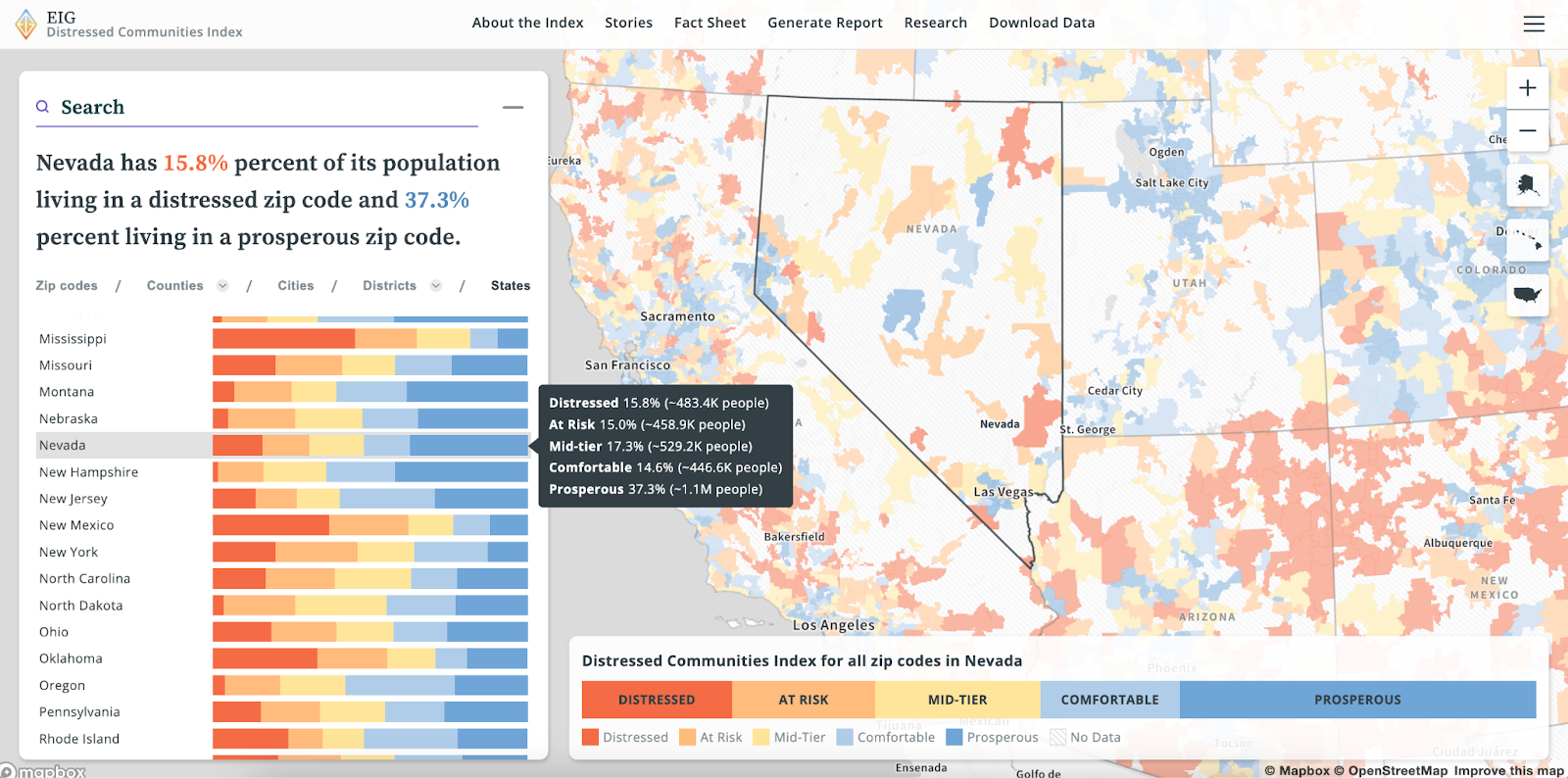
Since the map is the most prominent visual component of the DCI dashboard, we started our color palette overhaul there. In the new version we still have five distinct sequential categories ranging from distressed to prosperous that we need to visualize as choropleth maps. That said, the choropleth maps are now viewable at more geographies, including the state, congressional district, city, county, and zip code level.
The main challenge here was identifying the right visual balance between the classes. Should all five categories carry the same visual weight? Should one or both poles of the distress spectrum be emphasized? Do we consider the “mid-tier” as an average, median, or something else? We tried a lot of versions to help strike the right balance:
In the end, part of the relaunch of the DCI dashboard included a clearer framing about the data: distressed communities are the focus. The final color palette we landed on emphasized distressed communities the most but maintained a clear sequential relationship between the classes. Using a strong tomato red reinforced the message: distressed communities are and should be on the minds of policymakers concerned about our economic future.
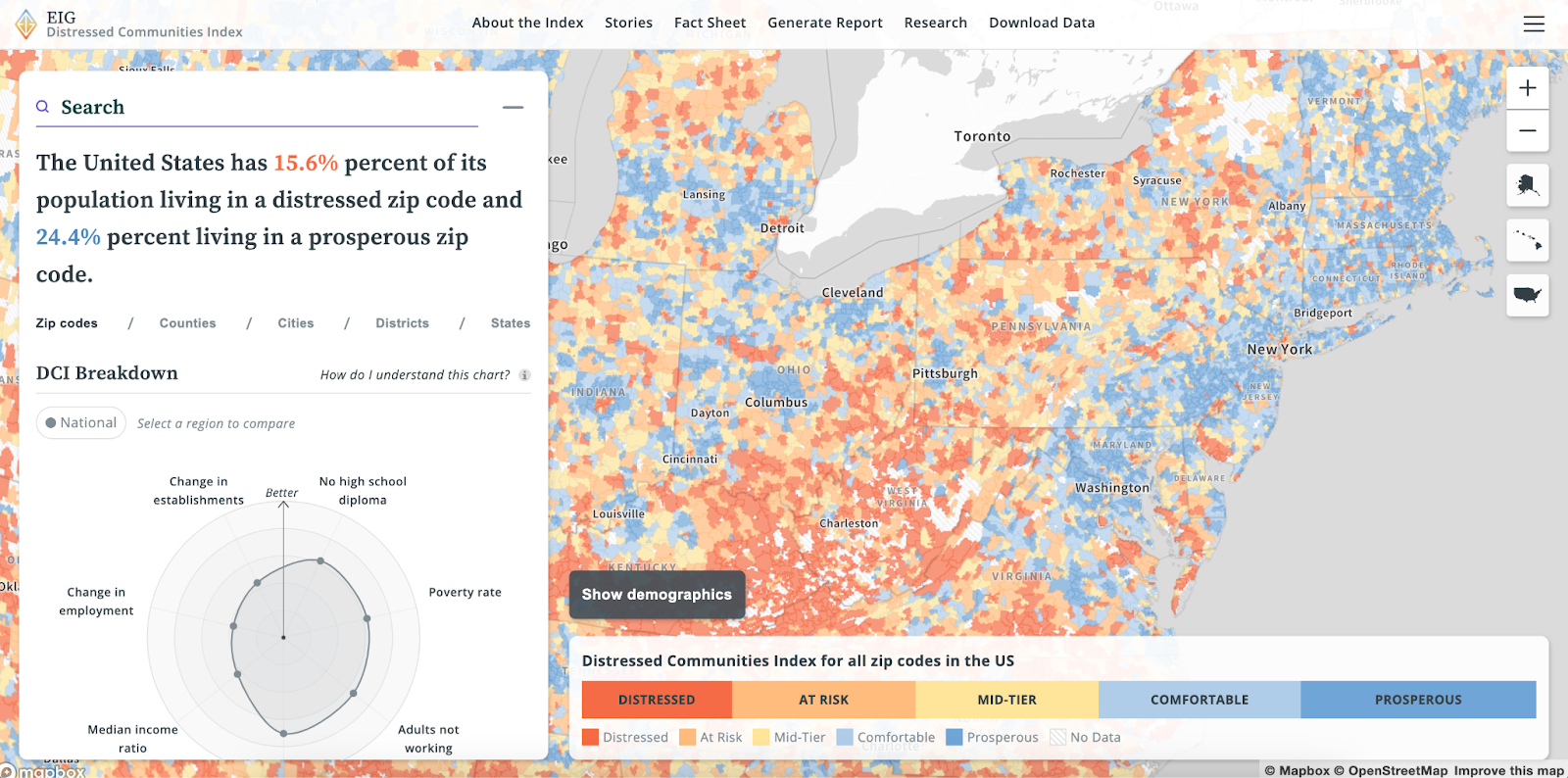
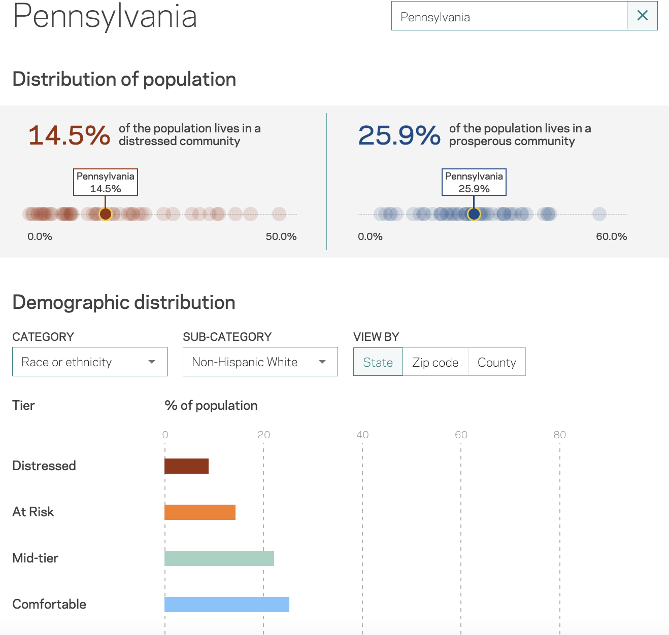
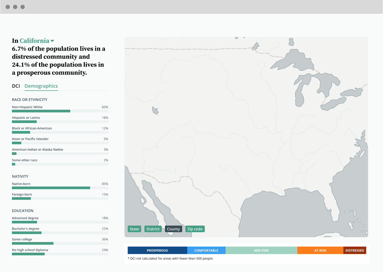
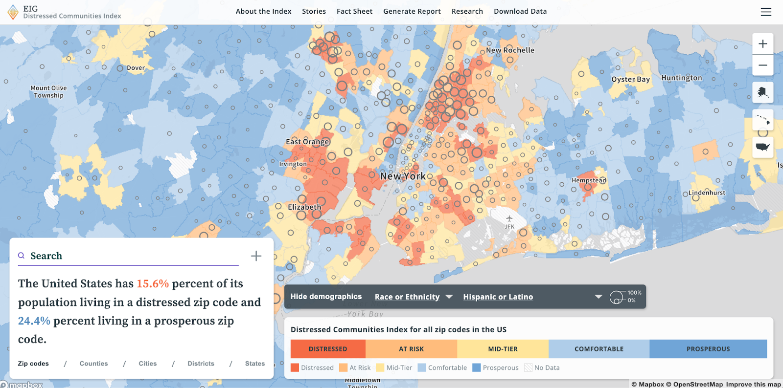
One addition to the map that we are particularly happy with is demographic data. The previous DCI featured data about race/ethnicity, nationality, and education in supplementary charts but never on the map. In the new version, you can view several demographic layers at the zip code and county level to help understand the role demographics play in economic disparity. Showcasing this data in a geographic context reveals patterns that are otherwise hard to see in the relationship between demographics and economic disparity.
Improve user experience
Beyond the visual overhaul of the dashboard, there were a handful of usability improvements we sought to make with this new version.
When exploring the DCI dashboard, users now have a data-driven sentence that clearly breaks down what they are seeing on the map to accompany the visuals in the sidebar. Subtle features like tooltips help explain what the charts are showing visually by providing percentages and population estimates. You can also hover over a DCI category in the legend at the bottom of the page to focus only on communities that fall into that category.
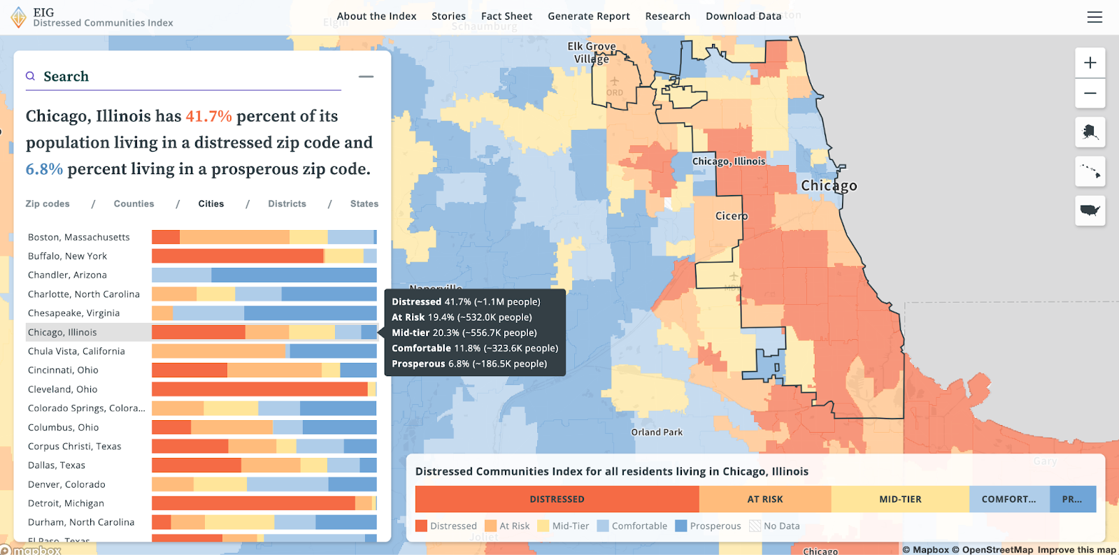
Why are two neighboring areas in different DCI categories? Now, you can compare one community to another to better understand how the different socioeconomic score components affect the overall DCI category.
Finally, we wanted to improve how areas with no data appear on the map. There are a few reasons an area may not have a DCI score – its population might be too small to calculate the index accurately, one or more socioeconomic indicators may be missing, or perhaps there is no population living in that area as designated by the Census. Instead of leaving those areas blank on the map, we wanted to add a subtle style (here, a hatched pattern) to signal to the user that they should not expect to see data in that area.
Explore the DCI dashboard
Economic disparities are present across the entire nation. Check out EIG’s Distressed Community Index dashboard yourself to uncover insights about how socioeconomic factors impact your community. You can also read about patterns in the data in a recent Axios article showcasing the DCI. If you have data with similar complexity or visualization challenges, drop us a line.