
With climate-related natural disasters on the rise, it has become increasingly obvious that we lack the tools to provide useful information as crises unfold—the venn diagram of crucial data and real-time communication has painfully little overlap. Since early 2022, Stamen has had the pleasure of working with CrisisReady and Direct Relief to create ReadyMapper, an interactive map and reporting tool that visualizes critical time-sensitive data during natural disasters. ReadyMapper brings together over a dozen datasets and pipelines to synthesize real-time population movement, vulnerability, and healthcare infrastructure to aid emergency planning officials in times of crisis. Using this incredible data resource as the springboard, we had the opportunity to contribute information design for crafting an interface coupled with the right data visualization and cartographic solutions to make it useful and accessible to those who would otherwise be stuck interpreting a spreadsheet.
After several weeks of working closely with CrisisReady subject matter experts and users to focus on data interrogation and use case mapping, the team devised three primary modes – vulnerability, movement, and infrastructure – as aggregated views based on expected real-time workflow in a crisis response center.
While crafting the mode framework, we also made sure each of the constituent views were clear and useful; thus, while designing this map and interface, our guiding mantra was to show as much data as possible without overwhelming or confusing the reader. In emergency scenarios, having many different sources of information is essential for responders to get a complete picture of the situation. Natural disasters are hard to communicate well because of challenges like forecasted vs. actual data and natural data aggregated to artificial boundaries. Simplifying these concepts is essential for the reader to understand the state of affairs at any given moment.
The importance of making these visualizations highly legible and aesthetically pleasing was not far behind making them understandable. So often, any data with a spatial component is thrown on a map without considering whether a map is the best medium to visualize it. With 12-20 layers in the interface at any one time, separating visuals into maps, charts, and text was essential.
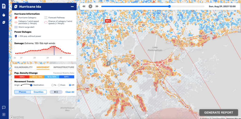
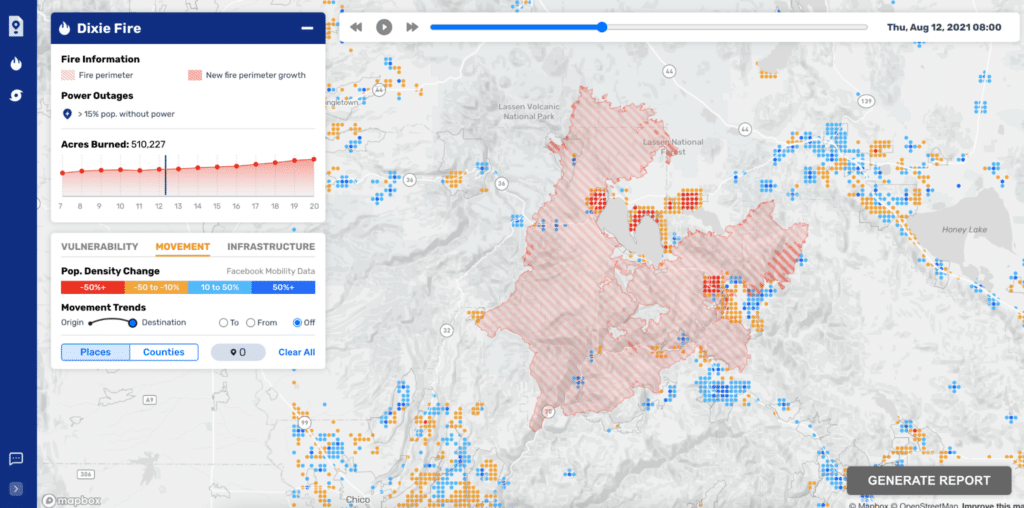
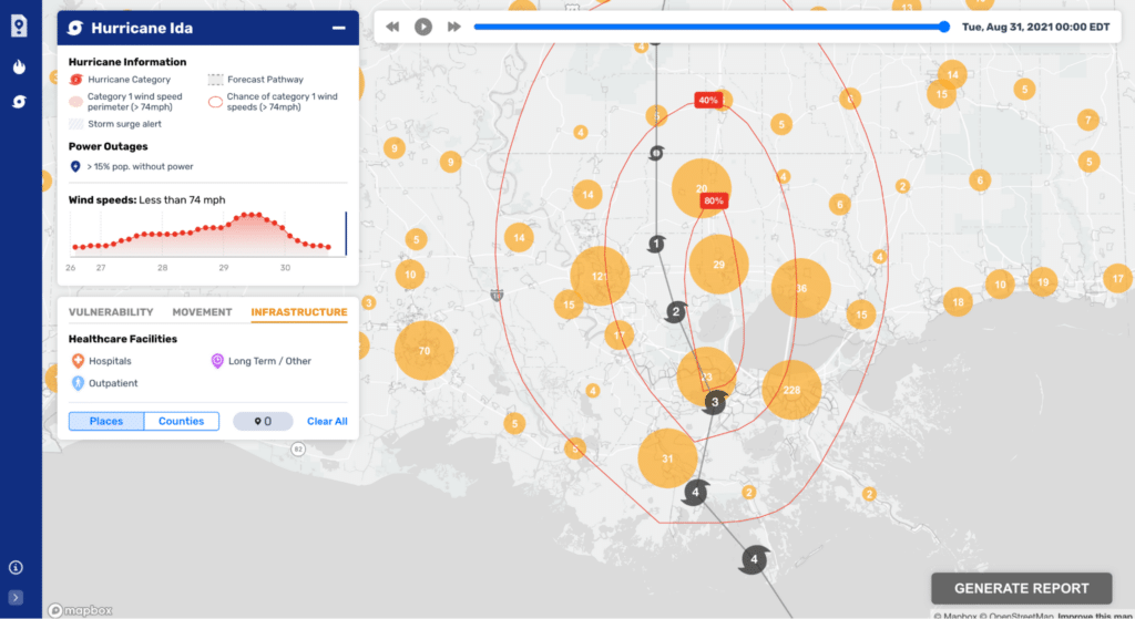
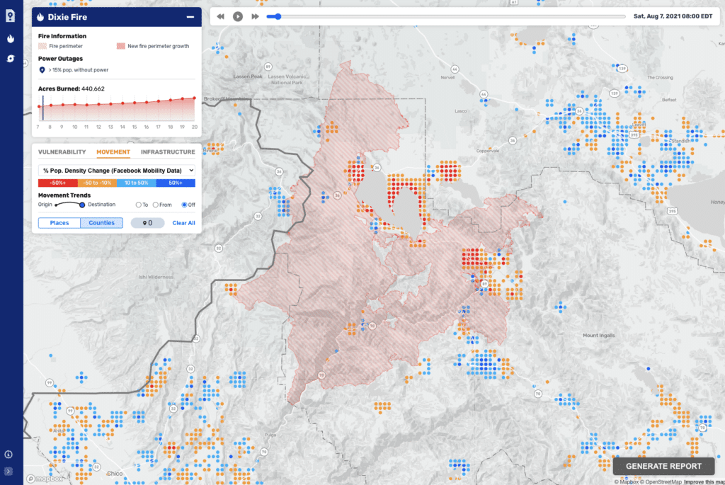
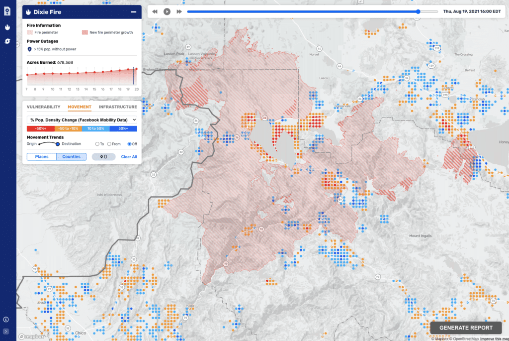
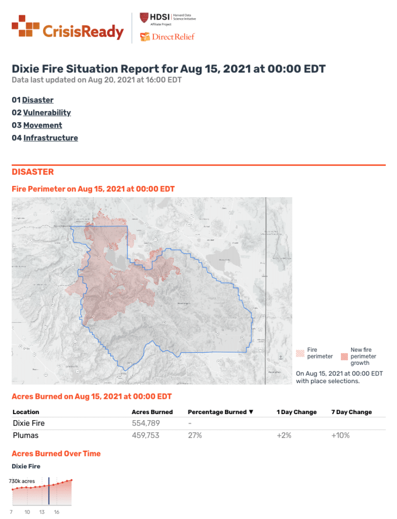
Data where location was a critical element – population movement, hurricane tracks, wildfire extent, and power outages, among others – ended up on the map. Data where aggregates were more useful or informative – maximum wind speeds, acres burned, power outages – live in charts alongside the map. With emergency officials needing to access information quickly in time-sensitive emergency scenarios, it was imperative that we convey data efficiently and effectively.
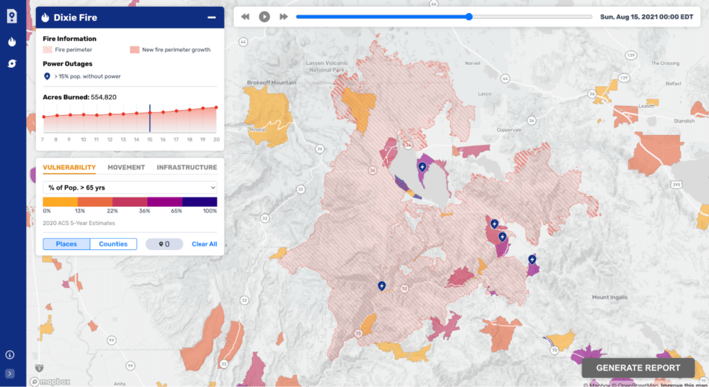
Striking the right tone for this map was critical to ReadyMapper’s effectiveness. We overlaid disaster feature data on top of thematic data for added context, which created additional visual challenges. The focus of our supplemental data was people – where do they live, how are they moving, and what critical infrastructure is available to them.
Visualizing this data differently at varying scales helped us ensure the right level of detail throughout the map experience. For example, Meta’s Data For Good high-resolution population density data shows how people move from one area to another in near real-time. To visualize such a complex dataset, we used zoom-based styling so movement patterns were easy to read and understand at all scales.
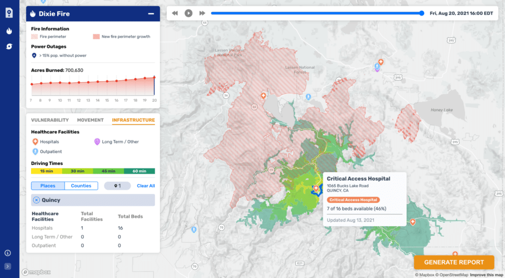
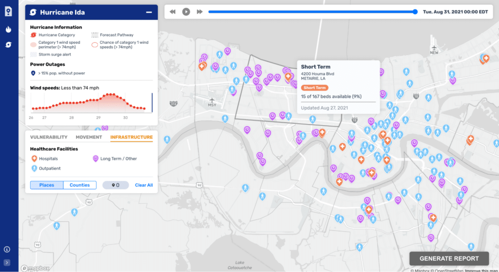
When visualizing healthcare infrastructure, it makes sense to show individual healthcare facilities at a local level, but cluster them at a regional level, where it would be difficult to distinguish so many locations individually.
Time is an essential component of any disaster scenario. ReadyMapper includes a timeline for each disaster, which makes it easy to pinpoint a moment in time or see how a scenario unfolded. You can scrub to see changes over time or simply click play to watch the entire event.
In addition to real-time updates, ReadyMapper has a disaster scenario archive that officials can use to look back at past events or simulate a future scenario. A moment in time for any disaster – current or past – can be summarized in a static report that emergency officials can print and take to the field. One of our primary goals was to create a tool that can work for many different officials operating in different scales and types of disaster scenarios. Reports include maps, graphs, tables, and field notes for each section, which are highly editable and customizable to ensure any disaster official could find use in ReadyMapper.
It’s rare that we have the chance to work on something as quintessentially reliant on the intersection of design, data, and cartography as ReadyMapper. This tool plays a central role in CrisisReady’s ongoing emergency response work and is expected to evolve to include additional use cases in the near future. Read more about the overall project in The Journal for Climate Change and Health and The International Journal of Geo-Information, or about the effectiveness of dot grid maps like this one.