
¡Plantásticas! is now open at the Exploratorium! This exhibit introduces visitors to the world of plants through a diversity of perspectives, and features an installation by Stamen design.
The Exploratorium came to Stamen with two rich sets of data: the lived experience of plants through the eyes of Latinx and Indigenous communities, and high resolution plant community raster data. The Stamen team—D. Vinay Dixit, Caroline Carter, Daniel Kao, Kelsey Taylor, and Amira Hankin—worked with Exploratorium staff to create an engaging experience that weaves together these human experiences with high-resolution geospatial data.
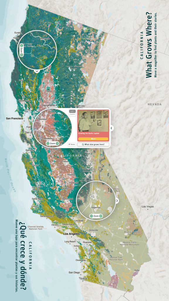
The installation’s 65” touchscreen table allows users to explore the vast geography of California plants while presenting stories that compel the user to see this landscape from new perspectives. Maps invite playful interaction and intricate exploration alike, and we were thrilled to create an experience that combines these approaches into an experience for grade-schoolers to graduate students alike.
Bringing together human narratives with complex data interactions was a challenging task that compelled the Stamen team to push the limits of what current tools allow. From dynamic data and novel map interactions, to cartographic color and remote development, these solutions resulted in a playful yet powerful experience for Exploratorium visitors.
Dynamic data interactions
It’s one thing to create a dynamic, interactive map of high-resolution raster data, but another to do it in a way that will stand up to interaction from multiple kindergarteners. How did the Stamen team approach this challenge?
The source data was a raster, a grid of data consisting of nearly 400 million pixels across California, with each pixel representing the plant community in that location. We wanted ways to quickly toggle between distributions of plants, dynamically adjusting and selecting data on the fly.
In order to do this in a responsive manner, a novel approach was required: we took the plant community data and encoded it into a pyramid of image tiles that store color data as Red, Green, and Blue (RGB) channels. RGB images are used to display satellite imagery in maps and instagram posts alike, but here we used them to store non-visual data.
Then as users pan and zoom around the map, this data is loaded and decoded back into plant data with a WebGL shader, which allows super-fast processing for display via the exhibit computer’s GPU.
Move the user not the map
Since this installation will be viewed by multiple users simultaneously, a single large map interaction was a non-starter. Yet, how could we invite exploration into the full granularity of plant community data while keeping the overall context of California geography in place for all users?
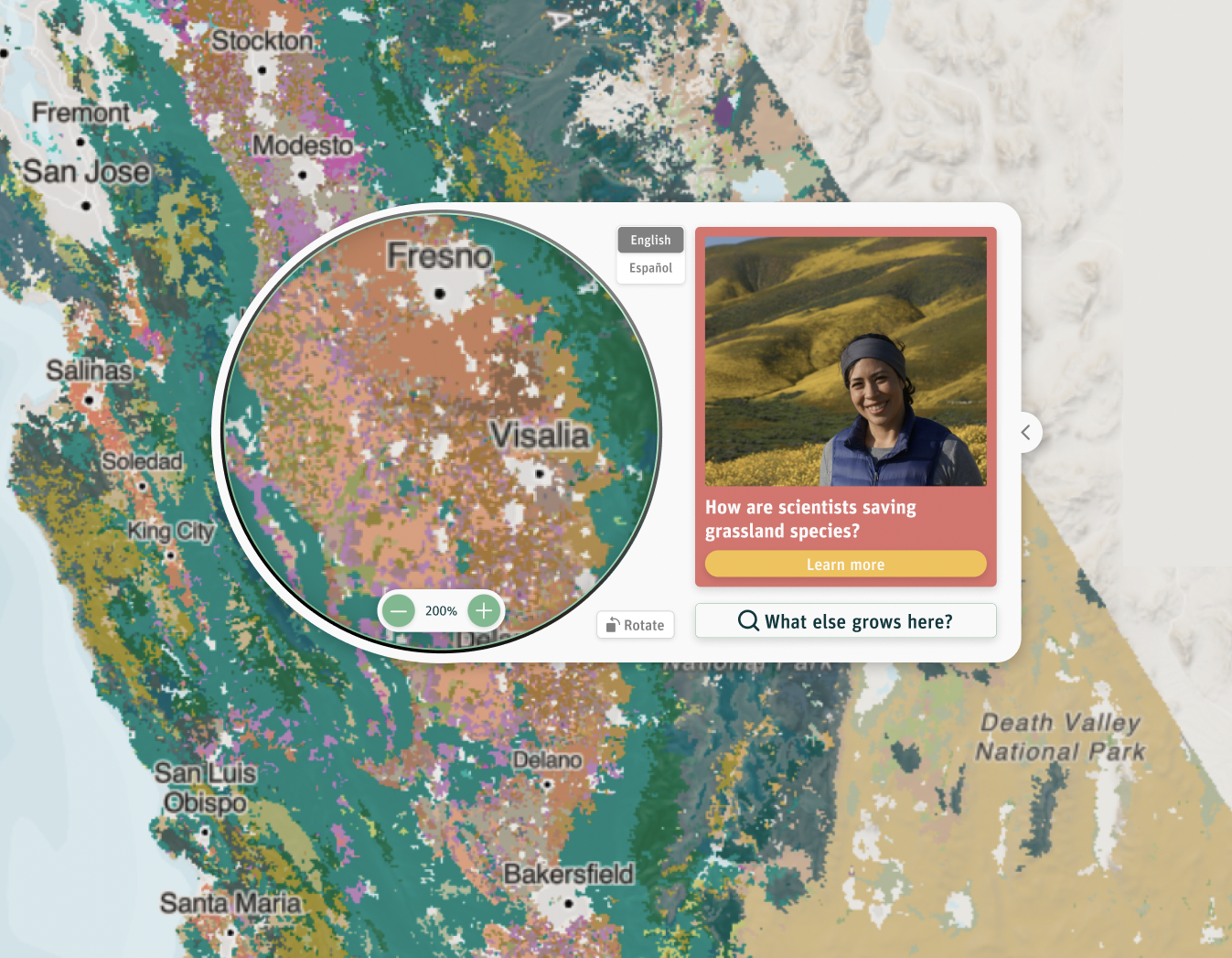
We solved this problem by using moveable magnifiers over the map. These act as small windows into the landscape that allow detailed exploration for visitors. With magnifiers like these, visitors can also enter the map experience from any edge of the table and are never limited by one orientation. As these magnifiers traverse the map, we calculate statistics for plant coverage within the window, allowing us to dynamically list plants in order of relative abundance.
Finding stories, telling stories
Perspectives on plants from Latinx and Indigenous communities bring a humanistic perspective to plant data, but how do you reveal these stories from a geographic interface?
As users explore the map via the above map-magnifiers, we dynamically reveal stories relevant to the magnifier’s geography by “geofencing” each story, creating virtual geographic boundaries for every story in the installation. As users move the magnifier around the map, the application will suggest stories that are relevant to that particular part of the state. Visitors are presented with human perspectives as they explore the texture of the landscape, bringing a deeper understanding to how the data is presented. We also dynamically highlight aspects of the data relevant to the story in question, which reinforces the connection between people and place.
Bringing cartographic texture
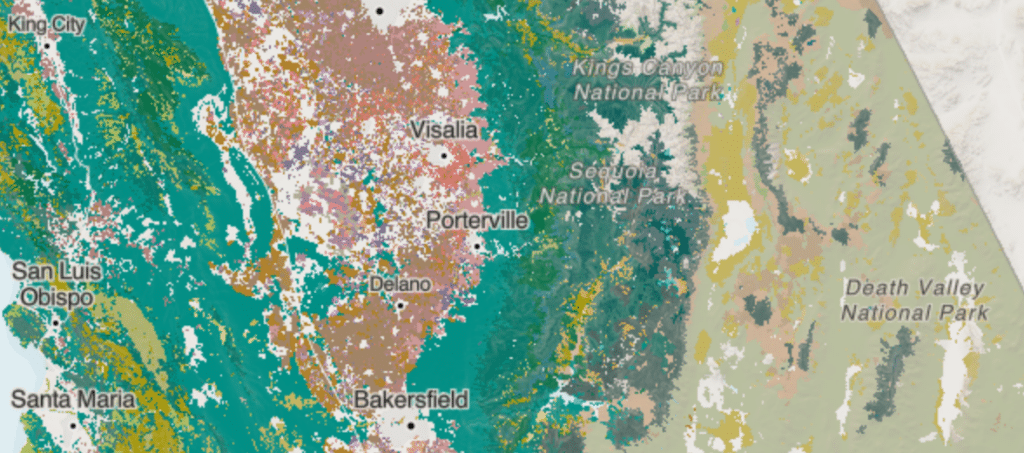
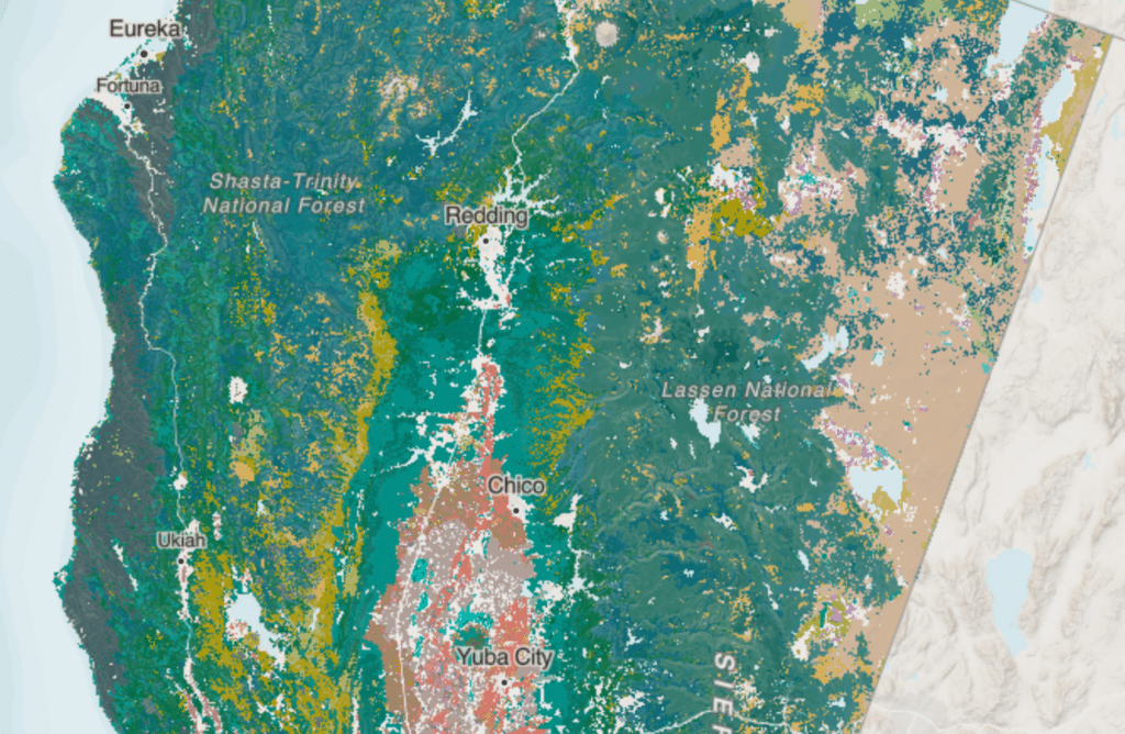
The plant data consisted of over 200 different distributions of plant community data over the state of California. These data were much too complex to visualize independently—there’s no way we could expect users to distinguish between 200 different colors—so how could we depict this in a more digestible way while keeping the rich texture of the dataset?
We used color theory, the golden ratio, and plant community groups to bridge this tension. Plant communities could be combined into tangible groups—agricultural areas, deserts, forests, and grasslands—where each had an intuitive color “center” that evoked the spirit of that community. For example, a darker rich green came to represent forested areas while a muted, dusty tan was used for deserts.
For each plant group, we then randomly generated colors that were perceptual similar to the color center in question. These colors were constructed in the Hue-Chroma-Luminance (HCL) colorspace, which is designed to approximate human perception of colors in a 3-dimensional space. We used the golden ratio for this random generation, which meant that our created color groups – some with as many as 50 colors – were perceptually close to each color center, yet different enough to create rich cartographic texture.
Remotely developing
Unlike many software projects that are deployed to the cloud and interacted through a browser or mobile app, this project’s final state was a physical museum exhibit, which presented some unique challenges to our distributed, remote team. To solve these challenges the Stamen team used TeamViewer to remotely access the machine for deployment and debugging, as well as coordinated with Exploratorium staff to test the in-person experience.
Additionally, one of the requirements for the application was that it needed to support multitouch to allow multiple users to interact with the exhibit simultaneously. Without being physically able to interact with the hardware, it was difficult to ensure all of the touch events were being properly communicated from the touch screen into the application. Fortunately, our developers discovered that the touchscreen uses a standard protocol called TUIO to communicate touch events, which our developer was able to mimic at home using nothing more than a smartphone with an application sending TUIO events to the application connected on the same network.
Another tool that we used for remote debugging was Sentry, a tool for error reporting often used on front-end web applications. In our case, by having it installed in the application running on the exhibit, we were able to see specific error messages when the Exploratorium team described certain technical bugs or performance issues.
Go visit!
This project required an array of innovations that each deserve their own post: look for these in the future. Until then, go and visit the exhibit and let us know what you think!
¡Plantásticas! at the Exploratorium is open now through September 10th, 2023, on Pier 15 in San Francisco.