As self-proclaimed map nerds, there’s nothing like a crossover of nerdy subjects to provoke thought and discussion at Stamen. The new season of House of the Dragon premieres this Sunday, June 16 on HBO and Max in the U.S. and we thought this would be the perfect moment to finally talk about cartography in The World of Ice and Fire. You may be familiar with this universe from HBO’s Game of Thrones and/or House of the Dragon, or perhaps you’ve taken the plunge and read the book saga that started it all, called A Song of Ice and Fire.
There are several maps included in the shows/books themselves, along with thousands created by fans across the internet. As a primer for the new season of House of the Dragon (which we will abbreviate as HotD from here on), we want to break down what we know about the World of Ice and Fire, geographically-speaking. We also want to dig into a few examples of text, maps, and data visualizations we’ve seen that add to our understanding of this complex world as viewers. Most of this post is safe to read for anyone who has seen Game of Thrones (GoT), as it covers facts about the world in the series (with some book lore sprinkled in as well), but we’ve added a 🐉spoiler alert 🐉 where needed for HotD in case you haven’t caught up yet.
Breaking Down the World of Ice and Fire
If we zoom out for a moment, the planet on which A Song of Ice and Fire (ASOIAF) takes place (we’ll use Planetos for brevity, although that’s controversial) is similar to Earth in many ways. Planetos is a similar size to Earth, has a handful of continents separated by large waterbodies, and has similar climate patterns to the Earth’s Northern Hemisphere. Most of our story takes place in Westeros, a continent comprised of several kingdoms which are generally much colder in the north and warmer in the south. While the shape of Westeros is similar to the British Isles, the climate is more similar to North and Central America.
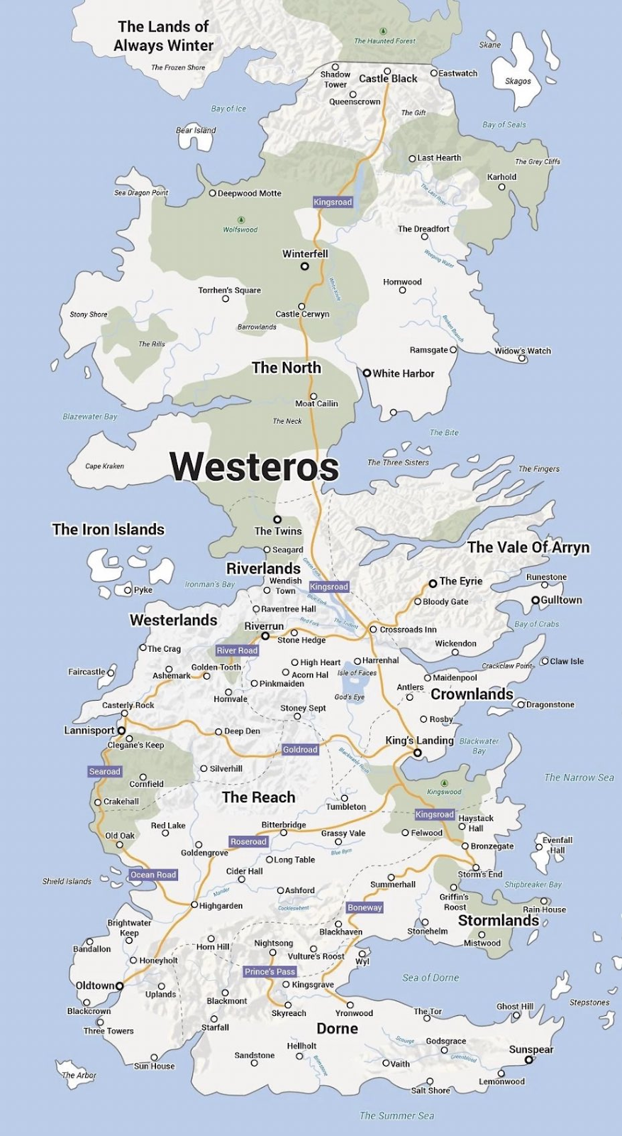
Some parts of the story are set in Essos, the largest continent in the Known World (more on this later) that is similar in shape and size to Asia. In GoT, Daenerys spends several seasons traveling across Essos on her way back to Westeros, passing through many of its larger cities along the way.
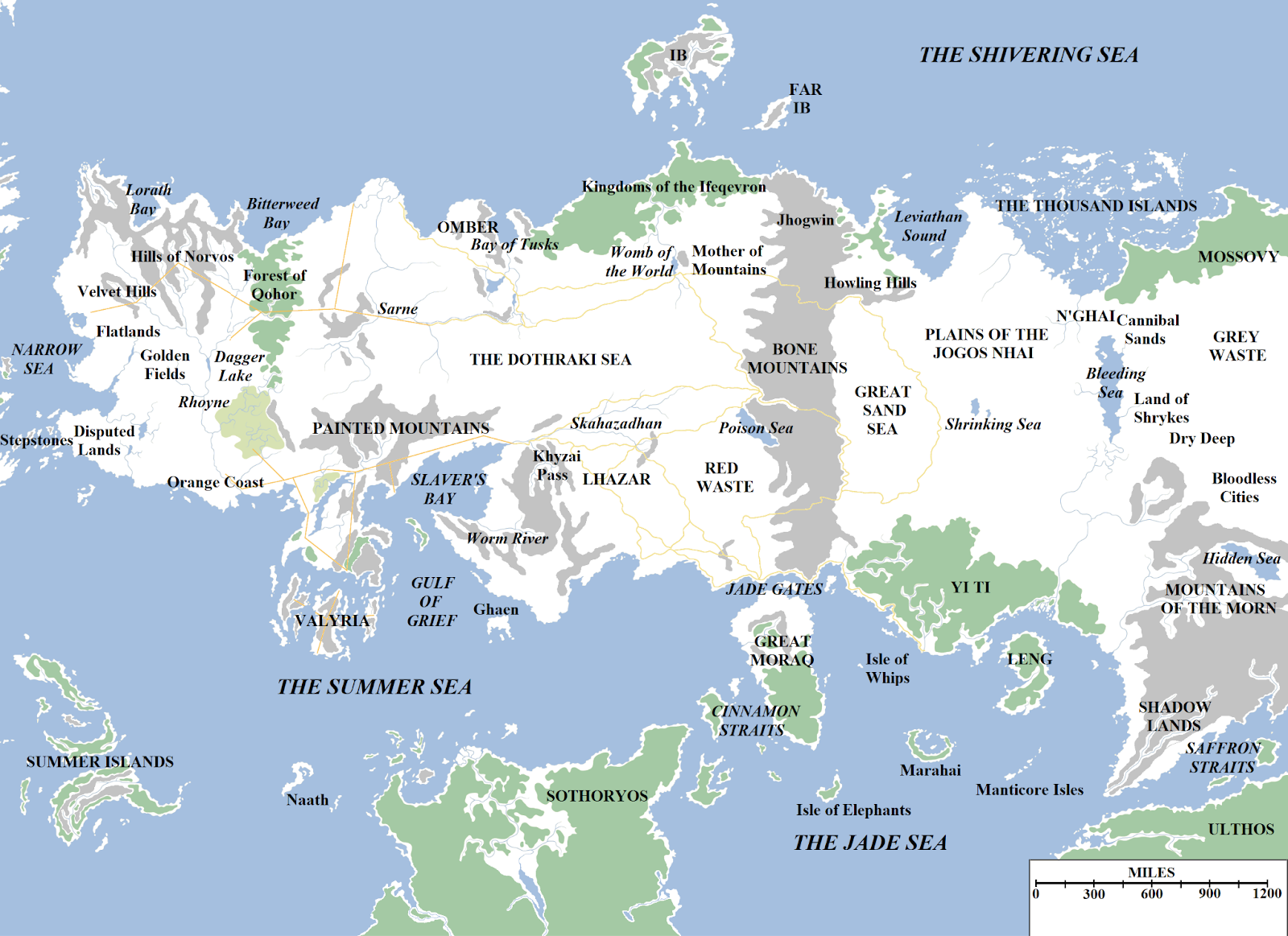
South of Essos is Sothoryos, a smaller continent opposite Naath about which little is known. YouTuber Alt Shift X notes that “a dragonrider once spent three years flying over the continent but never found a southern border”. It’s important to remember that ASOIAF has unreliable narrators and therefore we are limited to their knowledge and experience when learning about the world. Westerosi, who make up the vast majority of our narrators, generally know little about Sothoryos or possible fourth continent Ulthos.

It is known, however, that there is considerable terra incognita in ASOIAF. Author George R.R. Martin (known henceforth as GRRM) has acknowledged that the maps considered canon cover only about a quarter of Planetos. One of the final scenes in GoT shows Arya Stark boarding a ship to sail west of Westeros, beyond the place where “all the maps stop”. All this to say: the maps all stop in more or less the same places and as of the end of GoT, no one knows what lies beyond the map bounds.
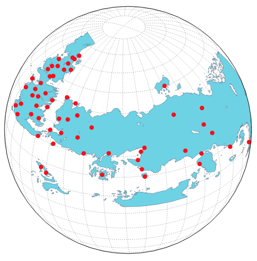
Data Visualizer Jeffrey Lancaster has made an interactive globe projection of the Known World which shows how little of Planetos we have seen (This is only one of dozens of GoT visualizations he has made, definitely check them all out).
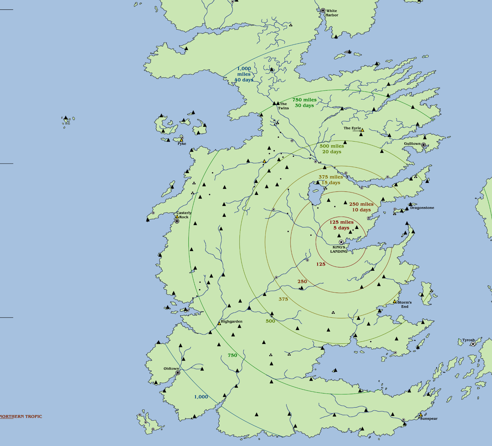
It feels worth mentioning that, while the size of the landmasses in Planetos are not that different from Earth, the technology used at the time of our story is closer to medieval than modern. Distances are sometimes provided in length units like miles, but more often casually as time estimates. In GoT season 1, Cersei notes that it was a “month’s ride” (on horseback) from King’s Landing to Winterfell. The actual distance is estimated to be close to 1500 miles or three days as the raven flies. The shortest method of transport here would be as the dragon flies, but only a limited few have this express option.
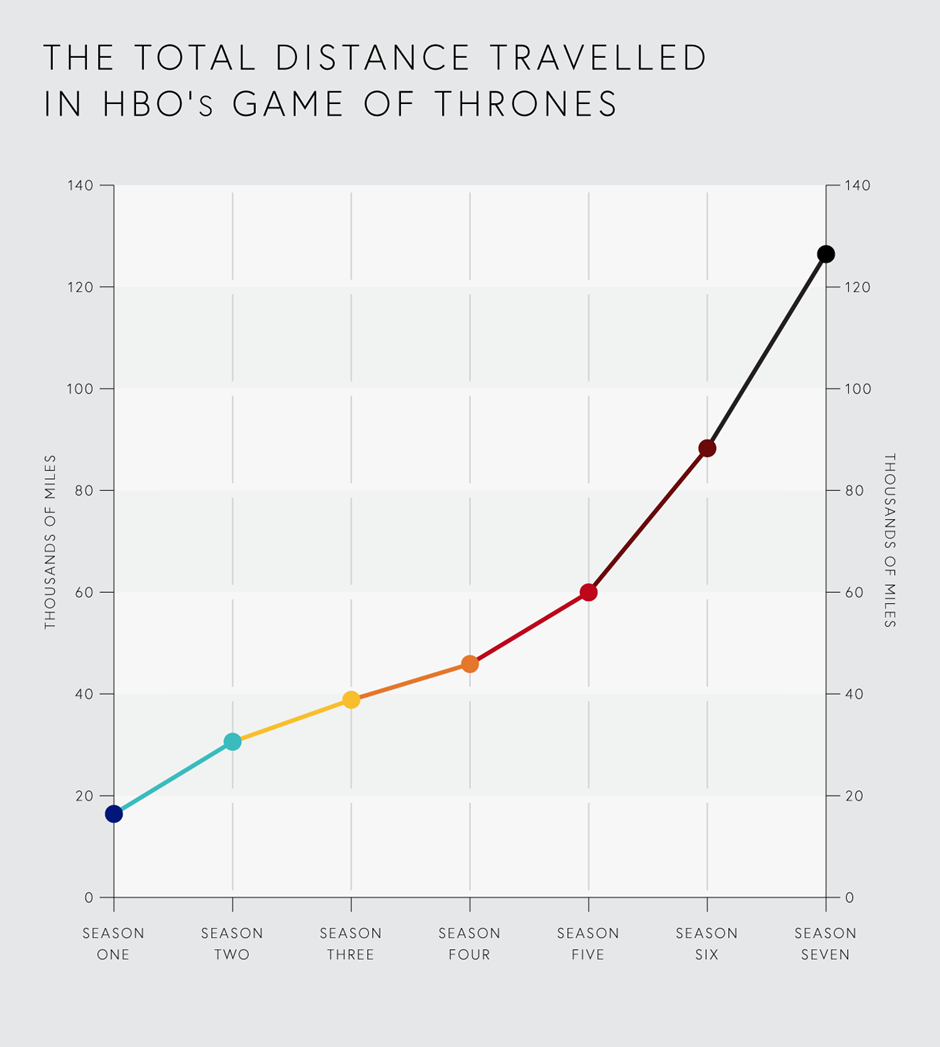
If you feel like these travel times haven’t been consistent over the course of the series, you’re not alone. Fans noticed that especially in the later seasons, characters seemed to travel much greater distances much more quickly, going from one end of the continent to another in half an episode, a journey that would have taken a whole season in the early years of the series. The data backs this up; a study commissioned by Megabus (yes, the bus company) showed that the distance traveled by all the characters in each season increased steadily over the years:
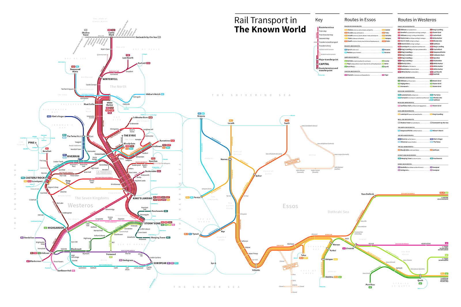
And speaking of public transit, of course cartographers can’t resist making a subway map of absolutely anything, so there are plenty of entertaining rail transport maps of The Known World such as this, this, this, and this. We may have to wait a few years for any of these train lines to be constructed, but GRRM hasn’t finished the novels yet, so who knows what might happen? Perhaps our favorite is this one by Michael Tyznik:
Worldbuilding and Parallels
One of the most interesting aspects of Game of Thrones is GRRM’s detailed worldbuilding of distinct nations and cultures that feel believable and somehow familiar. Of course, some may be exaggerated to the point of becoming stereotypes (*stares in Dothraki*), which we can attribute some of this to the same unreliable narrator issue we mentioned before; if some cultures seem more “foreign” and “uncivilized” that may largely be because we never see those cultures through the eyes of their own people. In any case, we are fascinated by the trend of GoT fans making their own maps where they attempt to connect the regions of Westeros and Essos to real-world countries.
While some of the cities and regions in Westeros and Essos seem to have cultures and terrain that are inspired by a diverse amalgam of real-life places, there are a few parallels that are so distinctive that almost everyone seems to agree.
Nearly everyone thinks that Dorne is inspired by Iberia and The Reach is France (which is also reinforced by the flower sigil of House Tyrell which evokes the French fleur-de-lis). Most people think The North is best mapped to Russia and Eastern Europe, although some people narrow their scope and imagine The North somehow as Scotland. (That doesn’t seem right to us, although perhaps some of this confusion is due to the showrunners’ attempt to use accents from Northern England and Scotland for the northerners and wildlings in Westeros? Or the fact that The Wall in Westeros is a clear analogy to Hadrian’s Wall. But we digress.)
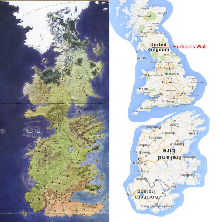
Speaking of real-world Great Britain, some of these maps think it’s a good fit for the Iron Islands… because it’s an island we guess? We tend to side with those who see much more of a Viking flavor in house Greyjoy, and assign the Iron Islands to Scandinavia. For us, real-world Great Britain aligns much more with The Westerlands, and again the lion sigil of House Lannister matches nicely with the lions used as emblems for both England and Scotland.


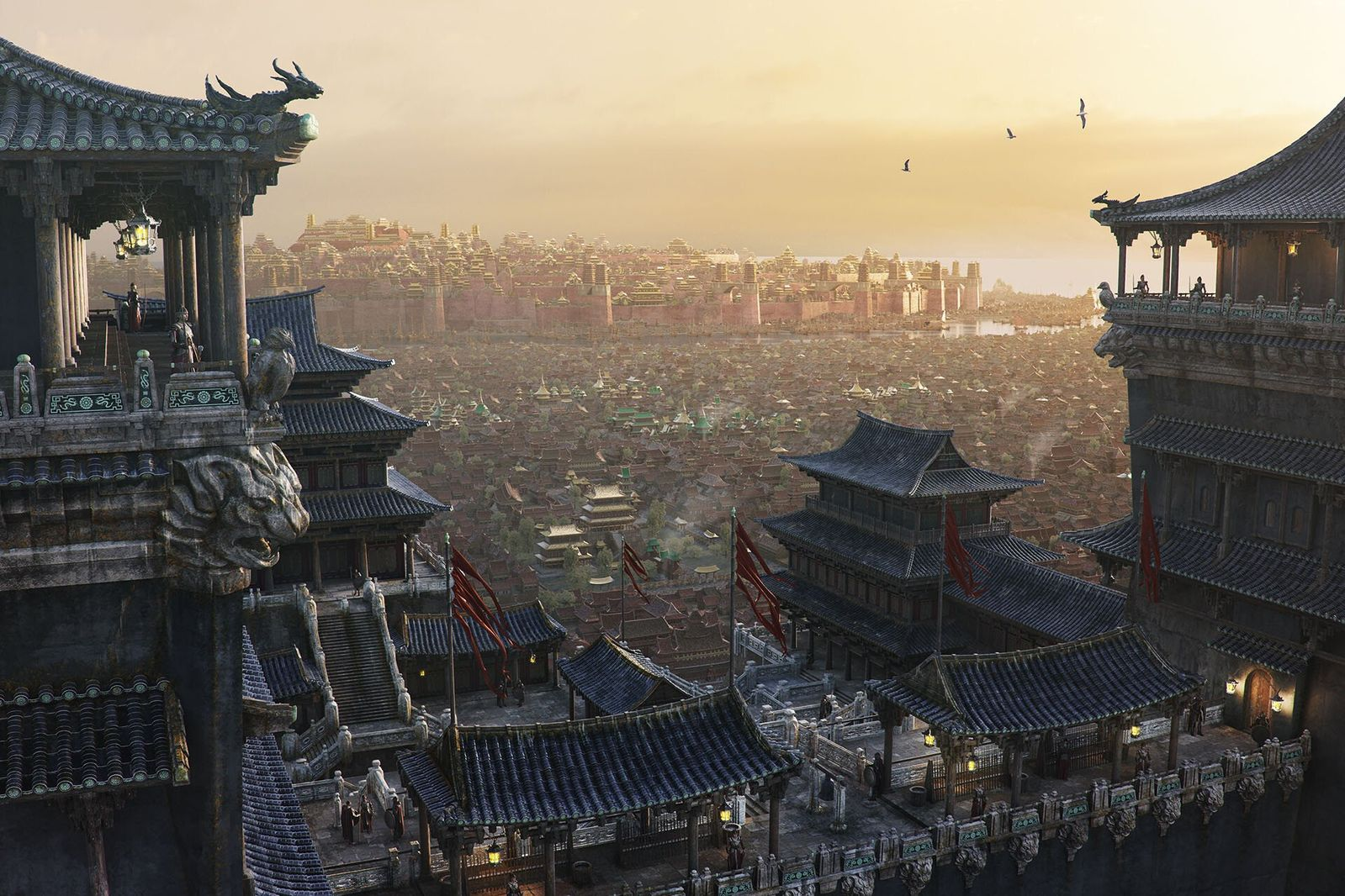
The various towns and castles in GoT have less obvious real-world allegories, with one exception: King’s Landing, which is usually seen as Rome or Venice, a major city with a long history and an influential position, although not always at the center of any of the major powers of the day. Some prominent landmarks such as the “Titan of Braavos” statue or the Great Pyramid of Mereen clearly evoke some of the Seven Wonders of our world, suggesting that most of Essos is a parallel of our world’s “Near East” and beyond. Yi Ti, for example, is clearly at least influenced by Imperial China:
Note that real-world demographers have some issues with the realism of the GoT world, setting aside the dragons and zombies! The sizes of armies described in the books are just too large when compared to real-world medieval history, and similarly the urban populations are too big. Westeros is also unrealistically homogenous when compared to medieval Earth; it’s hard to believe that across a continent the size of Westeros everyone would speak a mutually intelligible Common Tongue. Anyway, this blog post by economist Lyman Stone goes into fascinating detail, and even includes a map of ethnic groups in Westeros (!), but we’ll let you read it for yourself. It’s a long read, but we’re here for it.
Setting the Scene
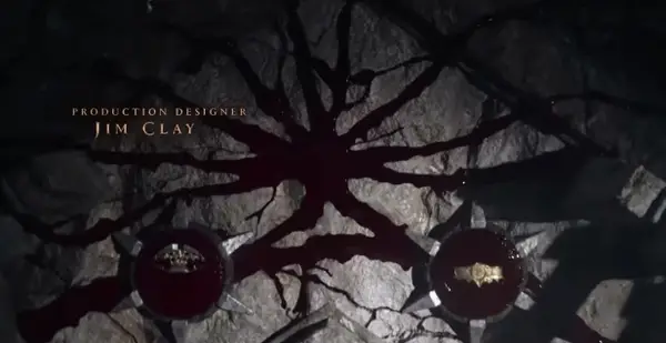
Maps are a critical part of both GoT and HotD, as we are constantly moving from one location to another, being reminded about the distances between places, who controls which lands and why they matter, and what threats await travelers along their journeys. The award-winning opening credits of GoT show us on the map where we’ll travel in each episode and who controls each stronghold:

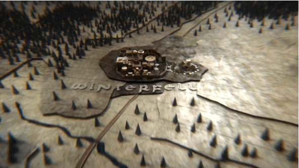
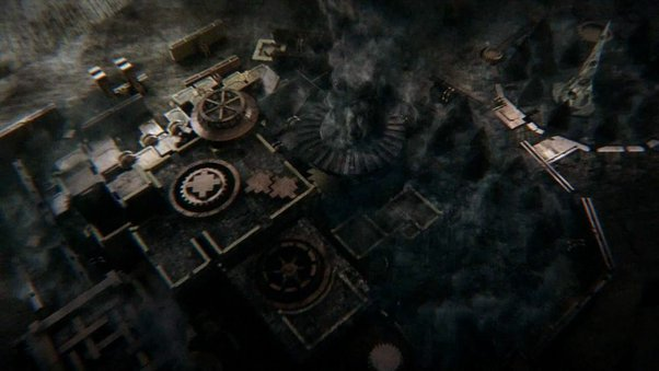
The sequence can also show us the state of a given stronghold. A castle in peril may appear ruined like Winterfell in season 3:
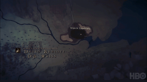
We are also introduced to Essos in the opening credits, which orients the viewer to a less familiar part of the Known World:
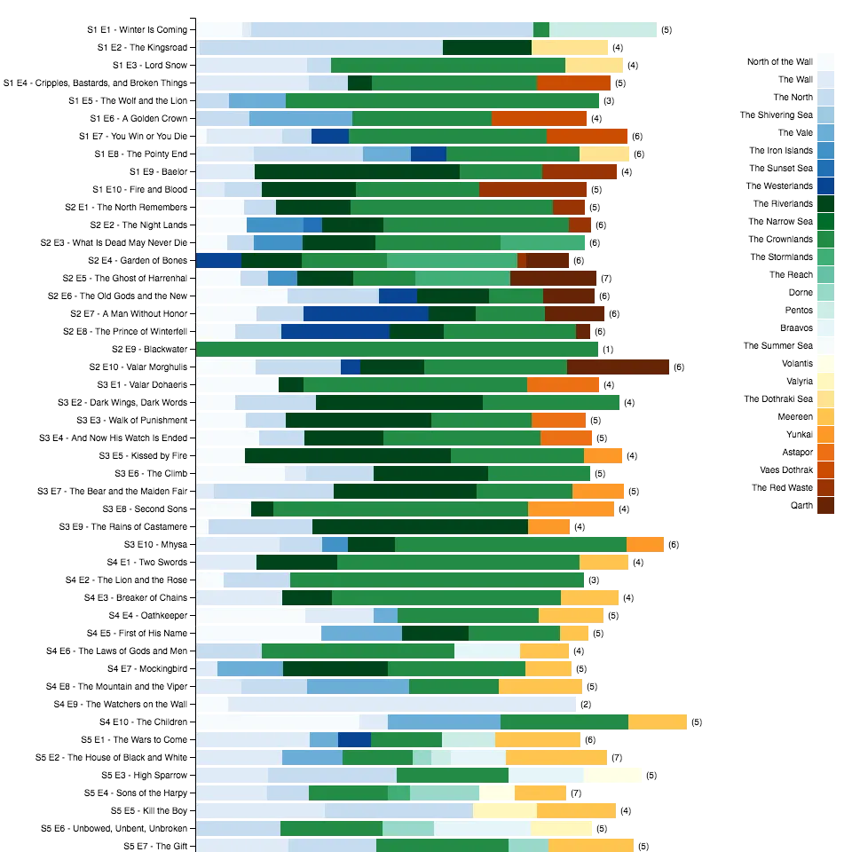
All of these together serve to set up the viewer before the episode begins so we know where we’re going and what we might expect to cover. If you’re already wondering how the episode locations trend, we found a data viz that answers that question:
For those who haven’t yet seen it, HotD doesn’t use the same opening sequence, as we don’t travel between locations as much. Instead of a map, the opening credits show the ever-changing and complex Targaryen family bloodlines as the episodes progress (they kept the epic opening music, though). A family tree is a data visualization of its own, especially with branches as, er, interwoven as in the Targaryens family. It feels like a lot of confusion could have been avoided by not naming half the family Aegon, but we digress…
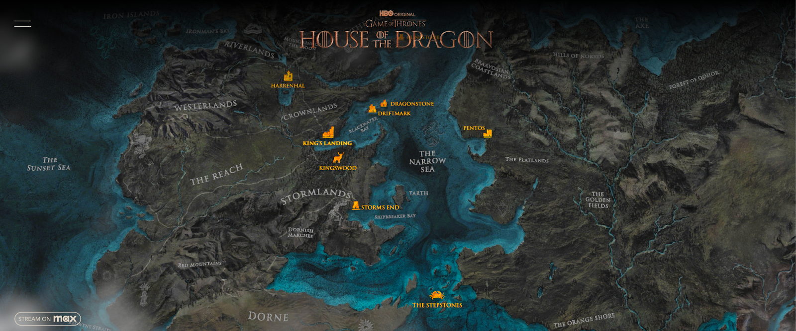
HBO did create this lovely map of the various settings from HotD to orient the curious viewer, though:
Friends, families, and foes (🐉 SPOILERS 🐉)
But back to the family tree intro from HotD. While we are most interested in the cartography of GoT, we think that diagrams and charts—especially when used to visualize a network of connections— are also certainly a form of maps, if not technically geographic ones. And given GoT’s famously complex relationships and staggering number of characters, seeing things visually is essential to understand what in seven hells is going on.
With HotD, it’s not just the Targaryen bloodlines that need mapping, we now have an elaborate family tree of dragons that we can visualize, along with their human riders.
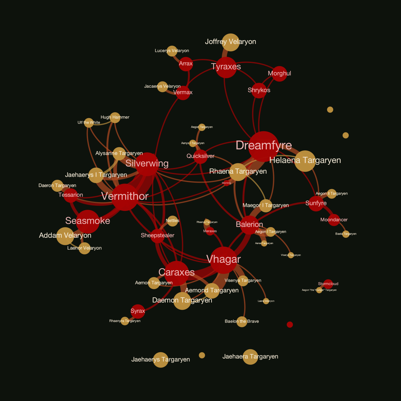
Technically, that diagram of dragons isn’t just showing a family tree, it’s generated from a more complex analysis of the number of times particular names are mentioned near each other in the text of the novel Fire and Blood. Mathematics professor Andrew Beveridge has created some impressive network datasets and analysis of both the Game of Thrones TV series and the A Song of Ice and Fire novels, which have become popular datasets for anyone learning the ropes of network visualization.
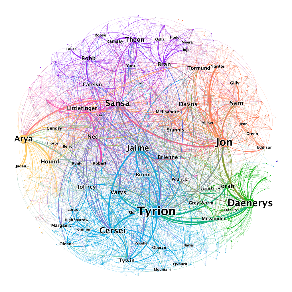
In these network diagrams, the names are placed such that characters that are closer to each other in the chart are the ones that have the most interactions with each other. We see not just the bonds of family or of fealty to a house, but of the relationships that are made simply through shared proximity.
To understand how that proximity between characters changes over time, we love to see a good timeline chart showing each character’s journey through time and space. This one created by Aaron Hillsdon is lovely but only went through season 3, and was expanded to season 7 by Rohonczi Gyul.
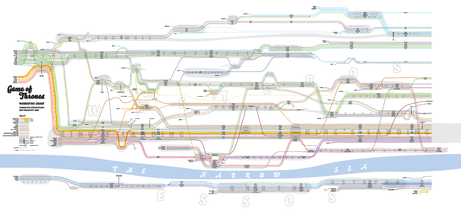
(For an interactive narrative chart that includes all eight seasons, we refer you yet again to the prolific dataviz output of Jeffrey Lancaster)
And finally, of course, what is the most important form of interaction in GoT other than betrayal? Visualizing who betrayed whom produces a dense, interconnected network that ties all the major characters together in multiple ways (and if you’re trying to avoid 🐉 SPOILERS 🐉, don’t look too close at this chart!)
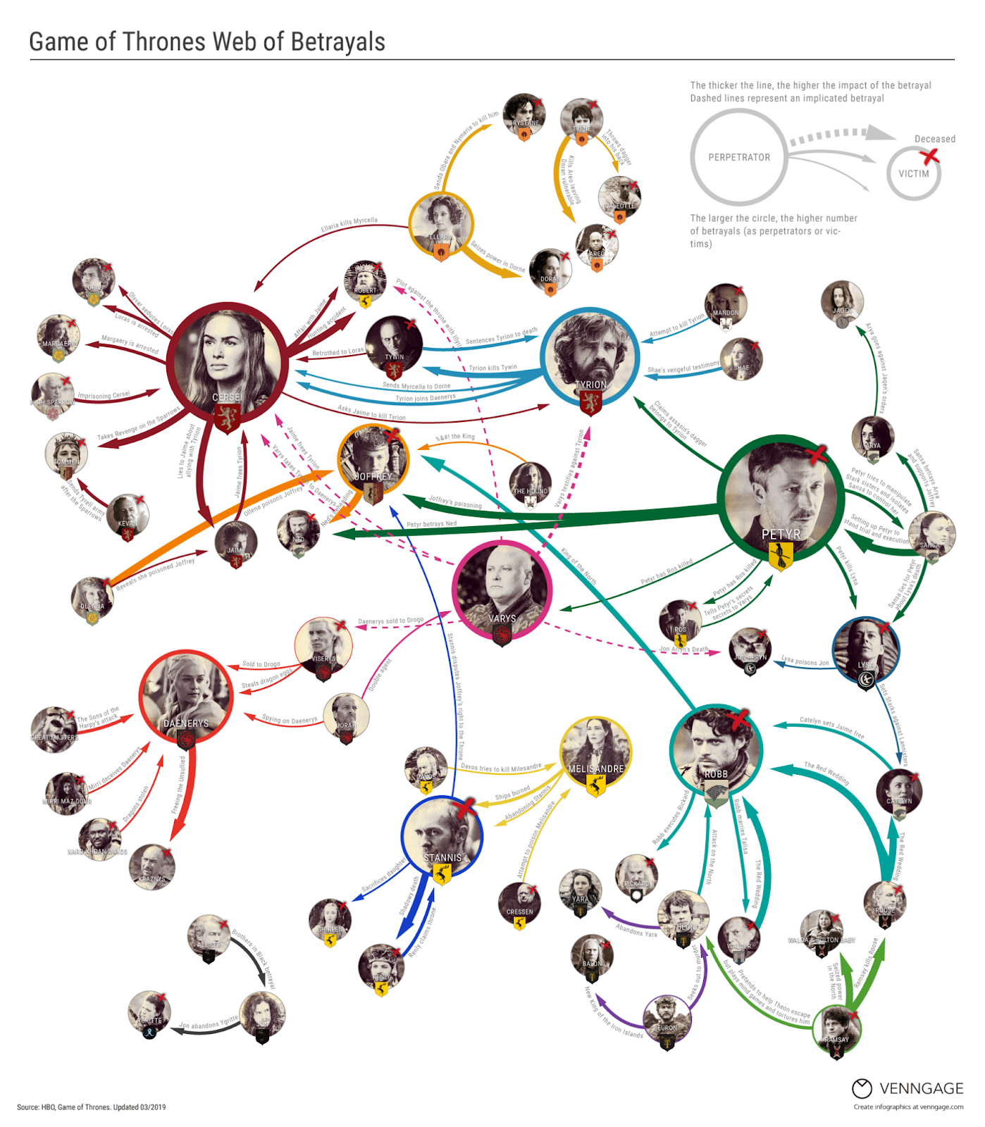
If you’re still confused, that’s understandable! The network of relationships in GoT is so elaborate that there is no perfect visualization that can clear it all up. For some characters in the GoT universe, though, the confusion is the point. Surely some of our favorite schemers and backstabbers have a chart like this in their heads at all times. After all, “chaos is a ladder.”
Maps for Playing the Game of Thrones ( 🐉 SPOILERS 🐉)
Maps are often used in Westeros to help plan or coordinate an attack on a rival contender for the throne. In GoT season 8, Cersei had a giant map of Westeros painted on the floor in a courtyard in the Red Keep:
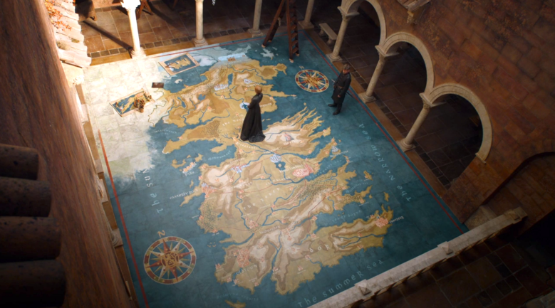
This map looks very similar to the map we follow in the opening credits, using the same label styles and general content (city names, waterbodies, terrain). However, this map uses colors similar to those seen on maps during the Middle Ages. This IndieWire article gets into more detail about how the map was created at such a large scale.

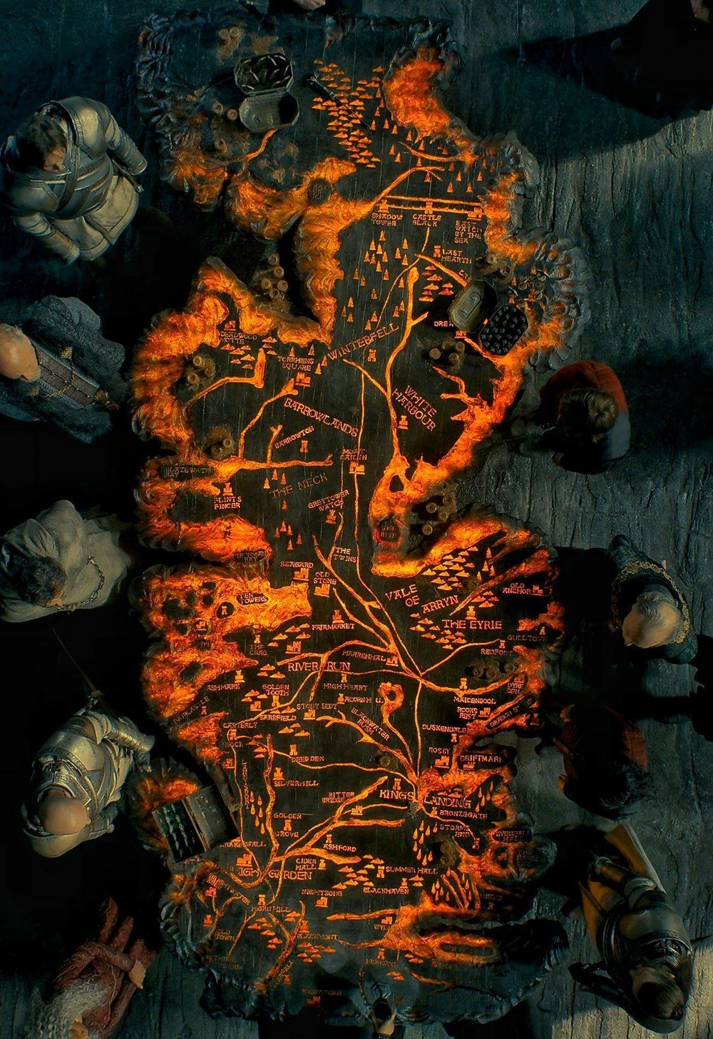
Daenerys has a custom conquest map of her own in seasons 7 and 8 of GoT, though this one has some history. Known as “The Painted Table,” this map is carved in wood and sits in the Chamber of the Painted Table (formerly Queen Rhaenyra’s apartments) at Dragonstone, the ancestral home of House Targaryen. Unlike Cersei’s painted map, we’ve seen this map a few times before. Stannis Baratheon used it in GoT season 2 in The War of the Five Kings and Queen Rhaenyra Targaryen uses it in HotD season 1 in what becomes The Dance of the Dragons. The map first belonged to (and was presumably created for) Aegon the Conqueror, who planned his invasion of the Seven Kingdoms from this very seat when the Targaryens first arrived in Westeros.
When using this map, the players place tokens representing each house on the territories they currently control. Quite the strategy game!
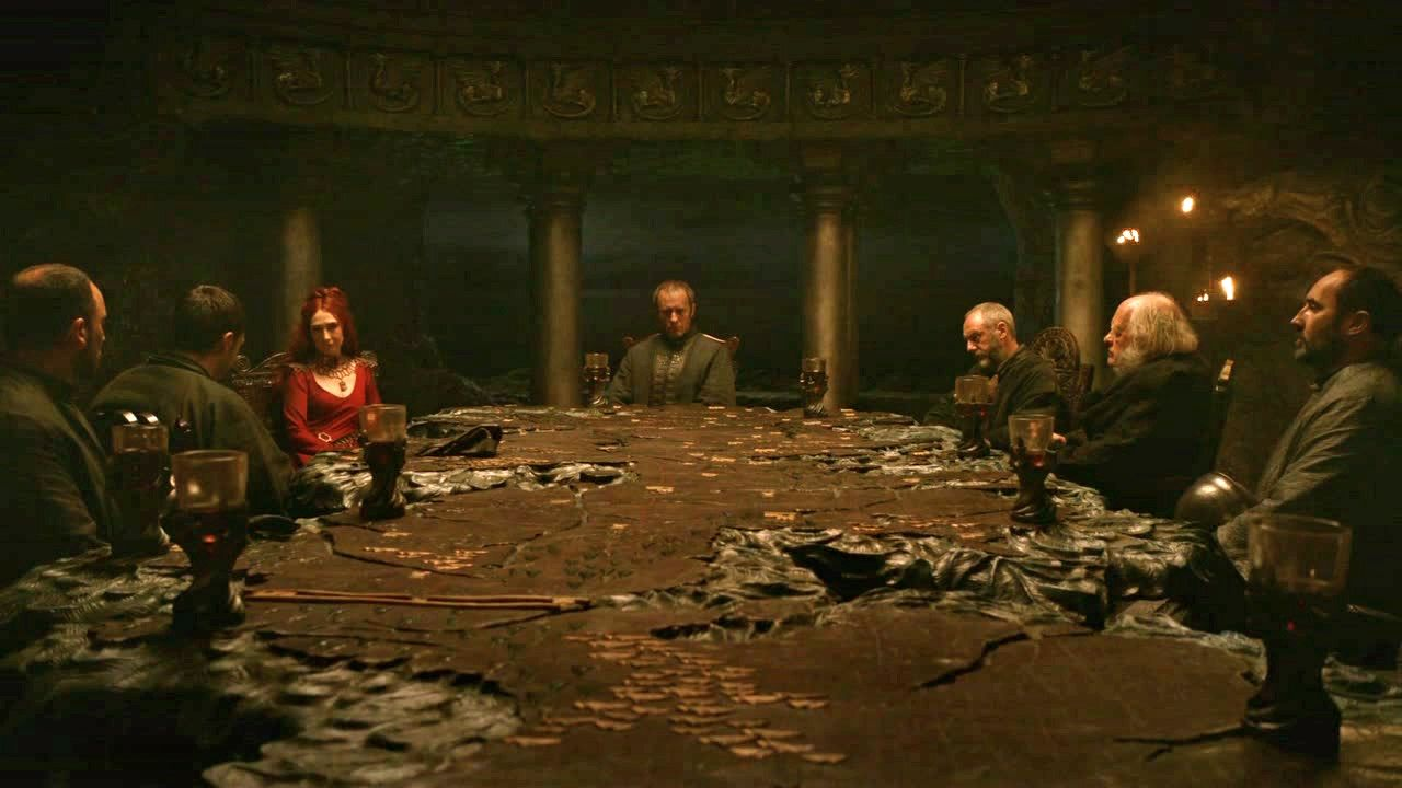
But the coolest part about the Painted Table, which we learned from Rhanyra in HotD season 1, is that it has a dark mode!🔥 Dragonstone is a very moody castle, so they honestly need the underlighting to read this map most of the time.
If you feel like planning your own campaign to conquer the Seven Kingdoms, you may want to check out the interactive map of battles in Westeros created by Flourish, or this choropleth of military strength of each kingdom, created by MapChart. Conveniently, each of those sites gives you a quick way to get started making your own maps of Westeros, or if you want a bit more control you can grab the raw GeoJSON data from the excellent web map created by our friends at Mapbox. Or you could always play the board game if you have several hours and friends (or foes) in waiting.
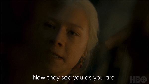
And now: all must choose 🐉 SPOILERS 🐉
Battle lines have been drawn and all must choose: Team Green or Team Black? We’ve purposefully avoided reading Fire and Blood so we don’t know who wins the Dance of the Dragons, but we’re firmly Team Black. The realm would benefit greatly from Queen Rhaenyra’s poise, thoughtfulness, and care should her ascension happen as Viserys intended. Plus, the Blacks’ wing of dragons outweighs the Greens’ by quite a margin.