
We’ve just passed the most prolific time of the year for cartographers: the 30 Day Map Challenge! Every November, cartographers across the globe answer the call to create a map each day with a theme outlined by the organizer Topi Tjukanov. These themes cover everything from continents to data sources to concepts. People often added their own unique spin and interpretation of the theme, making every day of the challenge exciting!
While we have yet to participate as a company (there’s always next year right?) we love to see folks creating maps using or inspired by those we make here at Stamen during this time. I’ll call out a few of those and also highlight some trends and favorites that we noticed during this year’s challenge.
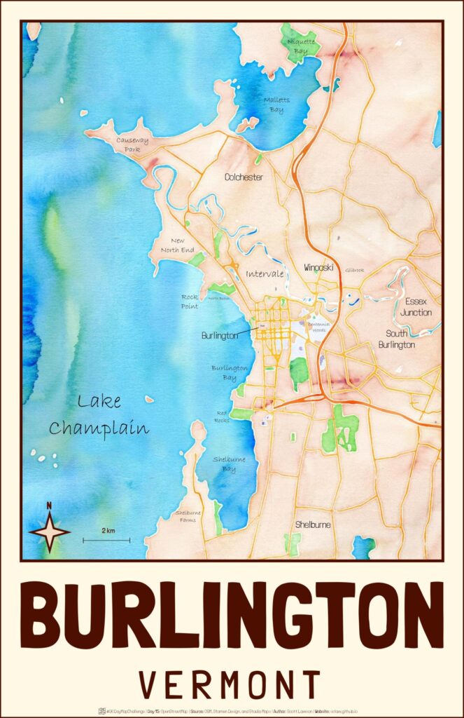
Our very own Watercolor style showed up on a few maps this time around. Scott Lawson used Watercolor to make a map of Burlington for OpenStreetMap day, a day to highlight our favorite open data repository and also gave a shoutout to our new partnership with Stadia where the maps are now hosted with a generous free tier for personal use. If you’re curious, you can learn more about that here!
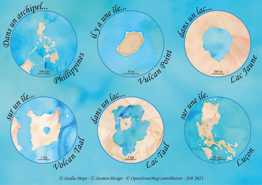
Alexandre Médina aptly used the style for the Raster theme, showcasing a humorous and dizzying look at an island within a lake on an island within a lake on an island in the Philippines (my head is spinning too).
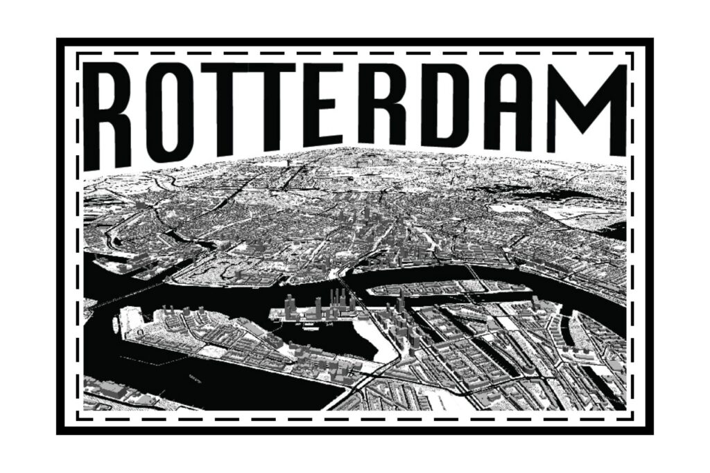
Toner also received some love from Walter L. Molina P. for the Black and White theme, who leaned on the high contrast of the style and added 3D buildings for a beautiful isometric look at the city of Rotterdam!
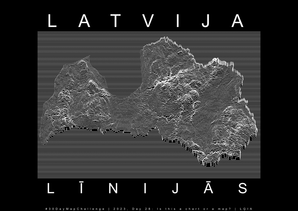
Joy Plots
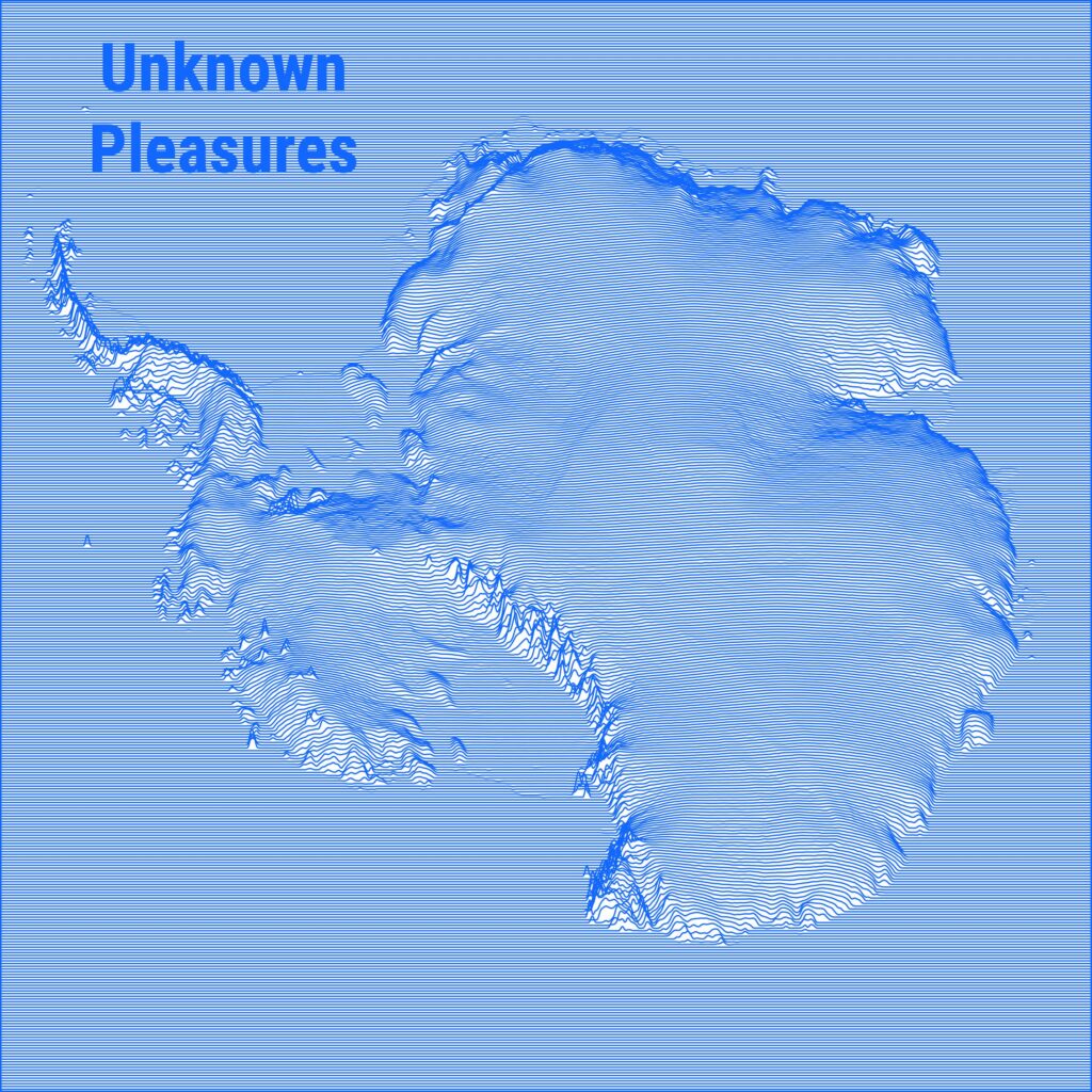
Outside of our maps, we noticed a few trends that were prevalent throughout the challenge. The first trend was the widespread presence of Joy Plots, visualizations named thus due to their similarity to the album artwork for Unknown Pleasures by Joy Division. Many of them, like Elīna Resne’s map of Latvija below, were particularly popular on Day 28, which posed the question “Is it a Chart or a Map?”—something we’ve also wondered about all maps after talking with Carissa Carter on our podcast last year.
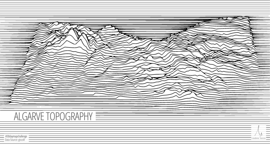
While they fit incredibly well into the “Chart vs Map” question, Joy Plots showed up on nearly every day. Part of the Joy Plot’s strength is it works well with both physical and thematic data. Below you can see Kurt Menke’s and Loubna’s topographic uses of the visualization, while Sam J’s animated plot of “The Hum” shows its strength for thematic geospatial data.
Click the video to play the animation!
Shadows
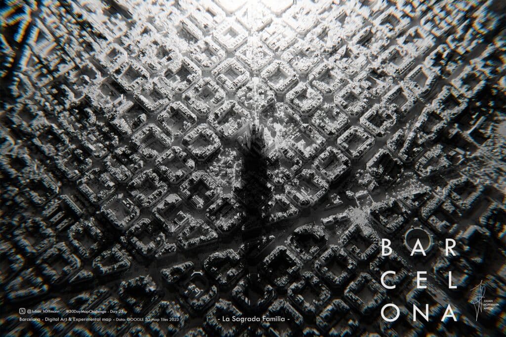
Last year, my colleague Alan McConchie wrote a blog post noting the trend of high-resolution, dramatic shadows that were showing up on a lot of maps. This year, that trend continued in the 30 Day Map Challenge, with several folks experimenting with an array of software to create maps with striking shadows for a variety of themes.
Lots of cartographers used the tried and true 3D-rendering software Blender to accomplish this, as seen in Julian Hoffmann’s stunning visualization of Barcelona for the Black & White theme.
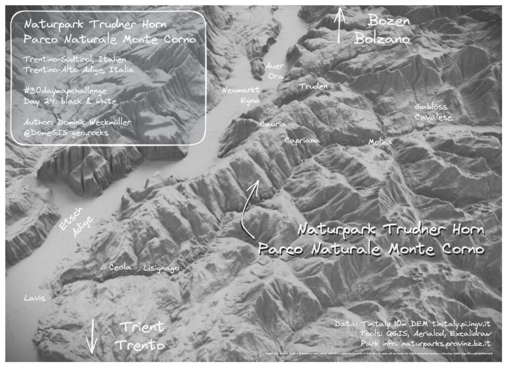
Dominik Weckmüller used Aerialod for the same day to create a black and white 3D visualization of Trudner Horn Nature Park in Italy.
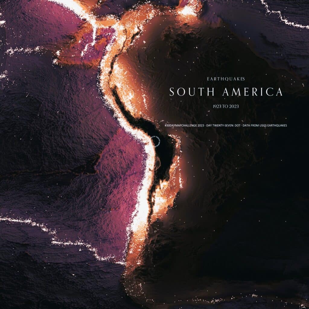
Other cartographers, like Terence created incredible visualizations with R using RayShader, like this luminous look at earthquakes in South America.
Other Favorites
There were a few other maps that caught our eye and were worth mentioning here! This is not an exhaustive list, of course, and we’re always impressed by what cartographers come up with every year.
Krishna Wijaya‘s “cool” ( ͡° ͜ʖ ͡°) glass-like rendering of Antarctica!
Wendy Shijia‘s interactive line style visualization of Mount Everest! It was hard to pick a favorite of hers out of all the great work she did for this year’s challenge (see for yourself).
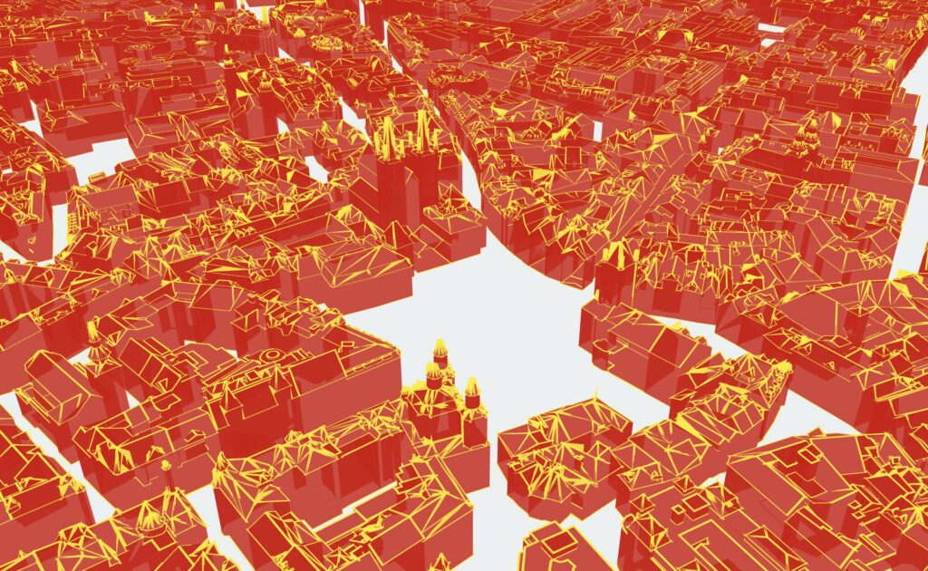
Obin Le‘s creative 3D representation of Old Town Square in Prague.
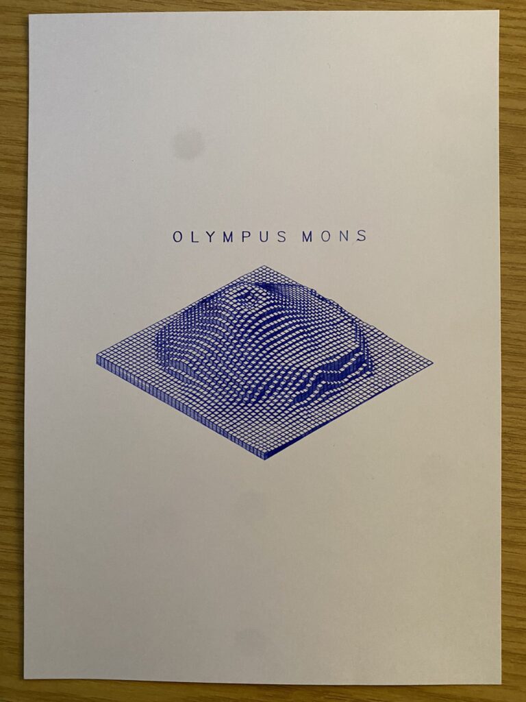
Finally, Chris Holmes‘s isometric plot of Olympus Mons on Mars. I couldn’t find if this was for a specific theme, but I don’t care because it’s incredible.
Hats off to everyone who participated this year and we can’t wait to see what next year has in store!