
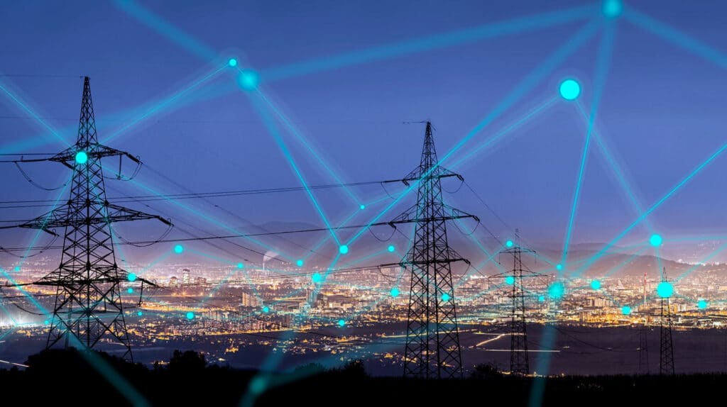
The myriad and complex challenges of addressing climate change can feel overwhelming, but when you combine the wealth and power of data available with communication strategies, it becomes possible to imagine a future where we are valuing conservation, relying on renewables, promoting efficient industrial, consumer, and agricultural processes, and not pumping greenhouse gasses and pollutants into the atmosphere.
How to visualize that data to drive outcomes is both science and art; data and design; technology and emotion. In this article, we’ll explore how data products and exploration can bridge the gap between mind-bogglingly big, systemic threats (like renewable energy and climate change) and insightful, appropriate action.
Why am I talking about addressing climate change on a cartography and design blog? Surely the subject matter experts are better positioned to communicate this problem and its solution?? Answer: over the years Stamen Design has had the honor to work with some incredible teams doing the work to usher us into the future; from that work with our clients, we’ve learned some things about how to turn mountains of data into tangible action.
Here’s something we know well at Stamen Design: the human brain processes visual information 60,000 times faster than text, 90% of information sent to the brain is visual, and 93% of communication is nonverbal. Pictures are just better than words when it comes to the communication of complex ideas.
Pictures are just better than words when it comes to communicating complex ideas
Here’s something we’ve learned: addressing climate change is a multifaceted challenge that will require, at its core, collaboration, coordination, and the will to act. Underscoring all of this is a need to communicate complexity at all levels. This is where we’ve had the opportunity to take advantage of the human brain and eyes’ incredible visual processing power to aid in this challenge.
Reveal the invisible
Finding solutions to likely future scenarios has often involved first and foremost making the risk, threat, or problem visible. Climate Central came to Stamen Design with just such a challenge: how can we take a looming threat like rising sea levels, and make it more visible?
Over multiple years and iterations, we created a tool to visualize the impact of rising sea levels to coastal residents, infrastructure, and property. The Risk Zone Map combines census data with elevational projections to create an interactive map of impact for various future scenarios. Individual locales can be seen in high resolution to show specific impact to a small area, or regions can be viewed to identify districts within a region that are under threat of future inundation. The data can then be isolated to analyze more specific impacts and vulnerabilities within a jurisdiction – allowing communities to advocate for political action in their cities. As a direct result of this work, Climate Central developed partnerships nationwide, including with the CLEO Institute in Florida and a nationwide partnership for climate change initiatives with the NAACP.
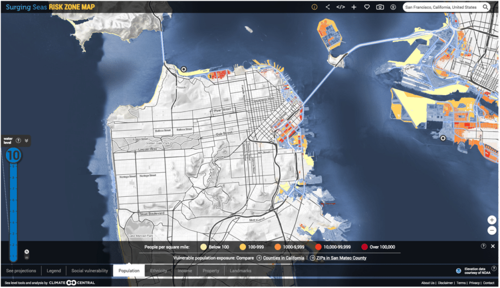
With this work we learned not to underestimate the value of putting dynamic tools right into the users hands; tools that allow them to reveal the breadth and depth of a problem’s impact for themselves.
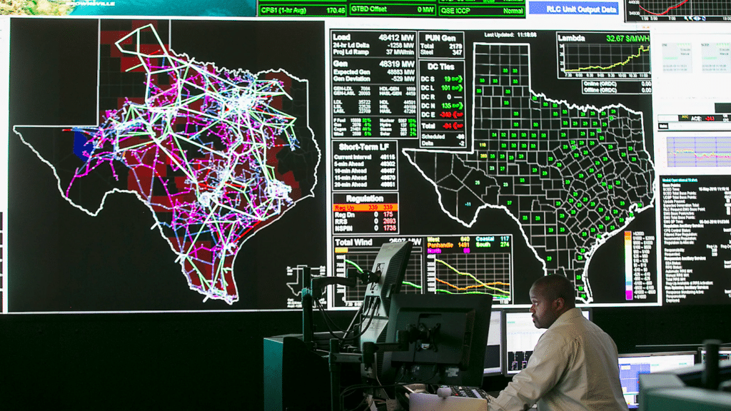
Showing impact is a great way to communicate urgency. For example, The best time to have started making big changes to our electrical infrastructure was decades ago. We’ve experienced some of the most extreme summers and bitter winters in the first part of the 21st century and our infrastructure is old, overburdened, and failing; it’s also designed to be invisible, which makes discussions about what to do about it all the more difficult.
The challenge we face now is not just around how to show impact, but how to envision reducing, reversing, and eliminating those impacts. In order to transition to a better future, we must also find it plausible to do so.
Create tools that enable communities to govern themselves
Stamen Design started developing energy benchmarking tools, in partnership with the City Energy Project. What we developed (maps and visualizations of building energy usage across a number of metrics, building-specific report cards, and email report card delivery customization for certain cities) is designed to help energy policy professionals visually understand progress towards meeting local energy use targets and communicate about such progress over time, building by building. Here is the version we customized for Seattle, WA.
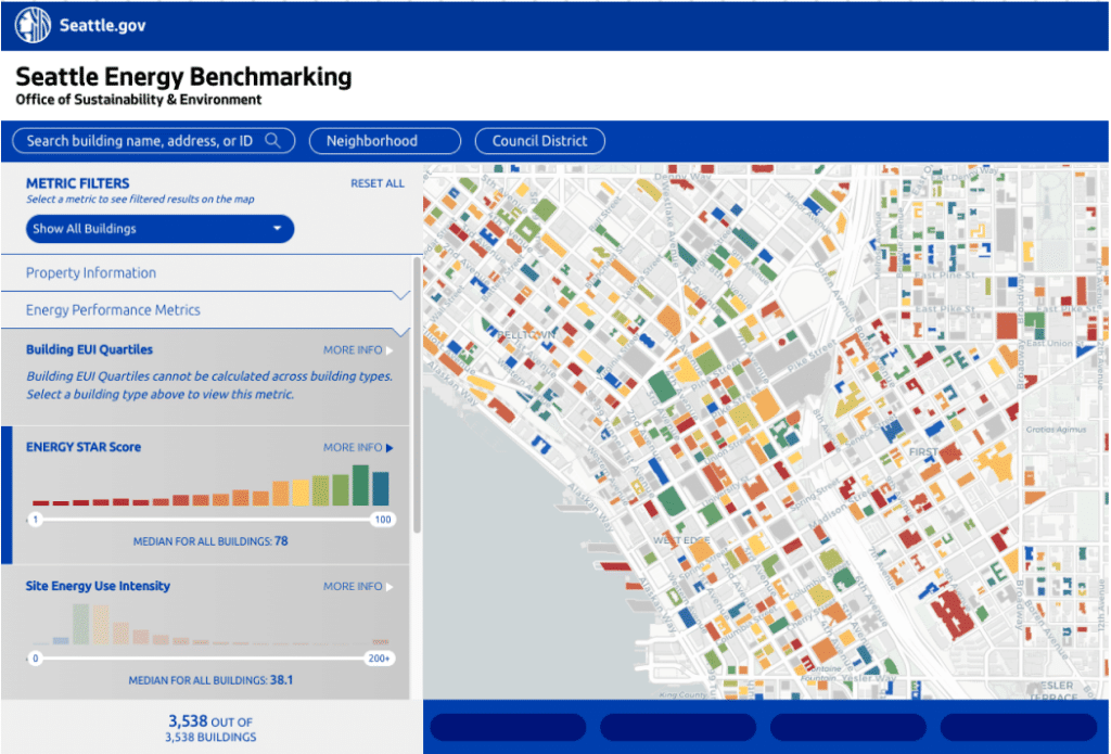
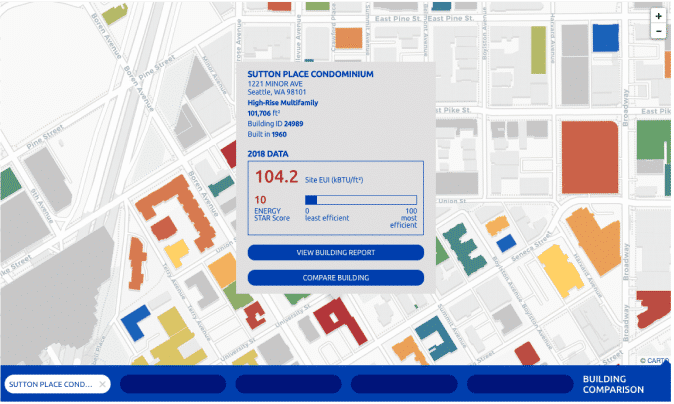
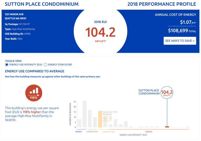
As the momentum behind energy transition grows, what we developed, based on open-source tools, enables progress toward incorporating energy efficiency metrics into our infrastructure and economy. In addition to Seattle, WA, the platform is also employed by Washington D.C., Chicago, IL, and other City Energy Project partners.
Change the Lens
Showing how changes will affect something as complex as an ecosystem can be both inspiring and a massive data visualization challenge. Turning expansive, esoteric datasets into a relatable narrative is a tried and true way to meet your audience where they are at. In Survival by Degrees, Stamen Design worked with The Audubon Society’s data on 604 bird species with up to 8 data layers each (well over 1,000 total, for those counting) and built an interactive map with narrative vignettes describing how each species’ migratory patterns across North America will change based on a warming climate. The Audubon Society used birds as a lens through which people could view the impacts of climate change, and a zip code finder feature that would allow the user to focus the story on their own backyard to demonstrate real change in an environment they recognized.
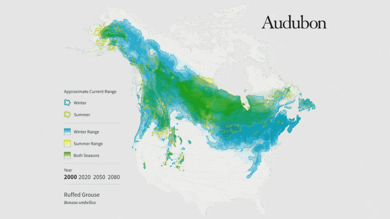
When Stamen Design began working with The Audubon Society, we focused on showing change over time with a single climate scenario.
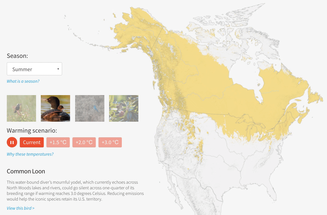
During our second engagement with the Audubon Society, we wanted to show alternate climate scenarios projected to the same moment in time. Stamen Design’s goal was to shift the narrative from being about how we are locked into an inevitably bleak future, to being about taking action to create a better future outcome.
On the other end of the spectrum from using data to demonstrate a real and tangible threat is engaging with existential threats through the lens of…a PR campaign. For this side of the fight, sometimes a shift in perception is needed to bring an intangible, existential threat down to earth. Species extinction due to human-caused climate change and destruction of habitats is easily dismissed in the day-to-day lives of humanity at large. Instead of letting these issues fade into the background of ‘happening somewhere else, to some other animal’, we worked with People v. Extinction to humanize the issue. Literally!
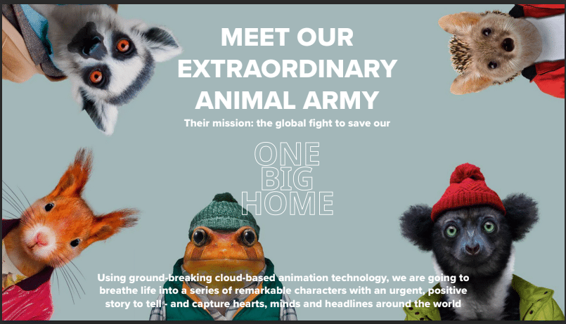
Developing an accessible portal for people to engage with personified versions of animals at risk of extinction might not be the first (or second or third) idea that came to mind when thinking about how to tackle climate change, but for something this massive, it’s actually essential to employ all the tools in our tool belt, from the quantifiable and specific to the emotional and persuasive.
Show them it’s worth it
Another lens through which to view addressing climate change is its relationship with our wallets. In the final run-up to the 2020 election, Rewiring America asked us to work on their Electrify Everything campaign to demonstrate to the incoming Biden administration that immediate and wide-ranging political action towards a renewable energy future is necessary to our survival, economically beneficial to everyone, and needs to be a core policy. Rewiring America showed how policies that aided in decreasing our reliance on fossil fuels would have a massive positive impact on the viability of world-saving changes.
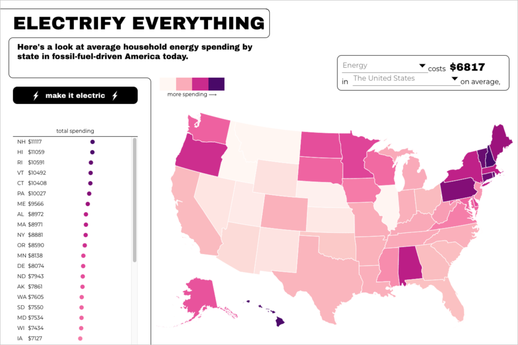
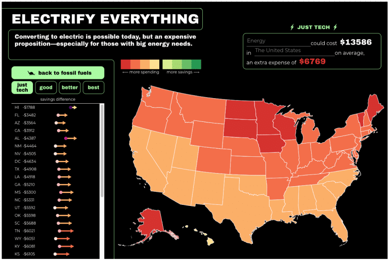
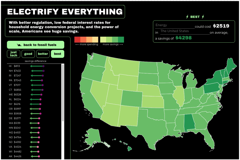
The Biden-Harris administration heeded the call and passed the Inflation Reduction Act (IRA) – the largest climate bill in U.S. history.
Pulling actionable insight from mountains of data is something we bake into our data design process. There is a tendency to use data as supporting evidence for a point of view, but that can easily result in misleading conclusions. Oftentimes, it’s much more useful to draw insight from the data.
A little insight can change an industry
We hear a lot about how the aviation industry is a major contributor to climate change, but that’s only a piece of the story. Convincing an entire industry to radically change their technology and business model is a tall order, but what if there was an easier way? Our client, Daitem, had one goal: to get airlines to re-route their flights in a subtle, but impactful way. Their reasoning? The CO2 emitted by aircraft is only responsible for about half the climate impact of aviation. The other half comes from contrails — artificial clouds that are created by soot in the engine exhaust.
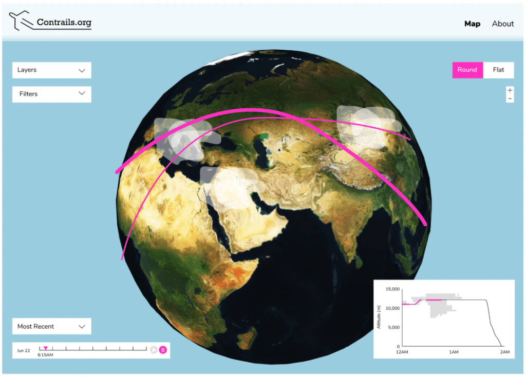
There are multiple types of contrails, most are harmless, but the kind that contributes to half of aviation’s carbon footprint only happens at certain altitudes, under specific atmospheric conditions. These types of contrails turn into artificial cirrus clouds which act as a blanket, contributing to global warming. We set out to build a tracker that showed that a relative minority of flights were routed in such a way as to cause these types of contrails and how simple reroutes (chiefly, lower cruising altitude) could drastically reduce overall CO2 emissions. Daitem could then use this tool to educate decision-makers in the aviation industry that change is possible and re-routing, according to two studies, was the quickest and cheapest way to do so.
Drawing conclusions
At Stamen Design, we’ve found that the common thread connecting these incredible projects is using real and complex data to zero in on actionable solutions to systemic threats. In the face of climate change, we’ve learned to incorporate the following strategies:
- Visualizing outcomes, rather than just data, helps contextualize the problem for your audience but is harder than just showing graphs and trend lines as it requires insight to be drawn from the data.
- Garnering social and political will for change requires the framing of solutions (not just the magnitude of the problem—though these two can go hand-in-hand to great effect when thoughtfully considered), communicated in such a way as to inspire and empower the audience to act.
- There is power in making the invisible, visible
Put more succinctly: action requires understanding and visualizing systemic problems and their outcomes, in clear and emotionally impactful ways, solidifies that understanding and inspires confidence that we can change.