
At its very core, data visualization has two main components: representation and interaction.
Representation (or how data looks) is the process of rendering data on a screen, after analyzing the data, transforming the data, and determining the appropriate method of mapping that data to visuals. Interaction (or how data behaves) involves the dialogue between your data visualization and the users who explore it to uncover insights or data stories. How you organize your information shapes both experiences.
Information hierarchy determines how data is grouped and aggregated. In design, and especially in data visualization, all aspects of a dataset cannot be equally emphasized. In order for any element to stand out, others must fade into the background. Effective data visualization often begins with gaining an understanding of the proper hierarchy (or hierarchies) to surface in your visualization and giving your users an appropriate interface for navigating that hierarchy.
However, knowing where to begin when experimenting with various hierarchical structures in your datasets and visualizations can be overwhelming.
Collaborating with a data visualization design studio elevates the power and possibilities of your project with four design-informed data hierarchy best practices.
1. Look Beyond the Obvious
For example, suppose you want to create a data visualization examining peoples’ jobs. You might show how many people are cooks in restaurants, or you might group that population under the umbrella of food preparation or more generally, food. Each time you zoom out or in, you’re affecting how the data looks and the story you’re telling.
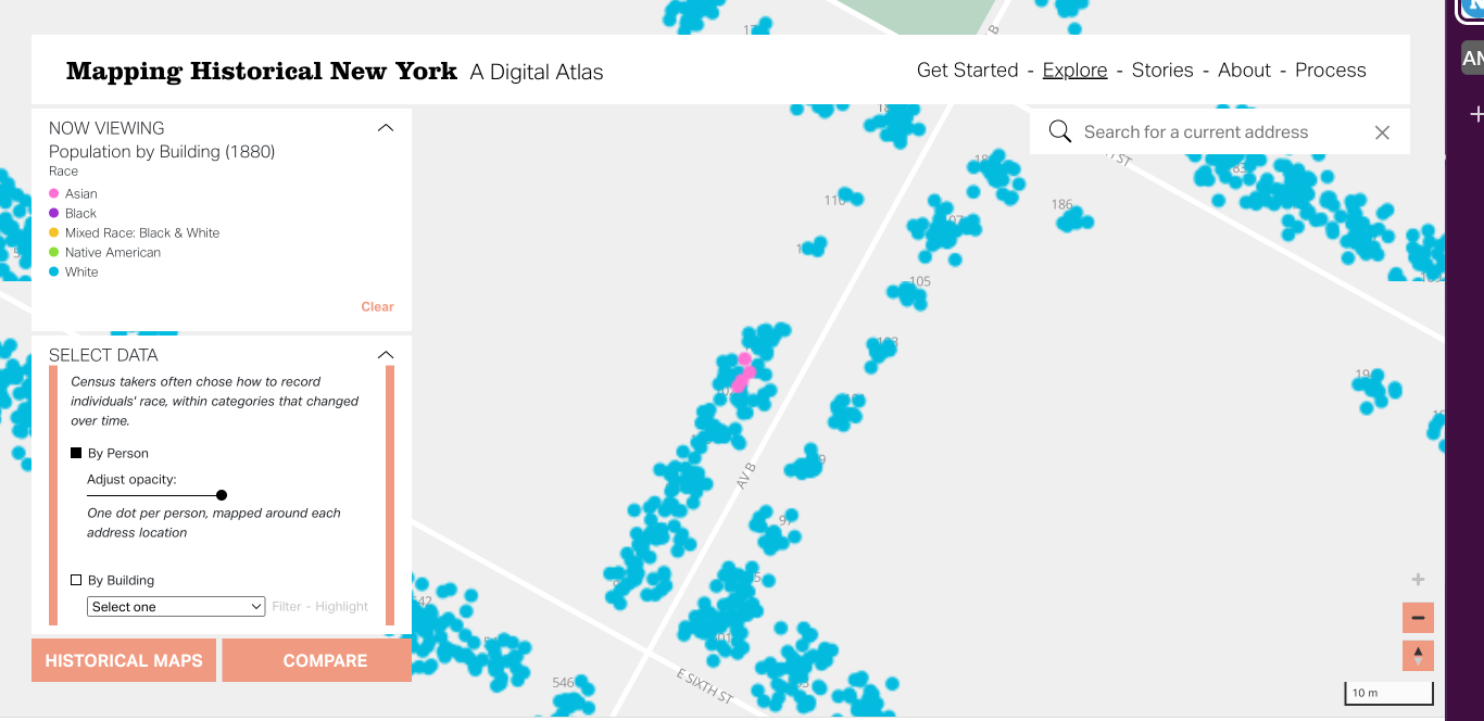
If you’re working with spatial data, there are similar questions to consider: Are you looking at the data for each individual? By building? By census tract? By city? By country? Every variation alters the way your data is viewed and impacts the way your users will interact with it.
A data visualization design studio works with you during the discovery phase of your project to determine proper and compelling ways to group your data. These design technologists are well-versed in reaching beyond the obvious hierarchical conclusions and asking what if?. What if your data is grouped by population? What if it is grouped by usage? What if it is grouped spatially? What if it is grouped by time? This enthusiasm for experimentation empowers you to dig deep and explore all your data’s potential.
2. Design From the Data, Not For the Data
Not only can a data visualization design studio help you consider the most effective method of grouping your data, but they can also conceptualize how to design an intuitive user interface from your datasets.
Designing from the data, not for the data, is a critical data visualization practice. Whether or not you’ve already identified a clear hierarchical structure for your dataset, it’s a common misconception to assume you immediately know what visualization you want to render your project in for users. Maybe you’ve seen a compelling map or chart somewhere else and believe you want to visualize your data the same way. But beware: Approaching your project from this perspective inherently limits the possibilities you might uncover through more exploration.
There’s not a “one size fits all” solution to designing from datasets. What works in rendering a specific form of visualization for one dataset may not work for another. The levels of information in any dataset can be skewed in particular ways that inform different visualization forms and user interfaces. What is a compelling representation for one dataset can quickly become a misleading representation for another. For example, you may think you want to render data about four different countries on a world map. However, doing so would inadvertently highlight the 191 countries for which you do not have data.
An experienced data visualization design studio understands the variety of forms a visualization can take. They can help you consider the most effective method of grouping your data and match that to a user interface appropriate for your visualization. Better still, they can craft visualization prototypes that allow you to really see your data visualization interfaces and experience how others will see and use them.
3. Play With Your Data Hierarchies Through Prototyping
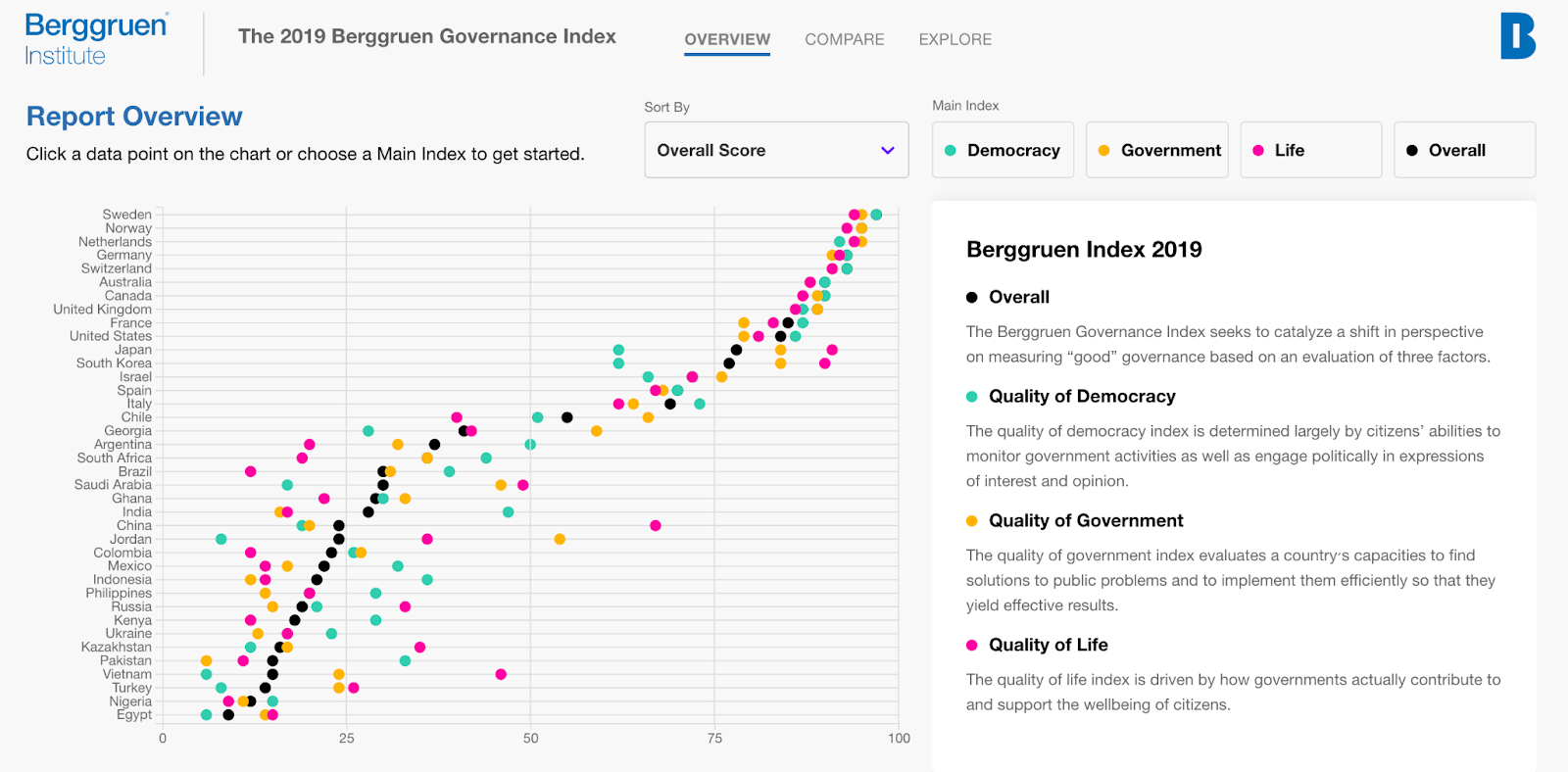
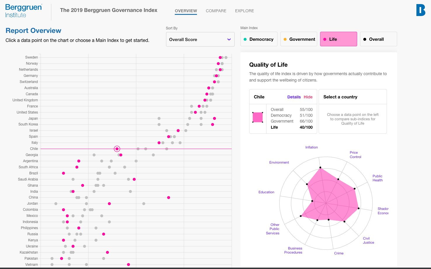
For example, when Berggruen Institute came to Stamen intending to bring a fascinating global governance index dataset to life, they knew they wanted to tell rich and insightful stories about governance. Still, they had only seen their datasets appear in spreadsheets. In that form, the dataset, composed of 90 different score indicators from 38 countries gathered over six years, was multi-layered and complex, overwhelming and ineffective. The Berggruen team knew they had an important story to tell about the current global crisis of democracy, but how to surface that story in a way that users could understand and explore was a challenging matter.
Sometimes, there are so many layers of information in your data that the only way to create a successful design is to experiment with different forms and a variety of visual hierarchies.
Working with Stamen’s design team, the Berggruen Institute explored various ways to organize their data. As design technologists prototyped some preliminary, experimental models of how the institute’s global governance index could be visually rendered, the Berggruen team began to see how visualizing their complex datasets in simple, elegant ways communicated mounds of information in a single glance.
“I have long understood the magic of fun, usable data tools. What has changed is my perception of how hard it is to build an interactive site. I had the misperception that it is hard, but it really wasn’t. That was fast and painless thanks to Stamen.”
– Dawn Nakagawa, Executive VP, Bergguen Institute
In the hands of experienced design technologists, data visualization prototyping is iterative and malleable. The Berggruen Institute could examine the form and function of different data hierarchies and their resulting user-interface structures. Allowed to play with their data in this way, they quickly found a powerful way to display their massive dataset and inspire users to explore what functions and capabilities of government matter most for citizens.
4. Inspire User’s Exploration Through Utility and Beauty
When it comes to building a compelling user interface for your data visualizations, a data visualization design studio knows that beauty and utility share equal footing.
By organizing complex data into clear and digestible groups, expert designers help make your data useful. They also recognize the importance of creating a UI that intrigues and delights users. A design team will work with you to create an experience that prevents user frustration and confusion, all by organizing the user interface to present the most important data information while successively revealing lower layers of information hierarchy.
Thoughtful Data Hierarchy Powers Better Data Communication
Well-designed data visualizations empower people to have more informed conversations about everything — from energy benchmarking to fiber optic cable vibrations to world immunization reports, and much more.
Knowing how to effectively hierarchize your data makes it insightful and actionable. An expert data visualization studio will dig deep into your datasets to find the stories in your numbers and deliver uncommon creative experiences that delight your users.