
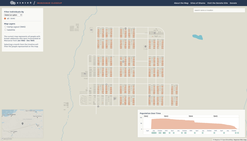
As we mentioned recently, Stamen worked with Densho in 2023 to create Manzanar CloseUp, a map of the Manzanar concentration camp in California where Japanese Americans were incarcerated during WWII. Where our previous work on Sites of Shame visualizes all of the camps that existed and the aggregated movement of individuals to and from camps, Manzanar CloseUp zooms into the Manzanar camp and displays data at the individual level.
Putting people on the map
In order to display data this granular, Densho digitized all of the buildings that existed in the camp and provided individual-level census data that includes details such as a person’s name, citizenship status, birth year, and address within the camp.
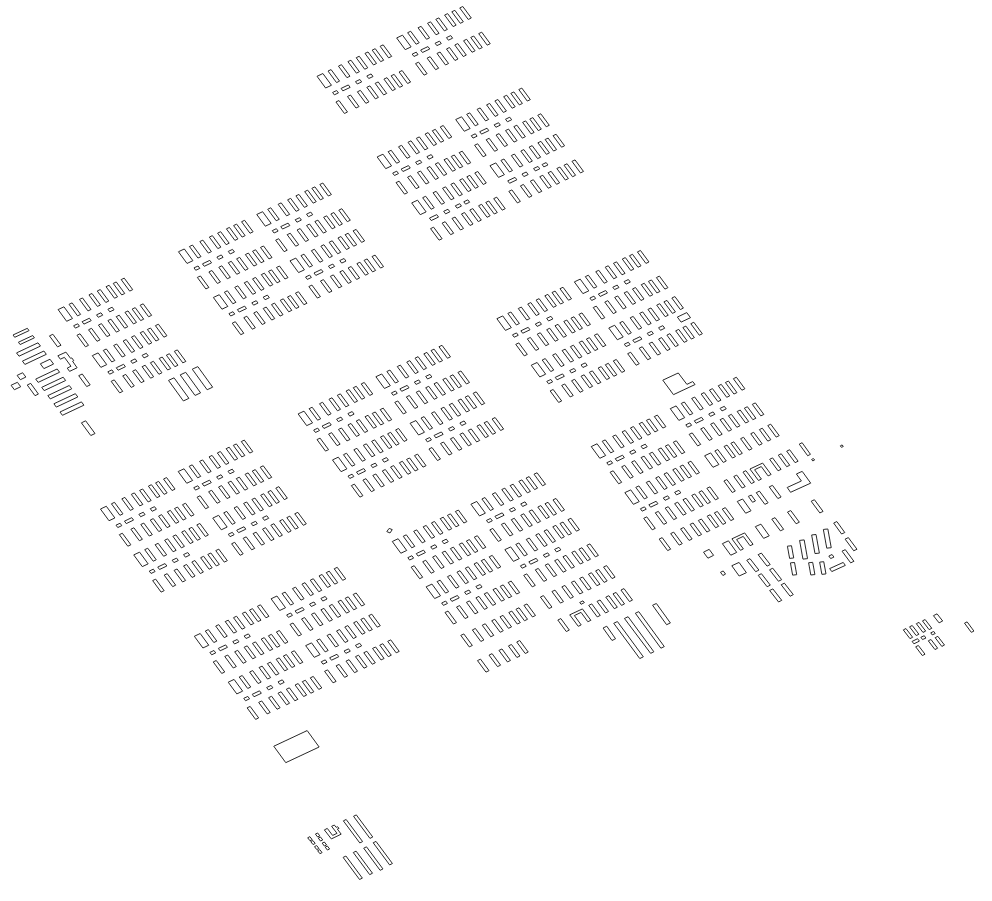
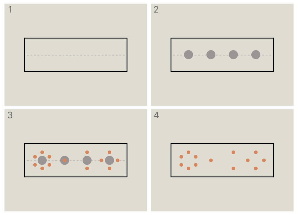
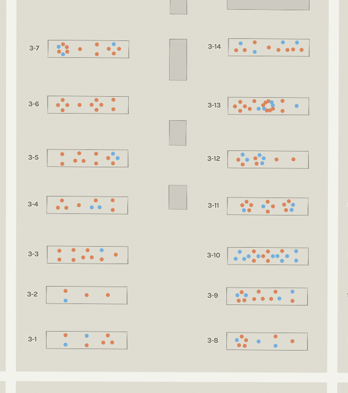
Once we had shapes for buildings and individuals’ addresses within the camp, we were able to associate people with specific buildings. For our initial prototypes, we randomly placed people in the building with their address:
This early prototype was unsatisfying because Densho has data that is more detailed than this in two ways. First, some individuals had multiple addresses in the camps over time as they were moved between barracks. Second, the data includes more specific addresses than just the barracks. As you can see above, 3-7 is a specific building, but barracks were split into multiple apartments and Densho’s data includes these apartment numbers for each person.
To handle data that changes over time, we added a timeline where users can select and view the state of that camp during a single month. This both removes individuals who were not in the camp during the selected month and repositions individuals who had moved barracks.
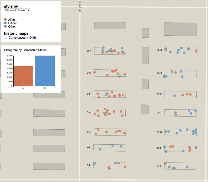
Mapping the apartments inside each building was more complicated. Since the historic maps do not include outlines of apartments, it wasn’t possible to draw a polygon for apartment 3-7-1, for example. So we decided to cluster individuals around a point that represents the apartment, similar to the dwelling-level dot density maps we helped make for Mapping Historical New York.
The process for doing this is:
- Calculate a line lengthwise through each barracks.
- Find the number of unique apartments in each barracks. Then calculate a point along the line found in step 1 for each apartment in each barracks.
- For each individual in an apartment, calculate a point offset from the apartment point, spaced evenly along a circle based on the number of individuals in that apartment.
- Associate the created points with each individual and discard the line and apartment points.
Since the census data is progressively being updated by Densho, the number of apartments in each barracks and the number of individuals in each apartment are both in flux. So we opted to do the above process client-side using flatten-js, Turf, and Mapbox GL to create a GeoJSON feature collection for individuals at load time. The result is a map visualization that surfaces much more of the information available more legibly than earlier prototypes. As an example, here is the same block of barracks from before but as seen on the live site using the synthetic apartment points:
Using these points you can more readily see patterns such as how full each apartment was, and you can better see who was living with each other. Paired with the hover effect that highlights members of a family, you can see when families were housed together or separated:
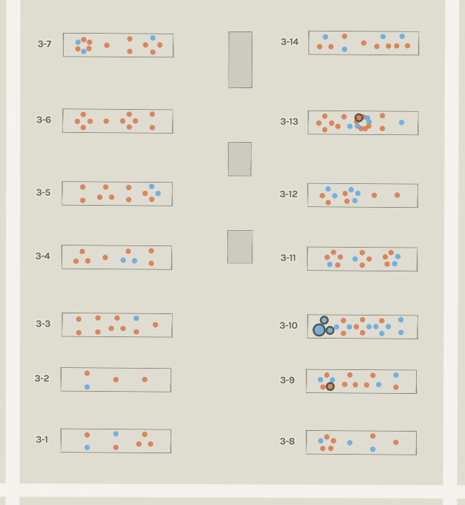
As you can see above, three members of this family were in the same apartment and two were in other apartments in nearby barracks.
In addition to viewing the data by family, you can filter individuals using some of the census data. For example, we can select a departure type and mouse over segregation to find individuals who were deemed “disloyal” and moved to Tule Lake:
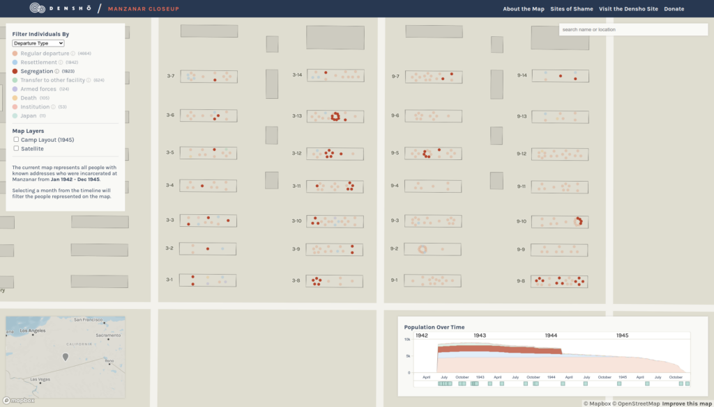
Individuals on the map are highlighted, as is their corresponding area on the timeline. At a glance, you can see the clusters of people who were moved from the camp as part of segregation, but you can also see that they were moved from Manzanar in early 1944.
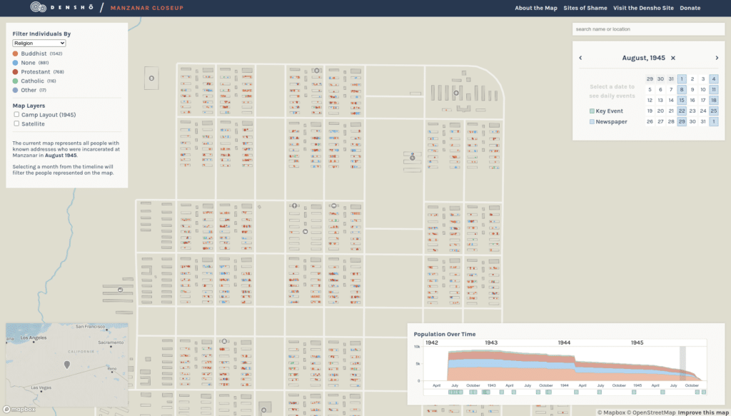
Key events and newspapers
In addition to showing where people were housed in the camp, Manzanar CloseUp includes additional information on the timeline, such as key events and issues of the inmate-run newspaper (where available):
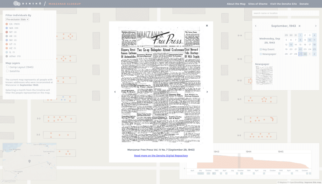
We wanted to link to more of the impressive resources Densho has made available and to help viewers get a sense of what was on the minds of Manzanar’s inmates as they lived their lives in the camp.
Take a look at Manzanar CloseUp and Sites of Shame yourself and explore the camps.