
Content in this post comes from our presentation at the North American Cartographic Information Society (NACIS) 2024 Annual Meeting last week in Tacoma, WA.

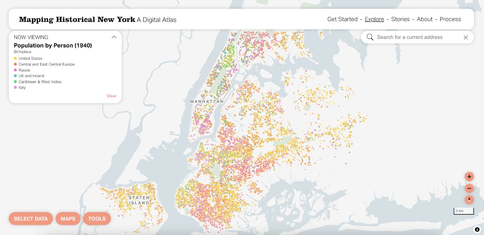
Mapping Historical New York: A Digital Atlas visualizes New York City’s transformations during the late-nineteenth and early-twentieth centuries both in terms of population and landscape. Drawing on 1850, 1880, 1910, and 1940 Census data, MHNY shows how migration, residential, and occupational patterns shaped the city. Researchers and students use the tool as a storytelling platform to highlight specific places and times in the city’s development over the last 170+ years.
Stamen first collaborated with Columbia University’s Center for Spatial Research on the original version of MHNY in 2021 (you can hear more about that on our podcast Pollinate or read more on our blog). This week, we’re excited to relaunch the tool with updated cartography, functionality, interface improvements, and narrative stories. Let us walk you through some of the improvements we’ve made in the new, more dynamic Mapping Historical New York:
Befores and afters

Here we have the original version of MHNY. Then and now, we feel like this version is a successful series of visualizations that function well and tell interesting stories about NYC over the years. There are some great tools and features that we won’t touch on here that persist from the existing version to the relaunch – definitely take a few minutes to explore the tool yourself if you haven’t already.

Our design goals for this redesign/update were simple:
- Utilize vector styling to allow users more flexibility when viewing data by individual
- Update the visual design of the map so the thematic data shines first and foremost, with support from the basemap
- Use a scalable approach that will work for more years and locations in the future
Before touching anything else on the map, we wanted to make some subtle changes to the basemap that will allow the thematic data to shine. Using a less saturated and more neutral color for the water helps avoid any competition between the basemap and colors in the data layers. We also wanted to utilize more of the underlying data in the basemap to improve visual data hierarchy. Styling the roads with the classes available in the data (primary vs. other) and including a casing (carto-speak for a thin outline) allows that data to add even more context to the map without being overpowering.
Another small but mighty change was around labels. We gave more weight to place labels to provide both historical and modern context for the locations where people lived during this period. We updated the fonts to match the sans serif Aktiv Grotesk we use in the interface for a more seamless experience.

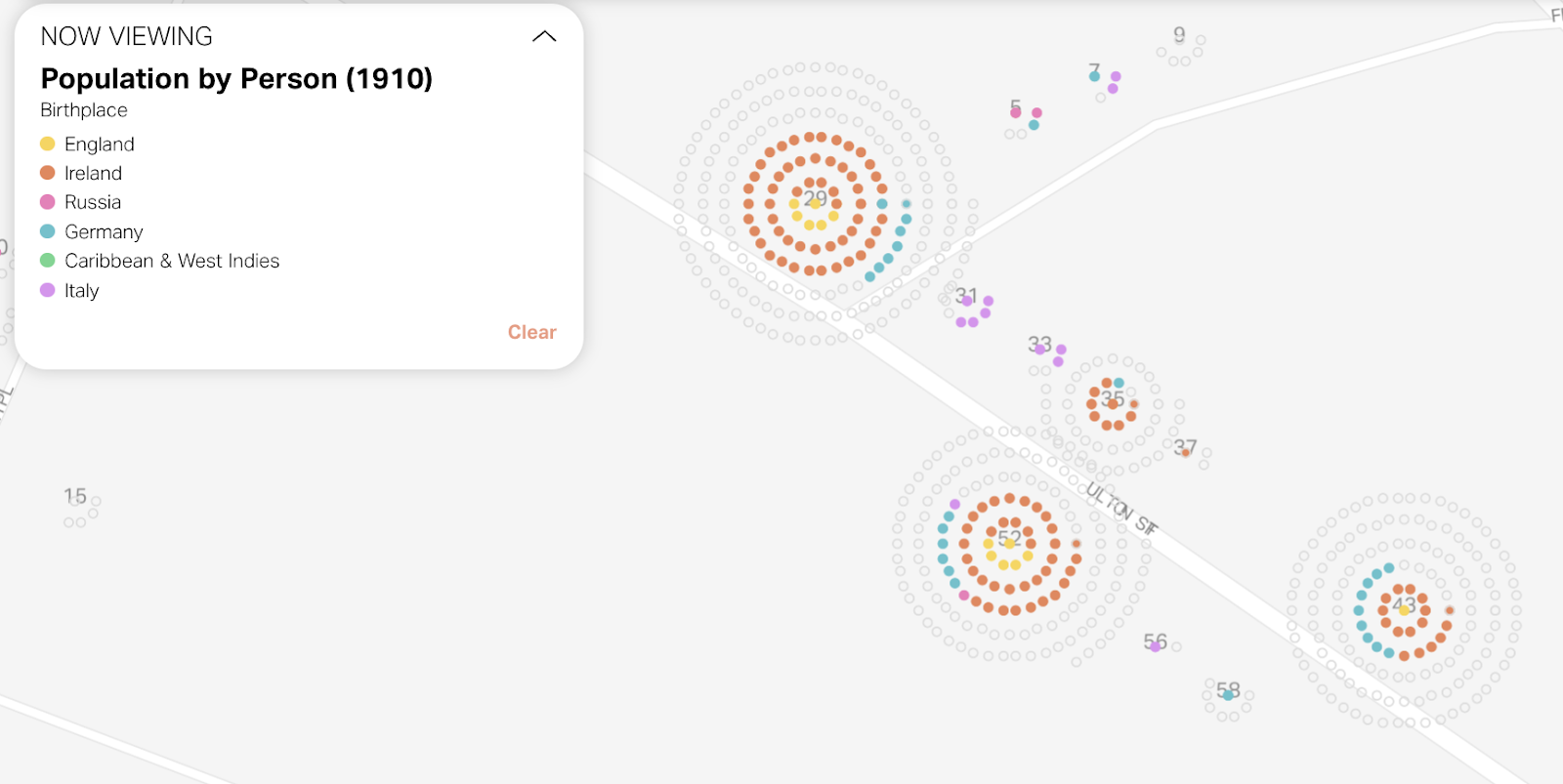
Dot density
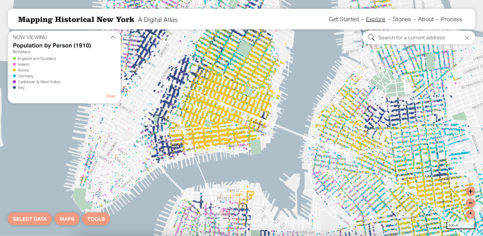
Probably the biggest change to MHNY was the transition from a raster to vector version of what we call beeswarm dot density. The initial version of this tool used raster tiles to show predefined slices of the data that were curated by the subject matter experts at the Center for Spatial Research. This worked well, but there are some limitations to flexibility and interactivity when using raster tiles. That said, we knew vector styling would be a challenge with this data because of how many points need to be visible in a small area at the same time.
We think the dot density map is a really beautiful visualization at the city, borough and neighborhood levels. That said, there are definitely situations where it’d be nice to focus on one attribute at a time. By using vector tiles, this is now possible by hovering over that attribute in the legend.
You can also select one attribute and change it in case your interests are different from the predefined options. This really unlocks a whole new world of possible maps you can view with the tool.

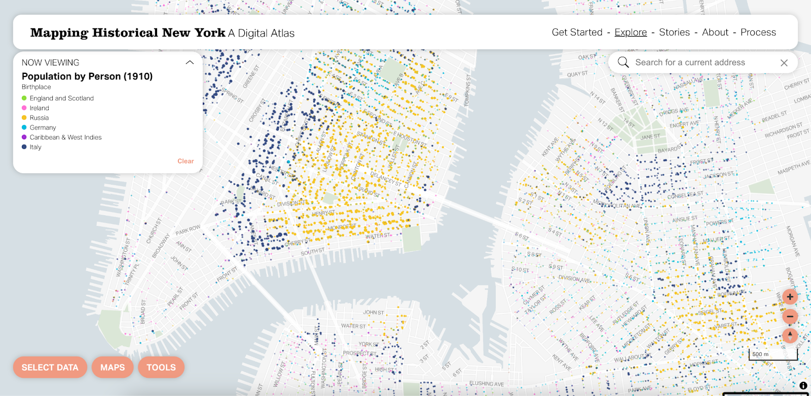
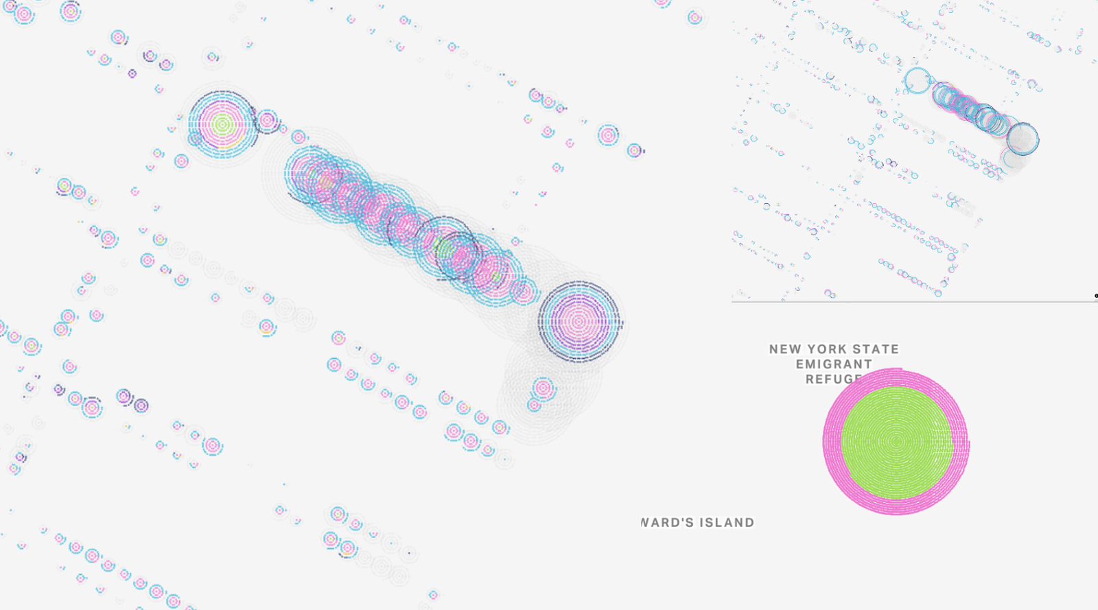
On the left you can see the old version, which some people are pretty attached to! Some of us at Stamen have called this the “fire drill view,” as if everyone in New York went outside at the same time during a citywide fire drill. The aim here was to make something like a beeswarm dot density map.

While nothing in the data changed between versions, dot density in raster vs. vector can look very different! Raster really weights some colors more heavily than others and has a bleeding effect where you end up with a blobbier look and feel. Vector rendering is much more precise and it’s easier to distinguish one dot from another.
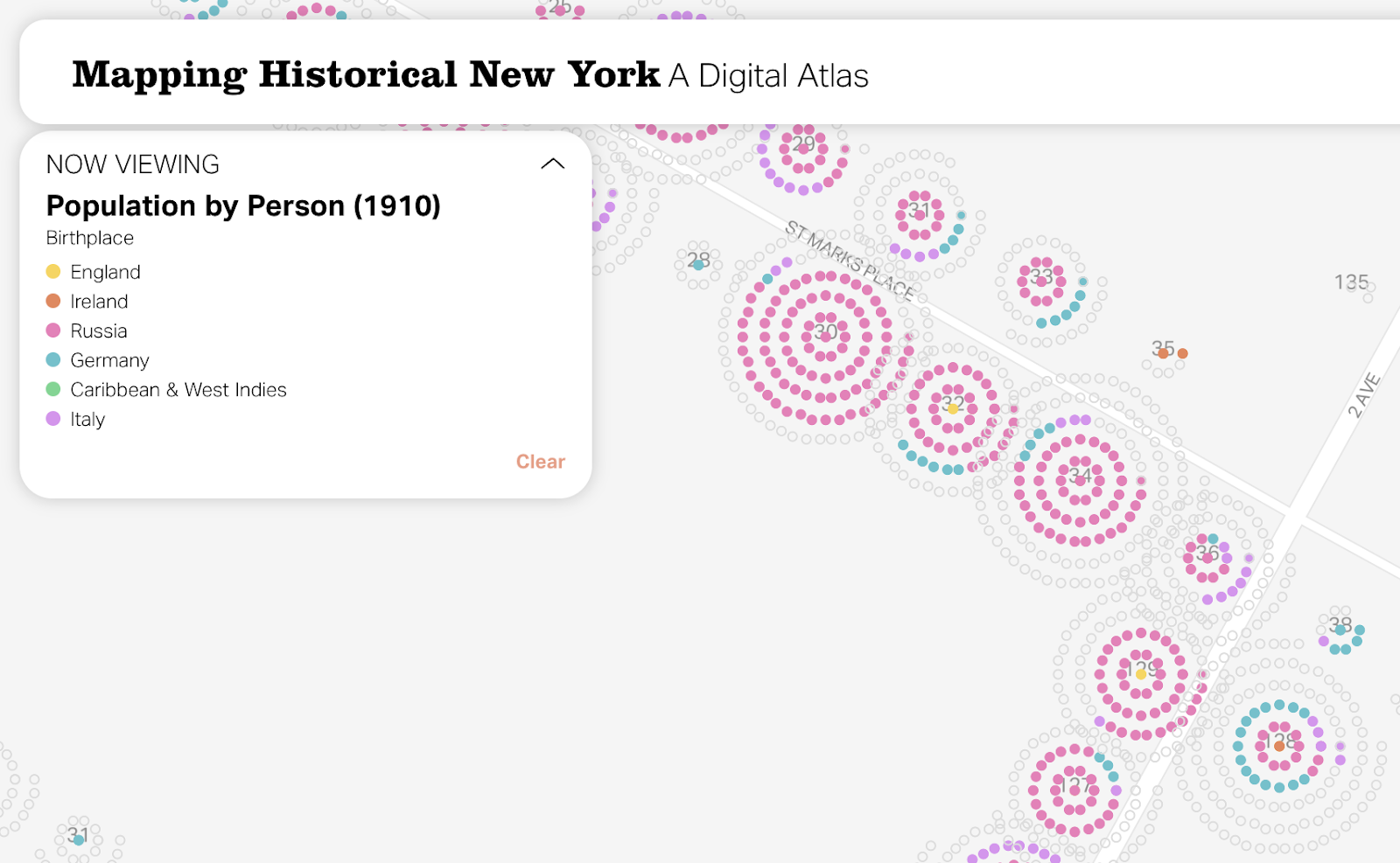
In the new version, as was the case before, every dot represents one individual. Individuals are aggregated by building, visually represented as individual dots in concentric circles. Things are more orderly and size is a bit easier to see at this scale. By using vector rendering, there is considerably less overlap between individual circles.
The original colors were working hard to be visually distinguishable, but the balance between colors needed some work. Ideally, no color outweighs another and patterns within the data are easy to see at all scales. Using colors with similar saturations and lightness made a big difference. Here is our dot density color palette, before and after:

We also tested the new color palette for colorblind-friendliness and adjusted some of the color assignments for default values for better blending. For example, using red and yellow instead of pink and green to represent male and female data made it easier to see patterns. Areas with similar concentrations of both attributes appear orange instead of brown.

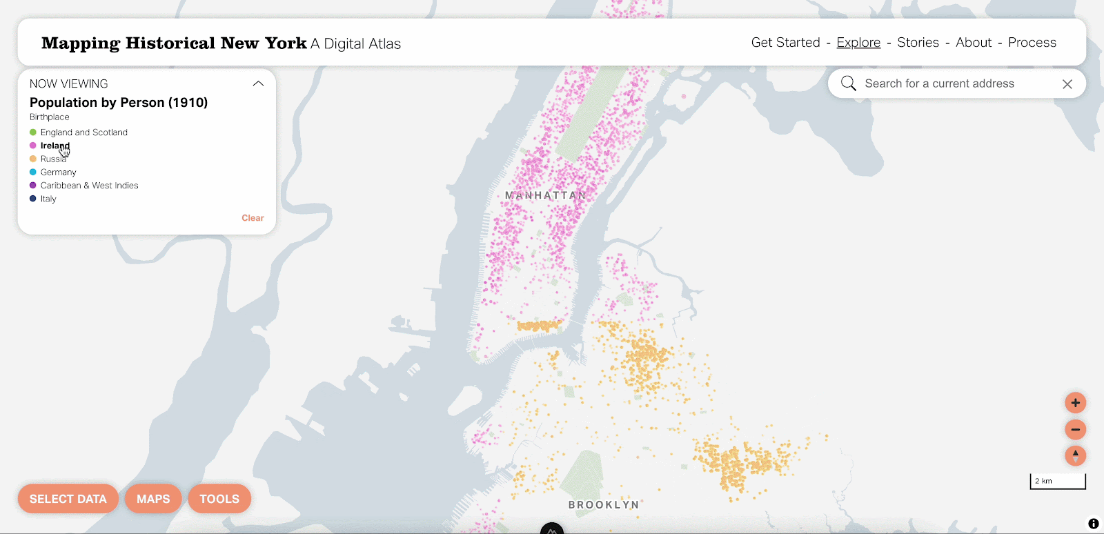
It was important to us to think about how to include people who are otherwise not currently on the map. There are dozens of birthplaces and occupation categories available in the data, but you can only view up to six at a time. In the previous version, you would only see an individual dot if the value was included in the legend. We opted not to show them as you’re zoomed out (as they would dominate the map in most cases), but to include “other” values as empty circles as you zoom in. With this small change, the zoomed-in view now paints a more complete picture of the data.
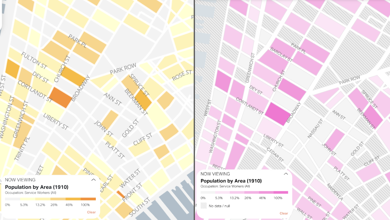
Aggregate views
When viewing the data by building, we moved from individual markers to proportional circles. Each circle represents a building that includes at least one person for the selected attribute (here, Italians). With proportional circles, the size corresponds to the number of Italians in that building. Now, we can see both the location and density of individuals for the selected attribute, which makes it much easier to understand population patterns across the city. Using a bright color helps make the data more legible, too!

For the aggregated view, we are still using a choropleth map, but have moved to a new color palette and added a no data/null pattern. There was no practical need for multiple colors on our spectrum. Our new monochromatic color palette feels easier to read and biases less to the higher values. Adding a pattern for null values helps us distinguish between null and zero, which was not possible in the previous version. This is always an important distinction to make, but especially so with historical data where gaps are more prevalent than modern data.
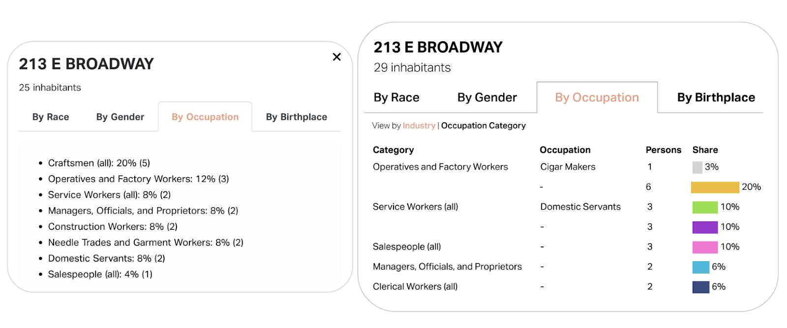
Pop-ups + data visualization
We added a little visualization to the pop-ups to help make sense of the sometimes complex hierarchy of this data and provide a clearer snapshot of a building’s demographic breakdown with just a glance. Students at Columbia use these in their classes, usually copy/pasting them into reports, so we wanted to make sure that was still possible with this view.
Experiments
We like to share experiments as we work through data visualization problems at Stamen. We tried a lot of interesting approaches for the dot density map in particular that may lend some insight into how we ended up with the final design.
For our vectorized beeswarm dot density approach, we repurposed dwelling vector tiles that have counts by category instead of creating redundant vector tiles for both dwellings and individuals. We created a custom protocol in MapLibre GL JS to load vector tiles, split each dwelling into individual points arranged concentrically, and return the result as a new vector tile. Doing it this way means we can reorder the points dynamically, but we still get all the benefits of vector tiles (i.e., restyling dynamically based on user interactions). There is a performance impact when using vector tiles here, but considering the flexibility and new types of user interactions it opens up, it has been a worthwhile tradeoff.

Our goal with this new vector approach was to show the millions of individuals in our dataset with less overlap than you see in the raster version. We tried several different options, including dots ordered in circles, dots ordered in rectangles, and dots placed randomly in rectangles. We used the circular arrangement concept on another project last year (Densho Manzanar), but with a much smaller dataset. We had a feeling that would be the best option but seeing all three next to each other had some interesting results:
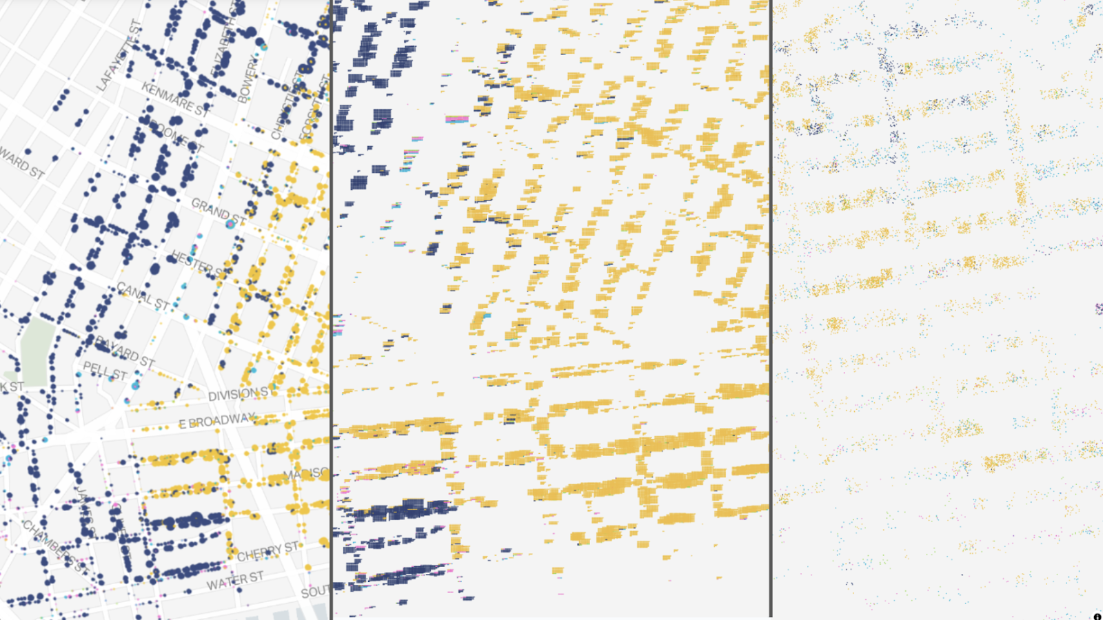
The circles are nice and organized with minimal overlap amongst the points. The ordered rectangles have lots of overlap and create a smudged effect, but we could see potential here in terms of mimicking the Hull House maps. Using rectangles also somewhat implied the shape of a building, which is not information we actually have in our dataset. Dots randomly placed within rectangles were a bit hard to see. This approach also made it difficult to account for small buildings and large buildings simultaneously, plus the likelihood of overlapping points is high.
We had to account for differently-sized buildings, which could range from one to hundreds of people, in terms of the individual circle size and dwelling-level concentric circle size and spacing. We also thought about the best way to order attributes within the concentric circles and ended up with the “other” attribute always sitting on the outside.
Looking forward
All of the changes discussed here were released in the relaunch of MHNY earlier this week! Now that the relaunch is available to the public, the team at Columbia is shifting focus to expansion. Census data from 1850 will be added to the tool in the near future. Data will also expand to include Queens, the Bronx, and Staten Island for some years. Look out for more updates on Mapping Historical New York in the coming months!
Working with teams like the Center for Spatial Research on projects like MHNY is what we love to do at Stamen. If you or your team would like to discuss a collaboration, drop us a line.