
Last month, I led an interactive workshop at The Midwest Climate Adaptation Science Center’s Summer Symposium at the University of Illinois Urbana-Champaign in Urbana, Illinois. MW CASC is a consortium of research-focused academic, Tribal, and non-profit partners working collaboratively with the United States Geological Survey (USGS).
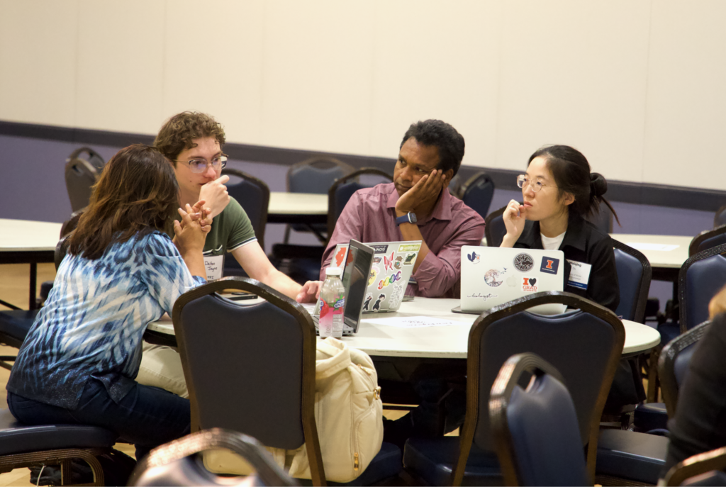
The workshop focused on data visualization and mapping for better science communication, specifically focused on climate-related topics. While the workshop was geared toward early career researchers, all attendees of the Summer Symposium were welcome to attend. We had about 25 attendees who learned about best practices in data viz and created their own visualizations on-the-spot with some hands-on guidance.
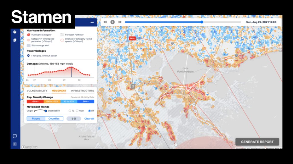
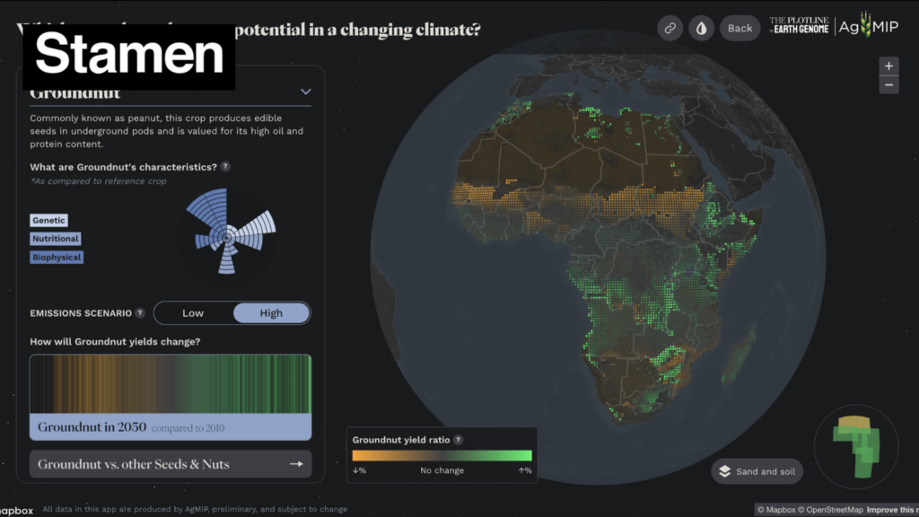
As part of the workshop, I shared lots of maps and visualizations from my career as a cartographer and designer, including several climate-related projects we’ve worked on at Stamen in recent years. Attendees were very interested in the projects themselves, but also in the process of creating tools like ReadyMapper and VACS Explorer in collaboration with scientists and researchers.
This led us to a discussion of best practices in data visualization. At the core, we thought about what data viz is useful for and how it can effectively complement an academic paper, presentation, or article to drive your findings home for the reader.
We focused on what we need to communicate to the reader and what we can assume they already know, which everyone does when making data visualizations whether conscious or not. The most compelling visualizations take the audience into account from the very beginning.
We applied some of these best practices in an example together using Datawrapper, a free, user-friendly online visualization tool. Datawrapper has several datasets ready to use in a visualization, including the data seen below, which shows the breakdown of rural and urban populations in several countries.
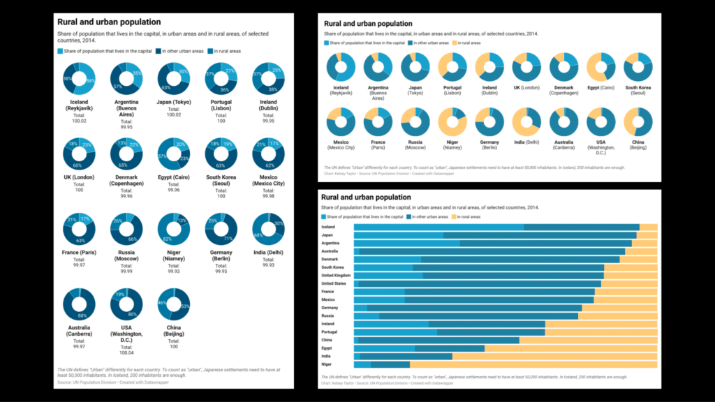
We started with the donut charts on the left, as recommended by Datawrapper, with most of the default settings unchanged. As a group, we discussed what does and doesn’t work about this visualization, which led us to two improved versions on the right.
The top, which still uses donuts, distinguishes rural and urban populations by easier-to-distinguish colors, removes unnecessary labels, and improves the layout for my screen dimensions (ex. landscape instead of portrait). The bottom tries an alternative method with stacked bars, sorted by rural population, which helps highlight trends immediately for the reader.
Following this exercise, attendees split into groups of 3-4 to create their own visualizations in Datawrapper. I jumped from group to group, helping as needed when they had questions. Participants ran into many classic data and visualization issues–improperly formatted data, the dreaded (albeit helpful) FIPS code, and selecting the right visualization type for their data, among others.
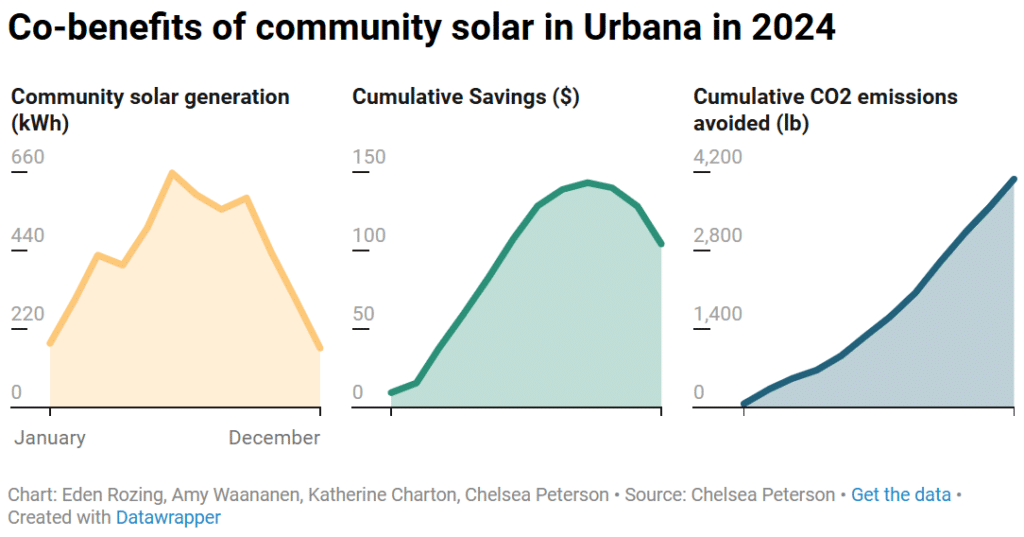
Despite the limited time, each group successfully made an interesting, informative visualization that they presented to the full group before we wrapped up. Here’s one example using the participants’ own data:
We end up doing a lot of informal client education as we collaborate on projects in our day-to-day at Stamen, so I really enjoyed the opportunity to focus on teaching more deliberately at this workshop. Thanks to all the participants for attending and the team at MW CASC for organizing the symposium!