
While you could say that visualizing data is like providing a window into your data, we at Stamen know it’s more like building a door. Sure, data visualization allows you to see some things, but the journey doesn’t really begin until you’ve walked in and figured out where you can go next. And creating these experiences in an educational context is the ultimate balancing act between telling a clear and compelling story, and allowing for open-ended exploration and the opportunities for learning that go with it.
Educational data visualizations designed for classrooms, museums, and the web allow students and citizen scientists to explore new worlds by seeing and engaging with scientific data. But, however amazing these immersive opportunities are, designing interactive visualizations for learning environments presents several unique challenges.
The basic premises of creating educational data visualizations include the following:
- Make it engaging. Visualizations must connect to learners on a personal level.
- Provide context. They must also communicate complex data stories in accessible ways to learners who often lack the background knowledge needed to readily interpret and understand data.
- Layer the information. A visualization must strike the perfect balance of explanation and exploration. It should resist the urge to oversimplify so that a learner may be appropriately challenged before ultimately achieving clarity, usually within a relatively limited amount of time.
So, what are the design considerations at play when creating an interactive educational visualization? Let’s break down how we can use iterative design and development to carry scientific concepts to everyday learners.
Designing an Inquiry-Based Learning Experience
It’s easy to think that the goal of designing data visualization for educational purposes would be to make everything “so simple a fourth-grader could understand it.” In practice, we’ve found that oversimplifying scientific data actually detracts from its value in an educational setting.
In practice, we’ve found that oversimplifying scientific data actually detracts from its value in an educational setting.
In fact, more than any other type of client we have worked with, educators are the ones who push back against the desire to “dumb things down.” Great teachers know that to enable deeper learning, students must not be served easy answers. Instead, they should learn to make real-world connections through active exploration and high-level questioning.
For UI designers, this represents the biggest challenge about creating educational data visualizations. After all, designers are conditioned to find elegant solutions that allow content to speak for itself. And in most other contexts, it makes sense to visualize data in a way that makes key insights and conclusions obvious at a glance. Switching from a mentality of “providing answers” to one of “provoking questions” is central to successful inquiry-based learning.
Interactive visualizations for education must intrigue learners enough to invite them into a dialogue — while also holding enough back so that students can engage in problem-solving and experiential learning. Put another way, the visualization must reveal the heart of the scientific data’s truths clearly, but it must also layer lessons in front of that final conclusion in a way that challenges the learner without making them want to give up. The educational visualization must support its audience through the investigative process with encouragement and enticement. It is with this lens one must examine design considerations through iterative development.
“All Roads to Rome” Methodology
When working with innately complicated and opaque material, the goal is to identify and prioritize the core of what needs communicating. This is true regardless of whether you are designing for a boardroom or a classroom.
Datasets often hold many stories, and you will surface the story or stories you feel most compelled to communicate during the data visualization discovery phase. With your prioritized learning outcome in mind, you now identify multiple data visualization paths that lead to the same outcome. This “all roads lead to Rome” methodology allows you to map the many ways you might layer data in your visualization to prompt and structure an inquiry-based learning design.
Determining Your Prioritized Concept
Of course, it would be impossible for anyone to simultaneously travel all of the roads to Rome. The same is true for the inquiring minds who will ultimately interact with your educational data visualization. After all, nothing sinks an experience like trying to accomplish too many things at once.
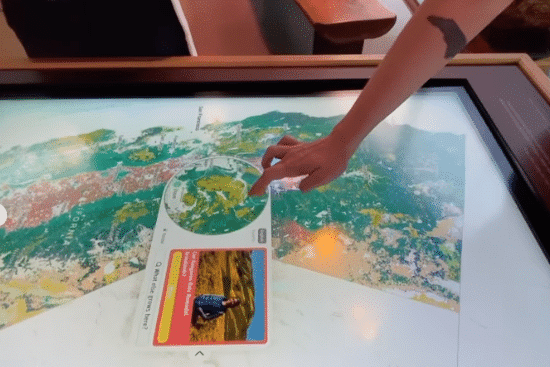
You must prioritize one concept and be willing to let go of all the paths not chosen. For example, Stamen recently contributed to the ¡Plantásticas! exhibit now open at the Exploratorium. This project’s goal is “to foster new understandings of the connection between plants and people through direct engagement with scientific tools, living plants, and broader perspectives.”
At the beginning of the project, our minds raced with possibilities. What core educational concepts could we focus on and support with the available data? Initially, we hoped to use the exhibit to demonstrate the basic connection of people and plants through the intergenerational passing of plant knowledge. However, in the end, our most explicit data story was different. The available data allowed us to make a beautiful map of What Grows Where. This became the compass we consulted for each UI element of the exhibit design.
The Goldilocks Paradigm of Educational Data Design
The process of designing for education requires that you zoom in, zoom out, and then zoom back in — but just partly — when considering the project’s learning outcome and the prioritized paths to reach it.
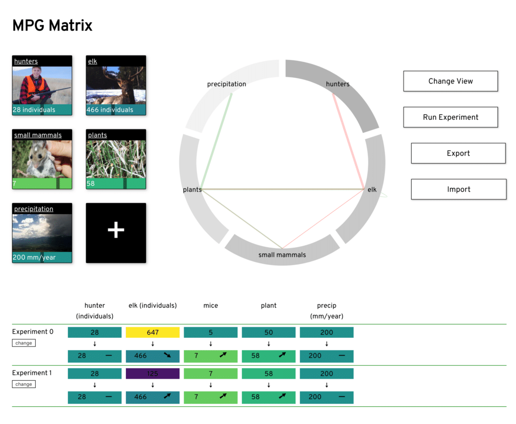
Our work with the MPG Matrix illustrates this critical process. MPG is a 15,000-acre ranch in Montana specializing in habitat restoration and ecological research. The goal of Stamen’s data visualizations were to explore and predict the second-order impacts of conservation efforts (i.e., if you remove one organism from an ecosystem, what impact will that have on the rest of the system?).
Zooming in for the expert view
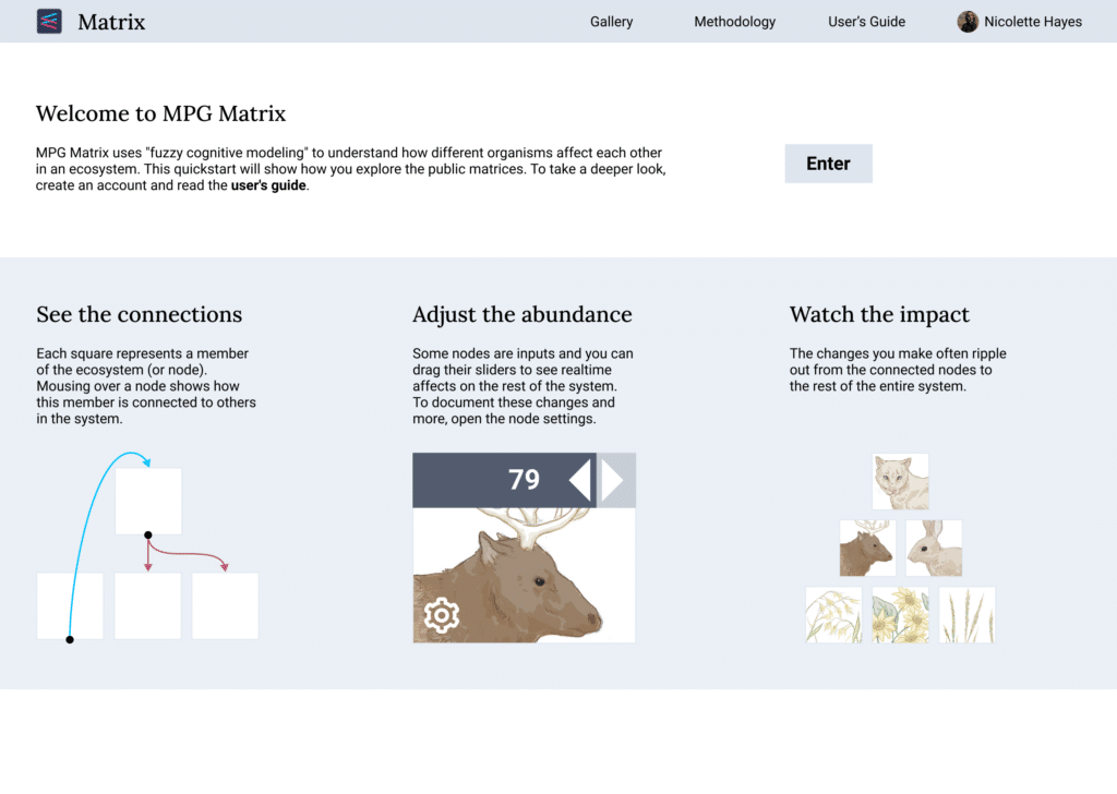
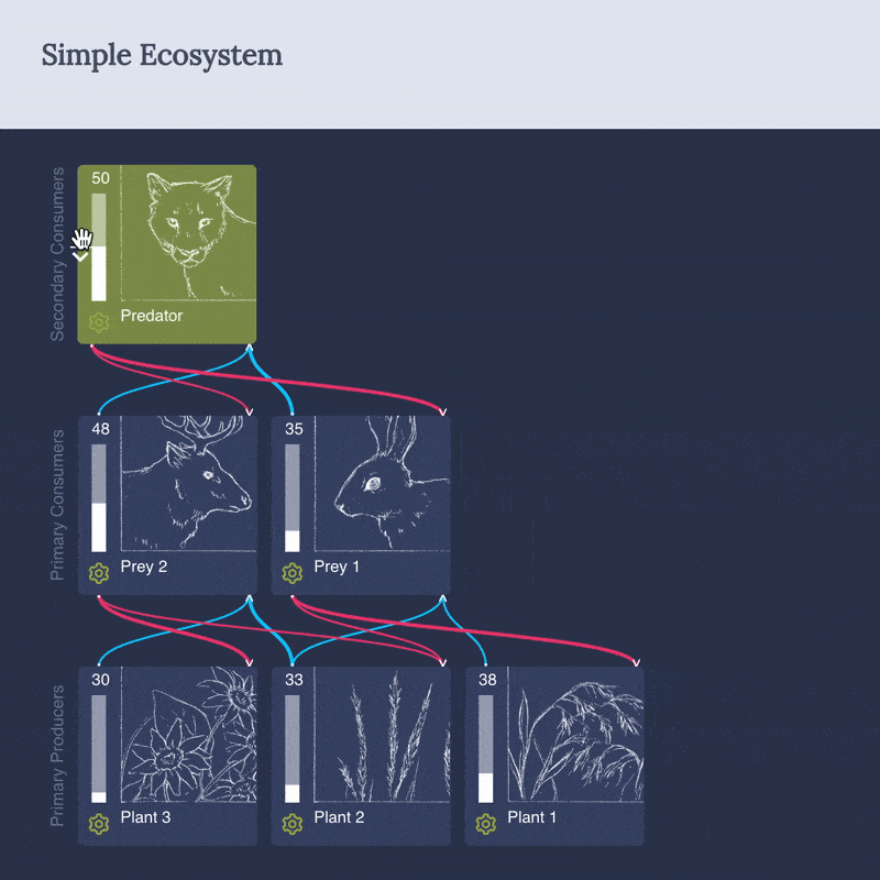
When designing for education, you dive in and make sure you fully understand the breadth, depth, and nuance of a problem. For MPG Matrix, this meant reverse-engineering the fuzzy cognitive model that would allow us to map the ranch’s ecological relationships and devising the data inputs and controls that would be necessary to impact the connections between the variables within an interface.
Another way of conceptualizing this step is building an educational design from the inside out. You start with the data and build a comprehensive first pass at a visualization interface. In a case this complex, this leaves you with a design unintelligible to all but the experts.
But if, of course, you aren’t designing for experts alone but for inquiry-based learners, it’s time to zoom out.
Zooming out for the novice need
In this “zoom out” stage, you take the deep understanding of the data story, problem, and project goal you’ve just created and simplify it to make something accessible for novice users and learners.
Our second round of MPG Matrix design was essentially product design, focusing on the user flows surrounding logging in, saving matrices, sharing private versus public views, etc.
We also began hiding all of the previously “advanced” controls designed when we’d zoomed in. Doing so addressed the concern that too many interactive paths allowing users to troubleshoot their way out of flawed or confusing situations might, ironically, confuse them all the more.
Zooming part way in (again)
The third step of zooming in again (part way) brings you to your Goldilocks moment as you find the place on this spectrum that is just right.
In our third round of design prototyping and iteration with MPG Matrix, we began looking for ways to actually illustrate the complexity of the Matrix design’s underlying algorithm. Of course, it was critical that we do so without alienating students. Instead, we developed a layered approach that would give students (and educators working the MPG Matrix into their curriculum) multiple levels with which to engage.
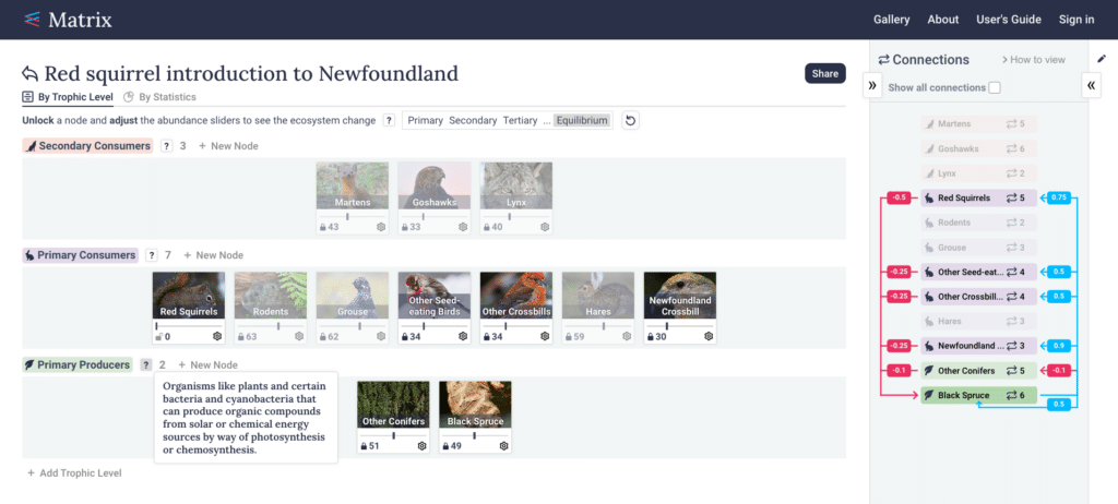
This prompted us to start looking for the most meaningful opportunities to show aggregations. We also added layers of annotation: inline descriptions providing basic UI guidance; a rollover “question mark” icon highlighting scientific or mathematical vocabulary; an overlaid “user’s guide” experience to prompt users to use the tool in new ways. Adding simple videos to better introduce and breakdown underlying scientific concepts also ensured accessibility for all learners. Because the design nests various learning experiences within each other and within the UI, it became possible for learners to explore the Matrix at their own pace and through unique paths of curiosity and learning.
Another way we’ve seen our educational tools be successful is as a springboard for unforeseen opportunities for learning as well. For these cases, providing for open-ended application of the insights becomes an additional deliverable that we’ve learned to consider as a meaningful part of the overall experience. For the Matrix, we are exploring adding export functionality so that students can take the underlying data and possibly even layer in the experience of learning to create meaningful data visualization; a goal that we never would have considered at the outset of the project, but that really brings home the vastness of what is possible when you forefront asking questions as the core of the experience.
Striking a balance between exploration and explanation
Creating a data experience for education requires the designer to provide such a simple and engaging framework for learning that there is additional room left over for open-ended exploration and question-driven discovery. A fun and accessible experience can set the stage for unearthing valuable concepts at different resolutions. Many struggle with trying to accomplish too much and then compensate by oversimplifying the project.
Getting these data visualizations right from the start can set the stage for the difference between rote consumption and real learning. For consultation on your educational project, contact Stamen.