
One of the exciting aspects of working at Stamen Design is that we work with all kinds of data. Not only do we get to explore what story the data is telling us, but we also get to explore how to tell it from a technical perspective.
A challenging data type for web mapping are rasters, which was exemplified in our recent work with the Exploratorium. Here, I’ll dive more deeply into a technique for working with raster data that has broad applications—from creating a hyper-performant 6 foot interactive map table, to being able to quickly and dynamically demo world sea level rise.
Let’s talk about rasters
If you haven’t, go back and read the previous post about our Exploratorium exhibit. To set the stage, let’s talk about raster data: at its most core level, rasters describe data arranged in a grid. Each individual cell, or pixel, in this grid represents one or more values for the area directly under it. An important concept for rasters is the idea of implicit georeferencing. I use this term to describe the fact that the geography of each pixel is derived from the overall raster’s position and the row and column of said pixel.
This contrasts to vector data, where the geography is explicit – each point, line, or polygon feature contains coordinates that describe the location in some sort of space.
About these pixels
We all interact with rasters constantly – the images that you see while panning a satellite map, the #nofilter posts on instagram—these are all rasters designed for efficient compression and display of visual information. The pixels in these images are generally representative of the Red, Green, and Blue parts of the light spectrum, and each have a constrained range of 0 to 255 in integer values.
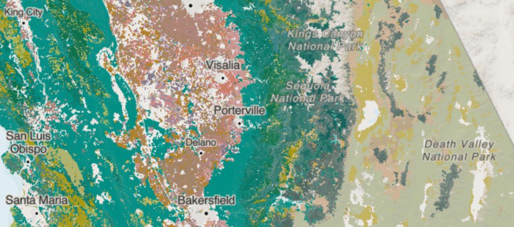
Yet, many other rasters contain other values; let’s call these data rasters. An example of a data raster was our data source for the Exploratorium, the California Augmented Multisource Landcover dataset where integer pixel values correspond to a particular land cover type.
Other examples of data rasters include: elevation data where each pixel represents a height; weather data where each pixel might describe a forecasted temperature or precipitation rate at a given pixel; or, anything else that is represented by pixels not directly designed for visual display.
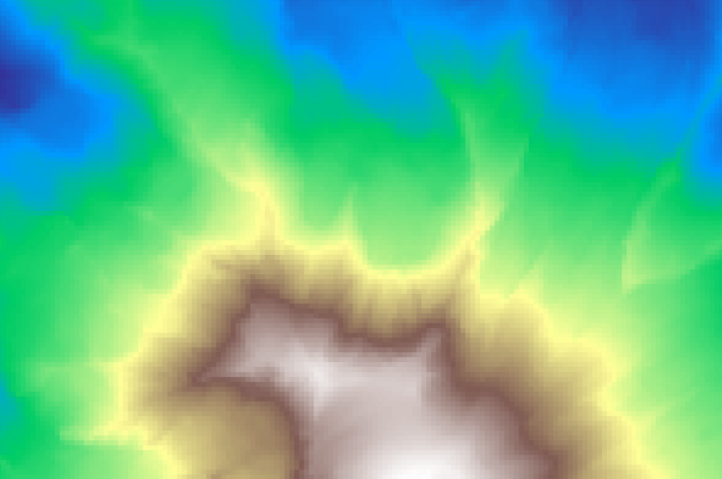
These data have different requirements of range and precision: for example, an elevation raster must describe (at least) elevations from the bottom of the Marianas trench to the peak of Mt Everest, and they must do so at a high precision. For our California land cover data, we needed to represent many different values outside the range of RGB images.
Rasters on the web
Since image rasters are so well supported across all aspects of the internet, displaying these data in web mapping applications is straightforward, as all browsers know how to display an RGB png. Yet, what are the typical approaches for serving and displaying non-image raster data?
Typically we have two main workflows for displaying these in web mapping applications like Mapbox GL JS:
- Vectorization where we convert groups of similarly-valued pixels into polygon features, which are then encoded into vector tiles and rendered as a kind of pseudo-choropleth
- Color mapping on the server where we apply colors to the raster data values, and effectively turn it into image tiles for display before serving these tiles for display
These both have advantages and disadvantages:
- 👍Vectorization allows out-of-the-box dynamic colorization, filtering, and interaction with existing web mapping frameworks
- 👎Vectorization requires heavy simplification, and greatly reduces the fidelity of the data in order to make rendering performant
- 👍Color mapping allows performant display like any other image layer and maintains the full fidelity of detail for the data
- 👎Color mapping doesn’t allow any interaction or access to original values, as these are displayed as colors
For our Exploratorium exhibit, the disadvantages of both made these non-starters. So, how did we solve this problem?
Hiding high-precision data in RGB rasters
Using a few math tricks, we can “hide” higher fidelity raster data in images. But how?
To demonstrate, let’s just use the base-10 decimal system with which we are so familiar. Let’s count to 10, padding our numbers with 0 to show each position clearly
001, 002, 003, 004, 005, 006, 007, 008, 009
Oh no! We have exhausted the range of our third digit. What shall we do?!?! We obviously all know the answer, but I am using this to make a point – we increment the second digit to 1, and reset the third digit to 0:
010, 011, 012, 013, …, 999
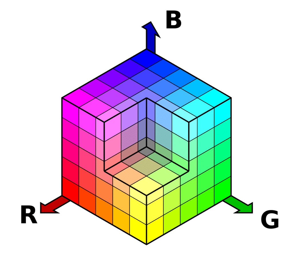
Are you with me? Now, back to RGB data: consider that each band (Red, Green, Blue) individually allows for a range of 0 to 255.
Imagine that each of these corresponds to a position for a number. Let’s apply this same logic to our RGB bands, keeping in mind that both go up to 255:[0 0 1], [0 0 2], … [0 0 255]
I bet you can guess what we do next!
[0 1 0], [0, 1, 1], … [0, 1, 255], … [255, 255, 255]
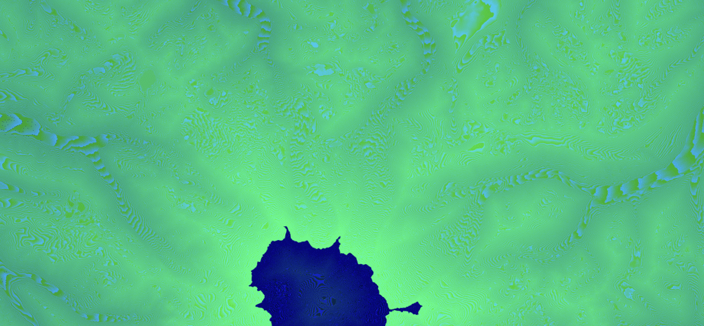
This method allows us to have a range of over 16 million values in each pixel, which we can use to store, distribute, and display data rasters at high fidelity. This is the same approach that I developed for Mapbox to encode elevation in their Terrain-RGB and Terrain-DEM tilesets.
For our Exploratorium project, we encoded integer values that represented different plant communities.
Shaders and textures and layers oh my!
Once we have the data safely nestled in images, how do we access it? Keep in mind that for the Exploratorium exhibit, we wanted to have multiple users exploring the map and interacting with the plant data. On this large screen, this results in a lot of pixels–even on my 13” MacBook we are talking over 4 million pixels— so how did we keep the map feeling snappy while a bunch of first graders feverishly mashed our plant filters?
By using a custom shader layer in the Mapbox application, we were able to get the performance and interactivity we needed. We did this by forking and modifying an existing open source texture layer library, then writing a shader that decodes each image tile, then applies styling and filtering rules dynamically.
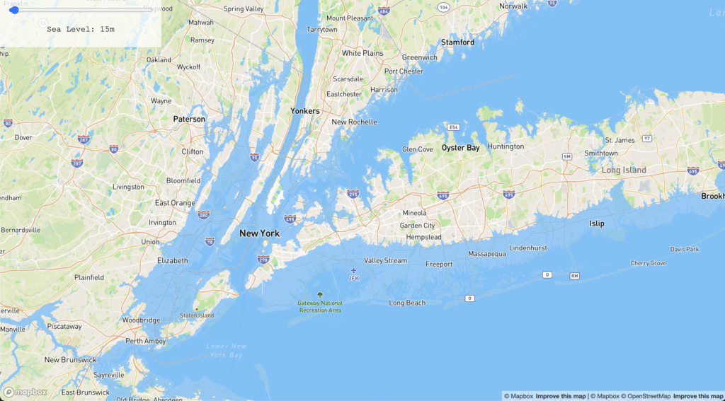
To demonstrate how this works, I built a simple prototype that depicts a rudimentary modeling of Sea Level Rise to outrageous yet striking levels (for more on using extreme inundation depictions to tell a powerful story, see Stephanie’s conversation with Jefferey Linn on our podcast).
Here, we filter and display elevations under a given level as water as you dynamically move around the slider: https://dnomadb.github.io/shader/#0.64/0/145. This uses RGB encoded elevation tiles from Mapbox, loads them via a custom texture layer, and uses a shader to filter and dynamically color each pixel by its elevation above or below the desired water level.
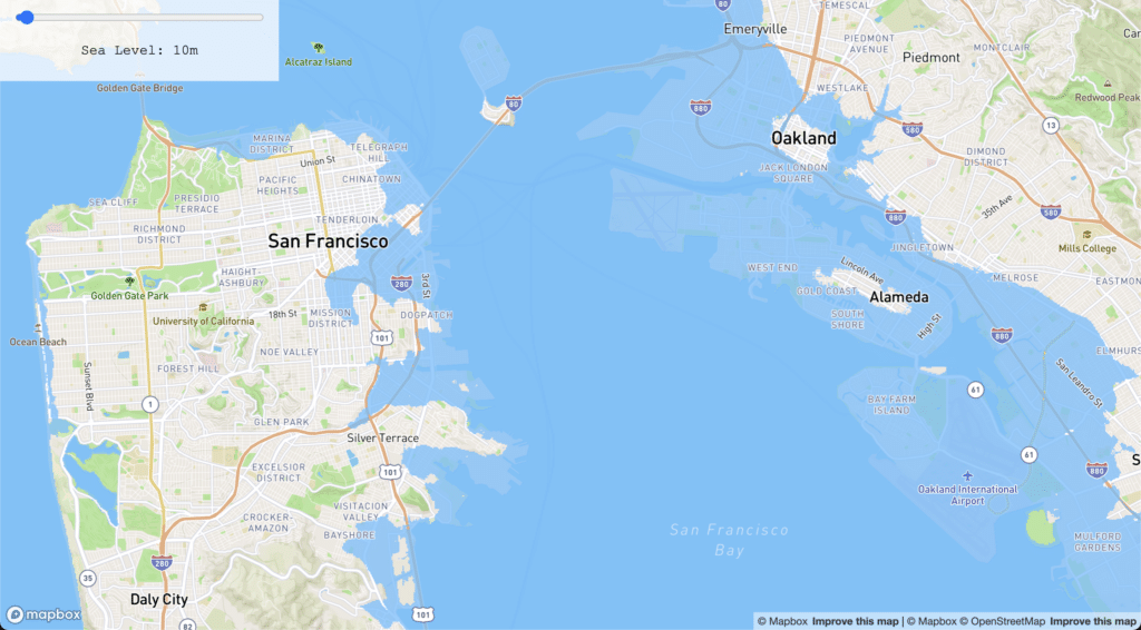
Again, note that this is super-rudimentary inundation modeling, and allows depiction of water levels that are downright ridiculous. Moreover, this implementation isn’t fleshed out on all platforms, and doesn’t yet work on mobile, but it’s a simple proof of concept that shows the approach to great effect. Play with the tool yourself, and let us know what you think! Can you think of other raster use cases could benefit from this technique?
By encoding and tiling raster data as images, and decoding and visualizing these images in a custom shader layer, we can create interactive visualizations far beyond what standard tooling allows. We are always looking to apply novel techniques to solve difficult challenges that our client projects bring. Here, I was really excited to experiment with display of data rasters for the web, and I am looking forward to applying this technique for more projects in the future.