
blog/Data Visualization

Data storytelling with respect for your audience
Making data visual is an incredible tool for communication, but finding the right way to do so is something we are always interested in refining here at Stamen. In our latest episode of Pollinate, Denise Lu digs into what it means to distill complexity for the news cycle, and in this conversation between Stamen’s Nicolette...

Pollinate Ep. 18- Denise Lu & Telling Stories With Maps
You can tell a good story with words. But a great story compels an audience through thoughtful visualizations. In this episode, Denise Lu walks us through her career in journalism—from her involvement in a student publication in college to her current role as Senior Graphics Reporter at Bloomberg News. We discuss what makes cartography and...

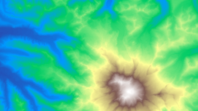
The charismatic megafauna of climate change maps
In the latest episode of the Stamen Pollinate podcast, Stephanie May talked with cartographer Jeffrey Linn about his fascinating series of sea level rise maps and about the concept of “speculative cartography”. Maps that show familiar coastal cities flooded by water are viscerally terrifying and visually compelling, but as cartographers we often struggle with the...

Data Visualization for Education: When Asking Questions is the Answer
While you could say that visualizing data is like providing a window into your data, we at Stamen know it’s more like building a door. Sure, data visualization allows you to see some things, but the journey doesn’t really begin until you’ve walked in and figured out where you can go next. And creating these...
Weaving together plants and people: developing a touchscreen installation for the Exploratorium
¡Plantásticas! is now open at the Exploratorium! This exhibit introduces visitors to the world of plants through a diversity of perspectives, and features an installation by Stamen design. The Exploratorium came to Stamen with two rich sets of data: the lived experience of plants through the eyes of Latinx and Indigenous communities, and high resolution...
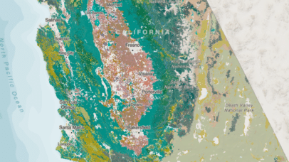
Connecting the Dots: How Data Products and Design Help Address Systemic Threats
The myriad and complex challenges of addressing climate change can feel overwhelming, but when you combine the wealth and power of data available with communication strategies, it becomes possible to imagine a future where we are valuing conservation, relying on renewables, promoting efficient industrial, consumer, and agricultural processes, and not pumping greenhouse gasses and pollutants...
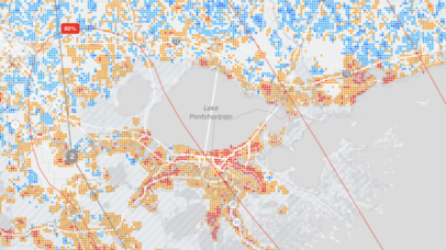
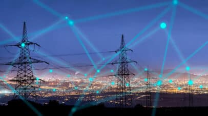
Visualizing critical disaster data with ReadyMapper
With climate-related natural disasters on the rise, it has become increasingly obvious that we lack the tools to provide useful information as crises unfold—the venn diagram of crucial data and real-time communication has painfully little overlap. Since early 2022, Stamen has had the pleasure of working with CrisisReady and Direct Relief to create ReadyMapper, an...