Visualizing ecosystems with MPG Matrix: A new approach to land management
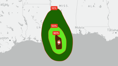
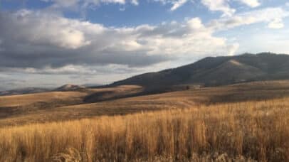
Has anything like this ever happened to you? It might not seem like it, but these stories are likely the impacts of a poor resource management decision. Ecosystems are composed of an extremely complicated web of plants, animals, microscopic organisms, fungi, people, precipitation, and so much more. When the abundance of one component changes, the...