blog/Data Visualization

A painting by Alex Parlato, who is a data visualizer at Stamen

A conversation with a Data Visualizer Who’s Also a Painter

| 01.17.24

Eric Rodenbeck (ER): Welcome, Alex! I’m excited to talk with you today and showcase you and your work. Let’s start with how you came to be at Stamen. How did we find you? How did you find us? Why are you working here? Alex Parlato (AP): That’s a good question. Well, I had been working...

Visualizing Japanese American Confinement with Densho

| 12.19.23

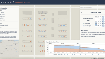
Back in 2021, Stamen began working with Densho, a nonprofit committed to documenting the oral histories of Japanese Americans who were incarcerated on American soil during WWII. Together, we worked to tell the stories of the 125,000 imprisoned individuals through a map-based visualization called Sites of Shame.  In 2023, we collaborated again to develop Manzanar...

Another #30DayMapChallenge!

| 12.14.23

We’ve just passed the most prolific time of the year for cartographers: the 30 Day Map Challenge! Every November, cartographers across the globe answer the call to create a map each day with a theme outlined by the organizer Topi Tjukanov. These themes cover everything from continents to data sources to concepts. People often added...

The Data Visualization Discovery Phase Made Clear, Clear, Clear, in Business Language!

| 06.12.23

Mention the term “discovery phase” in a room full of product managers, analysts, executives, entrepreneurs, or developers, and you’re certain to garner myriad responses: everything from nods of agreement and appreciation to rolling eyes and exasperated sighs. In fact, in the design and development process of digital products, there’s perhaps no phase that is more...

Pollinate Ep. 19- Andrea Lipps & Curating Digital Artifacts

| 06.08.23

Acquiring physical art for a museum requires a lot of planning and care. But what does it mean to acquire a digital artifact? You might be surprised to learn it’s less like the acquisition of a painting and more akin to how a zoo acquires a living tiger. In this episode, Andrea Lipps shares some...

Data storytelling with respect for your audience

Making data visual is an incredible tool for communication, but finding the right way to do so is something we are always interested in refining here at Stamen. In our latest episode of Pollinate, Denise Lu digs into what it means to distill complexity for the news cycle, and in this conversation between Stamen’s Nicolette...

Pollinate Ep. 18- Denise Lu & Telling Stories With Maps

| 05.11.23

You can tell a good story with words. But a great story compels an audience through thoughtful visualizations. In this episode, Denise Lu walks us through her career in journalism—from her involvement in a student publication in college to her current role as Senior Graphics Reporter at Bloomberg News. We discuss what makes cartography and...

The charismatic megafauna of climate change maps

In the latest episode of the Stamen Pollinate podcast, Stephanie May talked with cartographer Jeffrey Linn about his fascinating series of sea level rise maps and about the concept of “speculative cartography”. Maps that show familiar coastal cities flooded by water are viscerally terrifying and visually compelling, but as cartographers we often struggle with the...

Data Visualization for Education: When Asking Questions is the Answer

| 04.26.23

While you could say that visualizing data is like providing a window into your data, we at Stamen know it’s more like building a door. Sure, data visualization allows you to see some things, but the journey doesn’t really begin until you’ve walked in and figured out where you can go next. And creating these...

Making a snappy raster map with shaders

| 04.18.23

One of the exciting aspects of working at Stamen Design is that we work with all kinds of data. Not only do we get to explore what story the data is telling us, but we also get to explore how to tell it from a technical perspective. A challenging data type for web mapping are...