blog/Design

Data storytelling with respect for your audience

Making data visual is an incredible tool for communication, but finding the right way to do so is something we are always interested in refining here at Stamen. In our latest episode of Pollinate, Denise Lu digs into what it means to distill complexity for the news cycle, and in this conversation between Stamen’s Nicolette...

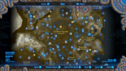
Cartographers Play Video Games – A Review of the Map in The Legend of Zelda: Breath of the Wild

At Stamen, our appreciation and opinions of maps go beyond just our professional work here and often bleed over into our personal interests as well. Our eye for interactivity, color palettes, contour lines, and labels doesn’t stop once we log off at the end of the day. As we covered in a previous post by...

Data Visualization for Education: When Asking Questions is the Answer

| 04.26.23

While you could say that visualizing data is like providing a window into your data, we at Stamen know it’s more like building a door. Sure, data visualization allows you to see some things, but the journey doesn’t really begin until you’ve walked in and figured out where you can go next. And creating these...

Weaving together plants and people: developing a touchscreen installation for the Exploratorium

| 04.04.23

¡Plantásticas! is now open at the Exploratorium! This exhibit introduces visitors to the world of plants through a diversity of perspectives, and features an installation by Stamen design. The Exploratorium came to Stamen with two rich sets of data: the lived experience of plants through the eyes of Latinx and Indigenous communities, and high resolution...

How we use collaborative design software to collaborate on more than just design

If you had the opportunity to visit the Stamen studio during our twenty-year reign at the corner of 16th and Mission you’ve probably noticed how integral collaboration is to the fabric of our business. Project teams huddled in a meeting room, whiteboard sketches happening in another, spontaneous hallway conversations, or our daily meals together around...

Connecting the Dots: How Data Products and Design Help Address Systemic Threats

The myriad and complex challenges of addressing climate change can feel overwhelming, but when you combine the wealth and power of data available with communication strategies, it becomes possible to imagine a future where we are valuing conservation, relying on renewables, promoting efficient industrial, consumer, and agricultural processes, and not pumping greenhouse gasses and pollutants...

Visualizing critical disaster data with ReadyMapper

| 03.08.23

With climate-related natural disasters on the rise, it has become increasingly obvious that we lack the tools to provide useful information as crises unfold—the venn diagram of crucial data and real-time communication has painfully little overlap. Since early 2022, Stamen has had the pleasure of working with CrisisReady and Direct Relief to create ReadyMapper, an...

Data Hierarchy Best Practices to Elevate Your Data Visualizations

| 03.02.23

At its very core, data visualization has two main components: representation and interaction.

When Creating a Digital Map, Know Your Options

| 02.23.23

Digital maps are everywhere. Through real-time data feeds and integrations, maps can turn into comprehensive multi-purpose tools within your organization, as well as a core part of operations, logistics, and customer-facing products. Geospatial analysis and location intelligence is a business priority for all industries, including governmental agencies, non-profit organizations, telecommunications groups, manufacturing and retail. At...

2022!

| 02.22.23

Remote dataviz & maps in the cloud 2022 was our first full year at Stamen being really remote. We’ve been out of our beautiful San Francisco office since the beginning of the COVID-19 pandemic, which I’ve reflected on before, but for the first year or two, we all assumed being remote was temporary. 2021 saw...